Mascots like the KFC Colonel, Michelin Man, and Starbucks siren show how illustrated ambassadors can become synonymous with a brand. Carefully curated by professional graphic designers, these unique characters embody company values to form deep consumer connections.
To help you brainstorm, we've created a list of the 13 best mascot design ideas, analyzing their distinguished characteristics. Let us unravel how the well-crafted mascot can enhance brand awareness, helping your brand become unforgettable.
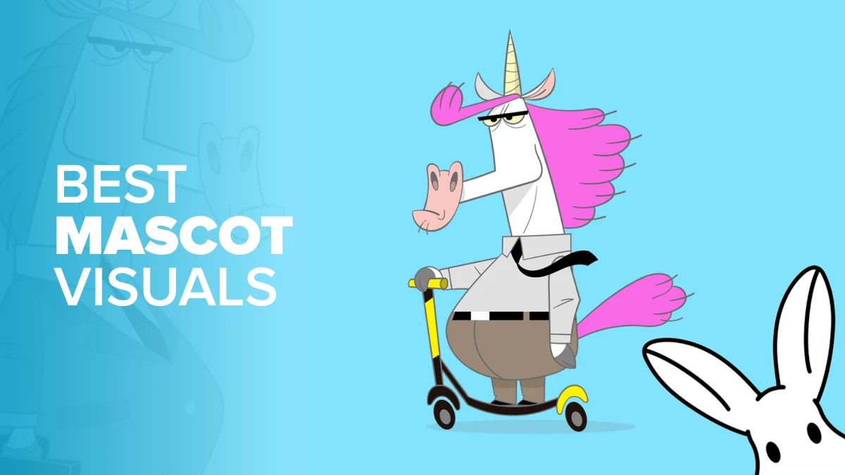
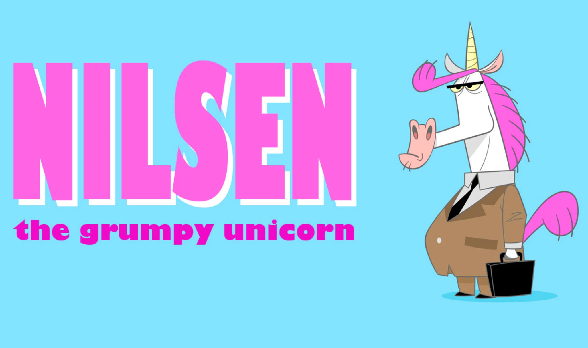
1. Nilsen by Aqueles Caras
Standout Features:
- Fun and colorful
- Ironic approach
- Evocative of early 2000s popular cartoons
The story behind Nilsen's mascot idea began as a conceptual project for an animated series. Aqueles Caras studio created Nilsen as a spiritual successor to the legendary Cartoon Network features like Dexter’s Laboratory, Powerpuff Girls, Courage the Cowardly Dog, and more.
Nilsen turns the satirical aspects to eleven, which in turn writes the comedy by itself. He is not a Brony; he’s always complaining, hating his "cute unicorn life," which is why he's the moodiest and most pessimistic unicorn.
Nilsen works at a big advertising agency as a financial advisor. He never won an award or attended an event, probably because he failed to see its potential.
His work and routine are very repetitive, living by the book and grumbling every step of the way. We bet you know someone like Nilsen. He may be unable to change, but his disgruntled face makes our day, especially when placed on various promo materials and business collateral.
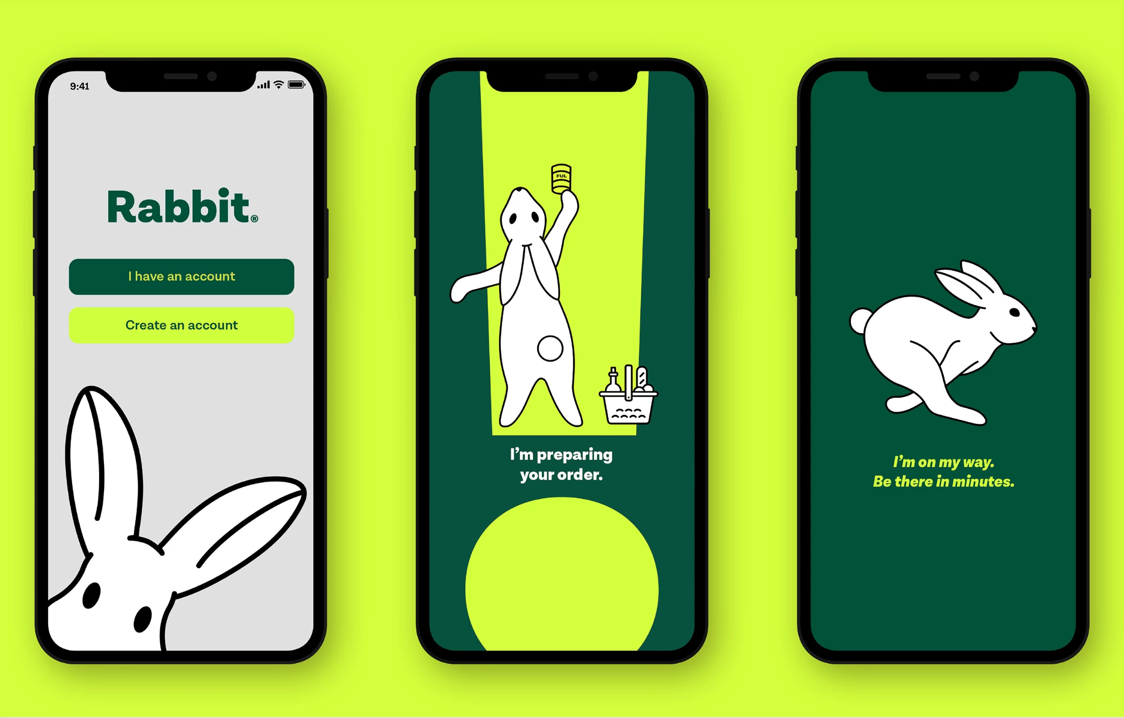
2. Rabbit by Tandem Branding
Standout Features:
- Simplistic design
- Efficient
- Animated
Rabbit is an on-demand, ultra-fast delivery service that promises to bring your ordered goodies, such as groceries, cosmetics, electronics, and more, in under 20 minutes! Now that’s impressive.
This bunny, designed by Tandem Branding, is always on the go, has no need for napping (unlike the one in the fable), and is bound to transform the future of retail. The simple white rabbit mascot idea visually communicates the brand's commitment to swift service while maintaining a friendly and memorable image.
Paying homage to the tortoise's triumph in the fable, Tandem Branding cleverly incorporated a green color scheme, creating a winning "tandem" on the path to success. The playful Rabbit character, set against bold fluorescent shades, is a striking visual that ensures the brand stands out on the streets and screens.
Rabbit is one of the prime mascot examples highlighting how strategic character choices can elevate brand identity and make it instantly recognizable.
3. NASH FRIED CHICKEN by Thiago Gari

Standout Features:
- Old-school atmosphere
- Blazing red color palette
- Custom typography
After Colonel Sanders’ fast food revolution, there wasn't much to do about fried chicken. Some standards became... Well, standards for a reason. However, some brands achieve the impossible and find a way to think outside the box or bucket.
To make the brand stand out from its competition, Nash Fried Chicken hired Thiago Gari to create a visual identity that will embrace the old-school style but with a bit of a twist to make its design contemporary.
While brainstorming mascot ideas, Gari wanted to create one that calls to mind nostalgic retro cartoons from the turn of the 20th century (Betty Boop, Felix the Cat, etc.). That led to the creation of the Nash Rooster — a mascot equally zany and quirky, radiating a fun personality that appeals to fast-food enthusiasts.
4. Estrategia Concursos by Ane Schutz

Standout Features:
- Symbolic meaning
- Blue color palette
- Symmetrical
Estrategia Concursos, a renowned Brazilian educational company, demonstrates how mascot ideas can derive from history and mythology.
Ane Schutz's choice of an owl as a mascot for this brand may seem like a no-brainer, but it has deeper roots. In Greek mythology, the owl is Athena's companion, revealing universal truths and highlighting her role as a goddess of wisdom.
This connection makes the owl a natural fit for an education company, reinforcing Estrategia Concursos' commitment to fostering learning and intellectual growth.
To further modernize the myth and integrate the owl into their brand identity, Ane Schutz reimagined the character design to be usable across various platforms and general communication. The result is a charming and symmetrical mascot that embodies the pursuit of knowledge, inspiring students and educators alike.
5. Nowall School - Universo Visual by Henrique Petrus

Standout Features:
- Charming character designs
- Creative use of color
- Twist on SaaS illustrations
Located in Londrina city in Brazil’s Paraná region, Nowall School is a renowned, albeit quirky social media education center that blurs the lines between learning and entertainment.
Wanting to personify its distinct “academic” approach, Nowall approached Henrique Petrus to develop an expanding visual universe that presents the company’s unique personality on social media.
For this, Henrique came up with a series of mascot ideas in the form of a slew of zany characters, illustrated elements, and a visual guide that contains color spectrum, typographic families, and more. Their modular features make these colorful “dramatis personae” stand out. They were exchanging members and elements among themselves to generate new characters, increasing the possibilities of this visual universe.
6. The Wine Cat by Nuta Mart

Standout Features:
- Sketchbook style art
- Animated drawing
- Wine-inspired color accents
You know what they say — cats and wine make everything fine! Therefore, Nuta Mart came up with an adorable mascot idea for a wine blog on Instagram and other social networks.
The idea is simple — the sophisticated cat in the images informs oenophiles about wine, its origin, grapes, varieties of wine, and its rich history. This unconventional mascot for the viniculture, depicted as a cute and well-mannered sommelier cat, will take you on an unforgettable vinified journey.
7. Balacobaco Prod. by Giovanna Merlin

Standout Features:
- Stylized smoke shapes
- Weed culture inspired
- Explosion of colors
Speaking of our furry friends, we will now present you with a cat mascot example that speaks to a different kind of enthusiast. Balacobaco Prod.’s objective is clear — to disseminate knowledge and to demystify taboos about marijuana. Forever.
The distinct design, created by Giovanna Merlin, helped the brand express its charisma through robust typography, an explosion of colors, and high-energy visuals inspired by the effect of cannabis and the shape of the smoke itself. The objective was to transmit what it means to "do balacobaco"(trendy, hip).
The brand mascot, Yumi, was based on the client's Persian kitten. It carries the voice and transmits all the energy Balacobaco Prod. radiates. Now, that is what we call high-class design!
Make sure to also check out our article on the best weed logo designs.
8. Lia by Rogerio Torres

Standout Features:
- 3D model
- Radiating character
- Formally dressed
The future is now! Virtual influencers are becoming more popular, and businesses looking to future-proof their impact invest heavily into ideal, artificially generated personas to represent them.
In 2021, designer Rogerio Torres presented a mascot idea to the Construtora Celi, resulting in the virtual darling of the company — Lia. Torres first outlined Lia as a digital influencer. She is a charming, mature, communicative, elegant, and connected woman of the 21st century. She is an architect with a consolidated career, is married, and has two children. Now, that’s an impressive CV.
From there, Lia’s physical appearance and fashion choices practically define themselves. In a nutshell, Construtora Celi opted for the perfect “show, don’t tell” way to personify its brand.
9. INSURGENTES: TORTILLAS Y TIANGUIS by CaliDoso

Standout Features:
- Vintage designs
- Anthropomorphic characters
- Limited color palette
Sometimes, the most effective mascot ideas come from revisiting the past. Designing a visual that authentically captures the essence of a bygone era can be challenging, but it can also lead to incredibly unique and memorable mascots.
CaliDoso accepted this challenge while creating mascots for Insurgentes restaurant, drawing inspiration from mid-20th-century graphics and the rich flavors of Mexican cuisine. The result was a nostalgia-evoking series of charming, anthropomorphic characters representing famous Mexican dishes.
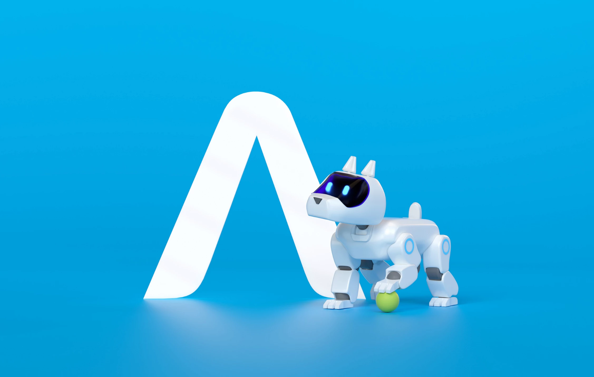
10. Smartway Insurance by Poke.
Standout Features:
- 3D render reminiscing of stop motion art
- Tech-oriented character
- ‘90s toy inspired
Smartway, known for its comprehensive services bridging the gap between insurance companies and clients, has unveiled an innovative approach to embody its brand values — a unique mascot, Smart Boy.
This tech doggo, created by Poke, perfectly carries the brand’s signature futuristic look. Its charming, friendly, loyal, reliable, and intelligent demeanor personifies the values clients look for in an insurance company.
Smart Boy is a mascot example that can inspire companies working in serious industries to become more inviting and distinctive to customers.
11. Ioio Fun by Joao Joinles Silva

Standout Features:
- Fun and colorful
- Nostalgic
- Smiling character
Ioio temporary tattoos' Little Yo-yo mascot, designed by Joinles Silva, brings back memories of childhood joy.
Little Yo-yo is the perky girl we all knew in kindergarten, reminding us of a simpler time filled with shared laughter, temporary tattoos, Saturday morning cartoons, and innocent crushes. Her wide-eyed innocence is enchanting, transporting us back to a world of magic and games and bringing that same joy to today's children.
Little Yo-yo deserved a place on our list of mascot ideas for business because of its ability to create a lasting bond with customers, fostering brand loyalty and positive associations.
12. The Mighty Horde by Johnny Haru

Standout Features:
- Sports-like imagery
- Embodies the band
- Dominant crimson color
The Mighty Horde, an epic folk band based in Shanghai, sought to create a mascot to encapsulate its diverse musical influences and unique aesthetic. A musician and designer, Johnny Haru, understood the assignment, knowing that the road to an ideal solution must lie in the fusion of various mascot ideas.
Drawing inspiration from historical figures like Genghis Khan's Mongolian warriors and the fierce Scandinavian Berserkers, Johnny crafted a charming yet wild warrior mascot. While rooted in historical references, the character incorporates a modern twist with hints of NBA-inspired heraldry, bridging the gap between the band's folk roots and contemporary aspirations.
13. Pet Style by Drop Estudio

Standout Features:
- Monochormaticity
- Geometric shapes
- Adaptive
Pet Style exemplifies how intuitive mascot ideas can complement brand identity. This company specialized in pet accessories, with bandanas as their flagship product, naturally embraced a bandana-wearing dog as its mascot.
Drop Estudio, tasked with creating a unique visual identity for Pet Style, developed a fun and cheerful color palette that sets the brand apart from competitors. The dog-shaped mascot, adorned with a bandana, is a minimalist yet impactful representation of the company's niche and core product.
The mascot's "cute & stylish" design, featuring rounded corners, harmonizes with the overall brand identity, creating a cohesive and memorable visual experience for customers.


-preview-webp.webp)