Duolingo’s Interactive Platform Makes It Easy For Users To Learn A New Language
Duolingo is a language learning platform that gamifies the process of learning a new language. The Duolingo app brings that experience to mobile, so users can work on their language skills anytime, anywhere.
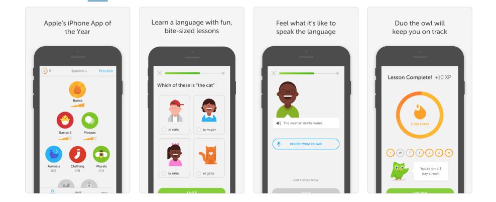
Duolingo allows users to engage with small, quick modules built around specific skills. As the user progresses through the module, they earn small rewards for completion and can move on to more advanced skills. The user’s home screen becomes filled in with skills achieved as the user advances -- iconography changes from greyed out to shown in full color to indicate this progression.
Learning modules are fun and easy to complete in part because everything on the platform is illustrated, and bright colors are used throughout. This engaging approach is a hallmark of well-designed education app UI, where intuitive visuals and interactive elements enhance the learning experience.
This design aesthetic helps make the app feel approachable and fun, which is important for something that’s as daunting as learning a new language can be. Different modules are employed, so it never feels as though the user is completing the same type of task again and again. Knowledge is reinforced through repeated presentation in different scenarios.
In addition to the learning modules, Duolingo has chatbot integration that gives users the opportunity to have a conversation with a bot, helping to develop their skills even further without requiring interaction with another person.
Duolingo is an immensely engaging learning platform that is filled with the types of micro-interactions that make an experience enjoyable and rewarding. The gamification elements of the app ensure that users are incentivized to use it regularly if they don’t want to break their learning streak.
With these interactive elements, people are pushed to play around and engage. And it makes them happy to see the platform reacting back, giving them positive reinforcement for their hard work.
And it works.
A Simple, Intuitive Interface Guides Users Along Their Journey
The Duolingo app is extremely intuitive and user-friendly, guiding people with ease to the languages they want to learn and the classes that will get them one step closer to their goals.
There’s a cleanliness and a minimalism to the interface right off the bat. With a simple, white background and the languages and classes made up of cleverly created modules, there’s an effortlessness to the navigation embedded into this platform.
Each language gets its own rectangle with a story inside. With clear, white text, soothing color gradients and a vibrant image of the destination, landing on the right new language is easier than you’d think and promotes a positivity in their playful and interactive nature.
And once you start a language, each step of the process is embodied by a playful, engaging and exciting circle of content with an image inside that lets users know immediately what they’ll be learning in a given lesson.
There’s also a cleverness in this app that makes users actively want to learn new languages and test their abilities. When users choose a specific language, they're met with a fun fact that is user-friendly, informative and fun.
Adults can use this app, but cute illustrations make it accessible for all ages — making this an app that can easily be integrated into school lessons for both children and adults.
And the step-by-step integration when it comes to the curriculum adds to this positive user experience.
This app is one with a personality, and it’s one that builds a platform that its users want to interact with.
The Step-By-Step Nature Of The Design Fosters A Happy User Experience
As a whole, this app is creative, enthusiastic and fun. It brings to the table educational content that isn’t dry, boring or bland. Instead, it’s full of life, energy and a happiness that fosters those same feelings in the users that choose to start their new language-learning endeavor.
But the bread and butter of this app are the languages and the courses that help build up a skill set in the users playing around with them. And Duolingo knows that — streamlining this process and creating an interface that is immersive, intuitive and simple.
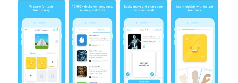
Duolingo incorporates a step-by-step program for its users to learn the information that the app has to offer. Users are able to choose from the circular images that make up the content in that section and dive right into each lesson.
It starts small — with users able to learn simple words, phrases and adjectives. They come in themes too — transportation, family, food and more. This helps to break down the process in a way that doesn’t overwhelm and complicate.
Everything is step-by-step, which keeps users from feeling overwhelmed and in turn, encourages them to keep using the app because it fosters a good experience.
And that’s great for an educational app which has the potential for coming off complicated, confusing and unusable. Instead, there’s a happiness and an ease-of-use that rolls off this platform in waves.
Consistent Branding Puts Duolingo's Authority Front And Center On The Mobile App
Outside of the brand’s exciting and engaging content, Duolingo is also a brand that knows good business and design best practices — infusing its branding into every aspect of its app and online presence.
With the use of a bright green color and a friendly tone, the Duolingo positive and upbeat brand identity makes an impact on its users, creating a relationship between users and brand in a stunning and intuitive way.
Not only that but by keeping branding consistent, Duolingo is ensuring its users know who the brand really is and what it’s all about. This aligns them as an authority in the best way possible.
Branding is seen in the color choice used — a bright, lime green that makes up the background, imagery and logo design in many cases. And this is seen throughout the app.
Similarly, the smart owl-looking vivid logo is present from the second you open the app until the second you close it. The bird holds up content cards, waves at you in congratulations and more.
This, matched with the creative and cool custom illustrations really makes for a brand that is full of life, effervescence and confidence in its content.
What Is Duolingo?
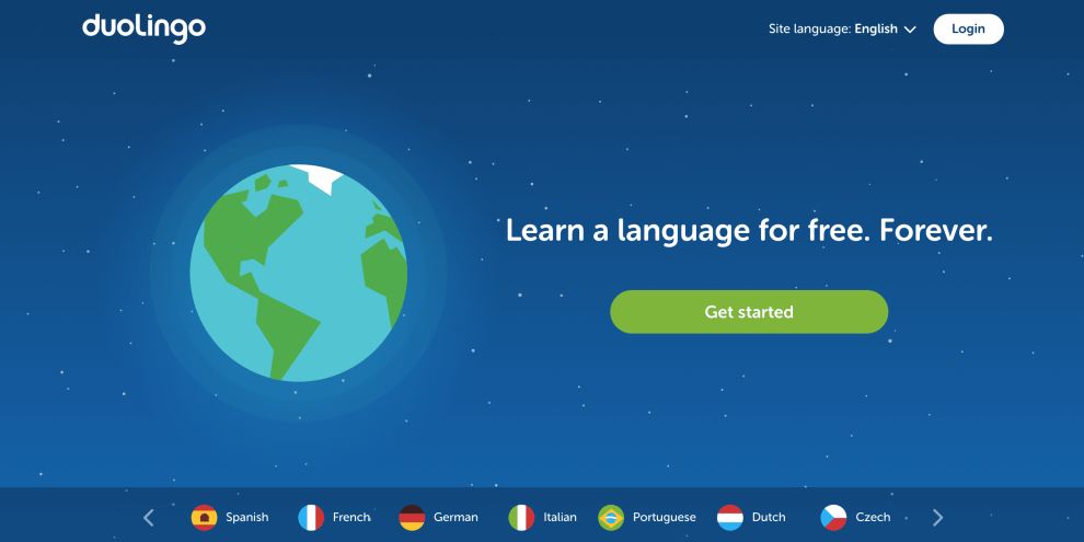
Duolingo is a language-learning platform available across the world. It offers free and paid services, offering a curriculum to its users that put them one step closer to learning a new language. The app has a collection of 68 courses for 28 separate languages available for users to try their hand at.
And it’s an educational brand with a heart, too.
This app started as a class project at Carnegie Mellon University in 2009, but by 2011, it was launched on the market. And seven years later, this platform is available on the app and on desktop, with millions of users utilizing the app across the globe.
Here’s the Duolingo manifesto:
Everyone learns in different ways. For the first time in history, we can analyze how millions of people learn at once to create the most effective educational system possible and tailor it to each student. Our ultimate goal is to give everyone access to a private tutor experience through technology.It's hard to stay motivated when learning online, so we made Duolingo so fun that people would prefer picking up new skills over playing a game. There are over 1.2 billion people learning a language and the majority are doing so to gain access to better opportunities. Unfortunately, learning a language is expensive and inaccessible to most. We created Duolingo so that everyone could have a chance. Free language education – no hidden fees, no premium content, just free. Duolingo is used by the richest man in the world and many Hollywood stars, and at the same time by public schools students in developing countries. We believe true equality is when spending more can't buy you a better education.This is an app that keeps you motivated and promotes a positive atmosphere. It wants to engage and enlighten its users, making them feel happy about the content they're learning and excited to learn more.
And Duolingo’s simple, serene and streamlined interface encourages users to keep coming back for more.
The Powerful, Immersive Elements Within The Duolingo App Make It A Success
Duolingo is a powerful, education app with a robust content offering approachable by all ages. Adults and children alike can log onto the app and learn a new language — and with 28 options to choose from, there’s no way you’ll run out of choices.
With its minimal and clean design, Duolingo makes it easy for users to navigate across the site. And its approachable and friendly tone fosters a positive atmosphere for learning and discovery.
It’s image-heavy, adding a playfulness that’s intuitive, pushing people even further into their language courses.
This, in addition to the brand’s prominence and consistent presence, makes it an app that knows what it’s doing and does it well.
Create an app that inspires with the help of these great app design and development agencies!