
Most software buyers finish evaluating you before anyone at your company knows they exist. They read your pricing page, your documentation, and your case studies on their own schedule, and your site either survives that scrutiny or drops off the shortlist without a conversation.
The 14 B2B SaaS websites below each answer a commercial problem you can name. They run from the most technical buyer to the broadest, and in most cases you can read the brief the client set alongside the finished work.
B2B SaaS Website Designs: Key Findings
- Gartner's 2026 sales survey of 646 B2B buyers found 67% prefer a rep-free buying experience, up from 61% in 2025. The routing decision your sales team used to make on a call now happens in your navigation.
- Contentsquare's 2025 Digital Experience Benchmark, built on 90 billion sessions across 6,000 websites, found conversion rates fell 6.1% year over year while the cost of a single visit rose 9%. Every design decision now carries a higher price for getting it wrong.
- DesignRush's own web design pricing data puts SaaS and tech website projects at $10,000 to $100,000+, the widest cost band of any tracked industry apart from healthcare and financial services.
How We Judged These 14 B2B SaaS Websites
We applied four criteria in this exact order:
- Brief fidelity. Does the finished site do the job the client asked for? Where a brief is published on a DesignRush submission, we link it.
- Buyer routing. Does the site know who is reading and get them to the right depth fast? A cybersecurity site serving a CISO and a security engineer is doing two jobs at once.
- Proof placement. Do logos, certifications, and analyst recognition sit where a buyer is forming a judgment, or on a separate credentials page nobody opens?
- Reported outcomes. Agency-reported numbers are marked as such.
Nine of the 14 sites carry a DesignRush Design Awards evaluation, which follows a published process.
Every submitted design is scored out of 10 by the in-house jury, and that score appears next to the live design. Scoring splits across four weighted criteria:
Criterion | Weight | What it measures |
Design | 30% | How well the design commands attention and elicits action |
Usability | 30% | Whether the design achieves its purpose and improves the user experience |
Creativity | 30% | Whether the design was unique and resourceful in its techniques, tools, and concepts |
Content | 10% | Whether the design was detail-oriented in execution and presentation |
The DesignRush Design Awards jury evaluates these projects based on strict conversion and aesthetic standards. This jury panel includes 79 seasoned professionals across 17 countries who have directed design work for global brands, providing rigorous peer review for every recognized site. Each entry is scored independently by three or more of them.
Reviews of the DesignRush-recognized projects on this list were written by the DesignRush design team, including Branko Dimitrijević, a senior designer with 33 design awards and 165+ web projects delivered.
1. Cazena by GoingClear
Standout Features:
- Calls to action that guide without pressure
- Performance treated as a design constraint
- Blue-dominant palette with restrained accent use
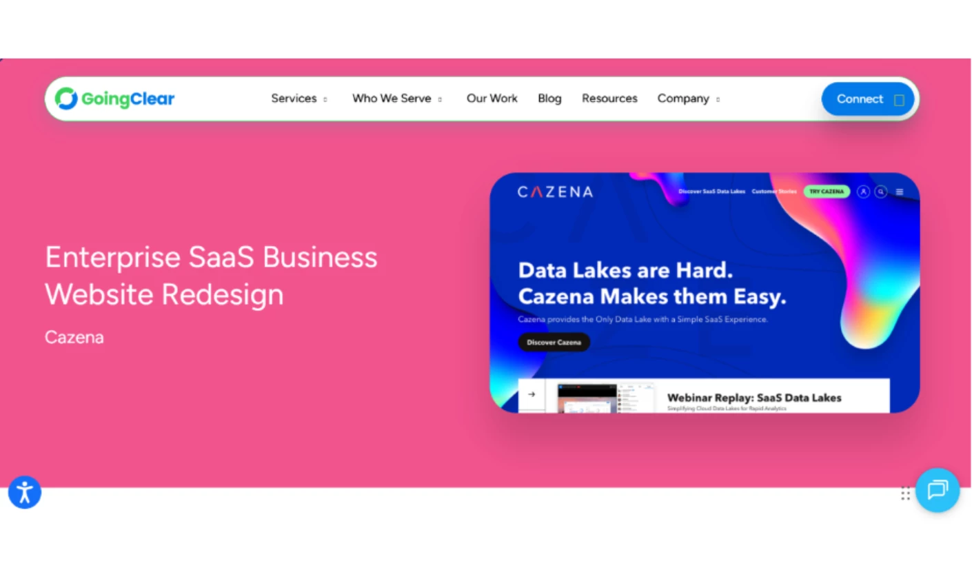
Cazena sold instant cloud data lakes, infrastructure software bought by data engineering leads who have seen every marketing site in the category and trust none of them. GoingClear stripped the persuasion machinery down until what remained read as quiet confidence.
The CTA treatment is what most teams get wrong. Rather than high-contrast buttons shouting Book a Demo every 600 pixels, the calls to action are short phrases paired with directional arrows, weighted to be findable without turning insistent.
GoingClear also treated page weight as design work from the start. Cazena's site skipped the animation layer almost entirely, and GoingClear reports the resulting speed showed up as higher average session duration and more pages per session, an agency-reported engagement result without a baseline.
Why it works commercially: The 2025 Web Almanac puts median JavaScript on a home page at 697 KB, and only 48% of mobile origins pass all three Core Web Vitals. Cutting the animation layer is how you land in the better half.
Read more about this B2B SaaS web design in our full Cazena enterprise SaaS website design breakdown.
2. Sky by Clay
Standout Features:
- Gradient system used spatially
- Oversized rounded type that slows the read
- Self-contained feature cards
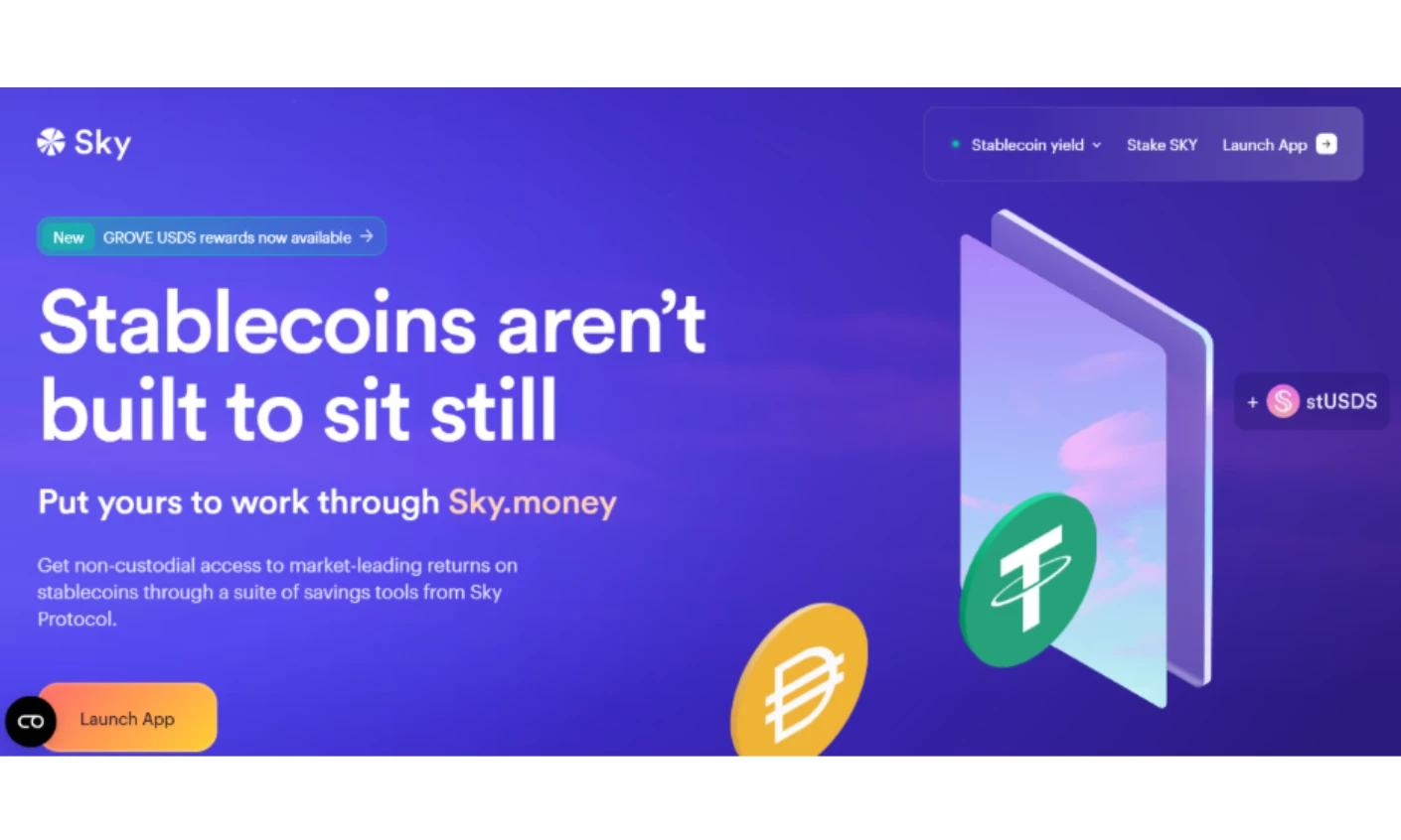
Clay's brief was to take MakerDAO, respected and technically formidable and opaque to anyone outside crypto, and rebuild it as Sky without losing the credibility that made it matter.
The solution runs on pacing. Soft transitions between lavender, sky blue, and warm peach create depth rather than ornament, and oversized rounded sans-serif headlines make the reader slow down.
Features like Upgrade, Rewards, and Savings live in self-contained modular cards. Breaking abstract financial mechanics into discrete units makes exploration optional, so the visitor picks their own depth instead of getting marched through a funnel.
Motion stays restrained, with hover states and transitions that confirm responsiveness without demanding attention. That is the right instinct for an interface handling money.
Reported outcome:
- Increased site traffic by 40%
- Improved engagement by 30%
- Boosted customer satisfaction by 35%
- Raised conversion rates by 25%
Why it works commercially: Contentsquare found organizations that actively fought frustration signals such as rage clicks and slow loads saw 4.5x less visitor churn. Removing urgency from a category built on it is a churn decision.
Read more about this B2B SaaS web design in our full Sky fintech website design review.
3. Palo Alto Networks by ANML
Standout Features:
- Doc-to-code publishing from GitHub
- Themeable light/dark design system
- Zero manual page updates
First off, a disclaimer: ANML rebuilt the documentation site, not the main Palo Alto Networks site. In enterprise security, the docs are where technical evaluation happens, which is why it belongs on a list of B2B SaaS websites.
A security architect deciding whether to shortlist you reads the integration docs long before anyone books a call. That reading is the rep-free evaluation, and it either lands or it does not.
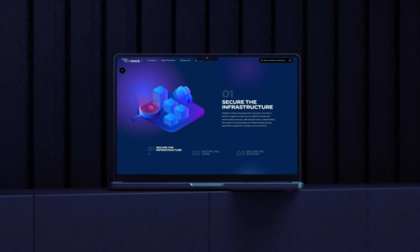
ANML partnered with Adobe to implement the Franklin framework, and the mechanism matters more than the visuals. Files in a GitHub repository convert into HTML pages, so publishing a change is a commit instead of a CMS task.
ANML also built a themeable design system that switches between light and dark modes across marketing pages and product documentation. One system carrying two content types is why the site scales across a portfolio Palo Alto's size without visual drift.
Why it works commercially: With 67% of B2B buyers preferring a rep-free experience, your documentation is a sales surface. Stale docs lose deals nobody logs as lost.
Compare against more technology website designs and the agencies behind them in our cybersecurity companies directory.
4. CiviClick by Design In DC
Standout Features:
- Custom illustration in place of stock advocacy-tech imagery
- Four audience-specific pathways from one navigation
- Built from scratch for traffic, speed, and scale
Design In DC's brief was to help CiviClick, an advocacy platform for public affairs teams, associations, and nonprofits, out-explain legacy vendors and turn strangers into scheduled demos.
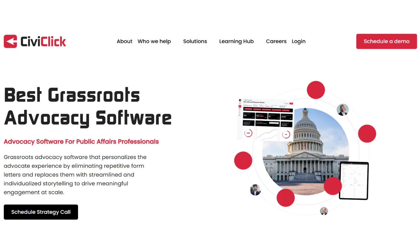
The site was built from scratch in WordPress, engineered for traffic and speed. Custom illustrations and scroll-triggered animation carry the explanatory work a screenshot-heavy competitor site can't.
Navigation splits by who's reading rather than what CiviClick sells. Dedicated pathways for agencies, companies, nonprofits, and associations sit beside solution pages for the core platform and its CiviBoost add-on.
The same team then handled app development, portal and dashboard work, branding, and content, so the site and product stay in step.
Reported outcome (agency-reported, no published baseline):
- Up to 1,000 organic views per day
- 42% email open rate
- 24% click-through rate to an 18,000-recipient list
- ~4,000 site visits in the 24 hours after a send
Why it works commercially: Founder Chazz Clevinger says Design In DC "surpassed any other web development firm that I've worked with in the past," and an audience-first build is what makes a complex platform legible to a buyer who's never used advocacy software before.
5. Zywave by Digital Silk
Standout Features:
- Information architecture rebuilt around buyer role
- Role-aware demo funnel in place of a generic form
- Gated PDFs converted into crawlable, AI-searchable pages
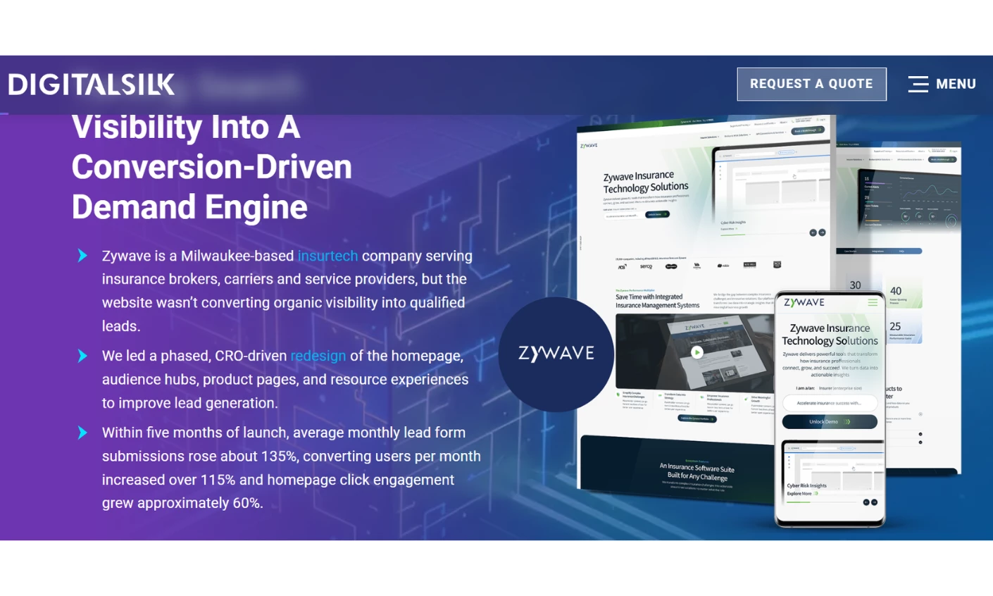
Zywave is a Milwaukee-based insurtech selling policy, analytics, and compliance software to insurance brokers, carriers, and service providers, a real B2B SaaS evaluation with the committee problem every technical seller faces. The site ranked well organically but converted almost none of that traffic, since the navigation exposed more than 20 solutions by internal product category instead of by who was reading.
Digital Silk rebuilt the architecture around three buyer roles, broker, insurer, and service provider, and rewrote the homepage for a clearer value proposition and heading hierarchy. Role-specific CTAs replaced the one-size-fits-all form.
The less visible fix is the more transferable one. Resource pages once locked inside embedded PDFs became structured, crawlable web pages, which mattered for search rankings and for visibility in AI search environments that can't read a PDF the way they read HTML.
Why it works commercially: DesignRush pricing data shows client-side content delays add 10% to 15% to a project, and turning gated PDFs into ordinary web pages removes that rebuild tax every time a resource needs updating.
6. Jungo by Storm Brain
Standout Features:
- Modular architecture the marketing team can operate
- CTAs placed at intent intervals
- Neutral palette with green accents
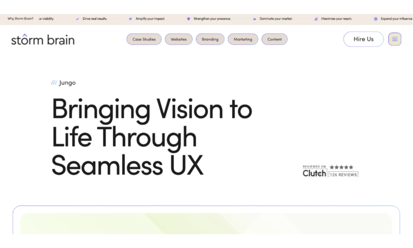
Jungo is a CRM for mortgage and real estate professionals, an industry that runs on relationships and speed. Its buyers want software their loan officers will actually use.
Storm Brain's answer includes soft neutrals with green accents read as credible for financial services without tipping into bank territory, and content breaks into focused sections that carry a visitor from overview to specifics.
CTAs land at deliberate intervals, so whether someone is ready for a demo or still orienting, the next step stays visible. Typography, color, and spacing hold consistently across devices.
The architecture is the real story. The layout is modular, so Jungo's team can add pages, swap feature blocks, and launch campaign content without a rebuild.
Reported outcome: Storm Brain reports 2x faster data processing after a backend refactor and 3x faster time-to-publish through modular WordPress architecture. Both are agency-reported, with no published baseline.
Why it works commercially:DesignRush pricing data shows client-side content delays add 10% to 15% to a project, and new features added mid-build add 15% to 30%. Modular publishing moves both of those out of the agency's invoice and into your own team's control.
Read more about this B2B SaaS website design in our full Jungo CRM website design breakdown.
7. Synack by eDesign Interactive
Standout Features:
- Icon-led walkthroughs of specific pentesting activities
- Guided in-page demos of the testing process
- A dedicated section naming the Red Team researchers
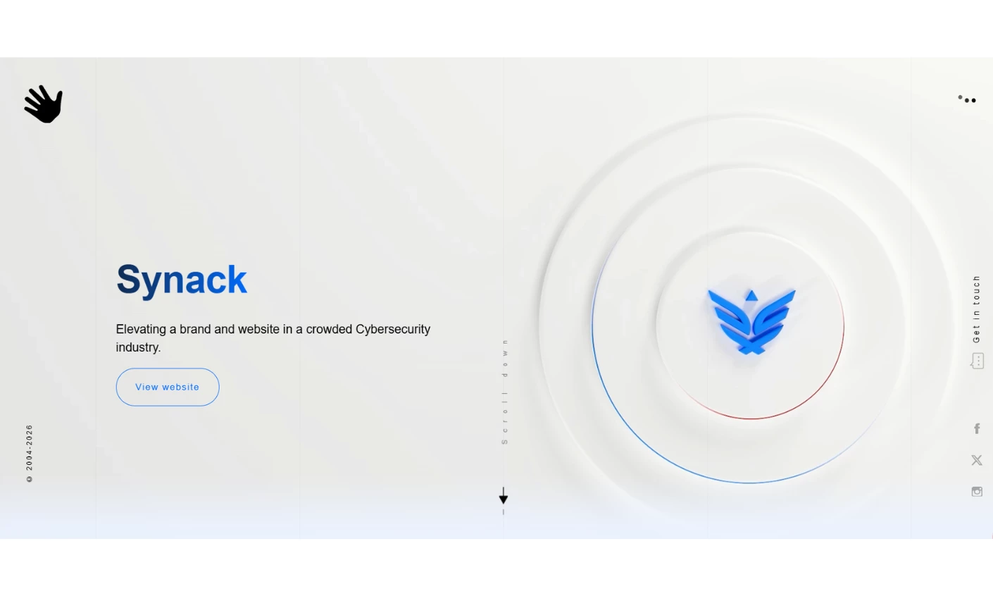
Synack sells continuous penetration testing and attack-surface management through a vetted network of security researchers, a real B2B SaaS security platform rather than a services brochure. The category runs dark, dense, and impersonal, which is exactly what founder and CEO Jay Kaplan asked eDesign Interactive to avoid without losing technical credibility.
eDesign built the site around icon-led sections that walk a visitor through CVE checking, patch verification, and risk detection, with guided in-page demos that add detail without a click-through. A wave motif carries the metaphor of continuous testing throughout.
The part most worth stealing is the one naming the people. A dedicated Red Team section presents each researcher as a trading-card profile against a vibrant red backdrop that plays off the site's blues and whites, trading the anonymity most security vendors default to for something a buyer can actually judge.
Why it works commercially: In a market where many B2B buyers now evaluate before ever speaking to a rep, real faces and credentials give a visitor the confidence they'd otherwise get only from a call with an account team.
Read more in our full Synack cybersecurity website design analysis, or browse more cybersecurity companies.
8. HUMAN Security by Baunfire
Standout Features:
- Dual-depth navigation from shared entry points
- Motion tied to the product claim
- Trust signals inside the reading flow
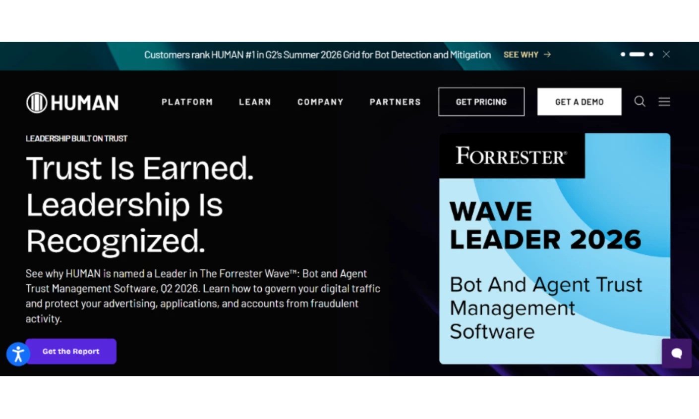
HUMAN Security sells bot mitigation and digital fraud defense to enterprises. Every visit brings two people with incompatible needs: a CISO who wants a credibility read in ninety seconds, and a security engineer who wants architecture, integration surface, and evidence.
Baunfire solved that structurally. The navigation carries two levels of depth from the same entry points, so the engineer drills into documentation and case studies while the executive never lands on a page written for someone else.
Proof placement is the detail worth copying. Forrester Wave recognition, certifications, and partner marks sit inside the pages where a buyer is already deciding, rather than on a standalone trust page.
Baunfire also shipped a CMS the HUMAN team can extend without returning to the agency for every content change. That line decides whether the site still holds up in eighteen months.
Why it works commercially: Gartner found 69% of B2B buyers report inconsistencies between a supplier's website and its sellers. One IA serving both audiences is how you stop being part of that number.
Read more about this B2B SaaS website design in our full HUMAN Security cybersecurity website design analysis.
9. Zig.ai by Peppermint
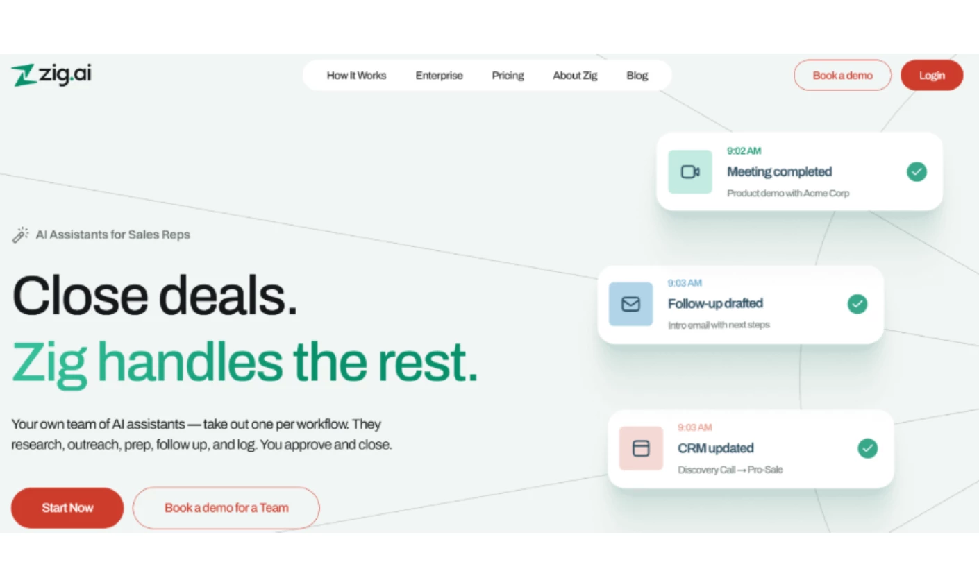
Standout Features:
- A homepage that demonstrates instead of explaining
- Pricing scoped by buyer type
- Emerald and brick red in a navy-and-grey category
Peppermint's homepage for Zig.ai never states what the product does. A live activity feed assembles itself in the hero, and scroll animations reveal each workflow in the order it genuinely executes.
For an automation product promising that work runs before you ask, a site that runs before you ask argues better than a headline. Metrics count up, then hollow into rings until one insight remains.
The How It Works page drops the feature list and introduces six colleagues instead: Research, Outreach, Meetings, Follow-Up, CRM Sync, and Pipeline. That mirrors how an automation buyer thinks, which is less "what features does this have" and more "what would I hand off."
Pricing is the quietest good decision. Each plan is scoped to a buyer type, so the visitor self-identifies before the comparison table loads.
Why it works commercially: Contentsquare found sites that raised session depth 10% or more saw a 5.4% conversion lift. A homepage that demonstrates earns those extra pages instead of asking for them.
More work in this vein sits in our best UX website designs collection.
10. Interos by RNO1
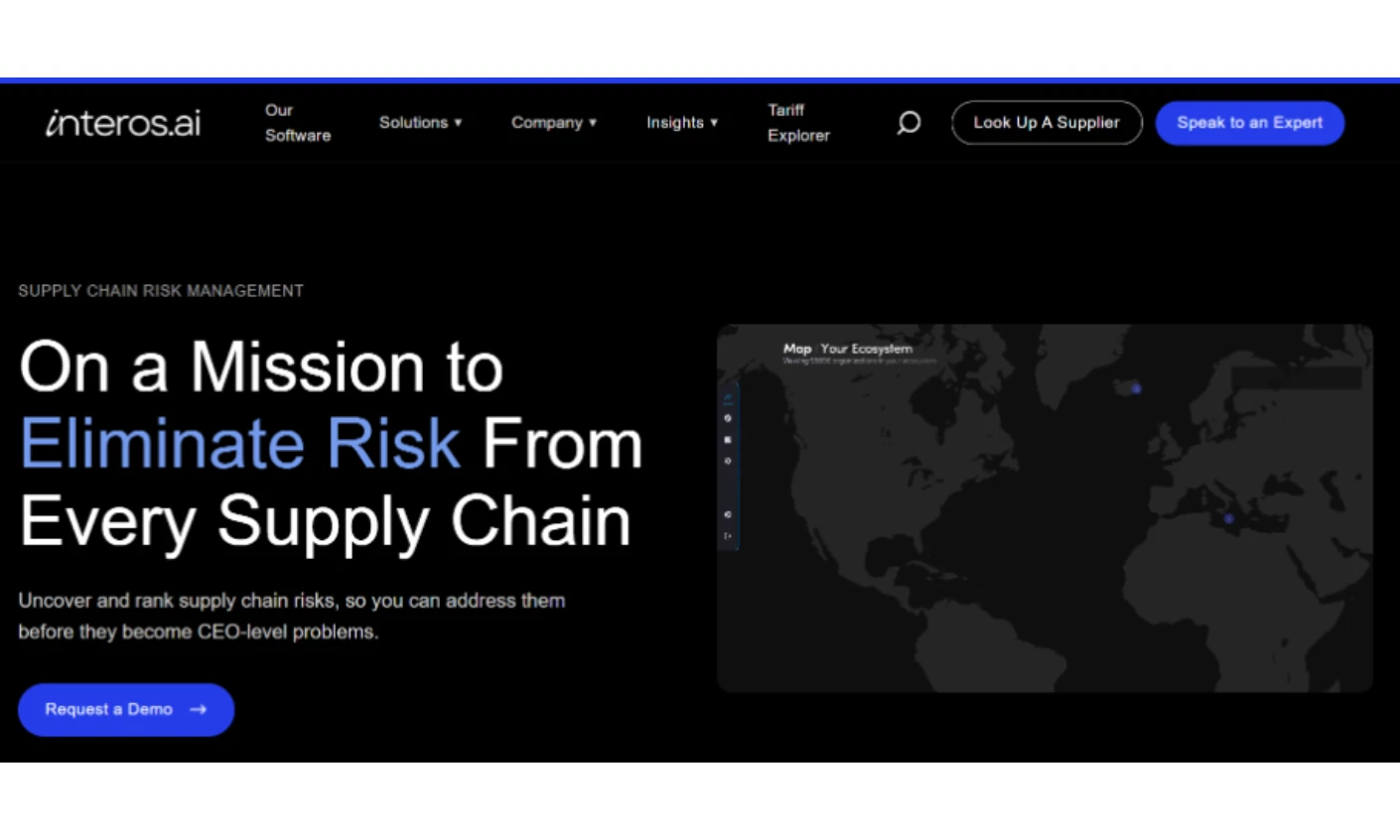
Standout Features:
- Animation used as wayfinding
- Section-level color coding
- Data design treated as brand design
Interos monitors relationships across global supply chains and surfaces risk hiding three tiers below your direct suppliers. The product's value is visibility into something you cannot currently see, which is hard to put in a hero section.
RNO1 resolved it by making the interface do the arguing. A spinning globe anchors the homepage, and animated elements point the visitor somewhere useful rather than impressing them, marking where to look next while showing the breadth of the service set.
Color carries a workload people underrate. Blue, white, and red appear in different combinations per section, so a visitor moving down a long page always knows which part of the story they are in.
Paired with plain sans-serif typography and an unambiguous menu bar, it produces a site where a risk officer, a procurement lead, and a CTO each find their entry point without a "Solutions by Role" dropdown.
Why it works commercially: The WebAIM Million put the average homepage at 1,257 elements in 2025, up 7.1% in a year and 61% over six. Wayfinding is what keeps that density navigable.
Read more about this B2B SaaS website design in our full Interos website design analysis, or explore more interactive website designs.
11. Seamless by Focus Lab
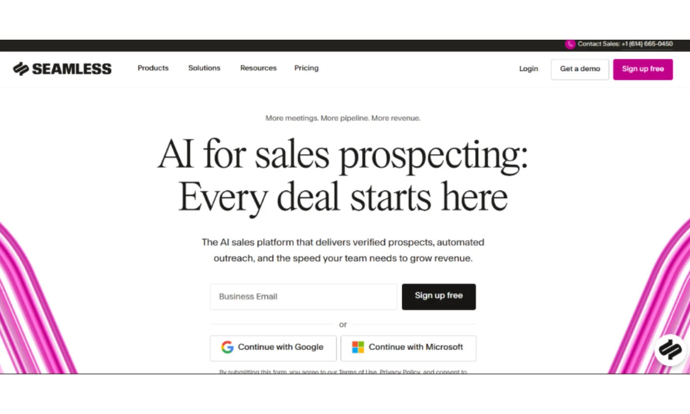
Standout Features:
- A rename as a positioning instrument
- "Force Multiplier" as an organizing concept
- Brand strategy resolved before any visual work
Seamless had over a million users and enterprise clients. What it lacked was a market that understood what the product had become: a real-time AI engine spanning prospecting, outreach, coaching, and revenue intelligence.
Focus Lab treated this as a strategy problem and refused to open a design file until it was solved. The concept they landed on, Force Multiplier, reframes the pitch from a feature into a physics claim, promising more of everything downstream of a lead.
The rename is the most transferable decision. Dropping .AI carried real weight, since once AI became table stakes the suffix stopped signaling differentiation and started signaling me-too.
Positioning is where most B2B sites lose. Jay Baer, the #1 Global Guru in Marketing and business growth and customer experience expert, explains that “Most B2B sites fail by saying, ‘We can do a lot of things and serve any industry.’ That doesn’t build confidence.”
Why it works commercially: Gartner found 73% of B2B buyers actively avoid suppliers who send irrelevant outreach. Vague positioning is irrelevance applied at scale.
12. Vectr by Utsubo
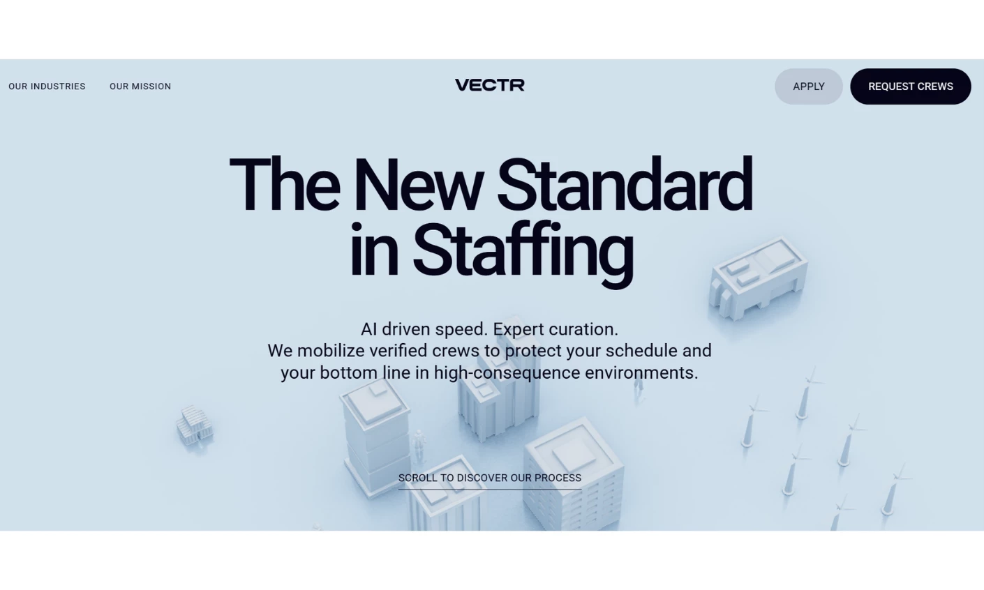
Standout Features:
- Isometric 3D scenes in place of stock photography
- Navigation as a numbered process narrative
- Persistent dual CTAs for two user types
Workforce platforms serving refineries, plants, and warehouses default to stock office photography or abstract gradients, imagery that tells a plant manager nothing. Utsubo built the experience around isometric white 3D renderings of the environments the platform runs in, set on a soft blue field.
The hero states "From call to crew" in heavy black sans with two CTAs pinned top right: Apply as a soft pill, Request Crews in solid black. Two audiences, two persistent actions, visible at any scroll depth.
Navigation runs as a linear process narrative instead of a menu: 01 Activation, 02 Zero-fail badging, 03 Proven fit, 04 Seamless arrival. Coral lines trace deployment paths across the isometric landscape as you scroll.
For an operations buyer whose real question is how this works on their own site, sequencing the page the way the service sequences answers more directly than a features grid.
Why it works commercially: Contentsquare measured the cost of an online visit rising 9% in a single year, a 19% climb across two. Forcing two audiences through one funnel wastes half of what you paid for.
Read more about this B2B SaaS web design in our full Vectr professional services website design review.
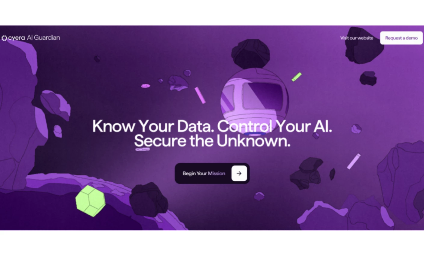
13. Cyera AI Guardian by Active Theory
Standout Features:
- Browser-based mini-games as product explanation
- A single controlling metaphor (orbit and mission)
- Short text blocks that survive mobile
Cyera launched AI Guardian into a category with a comprehension problem. Shadow AI is invisible by definition, and you cannot screenshot a risk nobody can see.
Active Theory built a campaign site where the visitor experiences the threat model firsthand. Real-time visualizations and game-inspired challenges turn "your data is leaving through tools you haven't inventoried" into a decision the user makes mid-scroll.
Metaphor discipline keeps it from collapsing into a tech demo. Orbit and mission run through the copy and through the sequential navigation: See Every AI, Know Every Risk, Secure the Unknown.
One caveat before you brief something similar. This is a campaign site deliberately separate from cyera.com, and the separation is the point, since high-concept interactive work has a short half-life and a narrow audience.
Why it works commercially: Contentsquare found brands leaning harder on paid social saw bounce rates rise 9.2% and conversions fall 10.6%. Running the campaign on its own subdomain keeps that volatility off your evaluation path.
See how other brands handle this in our most innovative website designs collection.
14. Payop by Goodface
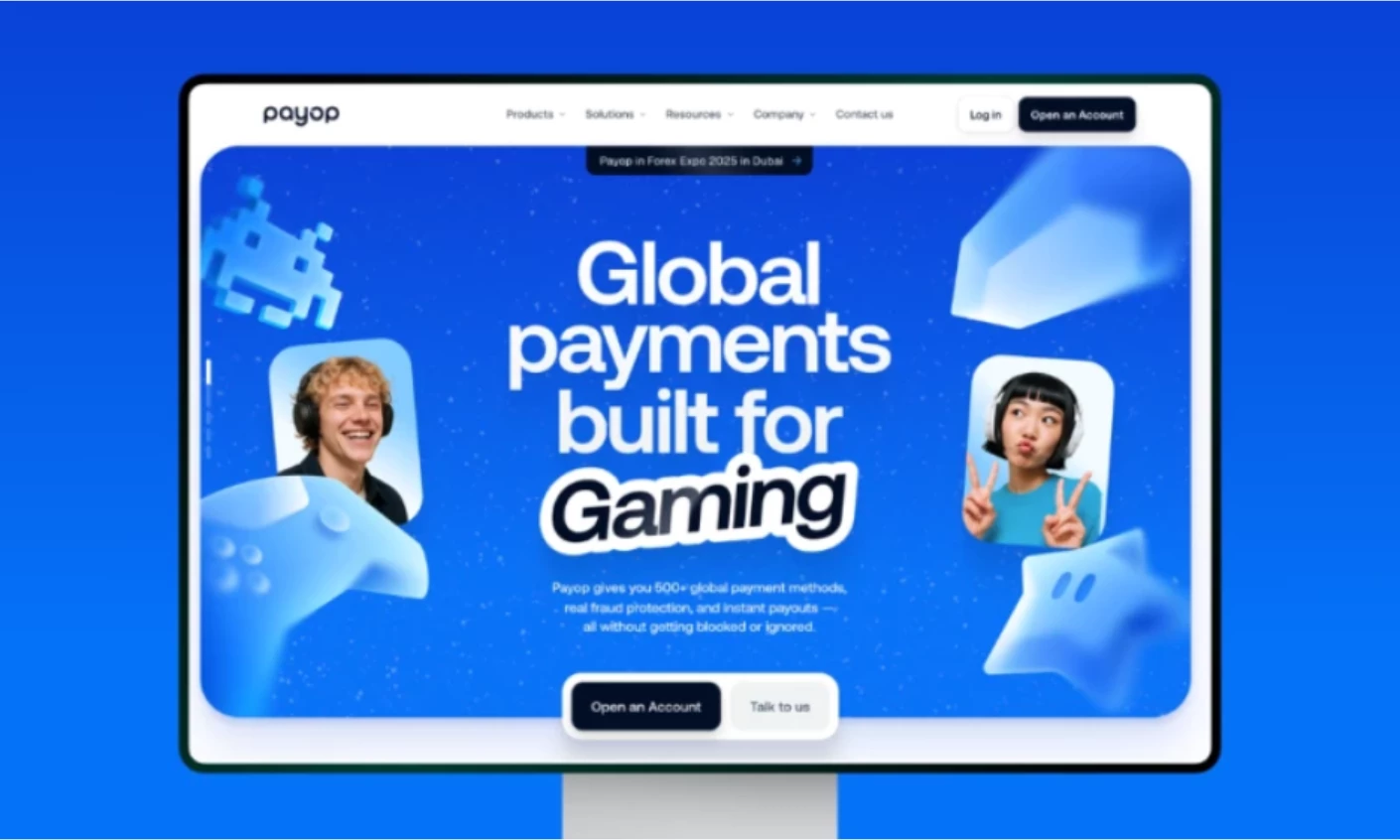
Standout Features:
- Bold gradients in a conservative category
- Modular feature blocks
- Vertical-specific messaging
Payments infrastructure has a house style: navy, grid, a stock photo of a handshake. It exists because the category sells on trust. Goodface bet that Payop's actual buyers do not want that.
Payop's merchants are gaming studios, e-sports organizations, and digital-first businesses operating across borders. Looking like a bank does nothing for those companies, so the site runs bold gradients and color-driven layouts and speaks to those verticals directly.
The structural work underneath keeps it credible. Modular UI blocks isolate what a merchant evaluates, like global payouts, fraud protection, and multi-currency support, so a prospect can assess capability without wading through a narrative.
“Most B2B websites are designed to feel safe,” Yagmur Ilgen, Creative Director at Baunfire says. “They check all the boxes, but they rarely take a position or express a point of view.” Payop is the counterexample, and the information architecture is what stops the tone from becoming a liability.
Why it works commercially: With conversion rates down 6.1% across the web, matching the category house style means competing on a shrinking baseline with nothing to distinguish you.
5 Design Patterns Every Site on This List Uses
Strip away the surface and the strongest B2B SaaS web designs converge on five decisions. Each one below is paired with the number that justifies it.
1. The homepage picks one buyer and routes the rest in a single click
HUMAN Security serves a CISO and a security engineer from the same nav. Vectr pins two CTAs for two user types. Neither site makes one page work for everyone, and both make the second click free.
The number: 67% of B2B buyers prefer a rep-free experience. The routing decision your sales team used to make on a call is now made by your navigation.
2. Proof sits inside the reading flow
Forrester recognition and certifications appear on HUMAN Security's product pages, where the judgment is forming. A logo wall parked on its own page is a page nobody visits.
The number: 69% of B2B buyers hit inconsistencies between a supplier's website and its sellers. Proof placed at the point of decision is the cheapest way to close that gap.
3. Motion is tied to a product claim or it is not there
Cyera's interactivity demonstrates a threat model. Zig.ai's activity feed demonstrates automation. Cazena removed animation entirely and gained speed. All three are defensible, and decorative motion is not.
The number: 697 KB of JavaScript on the median home page, with only 48% of mobile origins passing Core Web Vitals. Every unjustified effect is drawn from the same budget.
4. The CMS is part of the brief
Jungo's modular publishing, Palo Alto's doc-to-code pipeline, HUMAN Security's extensible CMS. The strongest operational outcomes here are architectural rather than aesthetic.
The number: Content delays add 10% to 15% to a project and mid-build feature additions add 15% to 30%. A site your marketers cannot update pays that tax on every campaign.
5. Pricing and packaging are structured around buyer type
Zig.ai scopes each plan to a buyer instead of a feature tier. Payop organizes around merchant verticals. The decision arrives before the comparison table loads.
The number: conversion rates fell 6.1% while cost per visit rose 9%. When each visit costs more and converts less, making the decision earlier in the page is the highest-leverage change available.
What a B2B SaaS Website Redesign Costs and How Long It Takes
DesignRush's web design pricing data puts SaaS and tech projects at $10,000 to $100,000+, the widest band of any industry tracked except healthcare and financial services.
US agency work sits in a similar range, roughly $7,000 to $100,000+, with a mid-tier blended rate around $145 per hour. Creative director and strategy time bills at $190 to $255.
A redesign competes against paid acquisition for the same budget, and the case for it keeps getting easier. Contentsquare's 2025 Digital Experience Benchmark, built on 90 billion sessions across 6,000 websites, found the cost of a single visit rose 9% in a year while conversion rates fell 6.1%
If you are weighing a solo hire against a team, our freelance versus agency cost comparison breaks down where each makes sense. You can also filter web design companies by budget range and verified reviews.
B2B SaaS Web Design Mistakes These 14 Sites Avoid
Each mistake below carries the problem it causes, a check you can run today, and a fix with an effort estimate. A bare list of mistakes is just assertion, while a list with diagnostics is a tool you can act on.
Problem: Writing the homepage for the buying committee instead of one member of it.
- Check: Open your homepage and name the single reader it addresses. If you can't, it addresses nobody.
- Fix: Write the hero for your economic buyer, then put every other persona one click away in the nav, the way HUMAN Security and CiviClick both do. Give that page one primary action matched to intent. A visitor comparing four vendors isn't ready for "Talk to Sales," so give that page a lighter action and reserve the demo CTA for pages showing real purchase intent.
Problem: edging your positioning to avoid ruling anyone out.
- Check: Read your value proposition and ask whether a competitor could paste it onto their own site unchanged.
- Fix: Name the segment you win in. Gartner's 2025 survey found 73% of buyers actively avoid suppliers sending irrelevant outreach, and vague positioning is the same failure on your own site.
Problem: Treating documentation as engineering's problem.
- Check: Search your own docs for a question a prospect would ask during evaluation, and time how long the answer takes to find.
- Fix: Brief the docs like a marketing surface. Palo Alto Networks hired an agency for exactly this, which almost no SaaS company considers.
Problem: Quarantining proof on a trust page.
- Check: Pull analytics for your customers, certifications, or awards page and compare the traffic to your pricing page.
- Fix: Move the three strongest marks onto pricing, product, and your highest-traffic solution page, the way HUMAN Security does inside its own reading flow.
Problem: Shipping animation without a claim behind it.
- Check: The median home page already ships 697 KB of JavaScript (2025 Web Almanac). For each motion effect, name the product promise it reinforces in one sentence.
- Fix: Cut what fails the test and measure load time before and after.
Problem: Ignoring the CMS until launch week.
- Check: Ask your marketing team how long a new landing page takes without a developer. If the answer is measured in days, the architecture is the problem.
- Fix: Put modular publishing in the redesign brief. Storm Brain reports 3x faster time-to-publish for Jungo from exactly this, and Design In DC built CiviClick from scratch specifically to avoid the same trap.
Problem: Gating pricing by default instead of scoping it by buyer type.
- Check: Compare your average deal size against the cost of the conversation you're forcing, and separately check whether your pricing page treats every visitor identically regardless of who they are.
- Fix: Publish tiers or publish a stated reason for gating, and where you do show pricing, scope each plan to a buyer type. Zig.ai and Payop both do this before the comparison table ever loads.
Problem: Letting the website and the sales deck drift apart.
- Check: Read your homepage next to the deck your AEs sent last week. Gartner's 2025 survey found 69% of B2B buyers hit exactly this kind of inconsistency.
- Fix: Assign one owner for both, and re-audit whenever positioning changes.
Problem: Treating accessibility as a post-launch ticket.
- Check: Retrofitting accessibility after launch costs more than building it in from the start, so run your homepage through a contrast checker.
- Fix: Brief WCAG 2.2 AA at scoping, then fix contrast and write real alt text for every image carrying meaning.
Problem: Copying a reference site's structure when you only admired its craft
- Check: Name the condition that makes the reference work, then name whether you have it.
- Fix: Copy the mechanism, not the layout. Cyera's interactivity works because it lives on a separate campaign subdomain, which is the part most teams miss.
BSB SaaS Website Design: Final Thoughts
The sites here share almost no visual vocabulary. Sky runs pastel gradients, Cazena runs near-static blue, Payop runs saturated color in a category that punishes it, and all three are defensible because each answers a different commercial problem.
What they share is sequence. Positioning gets resolved before layout, routing gets designed before decoration, and the publishing architecture gets briefed before launch week rather than after it.
That is the transferable part. Copy the order of decisions rather than the palette, and the visual answer for your own product will follow from constraints your competitors do not have.

Our design experts recognize the most innovative and creative designs from across the globe. Visit Design Awards to see the:
- Best Logo Designs
- Best Website Designs
- Best Video Designs
- Best Print Designs
- Best Packaging Designs
- Best App Designs
Our team also ranks agencies worldwide to help you find a qualified agency partner. Visit our Agency Directory for the top Logo Design Companies, as well as: