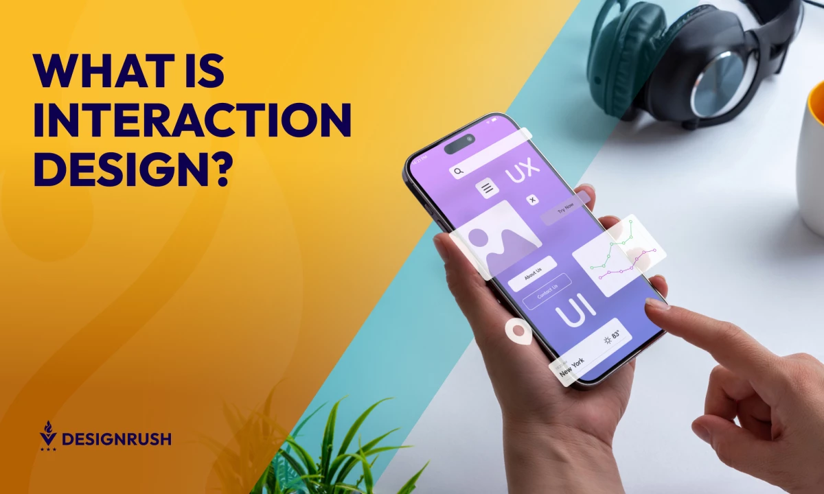
Interaction design (IxD) is all about creating intuitive and engaging user interfaces that transform digital interactions into seamless experiences. As a fundamental component of UX design, IxD focuses on the subtle art of making technology easy and enjoyable to use.
From the satisfying click of a button to the intuitive swipe of an app screen, it shapes every aspect of a user’s journey. Let’s explore the foundational principles and practices of IxD, with insights and tools to help you create memorable digital experiences. Let’s dive in!
What Is Interaction Design?
Interaction design (IxD) is the discipline of creating interfaces that facilitate smooth interactions between users and digital products. It optimizes the user experience by ensuring that every action, from navigating menus to entering data, feels intuitive and effortless.
Picture this: The satisfying click of a button that confirms a successful submission. The swipe-to-refresh gesture on social media apps. The animation smoothly transitions as you flip through photos. These are all outcomes of thoughtful IxD — subtle yet impactful details that enhance user engagement!
How Does Interaction Design Differ from UI and UX Design?
While the terms are often used interchangeably because of their similarities, the practices have distinct differences.
Interaction Design vs. UI Design
UI design focuses on the appearance of digital interfaces, while interaction design emphasizes how users interact with those interfaces. For instance, a visually appealing button (UI) must also be easy to find and responsive when clicked (IxD).
Interaction Design vs. UX Design
UX design encompasses the overall user journey, including emotional and functional experiences. Interaction design is a subset of UX, centering on users' tangible interactions during that journey, such as navigating menus or completing forms.
Unique Responsibilities of Interaction Designers
Interaction designers are pivotal in shaping how users engage with digital products, focusing on creating seamless and intuitive experiences.
Their key responsibilities include:
Optimizing user flows
Think of user flows as a map guiding users from Point A to Point B. An interaction designer makes this journey as smooth and intuitive as possible. They identify potential bottlenecks and refine steps so users can complete tasks effortlessly, whether it’s signing up for an account or purchasing a product.
Designing interactive elements
Interactive elements are the lifeblood of any digital product. These include buttons, sliders, dropdowns, or hover effects—essentially anything users engage with. An IxD designer ensures these elements not only look good but also function perfectly.
Developing prototypes
Prototypes allow designers to bring initial drafts to life without diving into full-scale development. It's part of their role to help stakeholders and users experience the flow and functionality of their design at its early stages.
Collaborating across teams
Interaction design doesn’t happen in a silo. Designers need to work closely with UX designers, developers, product managers, and even marketing teams to ensure the design aligns with user needs and business goals.
Conducting user research and staying updated with industry trends
Understanding users is essential for great interaction design. This means collecting insights through surveys, usability testing, and feedback sessions to learn what works and what doesn’t. At the same time, keeping up with emerging trends makes sure designs stay fresh and relevant.
What Are the Core Principles of Interaction Design?
The core principles of interaction design, inspired by Don Norman’s The Design of Everyday Things, guide the creation of intuitive, user-friendly digital experiences. By focusing on usability and clarity, these principles help designers craft systems that are functional, engaging, and easy to navigate.
Below are the core principles of interaction design:
Feedback
Feedback provides users with immediate and understandable responses to their interactions, enhancing user confidence and reducing confusion. Effective feedback mechanisms include:
- Visual Cues: To indicate an action has been acknowledged, buttons or icons might change color, illuminate, or animate. A button may emit a light pulse upon being clicked to show that it has been activated, or a progress bar might fill gradually to indicate ongoing processing.
- Audio Signals: Subtle sounds can be utilized to confirm task completions or signal alerts. A soft chime might sound when a download is complete, or a distinct beep might occur if an error message pops up
- Haptic Feedback: Vibrations or physical responses are particularly effective on touch devices. A short vibration can confirm a selection, while a series of pulses might alert users to an important notification.
For example, in the popular mobile game Candy Crush, swiping to match candies triggers a satisfying sound and a visual burst, which reinforces the player's action.
Jeff Nordstedt, Director of User Experience at eDesign Interactive, explains how thoughtful feedback can transform static interfaces into intuitive user journeys:
“Feedback is the bridge between user intention and system response — turning static interfaces into meaningful conversations. When designed effectively, it reassures users that their actions are recognized and guides them through the interface.
For designers, embracing feedback means designing with empathy, responding to user behavior, and iterating with purpose.”
Consistency
This principle helps users learn and navigate digital products more efficiently by ensuring similar elements behave in predictable ways. Consistency applies to multiple aspects of design, including:
- Visual Consistency: Uniform fonts, colors, and icons across the interface.
- Functional Consistency: Maintaining the same behavior for actions, such as how buttons or links operate.
- Internal Consistency: Keeping a cohesive style and functionality within a product.
- External Consistency: Aligning the design with broader industry standards or similar platforms to meet user expectations.
So, how can you achieve consistency in interaction design? Here are some good steps to take:
- Create and adhere to a style guide for design consistency.
- Ensure interface elements behave uniformly across all versions of the product.
- Regularly review and update components to maintain consistency.
- Gather user feedback to identify areas of inconsistency that need attention.
For example, Google’s suite of apps uses consistent layouts, colors, and navigation, making it easier for users to switch between Gmail, Docs, and Drive without confusion.
Affordance
Affordance ensures that design elements visually communicate their functions. Interaction designers create components with specific characteristics or properties that naturally suggest their purpose and use, often eliminating the need for explicit instructions.
Here are ways to make your design communicate its functions clearly:
- Design interactive elements to be visibly manipulable.
- Use standard conventions (like underlined text for links) to highlight the interactive nature.
- Conduct user testing to see if the intended affordances are clear.
For example, a play button on a video screen looks like a traditional media control, inviting users to click to start watching.
Simplicity
Simplicity eliminates unnecessary clutter or complexity, making the user experience more focused and efficient. Here are practical ways to simplify your design:
- Identify and highlight key functionalities that most users will need.
- Minimize the number of actions required for completing a task.
- Organize information hierarchically with the most critical data visible.
- Use progressive disclosure to keep advanced features accessible but not front and center.
For example, Apple’s homepage highlights one product at a time with clean layouts and minimal distractions, guiding user focus effortlessly.
Visibility
This principle emphasizes that the more noticeable a design element is, the easier it is for users to understand and interact with it. Conversely, if key elements are hidden or unclear, users are less likely to discover or use them.
To find the sweet spot, make sure to enhance these three key aspects:
- Visual Visibility: Highlight key actions with distinct colors, sizes, or placements.
- Functional Visibility: Ensure critical features are readily accessible without unnecessary steps.
- Contextual Visibility: Display relevant options only when users need them, avoiding visual clutter.
For example, Amazon’s prominent “Add to Cart” button stands out in bold colors, ensuring it’s immediately noticeable to users.
Tolerance
Tolerance is about designing forgiving interfaces that allow users to recover from mistakes easily. This includes confirming actions that could have severe consequences and providing clear, immediate ways to undo actions.
Some strategies for building tolerance in design:
- Implement confirmation dialogs for irreversible actions.
- Provide reverse options readily accessible after user actions.
- Design input fields to accept variations in data entries (like phone numbers with or without dashes).
- Educate users on error recovery through clear instructional messages.
For example, Gmail’s “Undo Send” feature gives users a short window to retract sent emails, preventing errors from becoming irreversible.
Learnability
Learnability means users can quickly grasp and become proficient with a system, facilitating a smoother onboarding experience. It focuses on creating experiences with minimal learning effort and using familiar patterns, clear guidance, and consistent design.
Here are some proven methods to enhance learnability:
- Use conventions familiar to the users in design to promote easy learning.
- Offer tutorials and tooltips for new users.
- Incorporate feedback mechanisms to learn from user interactions and improve guidance.
- Simplify the user journey to enhance comprehension and mastery over time.
For example, Google Drive incorporates a clean layout, intuitive icons, and contextual tips to help first-time users quickly understand how to organize, share, and collaborate on files effortlessly.
Essential Tools for Interaction Design
Effective interaction design requires dynamic software that adapt to each phase of the design process, from ideation to implementation. These tools help streamline workflows, enhance collaboration, and ensure that designs are both innovative and user-centric:
Ideation Tools
This is the initial phase where concepts and functionality begin to take shape. These tools help in brainstorming, sketching, and mapping out ideas:
- Miro: Facilitates team brainstorming and ideation sessions — great for creating mind maps and organizing ideas visually.
- Milanote: Allows designers to organize their projects into visual boards, collecting everything from initial ideas to final concepts in a single, accessible layout.
Prototyping Tools
Prototyping is a crucial phase in interaction design, as it lets designers explore ideas and iterate on them quickly before full-scale development begins. Here are some good prototyping tools:
- Figma: Allows for real-time collaboration to create interactive wireframes and prototypes.
- Sketch: Facilitates detailed interface design with a focus on vector UI elements.
- Axure RP: Provides advanced prototyping capabilities with logic, dynamic content, and conditional flows.
Testing Tools
Testing is critical to validate the usability and effectiveness of designs. These tools help gather user feedback and identify usability issues:
- Hotjar: Offers heatmaps, session recordings, and surveys to understand how users behave on your site.
- Lookback: Conducts live usability testing with users, capturing their reactions and verbal feedback for deeper insight into user experience.
Animation and Interaction Tools
These tools refine the micro-interactions and animations that enhance the user interface, making it feel more responsive and intuitive:
- Framer: Creates dynamic interactions, integrating design with code to build complex animations.
- Principle: Focuses on advanced animations and interactive user interfaces — ideal for high-fidelity prototyping.
- Adobe After Effects: Offers a comprehensive suite of tools for crafting subtle and complex animations that require detailed timing and control.
Implementation Tools
These tools assist in translating designs into functional outputs, ensuring designs are ready for development:
- Zeplin: Streamlines the workflow between designers and developers by providing specs, assets, and code snippets directly from design files.
- Figma: Beyond its prototyping capabilities, this tool also offers powerful features for design handoff, including automatic code generation for CSS, iOS, and Android (which simplifies the developer's job).
Best Practices for Interaction Design
-content-large-webp.webp)
- Understand Your Users: Start with user research to identify your target audience's needs, preferences, and challenges. Tools like surveys, interviews, and usability testing provide insights into how users interact with your product.
- Prioritize Usability: Break down complex processes into simple, intuitive steps that users can follow effortlessly. A clean interface with clear navigation ensures users can complete tasks efficiently.
- Provide Feedback: Offer immediate and clear responses to user actions, such as confirmation messages, animations, or error notifications. Feedback reassures users that their input has been acknowledged. Incorporate microinteractions, like button animations or sound cues, to make feedback more engaging and informative.
- Optimize for Context: Adapt designs to suit different devices, screen sizes, and environments. Consider how and where users will interact with your product to ensure it feels seamless across all contexts.
- Design for Accessibility: Ensure your product is inclusive and usable for individuals with diverse abilities. This includes providing text alternatives for images, supporting screen readers, and maintaining adequate color contrast. Follow the Web Content Accessibility Guidelines (WCAG) to ensure your designs are accessible to all users. Follow Web Content Accessibility Guidelines (WCAG) to ensure your designs are accessible to all users.
- Test and Iterate: Continuously evaluate your design through user feedback and testing. Iteration helps identify and address pain points, ensuring the product evolves to meet user needs. Conduct A/B testing to compare design variations and determine what works best for your audience.
Examples of Effective Interaction Design
Effective interaction design seamlessly blends usability with engaging elements, creating digital experiences that captivate users and facilitate intuitive navigation.
The following examples of interactive web designs, curated by DesignRush, exemplify how thoughtful interaction design can elevate user engagement:
1. KAYENTA by Báchoo
-content-large-webp.webp)
KAYENTA uses consistent visual motifs to reinforce branding. Its website employs cool colors and interactive elements that draw users in, while the consistent use of the brand's squiggly line logo motif supports brand identity while also enhancing visual interest.
2. Solar Journey by Julian Fella
-content-large-webp.webp)
Solar Journey offers an immersive experience with its interactive storytelling approach. The website uses scrolling animations and interactive graphics to educate users about solar energy, making complex information accessible and engaging.
3. Friesday by Konfiture
-content-large-webp.webp)
Friesday’s web design stands out as an excellent example of interaction design, combining playful features like a cursor that leaves behind stickers (on the homepage) with vibrant colors such as yellow, pink, and red on a deep blue background to reflect the brand’s lively personality. The intuitive fixed navigation bar also ensures usability, while interactive elements like hover-responsive "Order” buttons add moments of delight.
The Bottom Line on Interaction Design
Interaction design is at the core of every successful digital experience — the bridge between what works and what wows. By embracing its principles, designers create more than just functional products. They craft engaging and intuitive environments that users love to explore. It makes every interaction smoother, deepens user engagement, and elevates the brand in the eyes of its customers.
Interaction Design FAQs
1. What is the main goal of interaction design?
The primary goal of interaction design is to create intuitive, engaging, and functional interactions between users and digital systems. This involves designing systems that are not only easy to use but also enjoyable and efficient. Interaction design focuses on guiding users to complete tasks with minimal effort while ensuring that the process feels natural and satisfying.
2. Why is interaction design important for businesses?
Interaction design is essential for businesses because it directly impacts user satisfaction, engagement, and retention. A well-designed product that is easy to navigate and enjoyable to use builds trust and loyalty, encouraging users to return. Additionally, pleasant interactions can boost conversions, whether it’s completing a purchase, signing up for a service, or engaging with content.
3. How can I measure the success of a design (app or website)?
Invest in usability testing and iterative design to measure a design's success and refine your work. Use metrics like bounce rates, session durations, and task completion rates to assess and improve how users interact with your digital product. Implement features like feedback systems, error tolerance, and intuitive navigation to maximize both user satisfaction and business outcomes.


-preview-webp.webp)