Team Behind the Design
Agency: GoingClear
Client: Cazena
Category: Website Design (Technology)
Location: Massachusetts, USA
Project Brief: Develop a B2B Saas conversion-focused website to increase their conversion rate and improve their credibility while aligning with the brand’s recent refresh.
Website Design Analysis

Related Articles:
When I review a website, I often focus on user experience, creativity, and performance. Let’s see how this project for Cazena fares:
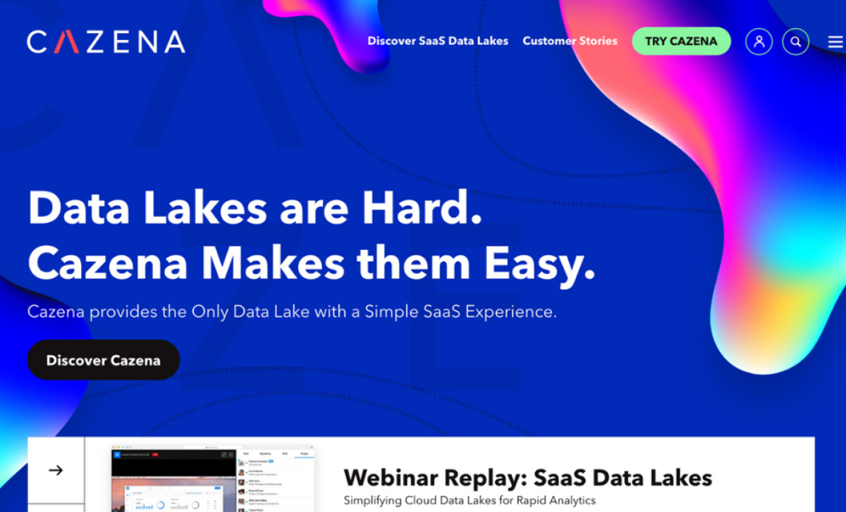
- User Experience (UX) Design: What I like about this website design is that it’s easy to navigate. From the simple yet impactful hero section to the informative content blocks, scrolling from one section to another doesn’t cause information overload.
- Visual Direction: I appreciate how the website perfectly balances blue, white, and colored spaces. Blue is the perfect color to symbolize Cazena’s professionalism and credibility, while subtle highlights add a pop of color to keep it from looking dull and monotonous.
- Subtle Call-to-Action Buttons: GoingClear did a good job of making CTAs look subtle, through short phrases or simple arrows. This way, the design remains focused on conversion without being too hard-selling.
- Performance: Unlike websites with plenty of animation and motion graphics, the design for Cazena is focused on performance, so pages load faster with less visual clutter. This design choice has resulted in increased average time and number of pages per session.
Get connected with the right web design agency for your project.
GET STARTED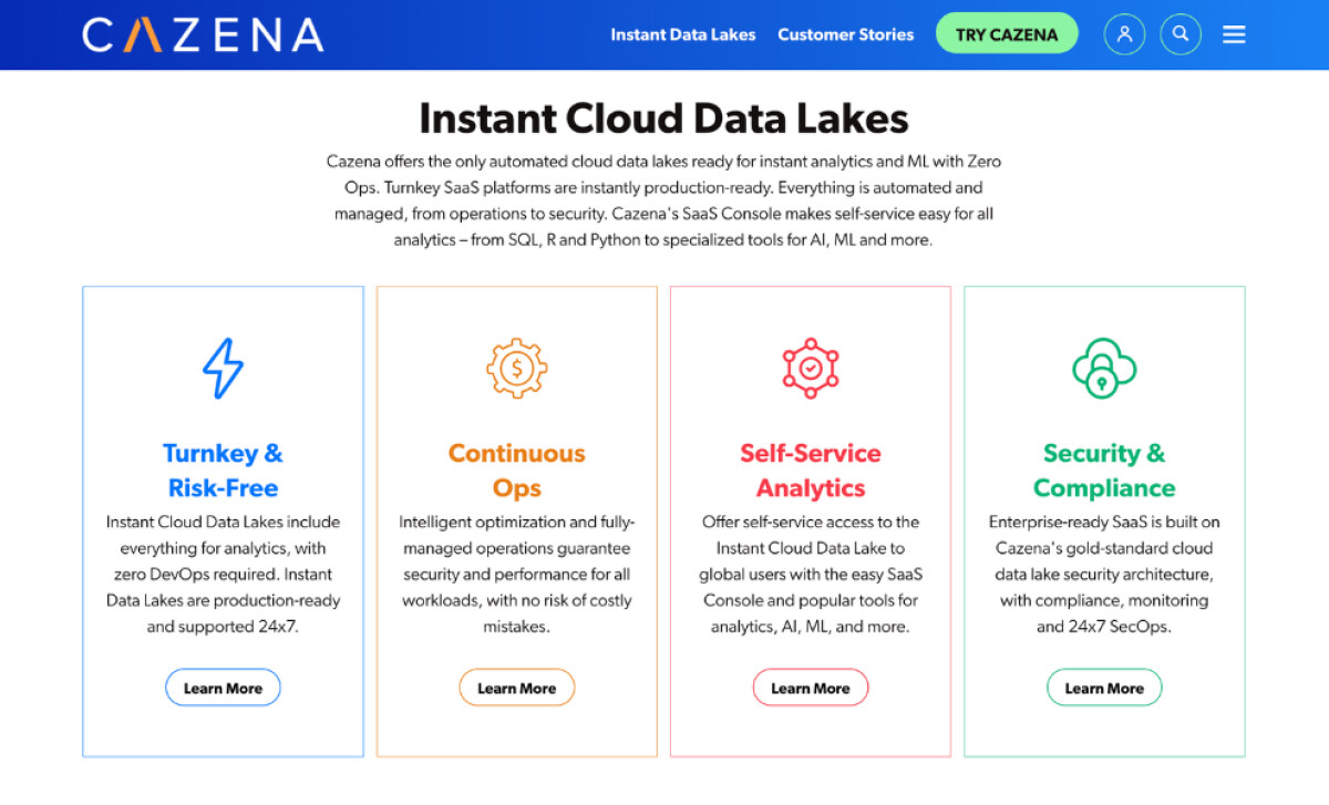
About DesignRush Featured Designs
At DesignRush, we review hundreds of agency projects each month.
The featured designs stand out for their creativity, innovation, and exceptional results, and standout projects are then hailed as our Monthly Design Awards winners, gaining industry recognition.
To view more designs as inspiration for your next project, check out the following pages:
- Best Website Designs
- Best App Designs
- Best Logo Designs
- Best Print Designs
- Best Packaging Designs
- Best Video Designs
For a full list of design agencies and related services, see our Agency Directory.
Get a chance to become the next Design Awards winner.
SUBMIT YOUR DESIGN