Most FAQ templates organize questions. They don't design for the person who arrives already frustrated, the one who spent 10 minutes on hold or can't figure out why checkout failed. That person doesn't need alphabetized accordions. They need one answer in under 30 seconds.
Treat FAQs as a content problem instead of a design problem and you get something that reads like a terms of service page: thorough, complete, and unreadable.
The best websites design FAQs like any other customer-facing surface, as proof the product understands its users.
Here are the templates that get it right, and what each one teaches about designing for someone who's already frustrated.
Best FAQ Templates for Websites in 2026
1. Notion FAQ Template (Free)

Notion's FAQ template gets picked up by startups and small internal teams because it's free, takes about 20 minutes to set up and requires no developer involvement. Those are real advantages, and they explain why it ranks among the highest-volume searches adjacent to FAQ website templates.
What it does well is hierarchy.
Questions sit cleanly in a database, answers expand on click, and the whole thing is easy to duplicate across workspaces. For an internal wiki covering HR questions, onboarding FAQs or process docs, it holds up.
The problem is scale. Push past 20 entries without adding category filtering and it becomes a scroll marathon. There's no native search within the FAQ database, no accordion behavior on a public-facing page and no mobile-first layout out of the box.
Verdict: Right for internal wikis. Wrong for public-facing support pages.
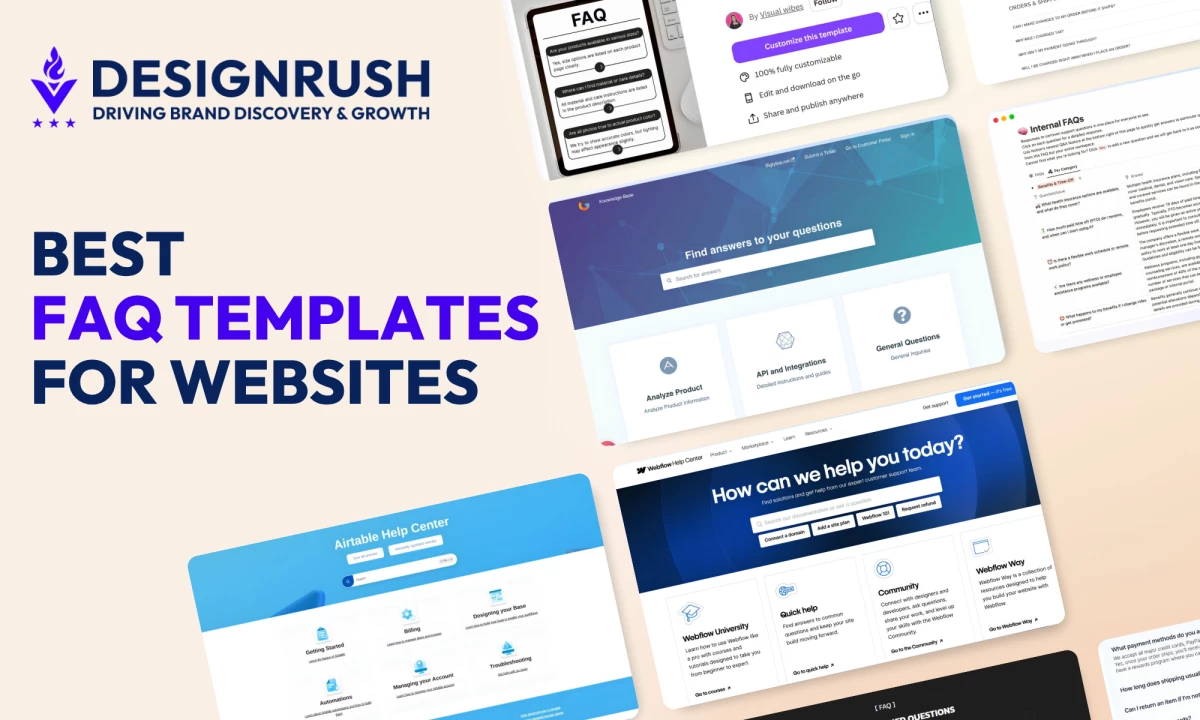
2. Webflow FAQ Section Component

The Webflow Help Center is one of the cleaner examples of a well-structured FAQ section in production.
Questions group into logical categories, answers sit behind collapsible panels, and a search bar at the top lets users who know what they're looking for skip the browsing entirely.
The design logic is sound: search first, browse second. Most users arriving at a help center have a specific problem.
The Webflow pattern makes the search bar the primary affordance and treats category navigation as a fallback for users still orienting themselves.
Where it teaches the most is in its restraint. No icons, no color-coding, no star ratings on answers.
The hierarchy is purely typographic, and that's a deliberate choice. Teams that add visual decoration to an FAQ section often do it because they don't trust the content to do its job on its own.
Verdict: Right for SaaS products that need a public-facing FAQ section and want it to feel integrated with the product.
3. Framer FAQ Template

Framer's marketplace FAQ templates lean into motion. Answers slide, fade or toggle with micro-interactions that add personality to what is otherwise a generic UI pattern.
For consumer brands or design-forward products, that polish matters. For enterprise software, it's probably noise.
The more useful feature for most teams is the premium accordion component in the marketplace, with real-time search, category tabs that auto-generate from your content, Markdown support in answers, SEO schema via JSON-LD and keyboard navigation.
Everything a functional FAQ section template needs ships in a single component. It handles FAQ rich results in Google without any additional configuration, which is rare in a marketplace asset.
Drag-and-drop editing and responsive behavior make it practical for design teams handing off to non-technical stakeholders. Customization across fonts, borders, card vs. divider layout and accordion icon style means it can match most brand systems without custom code.
Verdict: Right for design-forward products that want search and SEO schema without building from scratch.
4. Figma Community FAQ Template

The Figma community has several FAQ design system files worth knowing. The most referenced is the Interactive FAQ with collapsible component variants and prototype flows, built on Figma's component architecture so designers can swap states, test interactions and hand off to developers with clear specs.
The real value has less to do with how it looks and more to do with what it forces you to decide.
What happens when a question is open vs. closed? Does the transition between those states communicate anything to the user? A Figma prototype makes that question unavoidable in a way a static wireframe doesn't.
Teams using Figma-to-Webflow or Figma-to-developer workflows will need to rebuild it in code. The file earns its place at the beginning of the website design process, before any component gets built.
Verdict: Right for design teams in early-stage handoff. Wrong as a standalone deployable solution..
5. Canva FAQ Template

Canva ranks first for "faq templates" searches. That's worth understanding: the top-ranking result for a 940K monthly search term is a static image editor, and the template it ranks with targets Instagram posts and social graphics.
The Black and White Modern Product FAQ Instagram Post template is well-designed for what it is, a clean mobile-native format for brands that answer common questions in social content.
Size availability, return policies, product care. Those questions belong on Instagram.
The problem comes when teams reach for Canva because it's fast and end up publishing a static image FAQ on their website. Static images are invisible to search, offer no progressive disclosure and do nothing to reduce support tickets.
Verdict: Right for social-first FAQ content. Wrong for any website FAQ section template.
6. HubSpot Knowledge Base Template

HubSpot's knowledge base product is closer to an infrastructure decision than a FAQ template. The FAQ section it generates is a byproduct of a full help center, with searchable articles, multi-language support and AI-powered gap analysis that flags content holes based on support ticket data.
The FAQ section design is deliberately plain. Questions list out, answers expand, related articles surface at the bottom. That restraint is intentional. Formatting complexity in FAQ answers increases re-contact rates. Plain answers get read. Heavily formatted ones get scanned and then users call anyway.
The real value sits in the backend. HubSpot identifies which questions get searched but go unanswered, which articles users read before still contacting support, and where the FAQ section fails to deflect tickets.
Verdict: Right for SaaS teams that measure FAQ performance by ticket deflection rate.
7. Shopify FAQ Page Template

Shopify's native FAQ page template is built around a single insight: e-commerce customers contact support when they're anxious. The questions that matter most cover shipping timelines, return windows, payment failures and order changes.
The template structure reflects that. Categorized accordions group questions by customer state, such as Orders & Shipping, Returns and Products, rather than by site section. That maps to the user's mental model rather than the merchant's org chart, and the difference shows up in how quickly people find what they came for.
United By Blue, a sustainable goods retailer, is one of the better production examples of this pattern. The FAQ page covers order changes, tax charges, payment issues and international shipping in clean categorized accordions.
Contact information, including email and business hours, sits above the FAQ itself, telling customers they can reach a person before they've had to search for anything.
Verdict: Right for e-commerce brands whose support queue runs on pre-purchase anxiety and post-purchase friction.
8. Airtable Help Center FAQ

Airtable's help center uses category-based navigation rather than a traditional FAQ section. Users land on a hub page organized by topic, including Getting Started, Billing, Designing Your Base and Automations, then filter into progressively specific content.
The approach works because Airtable's user questions are technical and task-specific, and a flat list would collapse under that weight.
A single FAQ section can't serve "how do I set up a conditional automation" and "how do I cancel my plan" with equal clarity. The category-first structure routes each type of user to what they actually need.
Verdict: Right for software products with complex, multi-category user questions. Overkill for simpler sites.
9. Mailchimp FAQ Pattern

Mailchimp's FAQ pages treat the support experience as a sales channel. The sidebar carries jump-to links, category navigation and additional resource callouts. CTAs appear throughout. A live chat widget sits at the bottom of the page.
None of it gets in the way because the content hierarchy holds. Questions and answers lead, and everything else sits in the margin or below the fold.
Mailchimp uses FAQ pages to move people toward upgrades and partner resources, and it works because the FAQ content earns that trust first. Aggressive CTAs in a weak FAQ read as deflection. When the answers are genuinely useful, the CTAs read as a natural next step.
Verdict: Right for marketing-led SaaS teams that want FAQ pages to do more than reduce support volume.
What Makes a Good FAQ Template
- Good FAQ templates prioritize search over organization.
- They are built for mobile, where most support searches happen.
- They show questions and hide answers until needed.
- They are measured by ticket deflection, not design.
Which One Should You Actually Use
- If your team has no dev resources: Notion for internal use, Canva for social-only FAQ content
- If you're a designer handing off to a developer: Figma community file to Webflow
- If you're a SaaS company with a support backlog: HubSpot knowledge base template
- If you're an e-commerce brand: Shopify-native, tuned for returns and shipping
- If you're a Framer user who wants search and schema out of the box: Framer's premium FAQ accordion
The template is not the answer. What you put in it and how you organize it for the person who arrives frustrated is.

Our team ranks agencies worldwide to help you find a qualified partner. Visit our Agency Directory for the Top UI/UX Design Companies as well as:
- Top App Design Companies
- Top Branding Companies
- Top Graphic Design Companies
- Top Product Design Companies


-preview-webp.webp)
