-account-photo_listing.jpg)


Our Jury has worked with Prada, Nike, Chanel, Google, and Apple.
Best Technology Website Designs of 2026
View the Top Technology Website Designs Below
Best Technology Website Designs of 2026
4,200+ Submitted Designs
- Advertising
- Aerospace
- Agriculture
- AI
- Architecture
- Arts & Recreation
- Automotive
- Banking & Finance
- Community
- Construction Company
- Content & News
- Digital Agencies
- Distribution
- E-Commerce & Retail
- Education
- Engineering
- Entertainment
- Fashion & Beauty
- Film Production Company
- Food & Beverage
- Games and Entertainment
- Government
- Health & Wellness
- Hobby
- Hospitality
- Jewelry
- Legal & Insurance
- Luxury
- Manufacturing
- Medical & Pharmacy
- Museum
- Music
- News Magazine
- Non-Profit
- Professional Services
- Real Estate
- Restaurant
- Roofing
- Sports & Leisure
- Startup Business
- Tech Startup
- Technology
- Travel
- Wedding Planning
- Zoo
- 3D
- 404
- About Page
- Artisan
- Artistic
- Black and White
- Blog
- Bold Color
- Bold Font
- Book App
- Check Out Page
- Chinese
- Clean / Minimal
- Colorful
- Contact Page
- Corporate
- Custom
- Experimental
- Flat
- Footer
- Form
- Fullscreen
- Futuristic
- Green
- Horizontal Layout
- HTML5
- Illustrated
- Images / Gallery
- Innovative
- Inspiring
- Interactive
- Landing Page
- Menu
- Microinteractions
- Mobile Websites
- Motion Effects
- One-Page
- Parallax Effects
- Personal
- Pet Store
- Photographer
- Playful
- Podcast
- Pop Ups
- Portfolio
- Pregnancy
- Pro-loaders
- Product Listing Page
- Purple
- Retro
- Services Page
- Simple
- Slider / Module
- Small Business
- Soft Colors
- Sound / Music
- Storytelling
- Tech Online Store
- Typography
- Unusual Layout
- Use of Infographics
- User-Friendly
- UX Designs
- Virtual Reality
- Visible Borders
- Visually Striking
- Webflow
- Welcome Page
- WordPress
View Design
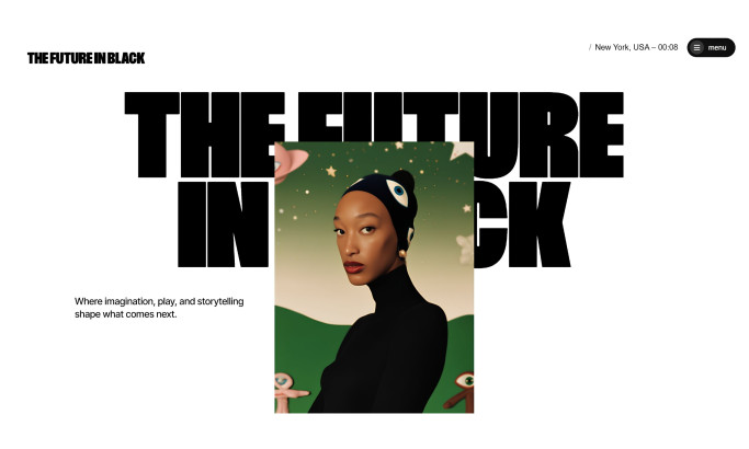
The Future in Black Website Design

View Design
Red
View Design
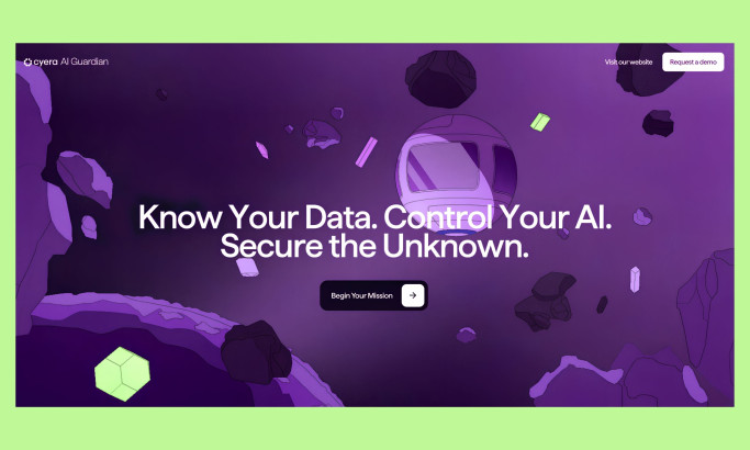
Cyera AI Guardian
★7.8/10
 AO 6.50
 BS 7.50
-account-photo_listing.jpg) IS 7.00
IS 7.00 KT 8.00
 LB 10.00
View Design
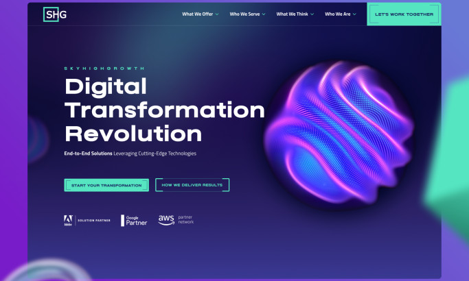
SkyHighGrowth
★9.05/10
 AO 10.00
 TB 8.00
 BD 9.00
 LS 9.20
View Design
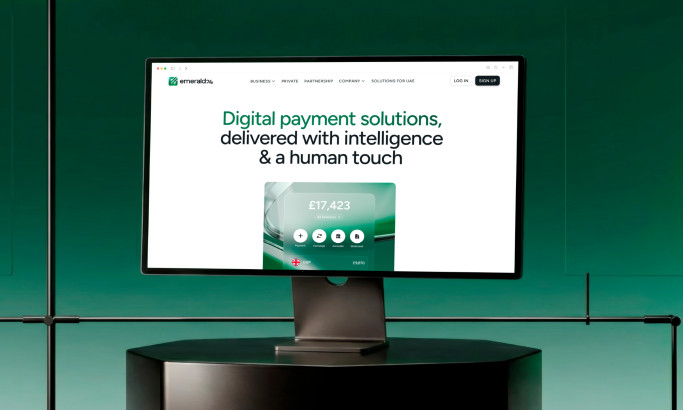
Emerald24
byGoodface

View Design
Amazon
View Design
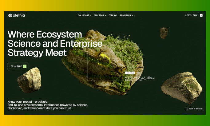
Alethia
View Design
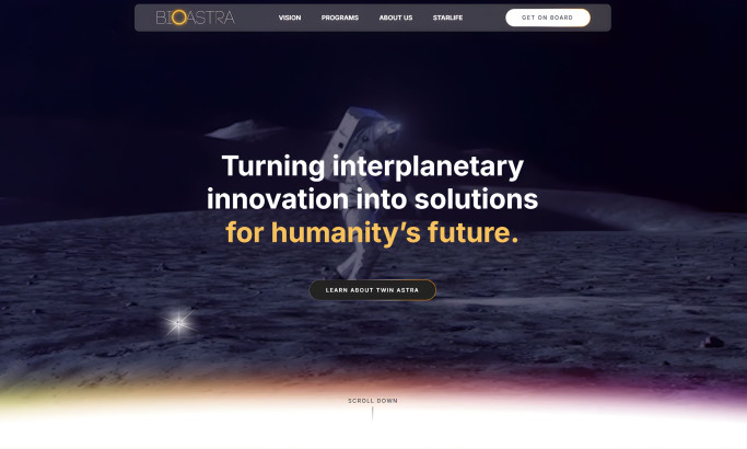
BioAstra
View Design
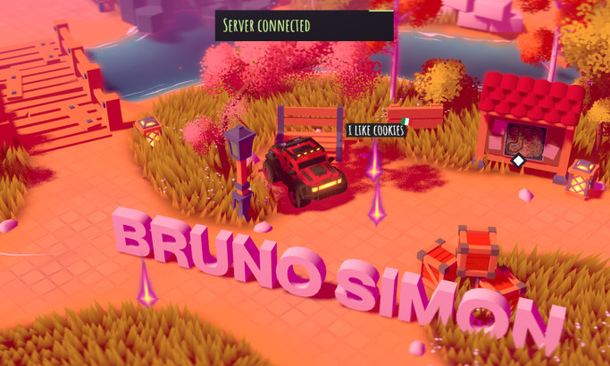
Bruno Simon
Get Connected
With The Right Agency Partner
& Receive Proposals For FREE
View Design
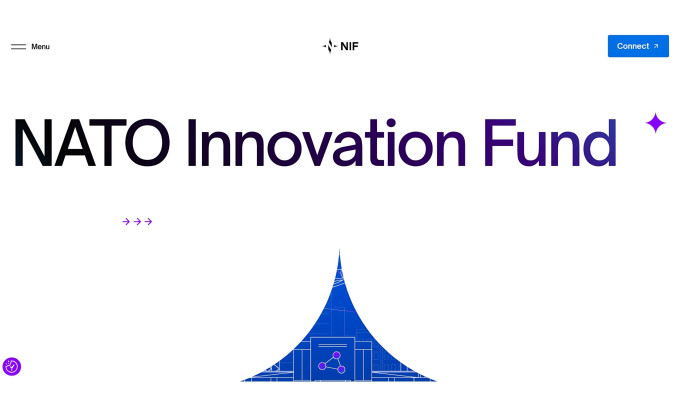
NATO Innovation Fund
View Design
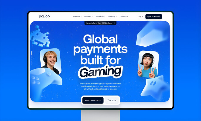
Payop
byGoodface
View Design
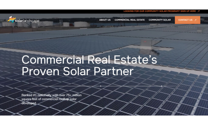
Solar Landscape
View Design
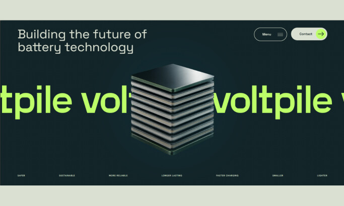
Voltpile
View Design
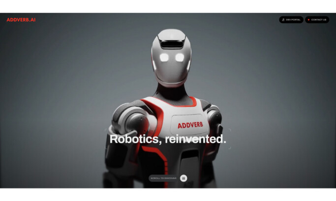
ADDVERB.AI

View Design
IFE-STAR
View Design
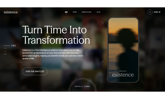
Existence
View Design
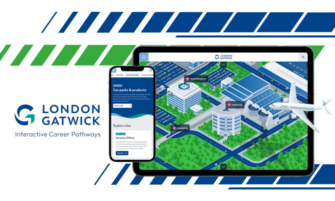
Gatwick Interactive Career Pathways
View Design
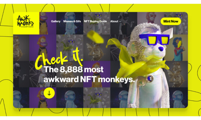
Awk Monks
Ready to elevate your designs?