The best interactive website designs are engaging and organized, effectively delivering content through entertaining design elements. Whether changing the color scheme, adding animation, or upgrading your UX, brands must regularly assess and improve their web development projects to keep visitors engaged.
To do this, consider partnering with professional web design companies on DesignRush, who will take your online presence to another level. Let's see some examples of what you can expect.
1. Wanted For Nothing
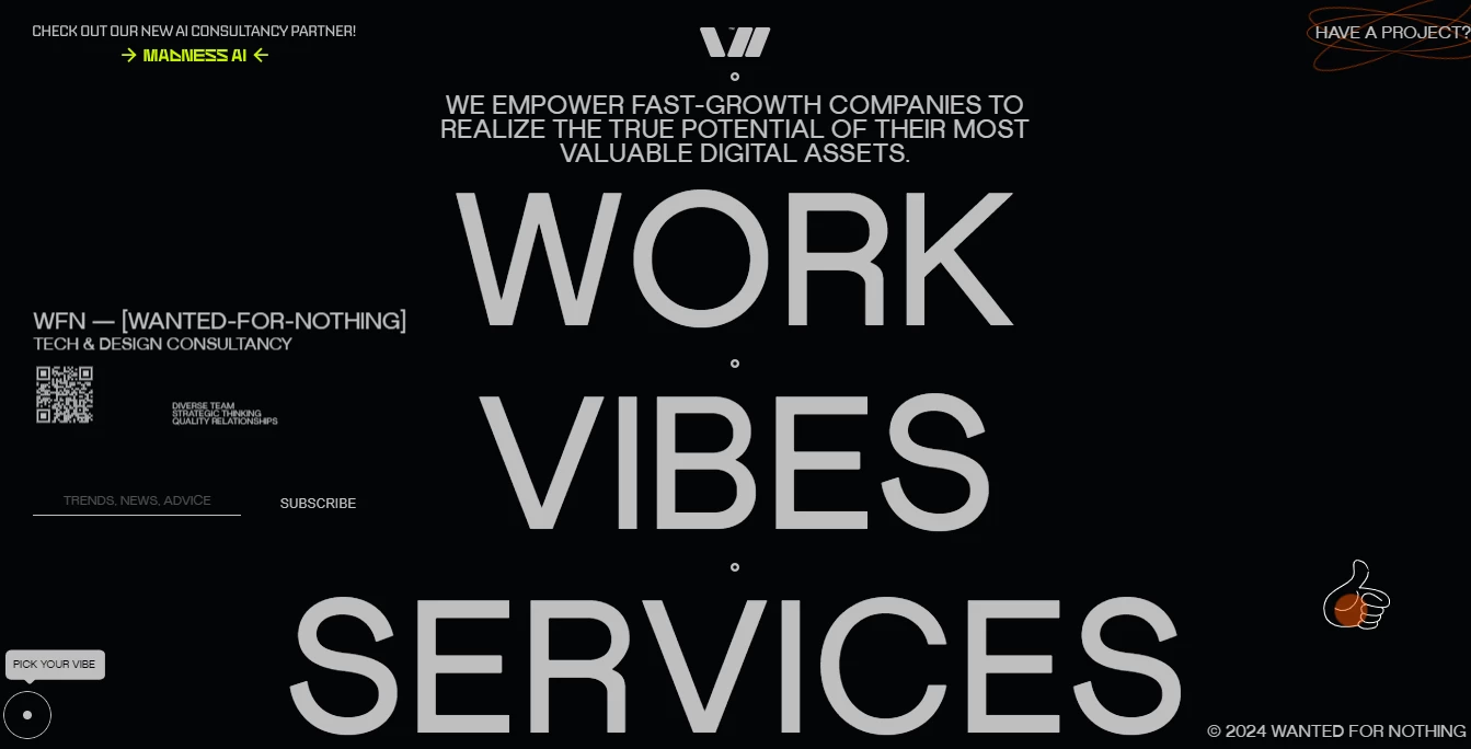
Wanted For Nothing's website design showcases this agency's unconventional thinking through an interactive, contemporary UI.
The first thing that strikes the eye is the button at the top right corner inviting parties to collaborate on a project. When hovered over, the text is encircled with several orange rings that assemble into one ellipsis.
As you start scrolling, the layout surprises you with intriguing animations, like the thin lines highlighting the letter O, a clever nod to the sun's rays. Below this large visual, smaller animations decorating the list of provided services create an entertaining scrolling journey.
The amusing text transitions are also worth mentioning. While the other animations are static, you can use your cursor to trigger and explore different interactive animations that make the content "dance" before your eyes.
To cap it off, Wanted For Nothing's site employs a striking aesthetic matched with picture-perfect functionality, making it one of the worthy interactive website examples.
2. 50 Years Of Swiss Music Charts

Music has always been an engaging experience, but the 50 Years of Swiss Much Charts website takes that idea to a whole new level with its immersive, interactive website design.
This website is made up of a constellation of songs — leading users from year to year with a few swipes and clicks of their mouse. The gradient background pulls you in while your mouse movement literally takes you on a musical journey. This minimal and modern website design is extremely engaging and gives users an experience they won't forget.
After a quick and seamless loading process, the website comes alive with movement and interactive elements. This website is quite literally created in the image of a universe, and users get a 360-degree view of all the songs that have captured audiences over the last 50 years like they're looking at the stars in the night sky.
Clicking on a "star" or year brings users to a specific song, where they are greeted with information about its title, its artist and the year it was recorded. In the distance, other songs hang like distant solar systems.
In this design, users quite literally travel through time and space with the click of their mouse and the scrolling of the page. They can travel to the past and back again, and these interactive features really make for an experience users feel innately a part of.
3. Solar Journey
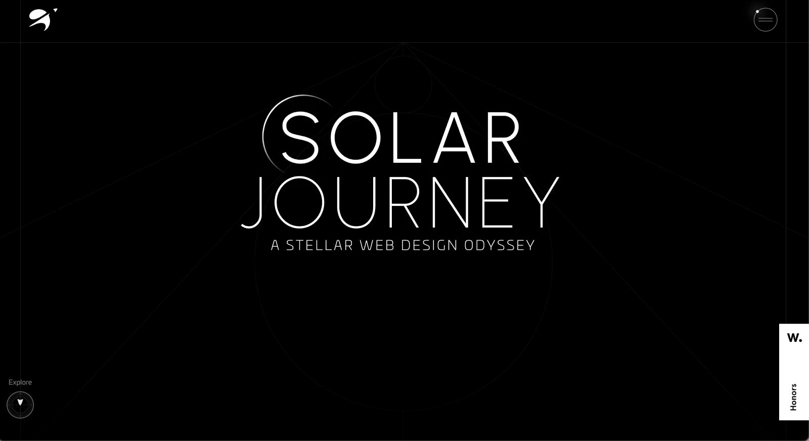
Born from Julian Fella's long-held passion to meld educational content with cutting-edge web technology, Solar Journey brings the cosmos right to your screen.
The website offers an awe-inspiring exploration of space, presented through a dark, star-speckled interface that evokes the boundless beauty of the universe. Visitors are greeted by a captivating view of the solar system, centered around the Sun, with each planet displayed as a meticulously crafted 3D model.
These models are not just for show. They are fully interactive, allowing users to rotate and zoom. This hands-on interaction creates a deeper understanding and appreciation of the complexities of our solar system.
Additionally, the website is structured to enhance learning, with dual-sided content accompanying each planetary model. On the left, users find key facts and figures painting a scientific picture of dimensions and orbits. The right side offers intriguing narratives about the planets, blending mythology with modern discoveries!
Powered by technologies such as GSAP, Webflow, and Three.js, Solar Journey is a stellar example of how digital design can transform educational content into an engaging, visually stunning journey through space!
4. Dave Holloway’s Website
-content-large-webp.webp)
Dave Holloway’s portfolio website perfectly balances creativity with professional digital design. From the moment visitors arrive, they get a captivating hero section that not only says "Hey" but also invites interaction.
Here, users can switch between dark and light themes and manipulate the three-dimensional typography. It offers a playful yet sophisticated introduction to Dave’s world of design.
As visitors scroll down, the website shifts gears to a more structured and refined layout. The vast use of positive space helps to focus attention on Dave’s portfolio, so each project stands out with clarity and impact. This minimalist approach shows the effectiveness of "less is more" in digital design.
The portfolio’s homepage is filled with large, eye-catching illustrations of client case studies. The best part? These illustrations come alive with interactive cursor effects that reveal project previews or creative animations. Such interactivity enhances user engagement and serves as an intuitive guide leading visitors deeper into the site.
Each project can be explored further by clicking on these illustrations, which redirect to dedicated pages. Here, Dave provides a comprehensive breakdown of each project-rich with contextual insights that showcase his strategic and creative capabilities across brand strategy and tactical execution.
5. Nueva.Tech
-content-large-webp.webp)
Nueva.Tech is a Web3 Development Studio expertly presented through Maria Vargas's visionary web design. Specializing in NFTs, the site shows the innovative edge of blockchain technology, mirrored in its daring and dynamic aesthetic.
At first glance, the website captivates with its bold black and red color scheme. This choice is not merely stylistic but strategically employed to cause intrigue and excitement. The use of red highlights critical information and visually organizes the content through cleverly placed lines and boxes.
Here's the unique feature: the site layout borrows elements from game design, transforming a standard corporate website into an interactive experience. Typography takes a playful turn with heavy, impactful fonts and orientations that break the traditional top-to-bottom reading pattern.
Additionally, a standout feature on the ‘About’ page showcases the team behind Nueva.Tech through a series of creative avatars. This gamified introduction uses cartoon and anime-style characters. It adds a personal and approachable layer to the brand while maintaining its professional character.
6. The Eames by Enso
-content-large-webp.webp)
The Eames by Enso is another exemplary interactive website, which gives users a peek into the lives of two legendary designers. It pulls out all the stops to ensure users get a fully immersive and engaging experience from start to finish.
With motion and fluid animations, users are welcomed with a history lesson that is as exciting as it is informational. This website uses parallax scrolling and A+ motion graphics to pull you in, as well as a deep and dark color palette to up the mystery and keep you engaged.
As you scroll through the website, attention-grabbing images and elements truly make a statement. This unconventional technique takes you on a journey through the lives of these designers in a highly interactive and immersive way. There are no videos or jarring graphics—it's all free-flowing, open, and smooth.
This use of seamless movement is a subtle and sophisticated way to showcase content that makes users want to learn more rather than feel obligated or frustrated by the learning experience. This level of innovation is what sets apart the best websites, and often what earns them recognition in web design awards competitions.
7. RAYTH
-content-large-webp.webp)
RedSquirrel’s website design for RAYTH transforms a simple landing page into a journey through the world of luxury car care. Located in the heart of Tallinn, Estonia.
The challenge? To create a web presence that not only reflects the sophistication of the services but also resonates with an upscale audience.
From the moment you land on the page, the fixed navigation bar guides you effortlessly through a well-structured narrative about RAYTH’s exceptional offerings. The site’s layout is a clean canvas with vivid red accents that command attention and highlight essential details — from testimonials to intricate processes.
The ample white space ensures that each segment breathes elegance. Meanwhile, interactive elements like the scrollable photo gallery and a vivid video showreel invite users into the meticulous world of car detailing.
These features not only illustrate RAYTH’s expertise. They also animate the user experience, making the virtual visit as engaging as the physical one!
Lastly, custom graphics and charts are cleverly integrated, utilizing the brand’s signature red to underline key information and navigate the user’s journey toward booking their service. RedSquirrel’s design strategically combines aesthetics with functionality to capture RAYTH’s brand in every pixel.
8. Kayenta
-content-large-webp.webp)
Kayenta's website caters to the sophisticated needs of hedge fund treasury management. In a realm where clarity and control are paramount, this website champions innovation and user-friendly design.
The core of this website is the animated purple line inspired by the brand's logo. It acts like a digital North Star, effortlessly guiding users through the complexities of financial management.
The design transforms the abstract concept of financial navigation into a clear, tangible path. This is symbolized by the purple line that weaves through the site, leading users to vital information and tools they need to manage their financing costs effectively.
The Swiss typography, known for its clarity and order, complements the streamlined navigation. The top web design agencies often employ this strategy to create a pleasant layout that enhances readability and engagement.
Additionally, dynamic elements such as moving circles and varying text sizes inject visual excitement, capturing attention and breaking the monotony of data-heavy sites. These playful yet sophisticated animations echo the winding paths of the original logo, now straightened into a roadmap toward financial clarity!
The use of cool colors and fun gradations also modernizes and freshens the interface, making complex treasury management appear more approachable. The bold, heavy typography underscores the key and ensures the most critical messages stand out.
9. Be The Buzz
-content-large-webp.webp)
A collaboration between Be The Buzz and Buzzworthy Studio has birthed one of the most immersive and interactive website designs, seamlessly blending sleek minimalism with mesmerizing motions. This site doesn't just tell a story — it's an experience.
The design is built on a foundation of fluid motions, vibrant gradients, and minimalist aesthetics. Subtle yet dynamic background gradients shift to create a sense of dimension, making visuals come alive without overwhelming the user. Every scroll reveals content blocks that transition seamlessly into view, keeping visitors engaged and informed in equal measure.
The website's typography design is a sight to behold — a pivotal role in the user journey. Bold sans-serif fonts and outlined typefaces establish a visual hierarchy while maintaining a clean interface. Oversized headers anchor each section, breaking down content into digestible segments. The concise text further enhances readability, helping users quickly grasp essential details without wading through the clutter.
The sticky hamburger menu exemplifies intuitive design. Always within reach, it expands into a half-screen white block showcasing clearly labeled navigation buttons. This approach simplifies the user journey, offering quick access to services, case studies, and contact information — all within a clean, organized layout.
Furthermore, hover states on content blocks, vibrant call-to-action buttons, and outlined icons add layers of interactivity. Each click and hover offers a dynamic color shift or motion, encouraging users to explore further. The indigo CTA buttons stand out against the site's purple, white, and gradient color palette, motivating users to take action while maintaining visual harmony.
Overall, Be The Buzz's website design is an intricate dance of aesthetics and usability, proving that minimalist design can still be richly engaging.
10. Option5
-content-large-webp.webp)
Option5, a Belgian web development studio, has crafted a highly interactive website that showcases its expertise and is a remarkable example of immersive UI/UX design. Every element of the site, from its smooth text transitions to its interactive visualizers, demonstrates meticulous attention to detail that leaves a lasting impression.
The standout feature lies in its hover states, which transform static visuals into dynamic, informative elements. The agency’s case study gallery initially appears as a standard image grid, but as users hover over each project, the images come to life. Animated cursors label each project with its name, creating a seamless blend of engagement and information delivery.
Scrolling further reveals a tabular display showcasing the agency’s clients and collaborations. This section elevates interactivity by displaying additional details with each hover, offering a deeper layer of information without overwhelming the user. This thoughtful approach makes navigation both functional and engaging.
The interactivity doesn’t stop there. As visitors approach the contact section, the experience becomes even more immersive. Hovering over the screen reveals large, animated photos of the team in action, following the cursor’s movement. These playful yet purposeful animations personalize the browsing experience, making it as memorable as it is functional.
Option5’s website stands out as a masterclass in interactivity, blending visual appeal with intuitive design to create a truly unique user journey. It’s not just a portfolio — it’s a dynamic representation of the studio’s capabilities, skillfully combining form and function to leave a lasting impact.
11. Feed Music

Music has the power to transform, and Feed Music's website design embodies this quality with a host of interactive and engaging elements.
The homepage greets visitors with a stark black screen, setting a dramatic backdrop for a smoke-like image. Overlaying this image, the company's mission statement scrolls upward, reminiscent of the iconic opening from Star Wars.
As users scroll, the text not only fades in and out but also fluctuates in size, compelling engagement through its dynamic presentation. This continuous interaction leads visitors seamlessly through stunning transitions into detailed blocks of information about Feed Music.
This website serves as a prime example of interactive design where scrolling plays a crucial role. The animation and text reveal are driven by user interaction; if the scrolling stops, so does the website’s dynamic movement.
Feed Music cleverly ensures that users remain actively engaged, not just passively scrolling, but connecting with the content in a memorable way. It's a pioneering approach that sets a standard for immersive web experiences!
Interactive Website Design: An Increasing Trend
An increasingly popular trend in web design has been the introduction of interactive and responsive website elements — a technique that gives users a more pleasing and engaging user experience. The best IT solutions companies are leading the way in developing these elements, recognizing their essential role in modern user experience.
Adding interactive elements to your web page can increase users' time on your site, heighten brand awareness, and showcase your brand's services and creativity.
These elements can be scroll-triggered animations or micro-interactions that get users involved. They also make for a more dynamic and exciting experience, directing users' attention exactly where you want it.
Why Interactive Website Design Is Important
If your website is simply static, there's a high chance that users won't engage with it. Did you know that with only 15 minutes to consume content, 59% of users want something beautifully designed?
Opting for interactive websites leads to more traffic, longer on-page times, increased brand awareness, and allows brands to show off their creativity.
Creating successful web pages is more than search engine optimization and quality content. It's about the whole package. Brands must integrate a responsive design on desktop and mobile apps through interactive media. That's where human-computer interaction comes into play, getting people involved on a deeper level.
These 11 brands have added interactive elements that are inspiring, insightful, and impactful. They seamlessly and fluidly lead users to the right information, inform users about issues that they might have otherwise overlooked, and showcase content to encourage users to interact and learn more.
As our world becomes even more mobile-first and brands are forced to do more in the realm of design, interactivity will continue to grow. That's because it's impactful, powerful, and unique. These elements make brands stand out and position them as industry leaders.
To truly make a mark, brands should integrate these interactive elements into their web designs. This not only sparks an emotional response from users but also ensures that your brand remains top of mind in the future.