-desktop.jpg)
- Agency: Clay
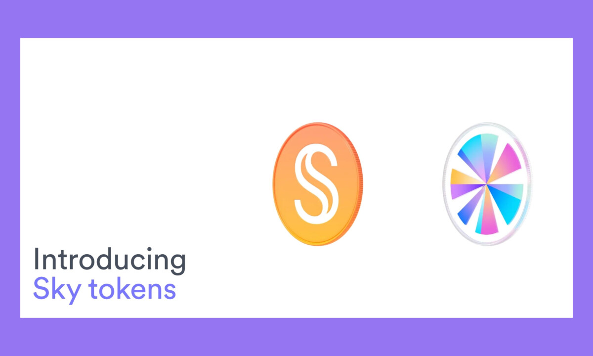
- Client: Sky
- Category: Website – Fintech / DeFi
- Location: San Francisco, California, United States
- Porject Brief: Evolve the MakerDAO ecosystem into Sky through a complete rebrand and immersive website that makes DeFi feel accessible, trustworthy, and forward-looking while supporting complex financial interactions.
Sky marks a clear shift in decentralized finance, bringing MakerDAO’s ecosystem into a more unified and approachable platform. Clay translated that vision into a website that feels open and navigable, using atmosphere, motion, and structure to help users ease into decentralized finance with confidence.
What matters most to me when reviewing DeFi platforms is whether they make advanced finance feel accessible without losing technical credibility.
Sky succeeds by shaping an emotional entry point first, then guiding users into complexity through clarity, rhythm, and restraint.
- Atmosphere: I like how the gradient system feels spatial rather than decorative. The soft transitions between lavender, sky blue, and warm peach create a sense of openness and scale, which subtly reframes DeFi as something expansive and breathable instead of dense or transactional.
- Typography: The oversized, rounded sans-serif typography immediately slows the experience down in a good way. I appreciate how the hierarchy gives complex ideas room to exist without urgency, allowing users to absorb value propositions calmly rather than feeling pushed into action.
- Structure: The modular card system for features like Upgrade, Rewards, and Savings is especially effective. I find that breaking abstract financial mechanics into self-contained, rounded units makes exploration feel optional and intuitive rather than linear or overwhelming.
- Motion: The motion design is restrained but intentional. I like how hover states, fades, and transitions communicate responsiveness and depth without calling attention to themselves, which is essential for maintaining trust in a financial interface.
- Brand Translation: What stands out most is how consistently the Sky metaphor carries through the experience. Lightness, control, and elevation are reinforced through layout, motion, and tone, making the brand feel cohesive at every step of the journey.
-(1).gif)
Impact & Results
The redesign significantly strengthened Sky’s market position and performance.
- Increased site traffic by 40%
- Improved engagement by 30%
- Boosted customer satisfaction by 35%
- Raised conversion rates by 25%
- Strengthened brand recognition across the DeFi ecosystem
What Brands & Agencies Can Learn from Sky
1. DeFi Doesn’t Have to Feel Intimidating
Careful typography, soft gradients, and modular layouts can lower cognitive friction while still signaling technical confidence.
2. Atmosphere Shapes Understanding
Visual tone plays an active role in building trust. Sky shows how mood and motion can guide users before complexity fully reveals itself.
3. Structure Helps Reframe Complexity
Breaking features into approachable modules gives users control over pace and depth, which is especially important in emerging financial products.