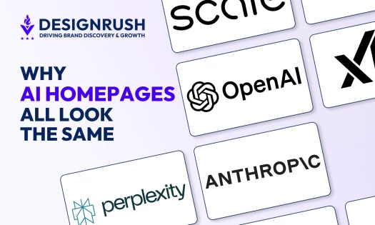
In 2026, a well-designed website layout can strengthen user experience and increase visitor engagement, leading businesses to higher ROI and a stronger digital presence.
We’ll dive into innovative website layout ideas for 2026 that will boost conversions and future-proof your online presence.
Website Layout Ideas: Key Findings
- Warby Parker and Allbirds’ grid layouts upgrade user experience and facilitate informed decision-making in eCommerce.
- In 2025, mobile devices accounted for about 64% of global web traffic, reinforcing the need for responsive design.
- The single-page layout helps users focus on specific actions like sign-ups or purchases, which can lead to increased conversions.
Types of Website Layouts and Their Business Impact
Different website layouts cater to distinct needs, and understanding the right fit for your goals is key to creating an intuitive user experience.
- Grid-based layout
- Single-page (scrolling) layout
- Split-screen layout
- Asymmetrical layout
- F-layout
- Z-pattern layout
1. Grid-Based Layout

The grid-based layout is ideal for businesses with structured content, such as portfolios, eCommerce sites, and image-heavy sites. It organizes content in rows and columns, providing a sense of visual balance and modularity.
This layout is perfect for showcasing a large amount of content in an easy-to-digest format.
Business impact:
- Improved user experience: Easy to navigate, encouraging user interaction and reducing bounce rates.
- SEO benefits: Well-structured content improves search indexing and visibility.
Challenges: The rigid structure can limit creativity and flexibility, especially for businesses requiring dynamic designs.
2. Single-Page (Scrolling) Layout
The single-page layout is perfect for businesses looking to streamline the user experience by presenting information on one long page.
This layout is especially suited for campaigns, storytelling, and small businesses with focused content offerings.
It guides users through the content in a clear, sequential manner without overwhelming them with too many options.
Business impact:
- Increased engagement: By limiting distractions and focusing attention, a single-page layout can effectively guide users toward taking specific action (like signing up for a newsletter or making a purchase).
- Improved conversion rates: The streamlined nature makes it easier to design clear, targeted CTAs (calls to action).
Challenges: It can feel limiting for large businesses or content-heavy websites. If not optimized for mobile, it can result in poor usability.
3. Split-Screen Layout

The split-screen layout divides the screen into two equal sections, each offering distinct content or actions.
This layout is great for businesses with two different products, services, or customer segments that need to be showcased side by side.
Business impact:
- Clear messaging: Users can easily distinguish between different paths, which helps drive conversions by focusing on one message per section.
- Increased targeting: By separating the content, businesses can more easily cater to different audience types, improving lead generation and customer segmentation.
Challenges: Poor design could cause confusion, and an unbalanced layout might make the page feel disjointed.
4. Asymmetrical Layout

The asymmetrical layout breaks away from traditional, rigid grid-based structures, creating an unconventional, visually dynamic design.
This layout is perfect for brands that want to stand out and make a bold visual statement.
Business impact:
- Raised user interest: The unexpected arrangement can make a website more engaging and memorable, increasing time spent on the site.
- Differentiation: Asymmetry can make your brand stand out, which is especially important in highly competitive fields like fashion and design.
Challenges: Navigation may become harder for users, and there’s a risk of confusing visitors if the layout isn’t intuitive. Balancing readability with artistic design is key.
5. F-Layout
The F-layout is based on natural reading patterns, reflecting how users scan web pages.
By aligning important content along the top and left sides of the page, this layout maximizes the ease with which users can consume text-heavy content, such as blogs, news sites, and informational sites.
Business impact:
- Improved readability: Ideal for information-heavy sites that need to make the most of content consumption without overwhelming the visitor.
- Optimized for SEO: By adhering to a predictable reading pattern, this layout makes it easier to present key content that drives engagement and ranking.
Challenges: It can become monotonous if not well designed. The heavy emphasis on content may make the page feel "busy" if not balanced with visuals or interactive elements.
6. Z-Pattern Layout
The Z-pattern layout is designed to guide a user’s eye across the page in a "Z" shape, drawing attention to key content areas and CTAs.
This layout works especially well for landing pages or websites focused on conversions.
Business impact:
- Effective for lead generation: The layout focuses attention on where it matters most, encouraging users to act (e.g., buy a product, subscribe to a newsletter).
- Simple and direct: Keeps the user journey clean and straightforward, reducing distractions.
Challenges: This layout may not work well for content-heavy sites, as it’s best suited for simpler designs with clear, direct goals.
Real-World Examples and Templates for Industry-Specific Layouts
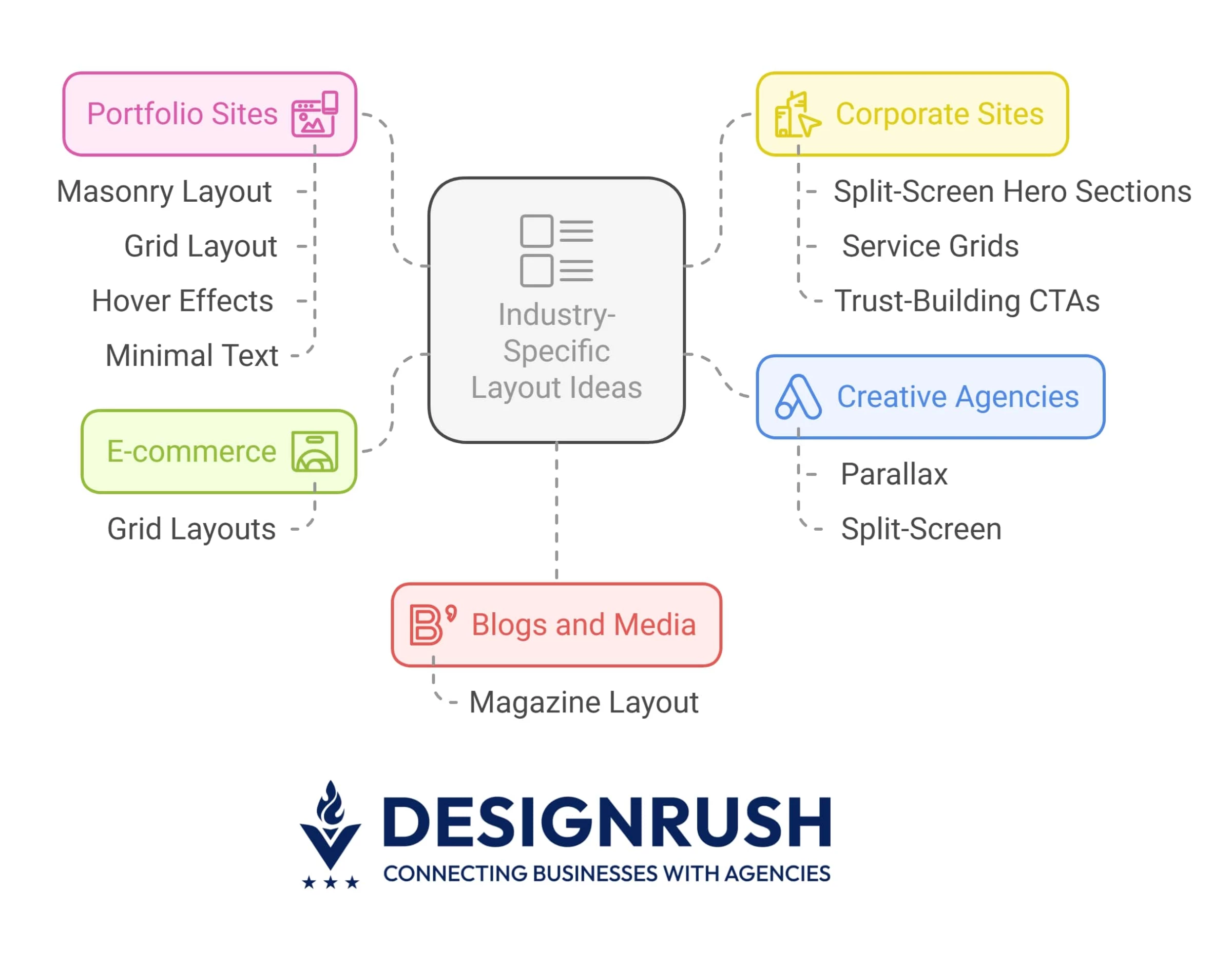
Let’s see how these layouts work across industries to find what suits your business best:
- eCommerce: Grid layouts
- Portfolio sites: Masonry or grid layout with hover effects and minimal text
- Corporate sites: Split-screen hero sections, service grids, and trust-building CTAs
- Creative agencies: Parallax and split-screen
- Blogs and media: Magazine layout
eCommerce: Grid Layouts

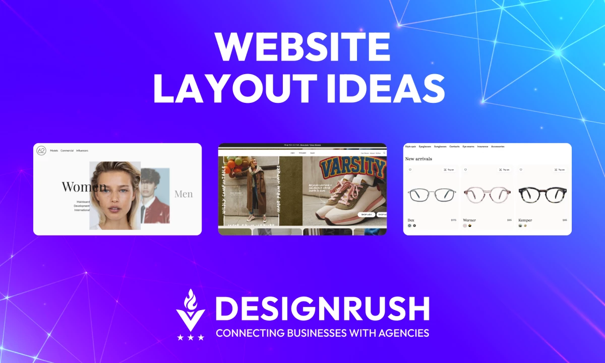
Warby Parker, a leading eyewear retailer, uses a grid-based layout on their website to display their extensive collection of eyeglasses.
The grid format allows users to browse through different styles and options in a clean and organized way.
This layout enables customers to easily compare products based on various features like style, color, and price, improving their shopping experience.

Allbirds, an eco-friendly footwear brand, also uses a grid layout to showcase their shoes. The design is minimalist, with clear visual separations between different categories, such as men’s, women’s, and new arrivals.
Each shoe is displayed in a consistent size and format, helping customers to easily compare styles and make informed decisions.
eCommerce Templates by Shopify
Shopify offers a robust selection of e-commerce templates with clean grid layouts designed to showcase products, making them easy to browse, compare, and purchase.
These templates are responsive and optimized for online stores.
Portfolio Sites: Masonry or Grid Layout With Hover Effects and Minimal Text

Fiona Robertson Graphics' portfolio uses a clean grid layout that highlights each project clearly.
Inviting hover effects add interactivity while the minimal text provides enough information to intrigue visitors without overwhelming them, creating a smooth and engaging browsing experience.

Behance, a popular platform for creative professionals to display their portfolios, utilizes a clean masonry layout. The site prioritizes large visuals, minimal text, and uses hover effects to reveal additional project details.
This user-friendly layout allows visitors to focus on the visual work of artists, designers, and agencies, and makes it easy to navigate through various projects.
Portfolio Templates by Webflow
Webflow offers visually stunning portfolio templates with masonry grids and hover effects. These templates are designed for creatives who want to showcase their work with minimal text and an engaging user interface.
Corporate Sites: Split-Screen Hero Sections, Service Grids, and Trust-Building CTAs

Zendesk’s homepage makes effective use of a split-screen layout to cater to both businesses and customers.
On one side of the screen, Zendesk highlights its customer service solutions, while the other side targets potential business clients, offering a clear path to sign up for the software.
This clear, dual-focus layout ensures that each visitor sees the content most relevant to their needs.

Stripe, a payment processing platform, also uses a split-screen hero section to target different user groups.
One side focuses on offering solutions for developers, while the other side caters to business owners looking to integrate payment solutions.
This design helps Stripe effectively guide each visitor toward their relevant content and offers clear calls to action (CTAs) to increase user engagement.
Corporate Sites Templates by Squarespace
Squarespace provides a range of corporate templates that feature split-screen hero sections and service grids.
These templates allow businesses to highlight their offerings while keeping the design clean and professional.
Creative Agencies: Parallax and Split-Screen

Active Theory uses both parallax scrolling and split-screen elements on its website to showcase its innovative web projects.
The parallax effect adds an interactive layer to the content, while the split-screen layout allows the agency to present two contrasting ideas or design projects side by side, effectively demonstrating their diverse creative capabilities.

Locomotive incorporates parallax scrolling along with a split-screen layout to showcase its web design expertise. The parallax effect adds depth to the visuals, creating an engaging user experience.
The split-screen format highlights their portfolio by visually separating different projects, making it easier for visitors to navigate the agency’s work.
Creative Agencies Templates by ThemeForest
ThemeForest offers a variety of creative agency themes that feature parallax scrolling, split-screen layouts, and interactive design elements to captivate visitors and showcase projects in a visually dynamic way.
Blogs & Media: Magazine Layout

NJUZ, a Serbian satirical news portal, utilizes a magazine-style layout that ensures a clean and professional look.
Each news article is highlighted with a hover effect that adds a subtle border, making the content visually distinct and easy to identify.
On the right side of the page, you can view the made-up tweets that preserve the ironic nature of NJUZ’s content.

Smashing Magazine employs a magazine-style layout to organize a vast amount of content, including articles, tutorials, and resources.
The website’s layout is designed for easy access to different categories, making it effortless for users to find relevant content.
The clean, well-organized grid and emphasis on readability make it an ideal example of a media-focused layout.
Blogs & Media Templates by WordPress
WordPress provides a large selection of blog themes that feature magazine-style layouts, perfect for organizing and categorizing content in a user-friendly manner.
These templates prioritize readability and easy navigation.
Best Practices for Website Layout and UX Optimization
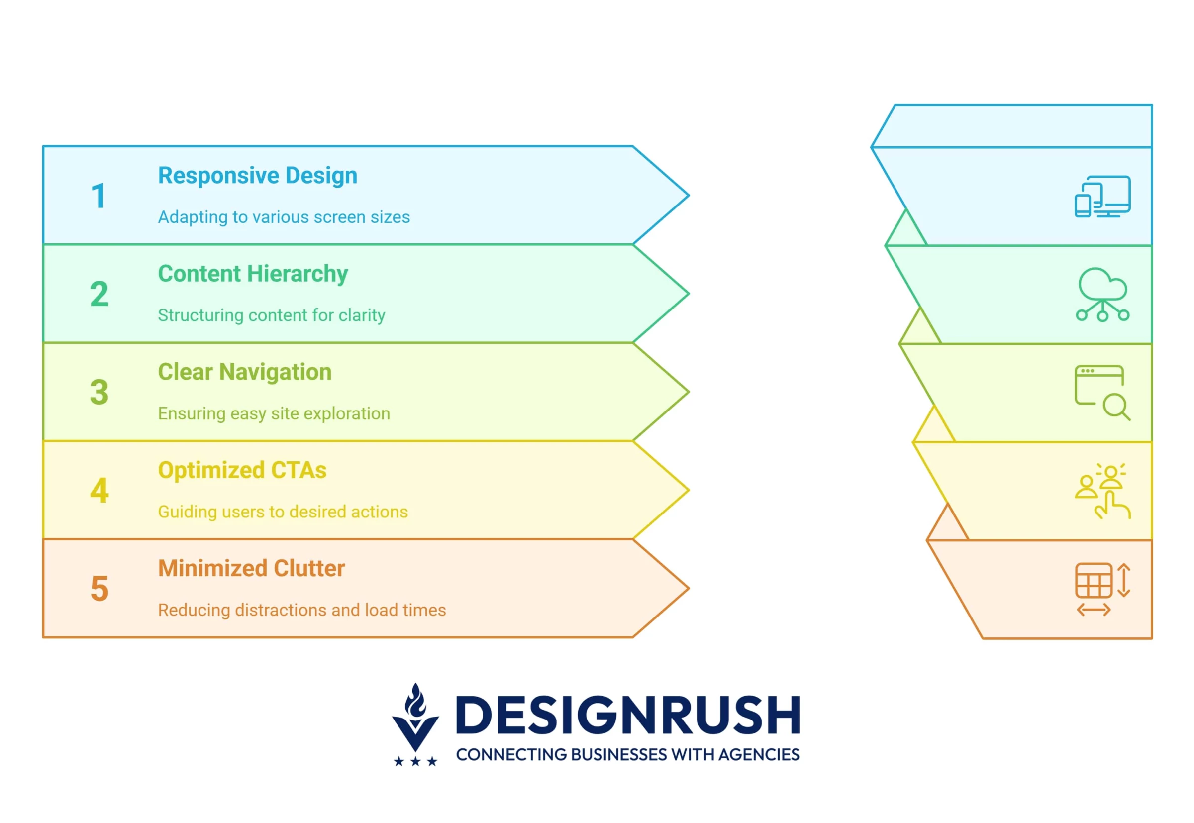 Here are some best practices to build an appealing and UX-friendly layout:
- Ensure responsive, mobile-first design
- Structure your content with a clear visual hierarchy
- Make navigation easy and user-friendly
- Use strategic and high-converting CTAs
- Minimize clutter and optimize load time
1. Ensure Responsive, Mobile-First Design
In 2025, mobile devices accounted for about 64% of global web traffic.
As a result, websites need to be designed with responsiveness in mind to ensure content remains accessible, readable, and easy to navigate across different screen sizes.
About 67% of users are more likely to purchase on a mobile-friendly website, highlighting the importance of responsive design. Here's how you can create a a responsive design across all devices:
- Use fluid grids and flexible layouts: Implement fluid grids and flexible images to ensure that content adjusts correctly to varying screen sizes.
- Test across devices: Regularly test your website across different devices and browsers to ensure functionality. Tools like BrowserStack can help with testing.
- Prioritize mobile-first design: Consider simplifying navigation and reducing content length for mobile users.
2. Structure Your Content With a Clear Visual Hierarchy
Content hierarchy refers to the arrangement of elements on a page to guide the user.
Effective content hierarchy helps users easily navigate and find what they’re looking for without feeling overwhelmed by the volume of information.
Here's how you can organize content so users can effortlessly find what they need:
- Highlight the important content: Make use of varying font sizes, colors, and styles to signify the importance of headings, subheadings, and body text.
- Create a logical structure: Group related content together and prioritize key sections, such as CTAs, product information, or blog posts, near the top of the page.
- Use whitespace: Adequate spacing between text, images, and sections allows for better readability and prevents the page from feeling overwhelming.
"Effective layout design starts by understanding how users naturally scan a page," says Malay Parekh, CEO of Unico Connect, a leading digital product development agency.
"We use progressive disclosure by presenting just enough information upfront to guide attention, while revealing more detail only as needed.
This keeps the interface clean and helps users stay focused, especially on mobile."
3. Make Navigation Easy and User-Friendly
Forbes reports that 61% of website users expect to find what they're looking for within five seconds of landing on a website.
So, one of the main goals of your website should be to help visitors quickly and easily find what they’re looking for without getting frustrated by confusing menus or excessive clicks.
Some elements in your layout can magnify the user experience:
- Simple and intuitive menus: Keep your main navigation menu simple, with no more than 7 items. This ensures that users can scan and choose their options quickly.
- Sticky navigation: Implement sticky headers or navigation bars so users can easily access the menu as they scroll through long pages.
- Descriptive labels: Use clear and descriptive labels for navigation items to avoid any ambiguity. For example, use “About Us” instead of “Company.”
- Search function: An accessible search bar, placed in the top right corner, increases the chances that users can find specific content quickly.
4. Use Strategic and High-Converting CTAs
CTAs should be visible at key points in the user journey to guide the user toward taking the desired action.
For example, personalized CTAs can increase conversion rates by up to 42%, as they are tailored to individual user behaviors and preferences, making them more relevant and compelling.
To get the most out of your CTAs you should think about:
- Strategic placement: Place CTAs where users' attention naturally flows. Use F-pattern and Z-pattern layout strategies to guide the user's eye.
- Action-oriented language: Phrases like “Get Started,” “Join Now,” or “Shop Now” are more effective than vague CTAs like “Submit” or “Click Here.”
- A/B testing: Regularly test different CTA designs, colors, and text to identify which variations result in higher conversions. Tools like Optimizely are great for A/B testing.
- Highlighting CTA buttons: Make your CTA buttons stand out with contrasting colors to draw users' attention and encourage action.
5. Minimize Clutter and Optimize Load Time
A clutter-free design amplifies usability and reduces bounce rates. Fast load times are critical for retaining visitors, with 53% of mobile users abandoning a site if it takes longer than 3 seconds to load.
Here’s how you can minimize clutter and optimize performance:
- Simplify your design: Remove any unnecessary elements that don’t serve a clear purpose. Prioritize what is essential and create a clean design that aids navigation.
- Optimize images and files: Compress images and files to reduce load time. Use image formats like WebP for better performance and faster loading.
- Lazy loading: Implement lazy loading for images and videos, meaning they only load when they come into view, shortening page load speed.
- Monitor load time: Use tools like GTmetrix to analyze your website’s load time and identify areas for improvement. Aim for a page load time of under 3 seconds.
Website Layout Ideas: Wrap-Up
Whether you aim to increase conversions, provide a dynamic user experience, or simply organize content more efficiently, each layout offers unique benefits and challenges.
By aligning your layout choice with your business objectives, you can create a website that not only looks great but also drives results.
Our team ranks agencies worldwide to help you find a qualified partner. Visit our Agency Directory for the top web design companies, as well as:
- Top UI/UX Design Agencies
- Top WordPress Web Design Companies
- Top Web Development Companies
- Top Responsive Web Design Companies
- Top B2B Web Design Agencies
Our design experts also recognize the most innovative design projects across the globe. Visit our Awards section for the best & latest in website design.
Website Layout Ideas FAQs
1. What is a good website layout?
A good website layout balances functionality and aesthetics. It should be easy to navigate and ensure a visual and information hierarchy on the pages. Good layouts are responsive, accessible, fast-loading, and user-friendly.
2. How do I choose a website layout?
When choosing a website layout, you should have a clear idea of what goals you want to achieve, who you’re creating the website for, and an idea of the content you want to post.
Consider functionality, responsiveness, visual aesthetics, navigation, and scalability. Addressing all these aspects is best left to professionals, so consider reaching out to a seasoned design team to help you get started.
3. How can I ensure my website layout is mobile-friendly and responsive?
The best way to get started is by choosing a responsive framework that automatically adjusts your content to screen sizes and device types.
Use CSS media queries to create custom variations for different screens, with possible layout and content simplifications.
Additionally, optimize your images and perform thorough manual testing to look for potential issues.