Web design in 2026 is being pulled in two directions at once: be more expressive and human to stand out, and still be fast and machine-readable enough for AI agents to read, cite, and rank.
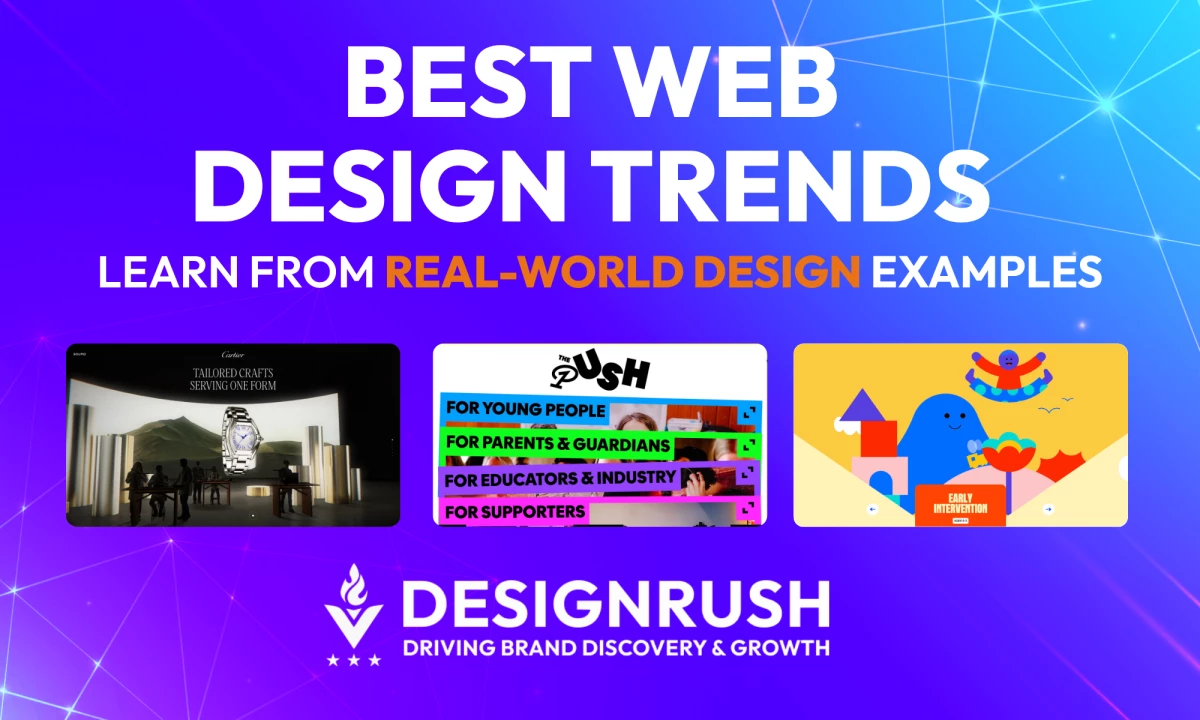
We break down 15 trends, with real-world examples and ways to implement them without sacrificing usability or performance.
Web Design Trends 2026: Key Findings
- Prioritize performance first. Improving mobile load speed by just 0.1 seconds can increase retail conversions by up to 8%
- Structure content for AI visibility using semantic HTML, FAQs, and a clear heading hierarchy to improve citation potential in AI search.
- Use expressive styles like neobrutalism and dopamine design to make your brand feel more human and less AI-generated.
Web Design’s New Challenge: Staying Human in an AI Web
1. Website Layout Ideas 2026
2. Web Design Statistics 2026
3. Top Web Design Tools
4. Web Design Best Practices
For the first time, web designers are building for two audiences simultaneously, and they want completely different things.
The same website now has to win over a human visitor in 0.05 seconds and earn a citation from AI systems that never see the design at all.
That is why the biggest web design shift in 2026 is survival, not just visual style.
Google’s AI Overviews have already reduced top organic click-through rates by as much as 58%, while Microsoft’s 2025 AI adoption report found global generative AI usage reached 16.3% in just one year.
In 2026, web design has to be fast enough to convert, structured enough for AI, and distinctive enough to not look machine-generated.
The 15 latest web design trends below address both pressures: expressive visual design and technical functionality. Each comes with real-world examples and an honest look at where the trend earns its place and where it backfires.
The Visual Trends That Exist for the Same Reason: Polished Stopped Feeling Special
- Neobrutalism: The anti-aesthetic making brands more human again
- Glassmorphism: Apple’s new benchmark for premium interfaces
- Neumorphism: The trend that failed accessibility in 2020 is back
- Dopamine design: The color strategy Gen Z brands use for instant attention
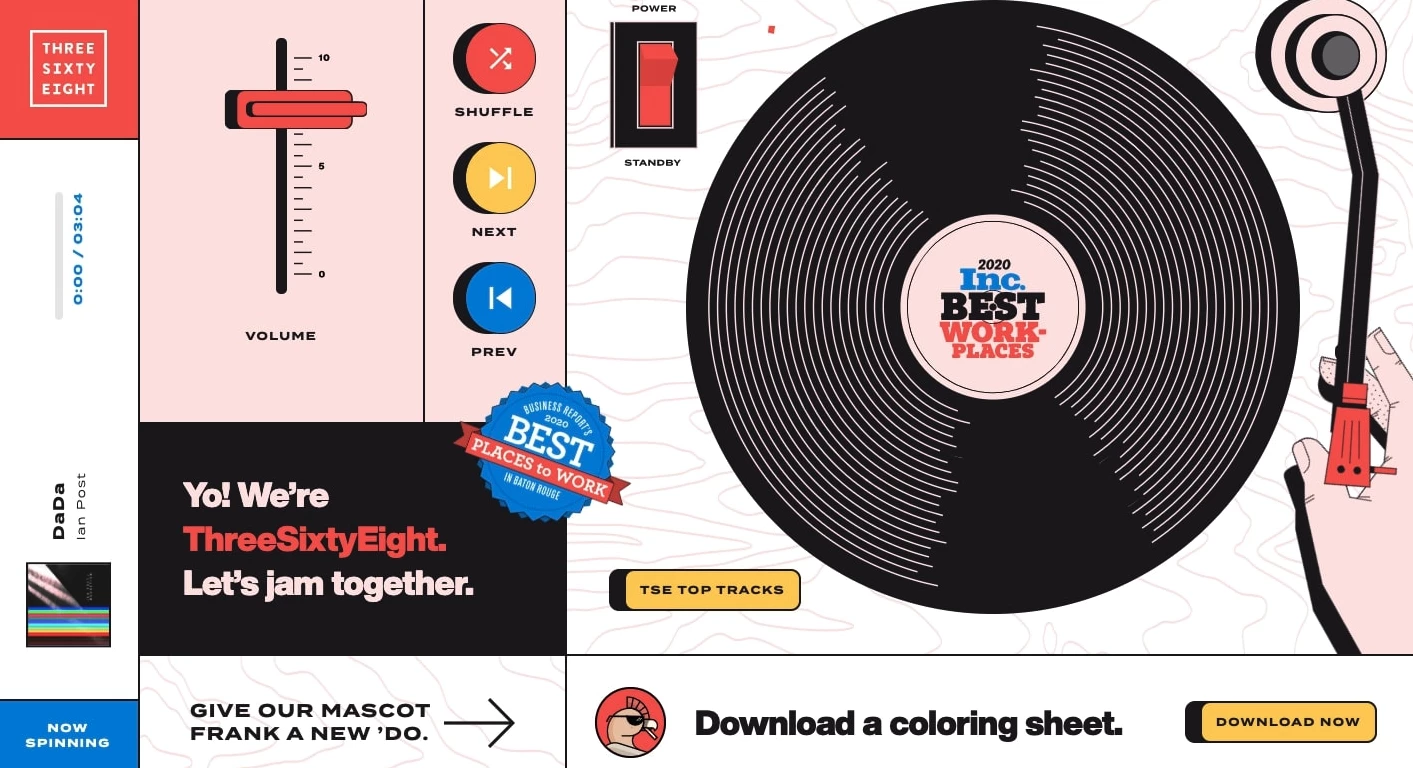
1. Neobrutalism: The Anti-Aesthetic Making Brands More Human Again

Neobrutalism is what happens when designers deliberately refuse to make something look AI-generated. Brands are leaning into sharp contrasts, heavy borders, geometric shapes, and layouts that feel intentionally raw or unfinished.
The whole point is to make a site feel unmistakably human-made.
AI tools can now generate sleek interfaces in minutes, which means polished design no longer feels special on its own. When every brand can create the same smooth landing page, perfect starts to feel generic.
Neobrutalism works because it brings back personality and intentionality.
How to Use Neo-Brutalism Without Hurting UX
- Lean into thick outlines, hard-offset shadows, and hard geometric shapes instead of soft shadows and rounded elements.
- Visible grid lines or ruled backgrounds and slightly off-balance compositions help the design feel more raw.
- Pick two or three colors maximum to create a high-contrast & limited color palette.
Where it works best: Fashion, lifestyle, culture, and creative studios that want to feel independent or anti-corporate.
Real-World Example: Diesel's Deliberately Chaotic Take on Luxury Fashion
Brands using it well, like Balenciaga and Diesel, use the style to look bold, creative, and culturally aware rather than overly corporate.
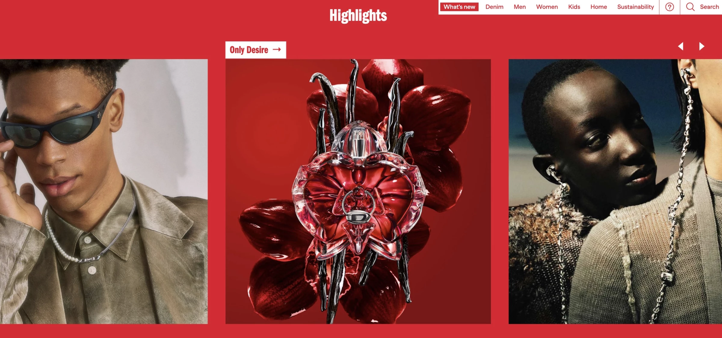
Diesel’s site leans into oversized type, stark contrast, and heavy borders that intentionally avoid the polished look typical of luxury fashion.
The imperfect elements or chaos are clearly controlled, which keeps the design from feeling broken or too messy.
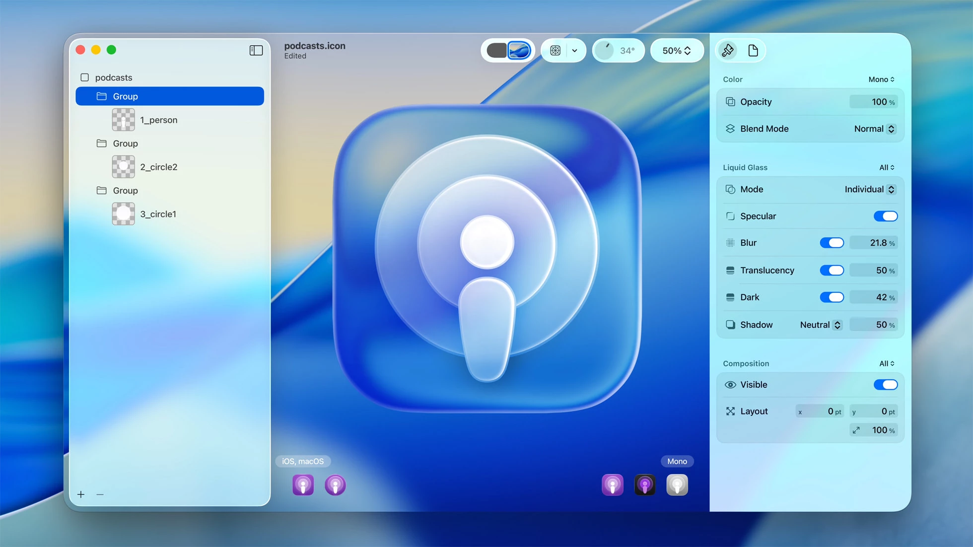
2. Glassmorphism: Apple’s New Benchmark for Premium Interfaces
Glassmorphism uses frosted-glass effects, like semi-transparent surfaces, background blur, and layered depth, which make UI elements appear to float above content rather than sit flat on it.
In 2026, it's the dominant direction for UI because of Apple’s Liquid Glass design language launched on iOS 26.
Depth and translucency act as shortcuts to understanding. They tell users what's interactive, layered, and touchable. When every button is a simple flat rectangle, glassmorphism's floating panels feel like a meaningful return to clarity and legibility.
How to Use Glassmorphism Without Killing Readability
- Lock text contrast to 4.5:1 against the worst-case background. The most common accessibility failure in glassmorphism is text that becomes unreadable as the blurred background shifts behind it.
- Use glass on floating layers only, like modals, tooltips, and nav bars. Applying it everywhere kills the hierarchy.
- Test light and dark backgrounds. A panel that works on a dark gradient can vanish on white.
Where it works best: SaaS dashboards, fintech, mobile-first, dark-mode UIs, and products signaling premium or technical quality.
Where to avoid it: Text-heavy content pages, government/healthcare contexts with strict WCAG requirements, and performance-critical interfaces where GPU-heavy blur is a liability.
Real-World Example: Apple’s Glass Design Brought Physics to Premium UI
Apple pushed glassmorphism beyond simple blur effects by simulating actual light refraction. Content behind a glass element warps subtly at the edges, the way real glass bends light.
Tab bars shrink and float as glass bubbles when users scroll. App icons become layered, light-responsive artworks. It's glassmorphism with physics, and it's already reshaping the visual benchmark for what premium digital interfaces are expected to look like.
3. Neumorphism: The Trend That Failed Accessibility in 2020 Is Back
Neumorphism, or soft UI, creates depth through subtle light and dark shadows that make elements appear pressed into or raised from a surface. The result feels soft and almost physical, like tapping a silicone button rather than a flat rectangle.
The style gained attention in 2020 but was criticized for accessibility issues, as its low-contrast design often made buttons difficult to distinguish from background surfaces. As a result, it largely disappeared from production interfaces.
In 2026, designers are bringing it back more selectively, using it for cards, toggles, and dashboard widgets within otherwise standard layouts.
Used with restraint, neumorphism adds warmth and a premium feel without the usability failures that originally hurt the trend.
How to Use Neumorphism Without Failing Accessibility
- Add a border or heavier type weight to establish separation without breaking the soft aesthetic.
- Apply to specific components only. It works best on individual elements like cards, sliders, toggle switches, profile badges, and dashboard widgets.
- Stick to muted, low-saturation base colors. The shadow effect needs off-whites, light grays, or soft pastels. High-saturation colors create too much noise for the subtle shadows to register.
Where it works best: Wellness apps, fintech and productivity dashboards, and premium SaaS, especially as an accent within dark or neutral design systems.
Where to avoid it: Strict WCAG environments, high-density dashboards where state changes must be instantly clear, and interfaces with a significant visually impaired user base.
Real-World Example: TATA AIG Insurance Layers Neumorphic Depth for Trust and Sharp Contrast for Conversion
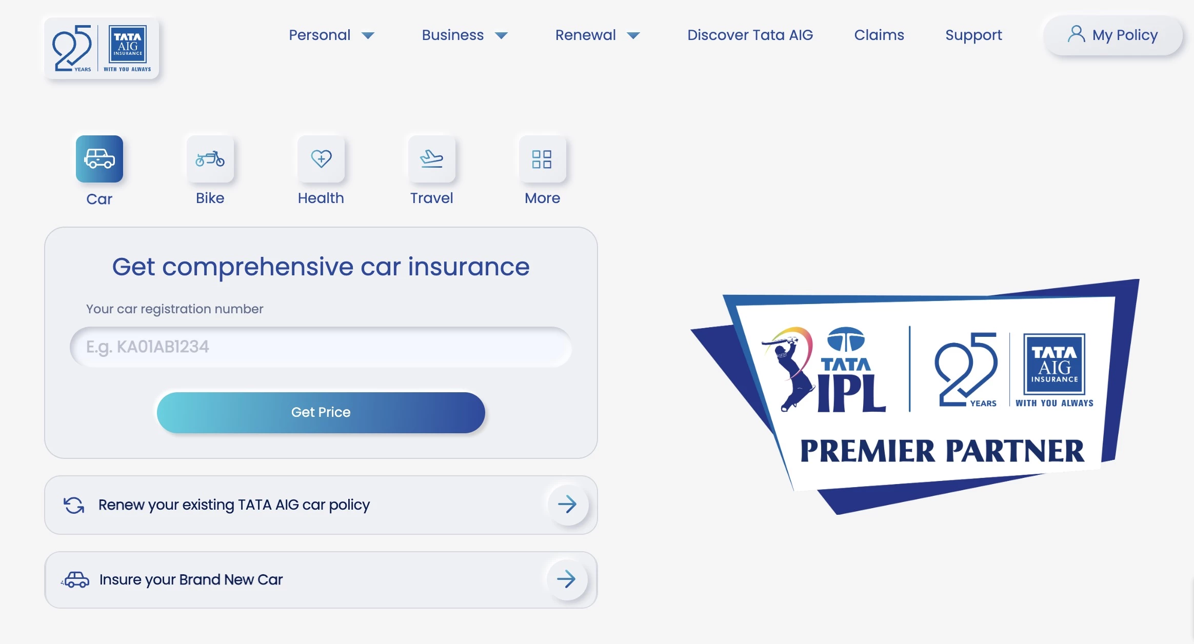
TATA AIG is a great example of neumorphism used effectively at scale.
The redesign used soft gray backgrounds, subtle shadows, and slightly raised cards and buttons to give the interface a tactile, pressable feel without overwhelming usability.
Instead of applying neumorphism everywhere, the design team used it mainly on secondary UI elements while keeping core conversion areas clear and high contrast.
The site offers a more premium, touch-friendly experience that still helps users navigate to insurance quotes faster across all age groups.
4. Dopamine Design: The Color Strategy Gen Z Brands Use for Instant Attention
Dopamine design treats color as a mood and attention tool before branding, using high-saturation color palettes like neon pinks, electric blues, acid greens, and hot oranges.
The name comes from dopamine, the neurotransmitter associated with pleasure and reward, and the concept is intentional: create visual stimulation strong enough to stop scrolling.
It emerged from TikTok and Gen Z visual culture, where high-stimulus environments are the norm and competing for attention is measured in milliseconds. It’s also a backlash against the beige minimalism that dominated brand design in the early 2020s.
The tradeoff is visual fatigue. Extended exposure to high-saturation interfaces can become exhausting, which is why the most effective examples use neons as accents against neutral or dark backgrounds.
How to Use Dopamine Color Palettes Without Fatiguing Your Users
- Use saturated neons for interactive elements like button fills, hover states, highlight text, and CTA elements. Neon backgrounds cause fatigue.
- Ground accents with a dark or neutral base. Near-black or neutral white makes the contrast do the work.
- Use gradients between saturated hues (pink to orange or blue to purple) for depth over flat neon fills.
Where it works best: Lifestyle, beauty, D2C, fashion, entertainment, gaming, and any products targeting young audiences in high-stimulus environments.
Where to avoid it: Healthcare, legal, financial, and B2B contexts where restraint signals trust, and anywhere sustained reading is required.
Real-World Example: Starface Turned an Invisible Product into the Loudest Element on the Page
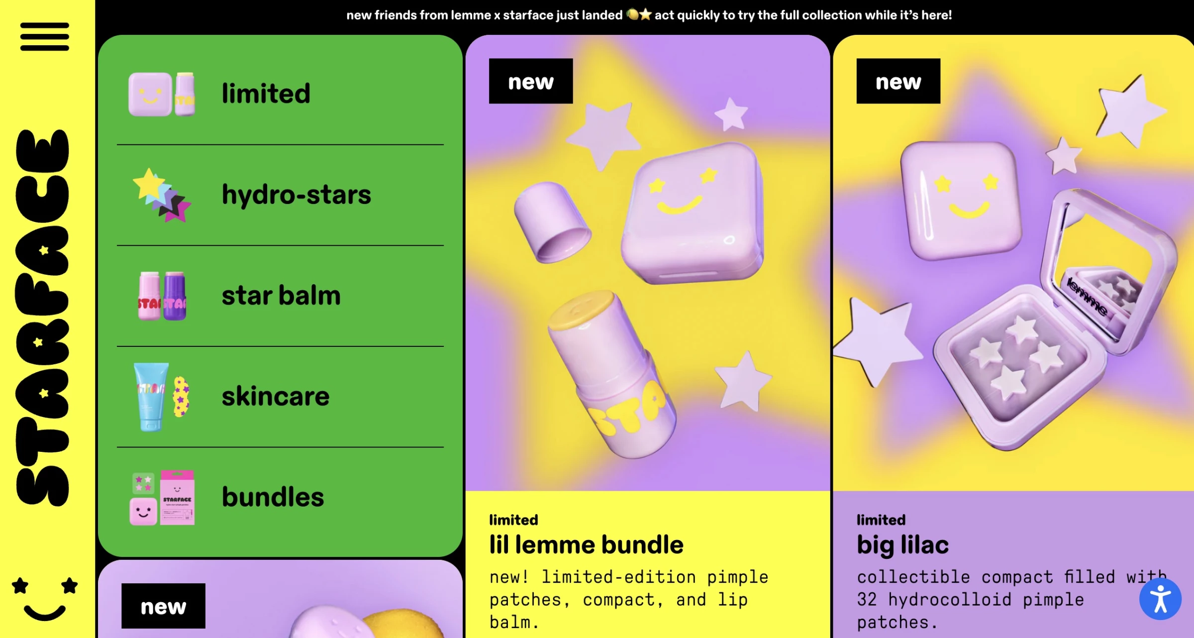
Starface is a Gen Z acne patch brand that turns an invisible skincare product into a visible fashion accessory. Its site is a textbook example of dopamine design done correctly.
It uses neon yellows, electric pinks, and high-contrast pairings that match the brand's product.
The mascot, Big Yellow, a star-shaped, highlighter-yellow patch designed to be seen, appears throughout a visual language that draws directly from Y2K nostalgia and internet culture.
Starface's dopamine palette is credible because it was built from a genuine brand position: acne positivity, self-expression, and Gen Z visibility.
Layout Trends: Why The Standard Grid Is Becoming a Liability
- Liquid design & anti-grid layouts: When breaking the grid carries more signal
- Bento grid: Where information density becomes a design feature
5. Liquid Design & Anti-Grid Layouts: When Breaking the Grid Carries More Signal
Liquid design and anti-grid layouts are gaining traction for the same reason as neobrutalism: template convergence means breaking the pattern carries more signal than it used to.
Rigid, predictable structure is becoming a liability for brands that need to communicate personality.
Liquid design uses fluid, morphing shapes, animation, and layouts that feel in motion even when static. Anti-grid layouts are the structural counterpart, using asymmetric compositions, diagonal sections, and overlapping elements to create flow against the expected grid.
How to Create Liquid and Anti-Grid Layouts
- Design mobile breakpoints first. Anti-grid elements need to be simplified significantly on small screens. Set the reading order there, then build the desktop layout around it.
- Keep the animation duration between 6-10s on loop for subtlety.
- Define the overlapping elements explicitly and test at every breakpoint to ensure it doesn't cause layout shift (CLS).
Where it works best: Crypto and Web3 brands, tech startups that need to communicate innovation, and any brand where personality is the primary differentiator.
Where to avoid it: E-commerce product listing pages, where scannability matters, and any interface where users are in task completion mode rather than exploration mode.
Real-World Example: Hatom's Scroll-Driven Landscape Reveals Its Pitch One Movement at a Time
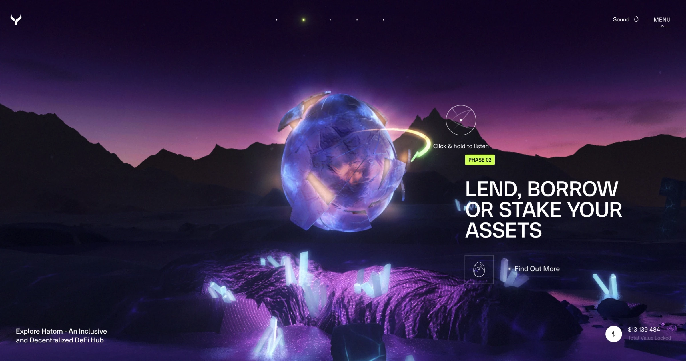
Hatom uses liquid design and an anti-grid layout to create a cinematic, high-tech, and almost otherworldly feel.
The site opens with fluid animations and layered motion that avoids traditional rigid grids. As you scroll, the central animation and landscape continuously transform, gradually revealing its core selling points.
Hatom’s fluid design language positions it as forward-thinking rather than corporate or conventional. In the DeFi space, immersive motion and unconventional layouts often signal technical innovation and ambition.
6. Bento Grid: Where Information Density Becomes a Design Feature
Bento grid arranges content in asymmetric, tile structures, like a Japanese bento box. It's popular for information-rich products as it solves the problem of surfacing a lot of content without visual chaos.
Varying tile sizes create an inherent hierarchy without extra visual treatment. Apple’s product pages popularized the format, and SaaS companies have been adapting it since.
The only catch is that bento grids collapse badly on mobile if responsive behavior isn't designed from the start. A 4×3 mosaic that reads beautifully on a desktop often requires a completely different tile arrangement on a 375px screen.
How to Build Bento Grid Layouts Without Breaking on Mobile
- Establish a size hierarchy before designing content. Size should reflect importance.
- Design mobile first. Decide the stacking order before building the desktop mosaic.
- Keep each tile self-contained. It should communicate its point without requiring context from adjacent tiles.
Where it works best: SaaS product pages, portfolio sites, dashboard UIs, and brand landing pages communicating multiple value propositions at once.
Where to avoid it: Editorial and narrative content where reading flow matters more than visual scanning.
Real-World Example: Design in DC's Bento Grid Gives Every Bakery Offering Its Own Entry Point
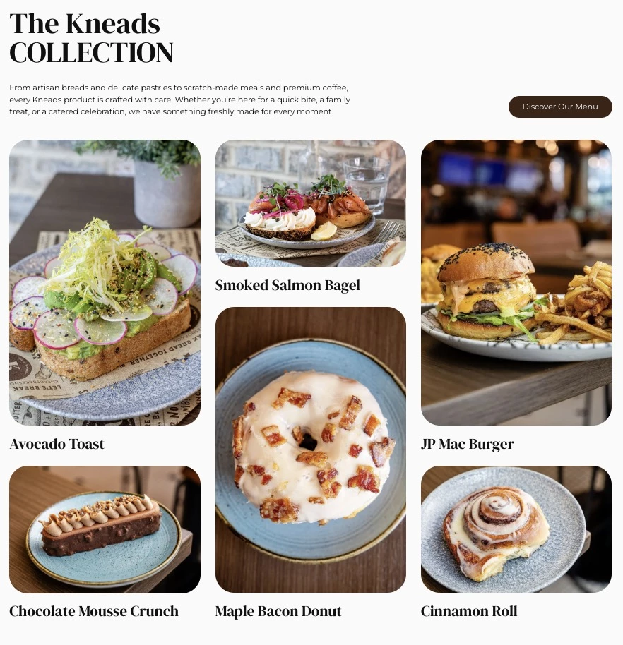
Kneads Bakeshop, a Baltimore artisan bakery and café, shows how bento grid design communicates multiple offerings like products and atmosphere without overwhelming visitors.
When Design in DC redesigned the site, the agency used modular, tile-based layouts alongside high-quality photography. Menu highlights, locations, and community-focused content coexist naturally within the same interface.
Each tile works independently, so you can understand what’s being presented without relying on the surrounding context.
For a business serving multiple audiences, be it everyday customers or wholesale buyers, the bento grid gives every offering a clear entry point without it being cluttered or overly hierarchical.
The Motion Trends Worth the Load Cost
- 3D & AR websites: The heaviest trend, but with real revenue potential
- GSAP & micro-animations: Motion that guides instead of distracts
- Kinetic typography: The element AI-generated design still can't pull off
7. 3D & AR Websites: The Heaviest Trend But With Real Revenue Potential
3D websites use WebGL, Three.js, or similar browser-based rendering to create immersive environments. It features rotating product models, interactive scenes, and depth-layered scrolling.
AR places digital objects in the physical environment via a device's camera.
Both are growing because the tooling has matured to the point where high-quality 3D experiences no longer require a game engine or a specialized studio. Three.js, Spline, and WebGL-based design tools have made it accessible to a wider range of teams.
The consistent caveat is performance. 3D and AR content are the heaviest-weight trends in this list. Every implementation needs a performance budget and a fallback for lower-end hardware.
How to Build 3D and AR Experiences Without Killing Page Performance
- Use Spline or Three.js for browser-native 3D. Both support lazy loading that only initializes the scene when it's in the viewport.
- Implement a CSS/image fallback for low-end devices. Detect GPU capability via WebGL renderer info and serve a static render to devices that can't handle the scene.
- Use WebXR for in-browser AR without requiring a native app download, the biggest adoption barrier for AR commerce.
Where it works best: Product-heavy ecommerce for furniture, fashion, footwear, jewelry, and autos, architecture and real estate, gaming and entertainment.
Where to avoid it: Informational sites and any product where the 3D load time outweighs the business benefit.
Real-World Example: Cartier’s Hidden 3D Interactions That Reward Users for Exploring
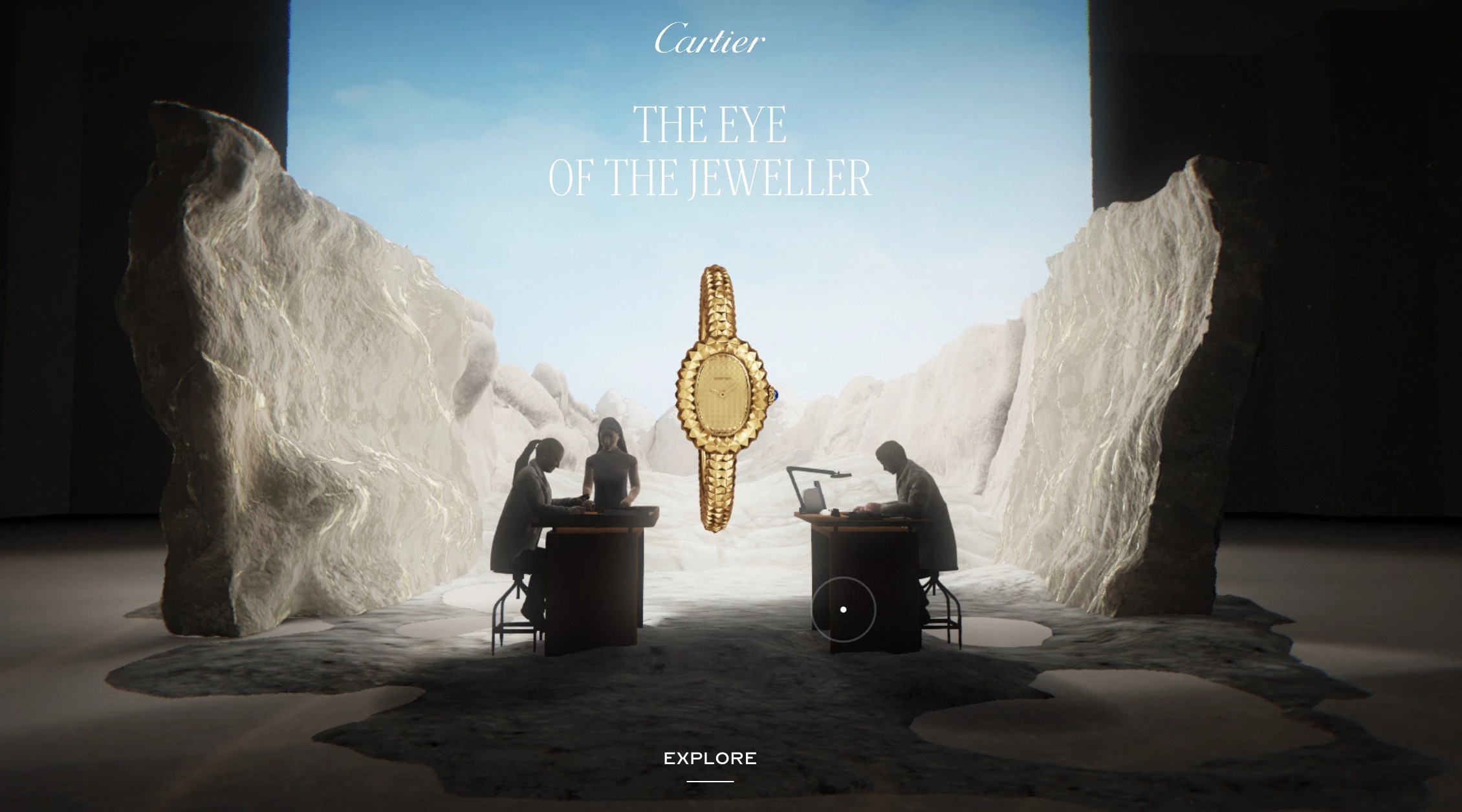
Cartier's Watches & Wonders experience is one of the most technically accomplished 3D web experiences produced by a luxury brand.
Built by Immersive Garden in collaboration with 60fps, the site presents six self-contained 3D alcoves, one per featured timepiece, that users scroll through like rooms in a private museum.
Each alcove is a complete world. It has light-responsive environments built in Blender that interact with your cursor and are animated with GSAP and Three.j. These hidden interactions reward curiosity throughout the experience.
Cartier demonstrates the full capability of what browser-native 3D can achieve.
8. GSAP & Micro-Animations: Motion That Guides Instead of Distracts
GSAP (GreenSock Animation Platform) is the dominant JavaScript animation library for complex, timeline-based web motion.
CSS animations handle simple transitions, but GSAP offers multi-step animation sequences, like staggered reveals and scroll animation that CSS alone can't match.
It creates page experiences where data visualizations draw themselves or features can be demonstrated through motion.
Micro-animations are a smaller-scale complement. For instance, a button that responds visibly to a hover or a form field that confirms input with a subtle color shift.
How to Use GSAP and Micro-Animations Without Overwhelming the User
- Use ScrollTrigger for scroll-based reveals to create the sense that the user is controlling the narrative.
- Stagger entrance animations by 50-100ms. Simultaneous pop-in reads as unintentional.
- Use Lottie for icon-level micro-animations. It renders After Effects animations as lightweight JSON, lighter than GIF or video for checkmarks, menu transitions, and similar.
Where it works best: Agency and portfolio sites, product launch pages, feature showcase sections, and anywhere animation is explaining or demonstrating something.
Where to avoid it: Dashboard and productivity UIs where users are doing repetitive tasks. Motion in those contexts is friction.
Real-World Example: Maxima Therapy’s Interactive Wheel Designed for Neurodivergent Users
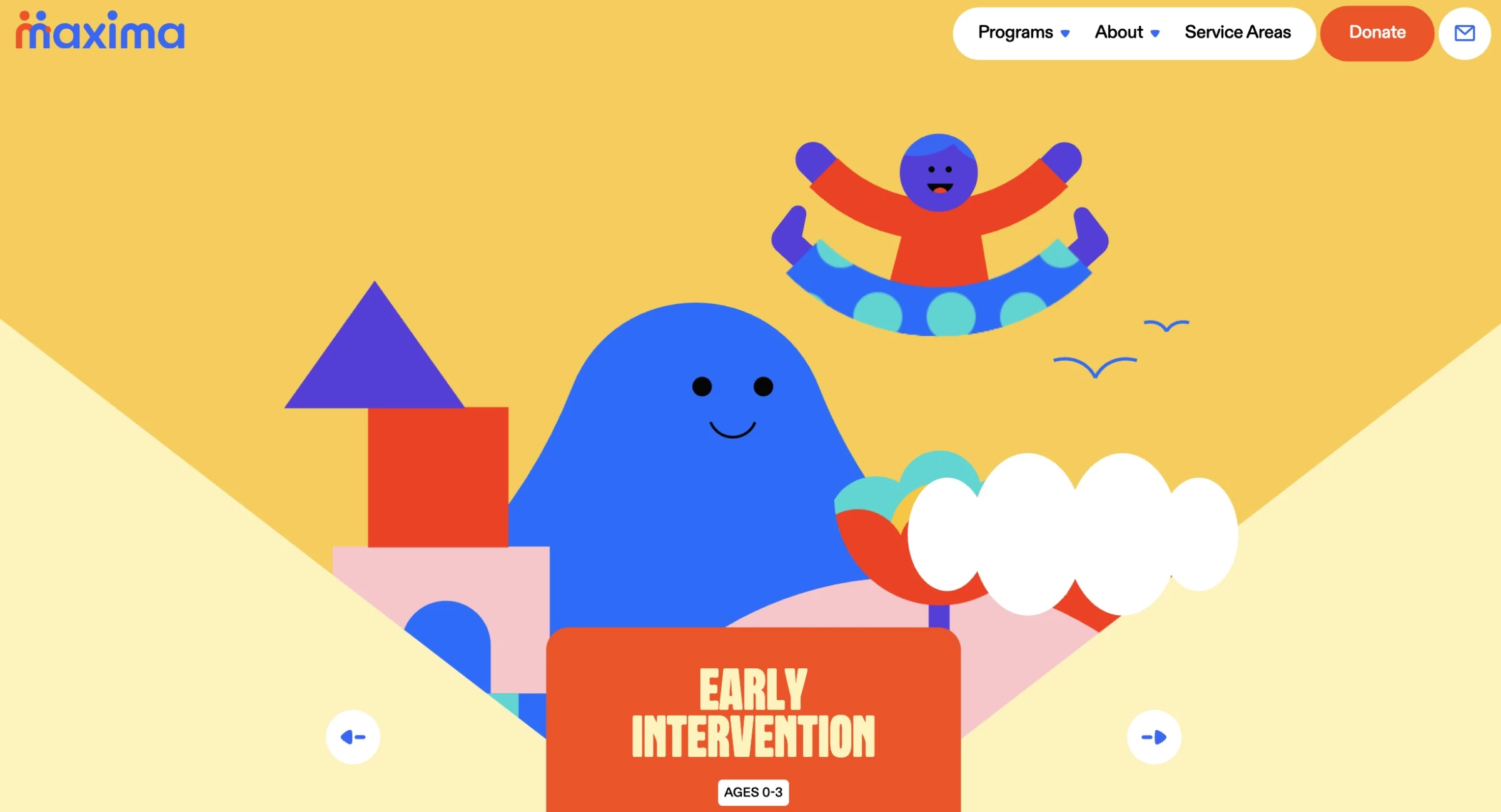
Maxima Therapy's site deliberately broke from the cold, clinical aesthetic typical of therapy and healthcare. Featured in GSAP's own official 2024 showreel, the site's most distinctive element is an interactive home hero carousel.
It’s a wheel users can grab and release to navigate through the programs, with each section containing Lottie SVG animations and a custom canvas for physics-based effects.
Scroll behavior is also synchronized with GSAP animation timelines.
Maxima Therapy’s site is a great example of how motion serves the content's purpose. The site was built for neurodivergent individuals and their caregivers, people who benefit from a design environment that feels alive, sensitive, and non-linear.
9. Kinetic Typography: The Element AI-Generated Design Still Can't Pull Off
Kinetic typography is where text moves as a primary storytelling element, like words that assemble on scroll or react to cursor position.
Website typography has become the primary carrier of personality for many sites in 2026 for a concrete reason. It's the most resistant element to generic AI output.
AI tools produce clean layouts and passable imagery quickly, but a genuinely distinctive type treatment, including the specific combination of typeface, scale, spacing, and motion, still requires taste and intent.
The functional rule: motion needs to earn its load cost. Type that moves to reveal information or reinforce brand rhythm earns its place.
How to Use Expressive Typography Without Sacrificing Readability
- Adjust letter-spacing and line-height at large sizes. At 80px+, default spacing is too tight.
- Keep entrance animations between 300-600ms. Shorter feels mechanical, while longer shifts from arrival to waiting.
- Test animated text at the midpoint. If it's illegible mid-transition, redesign the animation.
Where it works best: Creative agencies, fashion and lifestyle brands, portfolio sites, music and entertainment, food and beverage with a strong visual identity.
Where to avoid it: SaaS and dashboards where users are in task-completion mode. Type motion in productivity interfaces adds friction.
Real-World Example: Dillinger.tv Animated Typography That Doubles as Navigation
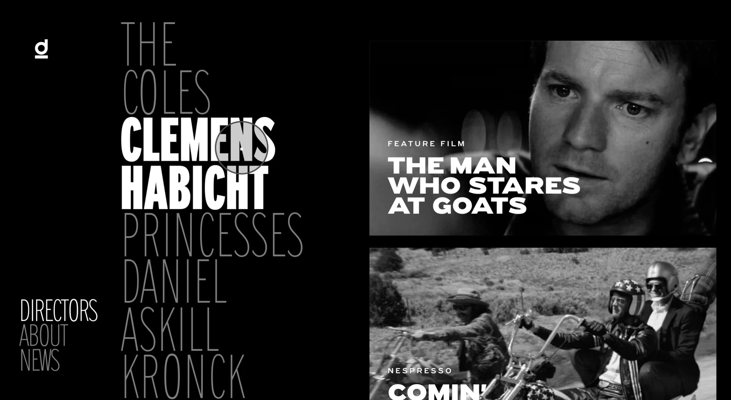
Dillinger.tv is a production and director representation site where kinetic typography is the primary navigation mechanism.
Director names, project titles, and category labels animate and shift in response to user interaction. It makes browsing feel closer to moving through a cinematic reel than browsing a standard directory.
The kinetic typography is applied to a functional interface requirement rather than simply aesthetics. It solves the problem of how to present a deep content library in a way that matches the visual sophistication of the work it represents.
AI Trends: Designing for the Audience That Never Sees Your Site
- Machine experience (MX): AI cites the best-structured site
- Agentic AI: From “Where do I click?” to “What do I need?”
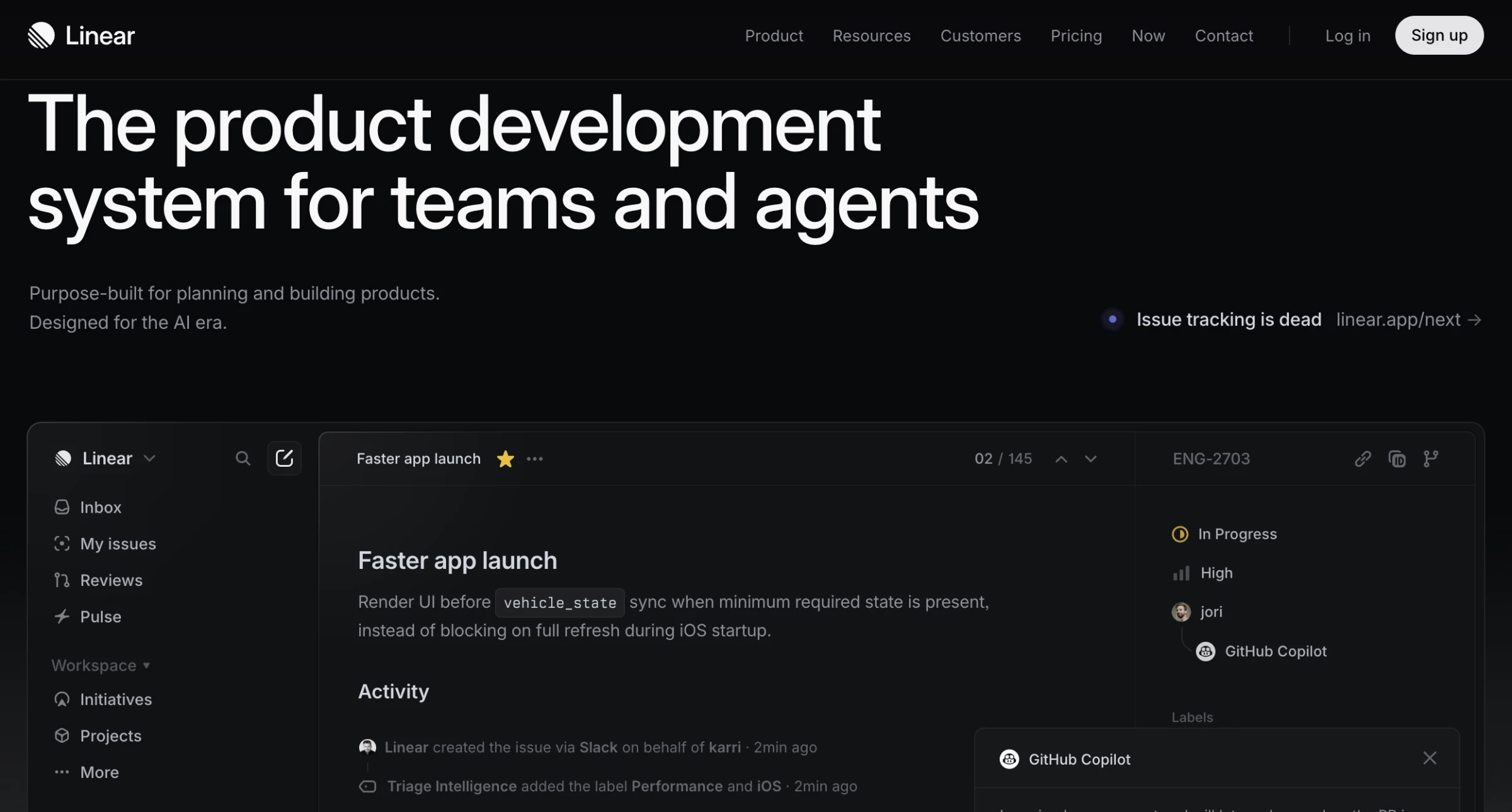
10. Machine Experience (MX): AI Cites the Best-Structured Site
Machine experience (MX) means designing your website so AI search agents behind ChatGPT, Perplexity, and Google’s AI Overviews can read, interpret, and cite your site.
When an AI Overview appears in Google results, organic CTR for the links below drops by more than 61%. The sites earning placement inside those Overviews share a common thread: clean information hierarchy, semantic HTML, predictable navigation, and clearly labeled sections.
For web designers, this means page layouts need to work for two audiences simultaneously: the human visitor and the crawler parsing the page without rendering it.
That means prioritizing heading structure and avoiding patterns where key information lives inside images, carousels, or JavaScript-dependent components that crawlers can't reliably access.
How To Make Your Website Readable to AI Systems
- Move important content out of JavaScript. Avoid patterns where key information lives inside images, carousels, or JavaScript-dependent components that crawlers can't reliably access.
- Add structured data markup (schema.org). FAQ schema, Article schema, and BreadcrumbList markup tell AI crawlers what type of content they're reading.
Where it matters most: Content marketing-heavy sites, SaaS companies with educational resource libraries, and agencies producing guides and reports.
Real-World Example: Healthline’s Question-Format Headings Made It an AI Citation Magnet
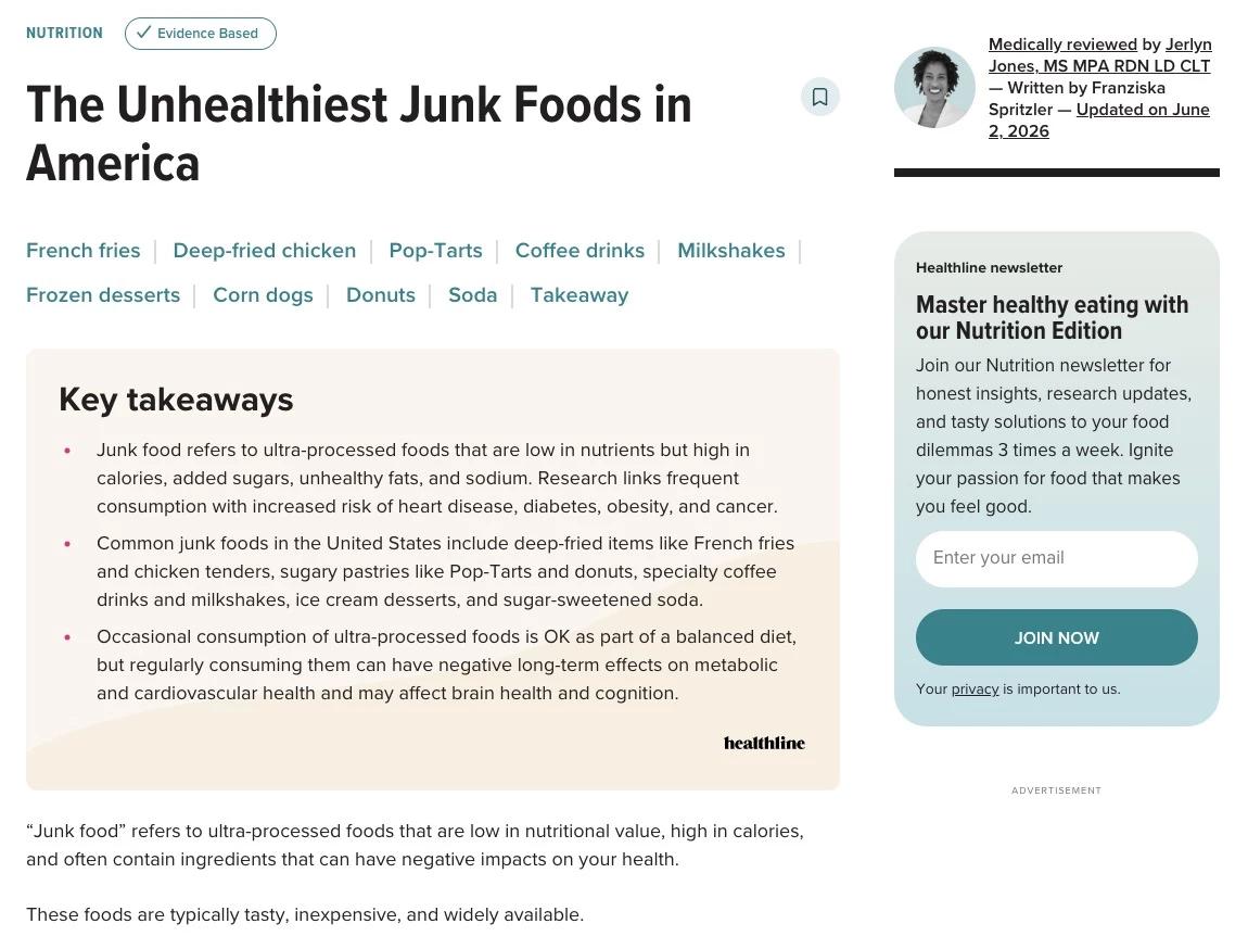
Healthline's editorial structure is a near-perfect MX. Every article opens with a definitional summary, uses H2s phrased as questions, and includes FAQ sections with direct Q&A pairs.
The result is that Healthline gets cited in AI health-related answers with disproportionate frequency relative to its traditional SERP position because the content is formatted for machine extraction as much as human reading.
Write like you're answering a specific question, because for an increasing share of your audience, that's literally what's happening.
11. Agentic AI: From "Where Do I Click?" to "What Do I Need?"
There's a meaningful difference between a chatbot and an agent. A chatbot answers questions, while an AI agent completes tasks, like a travel site that searches, compares, and books in a single conversation.
According to Gartner, traditional search engine volume could decline by 25% as users shift toward AI assistants and conversational interfaces.
In design, conversation-first interfaces require rethinking information architecture entirely. Navigation becomes less critical when an agent can surface anything on request.
Gabriel Shaoolian, CEO of Digital Silk, says that conversation-first interfaces work best when they guide users naturally through decisions:
“Conversation-based chatbots that mindfully answer key questions and usher users along their journey with a personal touch are key in improving the user experience and, naturally, result in higher conversion rates.”
How to Introduce Agentic AI Without Creating a Frustrating Experience
- Design for intent. The core UX shift is from "where do I click?" to "what do I need?" Build around a single prominent natural language input.
- State capabilities upfront. "Ask me to find, compare, or book" sets expectations and guides users.
- Design transparent fallback states. When the agent can't complete a task, it should hand off gracefully and not just throw an error.
Where it works best: E-commerce product discovery, travel search-to-book workflows, SaaS onboarding, healthcare scheduling, and anywhere multiple manual steps sit between user intent and task completion.
Where to avoid it: B2B enterprise procurement and legal or financial contexts where users need documented human decision points.
Real-World Example: Agentic.ai Removes the Navigation & Users Describe What They Need
Agentic.ai is a site designed to help users find AI tools that take action.
It’s a useful design reference for this trend as it translates the agentic concept into its own interface: natural language search, intent-based filtering, and category logic structured around what an AI agent does (browse the web, generate content, or manage workflows).
The site's architecture is itself a demonstration of agentic UI principles: users describe a goal and get matched to the relevant tools, without needing to know the category taxonomy in advance.
For designers trying to understand what an agentic interface feels like in practice, Agentic.ai is a clean reference point.
The Unglamorous UX Trends With the Biggest Payoff
- Performance-first design: The conversion-driven shift brands can’t ignore
- Gamification: It works best right where users almost quit
- Dark mode: 81.9% of users enable it when they can
- Accessibility design: 95.9% of homepages still fail, and most fixes are design decisions
12. Performance-First Design: The Conversion-Driven Shift Brands Can’t Ignore
For most of the 2020s, web design rewarded visual excess like autoplay video backgrounds or scroll-triggered animations. In 2026, a portion of the industry is pushing back.
Performance-first design treats load speed and responsiveness as core parts of the UX. For designers, that means simplifying interfaces, reducing motion, and compressing media as these are now costs that show up directly in conversion data.
A two-second delay in page load time raises bounce probability by 32%, according to Google, and Deloitte found that shaving just 0.1 seconds off mobile load time can lift retail conversions by up to 8%.
Designers are now expected to think not just about how a site looks, but how quickly it stabilizes, responds, and becomes usable.
How to Build Visually Ambitious Sites Without Destroying Performance
- Serve images in WebP or AVIF with responsive srcset. A full-resolution hero image on mobile is one of the most common and most fixable performance failures.
- Lazy load everything below the fold. Heavy components should load only when scrolled into view.
- Test on a mid-range Android on 4G, not a MacBook. A $200-300 device on 4G represents a significant portion of real-world users.
Where it works best: E-commerce, mobile-first audiences, international markets with lower device specs, and any site where Google ranking drives significant traffic.
Where to avoid it: Portfolio and agency sites, but performance and visual ambition aren't mutually exclusive.
Real-World Example: McMaster-Carr Looks Outdated But Outperforms Modern Websites
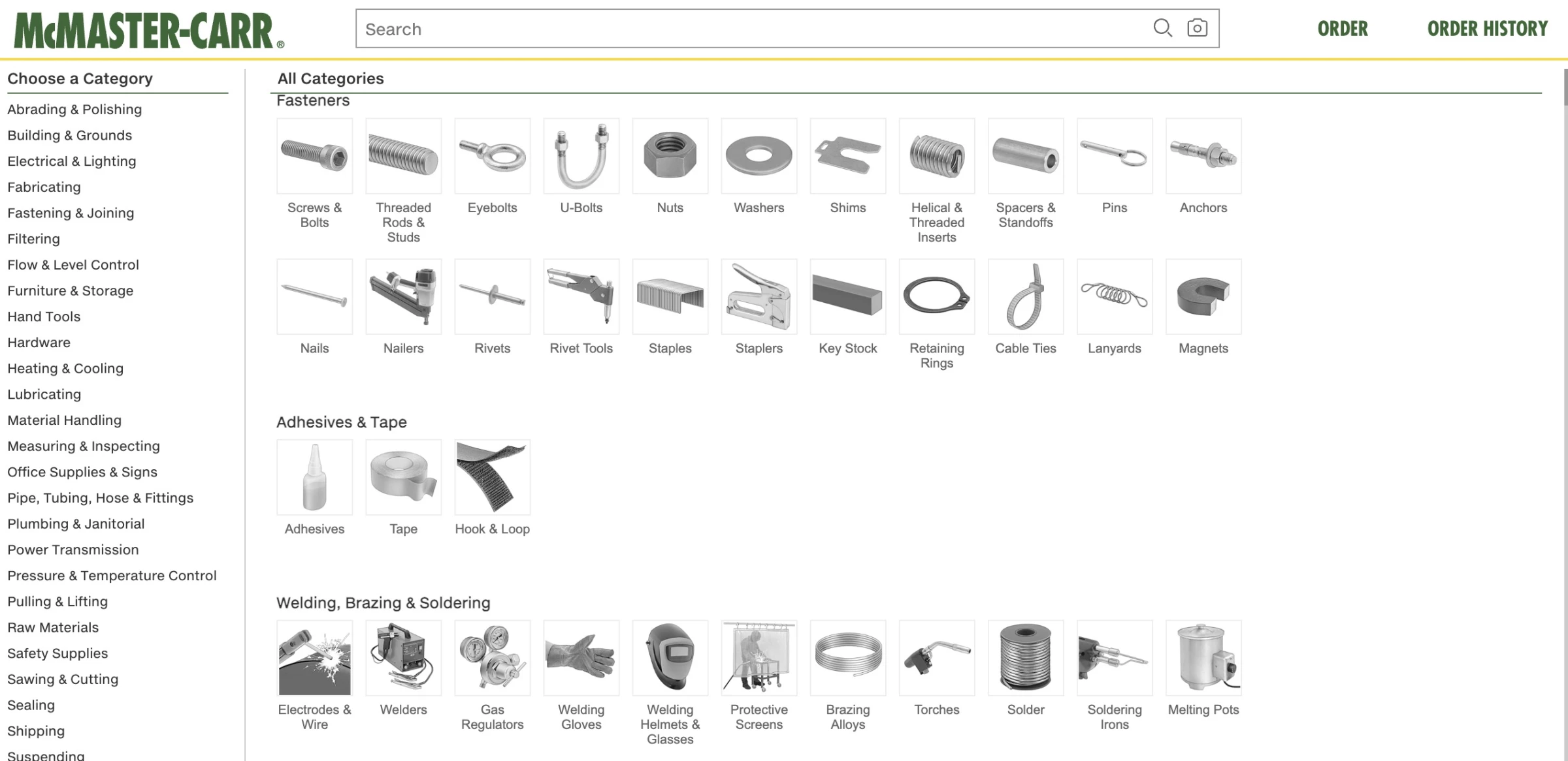
McMaster-Carr is a 100-year-old industrial supply company with a catalog of over 700,000 parts, and one of the fastest websites on the internet.
In 2024, a breakdown by developer Wes Bos of the techniques behind it went viral in 2024: prefetched HTML on hover, inlined critical CSS, server-side rendering, fixed-dimension images to prevent layout shift, aggressive CDN caching through Akamai, and service workers for browser-level caching.
The site became a benchmark in web performance discussions precisely because it looks like nobody cared about design and performs like a team cared about nothing else.
The practical lesson McMaster-Carr offers is uncomfortable for design-forward teams: every visual decision that adds load weight is a conversion hypothesis. If the experience doesn't improve outcomes enough to justify the load cost, it fails on design grounds.
13. Gamification: It Works Best Right Where Users Almost Quit
Gamification means integrating micro-reward mechanics into standard site flows. This doesn’t mean building games on your website. It can be a simple profile completion meter or a badge for reaching a milestone.
The highest-ROI implementation is almost always at existing drop-off points like the second step of a multi-step form or the moment after sign-up, before onboarding completion.
How to Add Gamification Without Making Your Site Feel Like a Mobile Game
- Progress bars in multi-step forms and checkouts. "Step 2 of 4" reduces abandonment by giving users a sense of proximity to completion.
- Profile completion meters. "Your profile is 60% complete" paired with a specific action prompt ("Add your job title to reach 80%").
- Streak indicators for habit-forming products. "You've visited 3 days in a row" creates loss aversion.
Where it works best: SaaS onboarding, ecommerce, education, fitness, and any product where return visits and habit formation are core.
Where to avoid it: B2B enterprise procurement, professional services, and legal or financial contexts where playful mechanics undermine credibility.
Real-World Example: Duolingo's Most Addictive UX Element Is Just One Carefully Timed Number
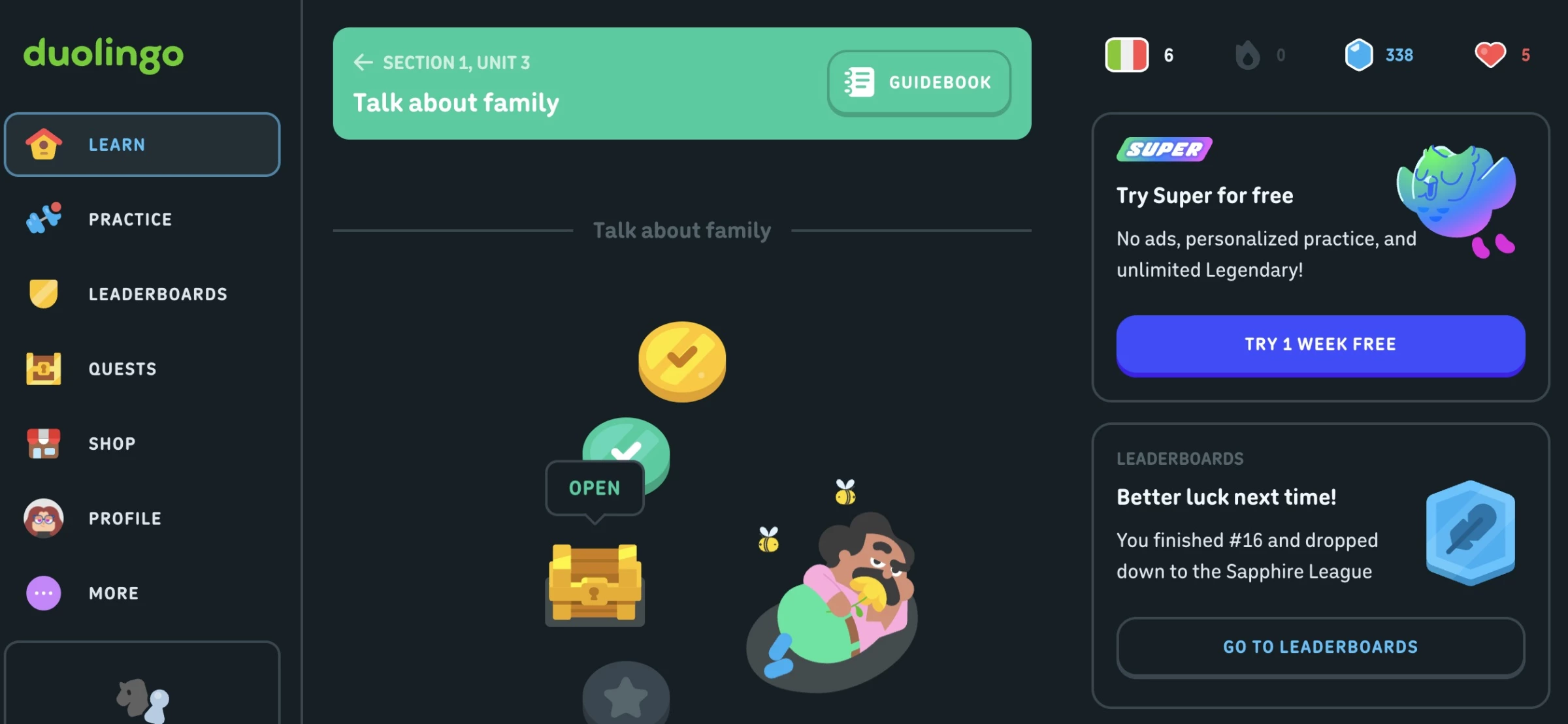
Duolingo's streak system is the most studied gamification mechanic in consumer software.
The daily streak counter, which is visible on every screen, reinforced with push notifications when it's at risk, and celebrated with animations when it advances, drives a return-visit rate that makes Duolingo one of the stickiest consumer apps in existence.
What's instructive isn't the complexity but the simplicity: a number that increments, surfaced at the right moment, with the right amount of ceremony. A single well-placed progress mechanic outperforms a hundred general engagement features.
14. Dark Mode: 81.9% of Users Enable It When They Can
Dark mode is a system preference, not a feature. Users set it for eye strain reduction, battery savings, or night-time use, and when a site ignores that and forces a bright interface, it creates immediate friction for users.
In an Android Authority survey of more than 2,500 users, 81.9% said they used dark mode on their phones whenever possible.
As Caleb Bradley, CEO and Founder of Bighorn Web Solutions, explains, designing for user preferences should happen from the start, especially on mobile:
“With the majority of web traffic coming from mobile devices, a mobile-first approach is essential. We design with mobile users in mind from the outset, ensuring seamless experiences across all devices.”
How to Build Dark Mode Without Designing Your Site Twice
- Use CSS custom properties for all color values. One block of CSS changes every color simultaneously.
- Review images and icons separately. Photography usually works on dark backgrounds. Icons designed for light mode often don't.
- Replace shadows with borders or glows for elevation. Drop shadows are invisible on dark backgrounds.
Where it works best: SaaS, developer tools, media and content platforms, productivity software, and products with significant evening or extended-session usage.
Where to avoid it: E-commerce and consumer lifestyle brands with audiences that skew toward short, casual browsing sessions.
Real-World Example: Webflow University Matches Dark Mode to How Its Users Learn
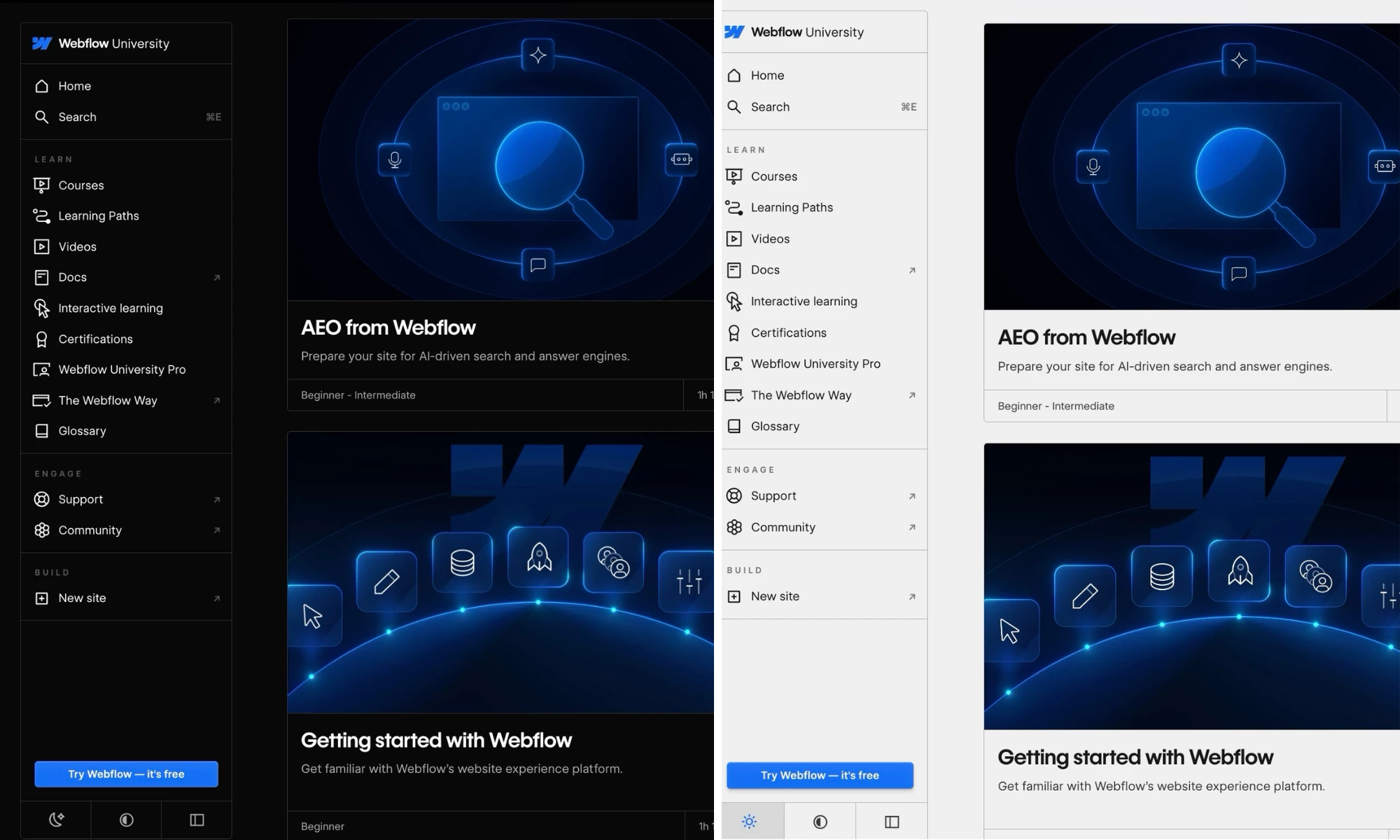
Webflow University demonstrates dark mode implemented for the right audience and context. The platform is used by designers and developers who spend extended sessions learning.
The dark mode is specifically designed for on-screen learning environments, and the interface transitions between course content, code examples, and video players without jarring brightness inconsistencies.
Webflow University demonstrates the logic of matching dark mode execution to user context. It knows its users are in sustained learning sessions and often in low-light environments.
15. Accessibility Design: 95.9% of Homepages Still Fail and Most Fixes Are Design Decisions

Accessibility is a user expectation and a legal requirement in a growing number of jurisdictions, and a direct revenue factor.
Research by the University of Bristol estimates the spending power of disabled UK households at £446 billion annually. However, WebAIM’s 2026 accessibility report found that 95.9% of home pages still had detectable WCAG 2 failures.
Web accessibility should be treated as a design decision made up front. Color contrast, heading hierarchy, form labels, focus states, and alt text are design choices. By the time they become a developer's problem, the design system generating them is already in production.
How to Design Accessible Sites Without Restricting Creative Direction
- Check color contrast before finalizing any palette. Normal text needs a minimum 4.5:1 ratio (WCAG AA).
- Label every form field explicitly. Placeholder text is not a label, as it disappears on input. Every field needs a persistent <label> element.
- Add a skip navigation link. "Skip to main content" as the first element on each page is invisible to mouse users, takes ten minutes to implement, and is one of the highest-impact accessibility improvements available.
Applies to: Every site, as a baseline for any public-facing web property in 2026. ROI is highest in e-commerce, healthcare, government, and products with global audiences.
Real-World Example: BBC’s Accessibility Scales Across Millions of Users and Decades of Content
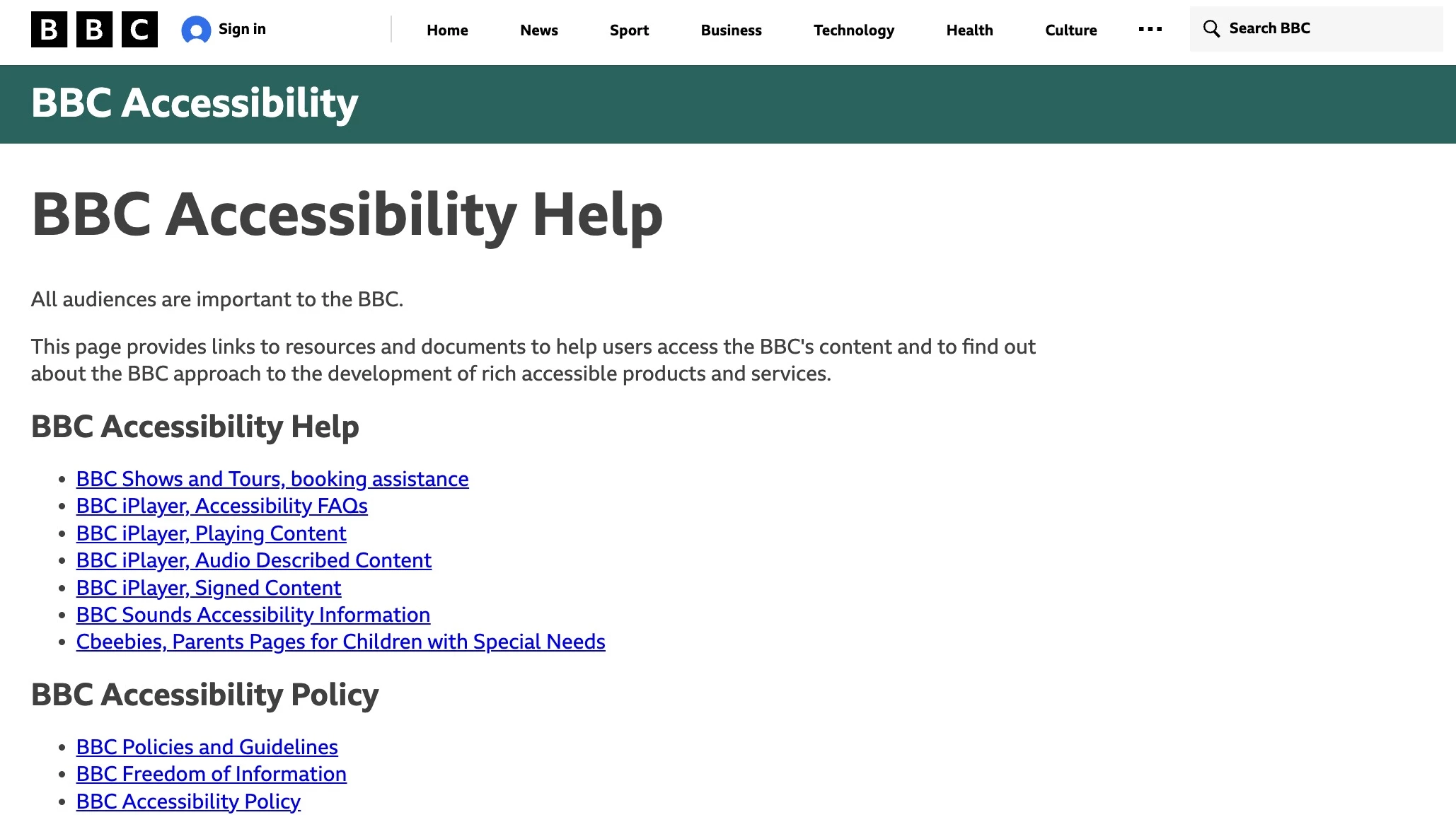
Accessibility at the BBC is a content and publishing standard, hence why it’s one of the most comprehensive public commitments to inclusive design by any major media organization.
The site supports screen readers, keyboard navigation, captions across video content, and text resize without layout breakdown.
Its accessibility standards are implemented across a range of content types, including news articles, live video, audio programs, interactive features, and data visualizations.
For any team managing a content-heavy website, the BBC's public guidelines are a useful accessibility reference, and the site itself shows what the standards look like across decades of content and an audience of hundreds of millions.
Which Website Design Trends Should You Prioritize?
The right trends for you depend on who you're designing for, what they need to feel, and what you need them to do. Here's how to think through it.
By Industry
Your industry sets the boundaries for what's appropriate, expected, and effective. A trend that converts in e-commerce can erode trust in healthcare. Context is the starting point.
1. E-commerce: Where 0.1 Seconds of Load Time Can Outperform a Full Redesign
Performance should come first, always.
Add agentic AI for product discovery, 3D visualization where applicable, gamification for cart completion and loyalty, and mobile-first layouts for thumb navigation.
2. SaaS and Tech: Where Dark Mode and Bento Grid Are Now Baseline Expectations
Bento grids work well for feature showcases, while dark mode is now a baseline expectation.
Use agentic onboarding to shorten the gap between sign-up and first value, and add glassmorphism or neumorphism to add depth to the dashboard.
3. Healthcare and Professional Services: The Designs That Build Trust vs. Break It
Keep things restrained. Earth tones, accessibility, and trust signals should be your starting point.
Avoid neobrutalism, aggressive motion, liquid layouts, and dopamine palettes, anything that feels overly experimental.
4. Lifestyle, Fashion, and Consumer Brands: Where Expressive Design Has the Most Room
This is where expressive design performs best. Dopamine palettes, bold typography, liquid layouts, and even neobrutalism can work if the brand has the confidence to carry it.
Gamification, 3D visuals, and GSAP-heavy campaign pages fit naturally here.
5. Agency and Portfolio Sites: Maximum Experimentation, One Non-Negotiable Constraint
These have the highest tolerance for experimentation.
Neobrutalism, WebGL, kinetic type, GSAP scroll effects, and unconventional navigation are all fair game.
The only real constraint is performance. If the site struggles to load during a client pitch, the design loses credibility instantly.
By Intended Audience
Industry narrows the field, and the audience tells you what will land:
- Design-literate audiences, especially in creative, tech, and gaming spaces, tend to reward craft and experimentation. Neobrutalism, liquid design, GSAP interactions, and glassmorphism land well here.
- Broad consumer audiences respond better to fast, emotionally engaging designs. Prioritize performance, color psychology, and gamification over visual complexity.
- Professional and enterprise audiences need trust first. That means clarity, restraint, accessibility, and speed. Mute palettes, strong semantic structure, and content optimization are usually the best design decisions.
- Younger audiences have high stimulus tolerance. Neobrutalism, dopamine design, kinetic typography, and mobile-first patterns have high appeal. Authenticity matters, and overly polished design reads as untrustworthy.
- Millennials and Gen X are design-literate and efficiency-oriented. Respond to well-executed glassmorphism, bento grid, and GSAP. This is the core audience for gamification and retention-focused products.
- Older audiences prioritize legibility, contrast, and predictable navigation above all else. Dark mode, accessibility, and performance are baseline features here.
What’s Losing Momentum in 2026
Here are some modern website design trends that were good ideas on paper but have had enough time to prove otherwise:
1. AI-Generated Illustrations: The Credibility Problem Users Notice Instantly
Generic AI visuals can be identified easily at a glance with their flat lighting, uncanny proportions, and uniform soft-glow everything.
Users notice it, and many read it as a sign that the brand did not put real thought into its visual identity or branding.
2. Experimental Navigation for Its Own Sake: High Cost, Minimal UX Value
This is also losing favor when it serves no real purpose.
It adds load weight, causes accessibility issues, and delivers no meaningful user value when it isn't serving a specific narrative purpose.
3. Hero Stock Photos: Generic Faces Equals Generic Brands

Handshake shots, the smiling-at-laptop pose, or the staged meeting room have been parodied long enough that they’ve become invisible at best and trust-undermining at worst.
In many cases, a strong typographic layout beats a stock image almost every time and costs less to license.
4. Retrofuturism: When Y2K Nostalgia Becomes Template Thinking
Retrofuturism and Y2K aesthetics were genuinely differentiated signals in 2023-2024, when chrome gradients, pixel art, and lo-fi textures marked brands willing to take a clear visual position.
Saturation has flattened that signal, however. The same treatments now read as a template category rather than a considered aesthetic choice.
The look retains real credibility for entertainment, gaming, and music brands with an authentic connection to the era. Everywhere else, it signals mere trend-following.
Web Design Trends 2026: Final Words
In 2026, AI is changing who visits your site and how; performance is now a conversion metric, and distinctiveness is harder to achieve when tools can generate polished interfaces in minutes.
These are all pressures shaping current web design trends, and the ones worth prioritizing depend on your audience, your industry, and what problem you're solving.
The best-designed sites in 2026 will be the ones that feel like they were made for a specific person.
Our team ranks agencies worldwide to help you find a qualified partner. Visit our Agency Directory for the Top Web Development Companies, as well as:
- Top Backend Development Companies
- AI Web Design Agencies
- Top Front End Web Development Companies
- Top UI/UX Design Agencies
- Top Web Development Companies in Chicago
Our design experts also recognize the most innovative design projects across the globe. Visit our Awards section to see the best in web design.
Web Design Trends 2026 FAQs
1. What is the most important web design trend in 2026?
Performance. Every conversion metric, user experience signal, and search ranking factor points in the same direction: faster sites win.
The aesthetic trends matter for differentiation, but a beautiful site that loads in eight seconds loses to an average-looking site that loads in two.
2. What is sustainable web design, and does it matter in 2026?
Sustainable web design is the practice of building sites that minimize energy use.
In 2026, it mostly overlaps with performance-first decisions teams are already making. Leaner code, optimized images, and semantic HTML reduce both page weight and energy cost.
For most teams, treating performance as a constraint from the start makes sustainability a natural byproduct.
3. Are gradients still on-trend in 2026?
Yes, but context has shifted. Dopamine design palettes use high-saturation gradients as a core tool, and they work well for lifestyle, beauty, and consumer-facing brands.
The purple-to-magenta gradient that defined the "AI startup aesthetic" of 2023–2024 now reads as generic. It signals template thinking more than design intent.
4. How is AI changing web design in 2026?
In two directions simultaneously:
- At the interface level, AI is shifting from chatbots that answer questions to agents that complete multi-step tasks. That’s changing the design challenge from visual layout to conversation architecture.
- At the infrastructure level, AI search agents are replacing human browsing for informational queries, making machine experience (MX) optimization increasingly consequential for organic visibility.
5. What current web design trends work best for e-commerce?
Performance-first design as load time directly affects cart completion, agentic AI for product discovery, gamification for loyalty and cart mechanics, 3D product visualization where appropriate, and mobile-first layouts built for thumb navigation.
Dopamine color directions work for lifestyle and beauty ecommerce; Cloud Dancer palettes suit premium or professional product positioning.
6. How do you follow web design trends without making your site feel dated in two years?
Separate trend decisions by lifespan. Performance, accessibility, and semantic structure are durable. They improve over time as standards evolve and carry two-to-five-year relevance without needing to be revisited.
Visual styles like neobrutalism and dopamine design are medium-term signals, typically holding coherence for one to three years before they begin to read as dated.
Specific aesthetic treatments can shift quickly and should be treated as a surface layer that can be updated independently of the structural decisions underneath.