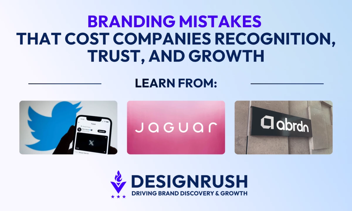
Most branding mistakes and fails start when a company removes the cues people use to recognize it, weakens the promise that made it matter, or asks branding to solve a product or positioning problem that branding alone cannot fix.
The examples below show 10 common branding mistakes behind famous brand fails.
For each one, we break down what the mistake actually is, what went wrong, and what a stronger version looks like in practice.
Branding Fails: Key Findings
- By bringing HBO back in 2025, Warner Bros. Discovery effectively confirmed that dropping the strongest name in HBO Max made the service feel broader in theory but weaker in practice.
- Jaguar’s 2024 rebrand drew backlash because the campaign asked people to buy into a new identity before the product gave them enough proof to believe it.
- Victoria’s Secret tried to reframe the brand through the VS Collective, but the return of its fashion show in 2024 showed how incomplete that perception reset still was.
Why Branding Mistakes Can Destroy Up to 91% of a Brand’s Value
Branding mistakes can destroy real business value when a company weakens recognition, trust, or category meaning that took years to build.
They show how fast a brand can lose momentum when it removes familiar cues, muddies its promise, or makes customers work harder to understand what the brand stands for.
For example, in X’s case, Brand Finance said the brand fell from $5.7 billion in 2022 to $498 million in 2025, a 91% decline from its peak, which it linked to the rebrand alongside broader reputational and advertiser issues.
Now that is the real cost of getting branding wrong. A weak branding can erode brand equity, make growth more expensive, and force the business to spend more just to rebuild clarity it used to own.
Every example in this piece points to the same lesson: brands fail when they trade recognition, clarity, or credibility for novelty.
Brock Smith, Partner at Oculus Studios, makes the same point from a rebranding perspective, arguing that while market trends may shift quickly, a strong brand foundation should remain the anchor.
As he puts it, “Remember, trends are fleeting, but a solid brand foundation is timeless. Always prioritize what makes your brand special and use that as your compass in the ever-evolving market landscape. Because at the end of the day, authenticity never goes out of style.”
1. X Removed the Assets People Used To Recognize Twitter
Social Media and Platform Branding

Twitter had something most brands spend decades trying to build: a distinctive name, a bird icon people recognized instantly, and product language that entered everyday speech.
If that wasn’t enough, Oxford dictionaries recorded tweet as a verb meaning to send a message on the social media service previously called Twitter.
The Cambridge Dictionary also has an entry for tweet as a verb. Very few brands reach that level of linguistic adoption.
The rebranding removed the memory shortcuts that helped people identify, talk about, and mentally retrieve the brand. When a company replaces a famous name, a famous icon, and a famous product vocabulary all at once, it is forcing the market to relearn the brand from scratch.
— Elon Musk (@elonmusk) July 23, 2023
What X did wrong:
- Dropped a globally recognized brand name that had become an everyday language.
- Abandoned a word people already used as a verb.
- Replaced a distinctive bird icon and product vocabulary with a far more generic symbol.
- Forced users to relearn the brand instead of building on equity that already existed.
Find out why 55% of Americans still call it Twitter.
How Mastercard Simplified Without Losing Recognition
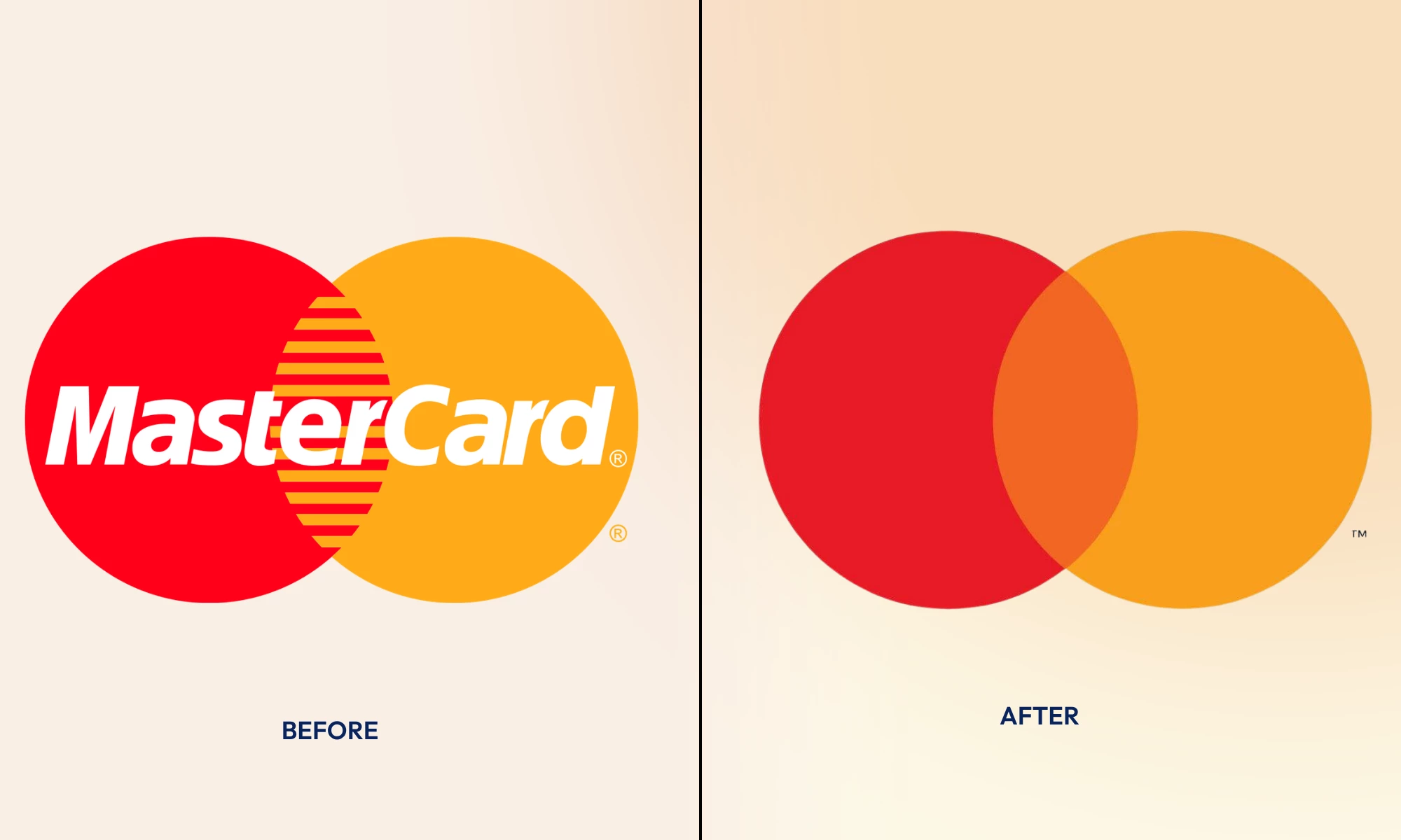
Mastercard is a strong counterexample to X because it removed its name after the symbol could already do the recognition work on its own.
When the company dropped the word Mastercard from its brand mark in select contexts in 2019, it said more than 80% of people spontaneously recognized the Mastercard symbol without the wordmark.
What Mastercard did right:
- Kept its most recognizable visual asset, the interlocking red and yellow circles.
- Dropped the wordmark only after the symbol had enough standalone recognition to carry the brand.
- Simplified the identity without asking customers to learn a new name, icon, or meaning.
- Made the brand more flexible for digital and physical use while protecting continuity.
What right looks like is simple: do not remove an asset because leadership is bored with it. Remove it only when another asset already does the same recognition job just as well.
2. Max Stripped HBO Out of the Name and Weakened the Brand Signal
Streaming and Entertainment Branding
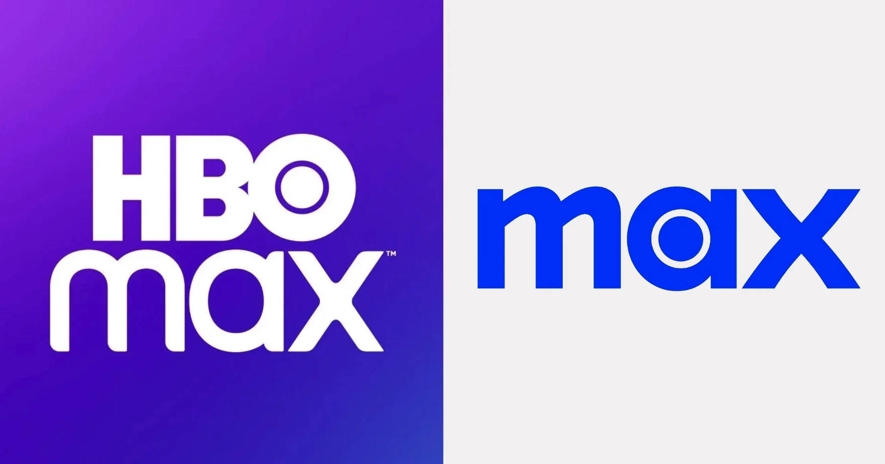
When Warner Bros. Discovery renamed HBO Max as Max in 2023, the logic was expansion. The company wanted a broader entertainment brand that could carry more than prestige drama.
The problem was that HBO was the strongest trust signal in the whole name.
In May 2025, Warner Bros. Discovery announced it was bringing the HBO name back, which tells you the market had not treated the subtraction as an upgrade.
What Warner Bros. Discovery did wrong:
- Removed the part of the name that carried the clearest premium and prestige signal.
- Treated brand breadth as more valuable than brand trust.
- Made the service feel more generic at the exact moment streaming competition demanded stronger distinction.
- Gave up a name that still had far more meaning than the replacement.
How Disney+ Expanded Without Dropping Its Strongest Brand Asset
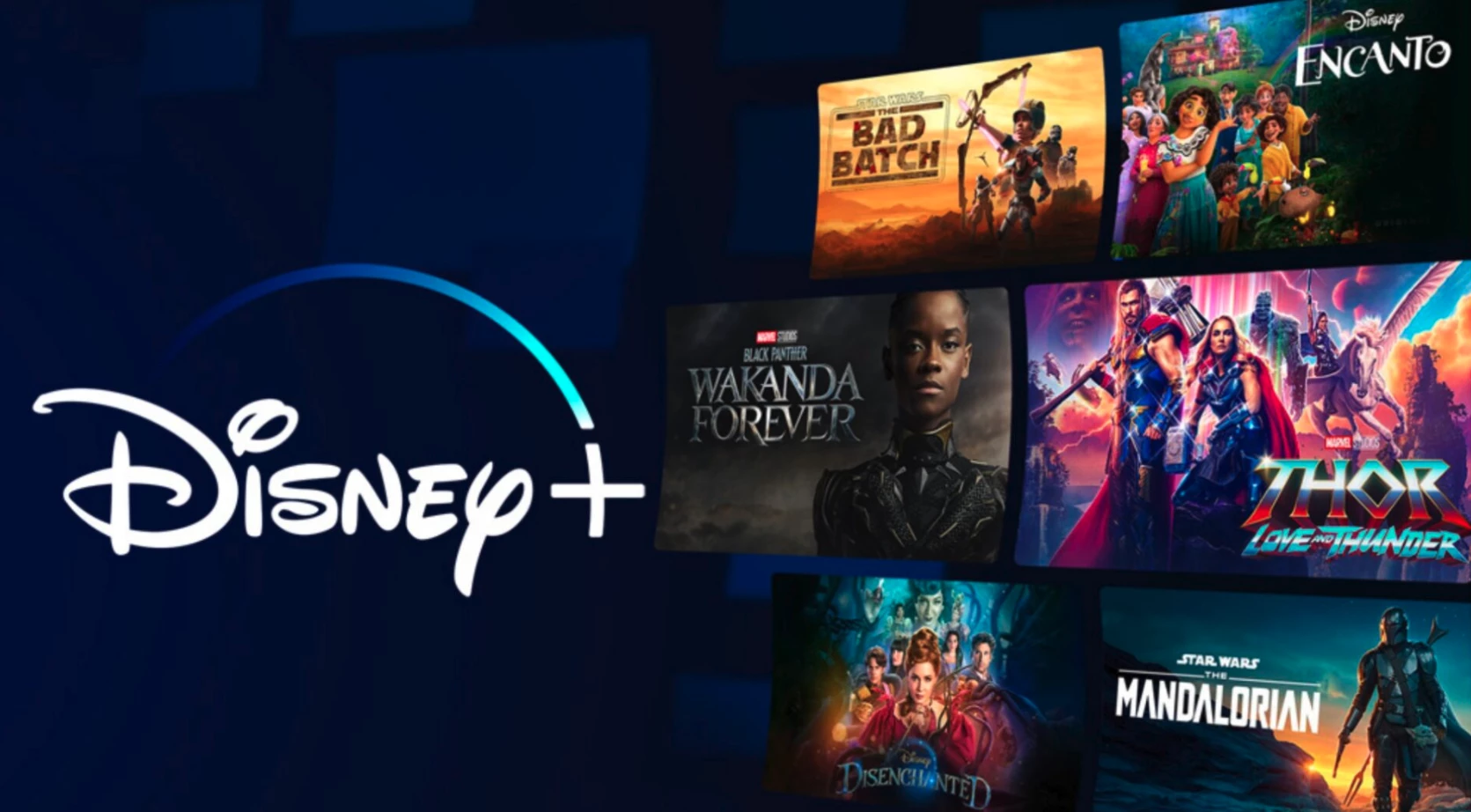
Disney+ did the opposite of Max. Instead of subtracting the strongest part of the name, Disney made Disney the anchor and then expanded the ecosystem around it with Pixar, Marvel, Star Wars, and National Geographic.
The brand stretch worked because the parent name still communicated exactly what kind of entertainment universe people were entering.
What Disney+ did right:
- Kept Disney in the name instead of removing the strongest trust signal.
- Expanded the offer around major franchises without weakening the core brand.
- Used the master brand to make a broader content ecosystem feel coherent and familiar.
- Built a larger product while keeping the asset that helped drive instant adoption.
3. Cracker Barrel Modernized by Pulling Back Too Far on Heritage
Restaurant and Heritage Branding
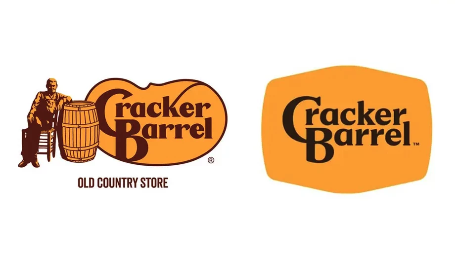
Cracker Barrel’s 2025 logo change became a branding problem because it tampered with the heritage cues people associated with the brand’s identity.
The company eventually reversed course, stating, “Our new logo is going away and our ‘Old Timer’ will remain.” That is the brand itself admitting that the redesign cut away too much of what customers valued.
This is a common mistake in heritage brands. Leadership wants to look more current, so the redesign smooths out texture, reduces character, and removes the very elements that made the brand feel rooted and recognizable. The result is often not modern heritage but generic with a backstory.
What Cracker Barrel did wrong:
- Changed a heritage identity that customers were still emotionally attached to.
- Pulled back a character asset that helped the brand feel rooted, familiar, and unmistakable.
- Treated heritage like visual clutter instead of brand equity.
- Modernized too aggressively for a brand people value partly because it feels traditional.
How Burberry Modernized by Reclaiming the Knight Logo
View this post on Instagram
Burberry is a much better model than Cracker Barrel because it did not treat heritage like something embarrassing that needed to be cleaned away.
The company has explicitly described the Equestrian Knight Design, or EKD, as one of its most enduring brand codes, and its recent brand direction has pushed harder on instantly identifiable assets such as the Heritage Trench, Burberry Check, and EKD.
What Burberry did right:
- Modernized the brand by reinforcing heritage codes instead of flattening them.
- Brought back and elevated recognizable assets like the Equestrian Knight Design.
- Treated heritage as a living part of the brand system, not as something outdated to remove.
- Updated the execution while keeping visible links to the brand’s history and luxury positioning.
4. Jaguar Repositioned the Brand Before the Product Could Prove It
Luxury Automotive Branding
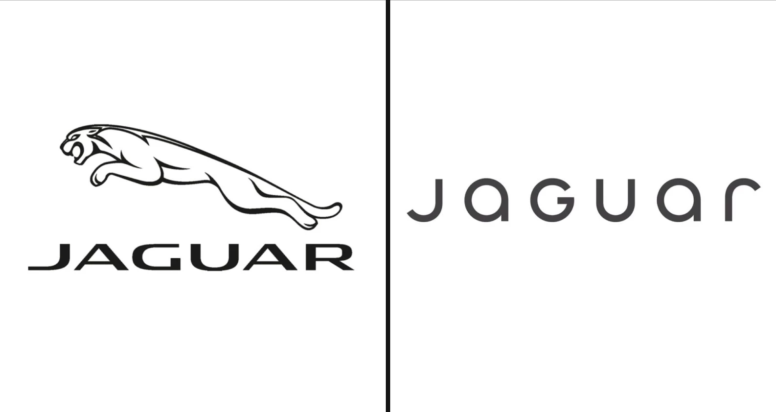
Jaguar’s 2024 rebrand drew criticism because the launch presented a bold new creative posture before the product story felt concrete enough to support it.
The early campaign emphasized abstract art direction, colorful fashion imagery, and the “Copy Nothing” line, but the launch material that drew the backlash featured no car, which made people question what exactly the brand was now promising.
View this post on Instagram
This is a high-risk branding mistake. Repositioning works when the new identity amplifies a product truth people can already see, test, or believe.
It fails when the identity tries to lead far ahead of proof and risks the audience reading the brand as evasive.
What Jaguar did wrong:
- Pushed an abstract new brand world before the product story felt tangible enough to support it.
- Launched a high-concept campaign that gave people styling cues but little concrete proof.
- Asked the audience to buy into the repositioning before they could clearly see what Jaguar now stood for in product terms.
- Created distance from the brand’s core object, the car, at the exact moment reassurance was needed.
- Not Conveying a Concise Brand Message
How Bentley Evolved a Luxury Brand Without Losing Its Identity
View this post on Instagram
Bentley is the clean how to do it right answer for Jaguar because it evolved a heritage emblem without acting like the past was a problem.
In 2025, Bentley unveiled a new Winged B and described it as only the fifth iteration in 106 years.
Bentley modernized the execution while keeping the core asset unmistakably Bentley. The redesign signaled forward movement, but it still looked like it belonged to the same marque.
That is exactly what a legacy premium brand needs from a rebrand.
What Bentley did right:
- Evolved the emblem with restraint instead of treating rebranding like a reset.
- Kept the Winged B recognizable while refining it for a new era.
- Framed the redesign as continuity and not rupture.
- Signaled future ambition without breaking the visual lineage of the brand.
5. HSBC Failed To Localize the Message Beyond Translation
Global Banking Branding
The HSBC example is still widely cited in localization circles because it captures a basic truth which is a line that works in English can collapse when moved into another language without transcreation.
In widely repeated accounts of the case, “Assume Nothing” was rendered in some markets as “Do Nothing,” which flipped the meaning from open-mindedness to passivity.
A message can be technically translated and still fail because its tone, implication, or cultural framing does not survive the move.
What HSBC did wrong:
- Treated a slogan as transferable when its meaning depended heavily on nuance.
- Relied on translation where the campaign needed transcreation and local meaning checks.
- Failed to test whether the message would survive culturally and linguistically across markets.
- Allowed the brand idea to flip from a strength into the opposite of what it meant to say.
How Coca-Cola Localized a Global Idea Without Breaking It
View this post on Instagram
Coca-Cola’s Share a Coke is a better answer than HSBC because it shows what localization looks like when the core idea stays intact but the execution adapts to people’s local identities and habits.
In its 2025 relaunch, Coca-Cola said the campaign would roll out across 120+ countries, with personalization features built into the experience.
What Coca-Cola did right:
- Kept the core campaign idea intact while adapting the execution for local markets.
- Built localization around human relevance, personalization, and participation rather than literal translation.
- Let the same brand idea travel globally without forcing every market into identical wording or execution.
- Extended the campaign with digital tools that made the concept more usable and shareable across markets.
6. Johnson & Johnson Updated a Heritage Identity at the Cost of Familiarity
@brandbosshq Johnson & Johnson’s new logo is a trainwreck. #business#marketing#advertising#branding#fail♬ original sound - BrandBossHQ
Johnson & Johnson’s 2023 identity update is a useful branding lesson because it shows how easily a heritage mark can lose some of its emotional texture in the name of modernization.
The company said the new identity “builds on” its legacy while modernizing the logo and placing more equity around the shorter “J&J” form.
A brand with a long heritage often carries emotional value in the very shape of its mark. When a handwritten or idiosyncratic identity becomes cleaner, flatter, or more corporate, some of the warmth and memory can go with it.
That is especially true if you own a brand whose historic form helped signal care, familiarity, and continuity.
In other words, if you modernize your brand without preserving enough character, it may become more efficient but less human.
What Johnson & Johnson did wrong:
- Replaced a long-standing handwritten identity with a cleaner corporate mark.
- Reduced some of the warmth and continuity people associated with the historic logo.
- Prioritized modernization over the emotional value carried in the legacy form.
- Moved a heritage brand closer to generic healthcare aesthetics.
How Campbell’s Updated a Heritage Logo Without Losing What People Recognized
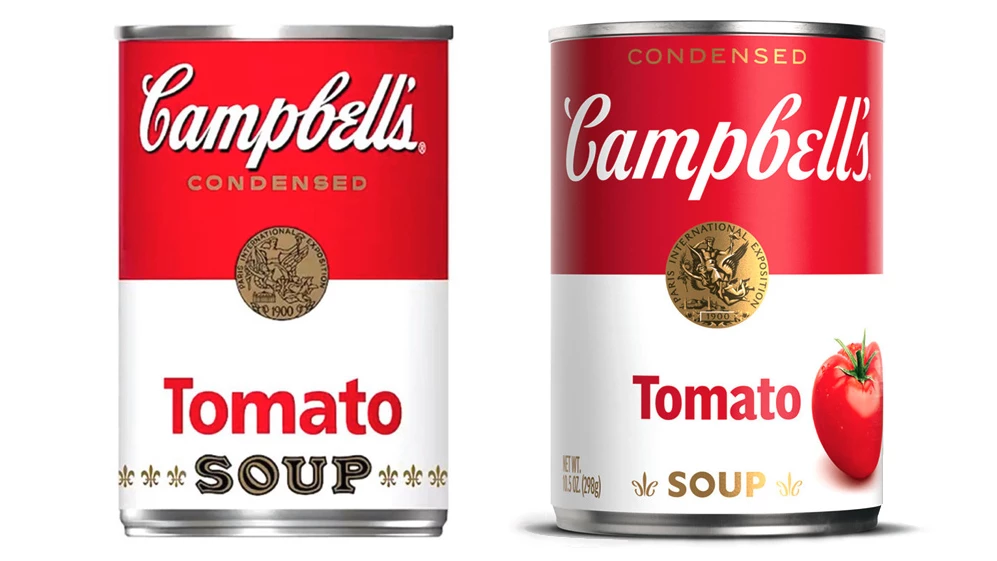
Campbell’s is a better counterexample for Johnson & Johnson because it modernized a historic identity without walking away from the familiar brand cues.
In its 2021 redesign, Campbell’s kept the iconic red-and-white can, kept the logo rooted in founder Joseph Campbell’s signature, and updated the lettering to improve legibility and flexibility across retail and digital environments.
What Campbell’s did right:
- Kept the core visual assets people already associated with the brand, especially the red-and-white can.
- Modernized the logo from within the heritage, instead of replacing it with a generic new mark. The redesign stayed based on Joseph Campbell’s signature.
- Improved legibility and digital usability without stripping out the brand’s character.
- Positioned it as a way to contemporize the brand for new generations while preserving what made it recognizable.
7. abrdn Turned Its Name Into an Obstacle Instead of an Asset
Asset Management Branding
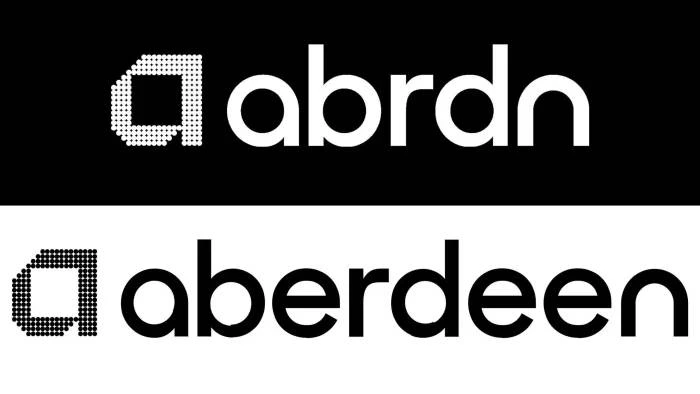
abrdn is one of the clearest examples of a brand making itself harder to process in the name of looking more current.
In 2021 Standard Life Aberdeen dropped vowels to become abrdn, a move that was widely mocked, and in 2025 the company did a revert to “aberdeen” as its principal trading name.
This is clear case of identity obfuscation that caused a cognitive friction. A name should help people say it, remember it, type it, and trust it. When a brand makes the name look clever at the expense of clarity, it creates unnecessary work for the audience.
This mistake shows up a lot in naming trends that chase minimalism, startup cool, or category sameness. The result can look contemporary for a moment, but it often weakens distinctiveness and usability.
What abrdn did wrong:
- Removed clarity in pursuit of modernity.
- Turned the name into something people had to decode instead of instantly process.
- Confused distinctiveness with awkwardness.
- Created friction in pronunciation, recall, and credibility for no real customer benefit.
How Dunkin’ Shortened Its Name Without Making It Harder To Recognize
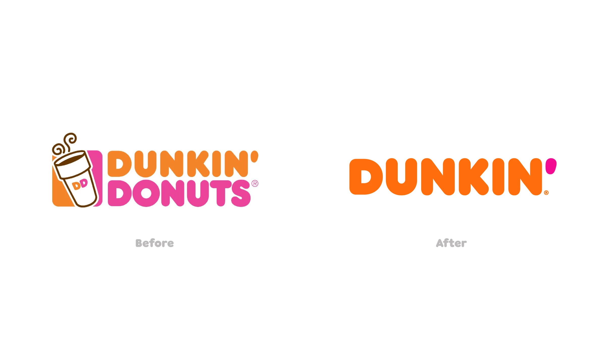
Dunkin’ is the stronger counterexample because it simplified the name while keeping it familiar, pronounceable, and easy to remember.
When Dunkin’ Donuts became Dunkin’ in 2018, the company said the change reflected its growing focus on beverages while still retaining its familiar pink and orange colors and iconic font.
What Dunkin’ did right:
Shortened the name without making people guess how to say it.
- Kept the parts of the identity customers already recognized, including the pink and orange palette and long-running font.
- Made the rename reflect a real business shift toward beverages instead of chasing modernity for its own sake.
- Built on a nickname people were already using, since the brand had long leaned into “America Runs on Dunkin’.”
YouGov reported that after the announcement, Dunkin’s Buzz score rose from 12 to 21, which suggests the rename generated positive public attention rather than confusion or ridicule.
8. Victoria’s Secret Tried To Rebrand Around Values It Had Not Fully Earned
Fashion and Retail Branding
View this post on Instagram
When Victoria’s Secret launched the VS Collective in 2021, the company framed it as part of a transformation designed to inspire women through products, experiences, and initiatives that champion them.
On paper, it looked like a major corrective move. The problem was that many people saw the change as a symbolic values update that still had to prove itself across the brand experience.
Authenticity is not a casting choice or a manifesto, but the degree to which the brand’s message matches the product, the customer experience, the leadership choices, and the long-term behavior of the company. If those layers do not align, the rebrand reads as image management.
Victoria’s Secret eventually brought back its fashion show in 2024, after Reuters noted the event had been canceled in 2019 amid declining sales and criticism of the brand image.
What Victoria’s Secret did wrong:
- Tried to signal values shift faster than the broader brand perception could catch up.
- Leaned on symbolic change through the VS Collective without fully resolving doubts about the brand’s legacy image.
- Made the new positioning feel performative to some audiences because the transformation still had to be proven over time.
- Showed that changing spokespeople is easier than rebuilding credibility.
How Aerie Made Authenticity Part of the Operating Model
Aerie is the cleanest counterexample to Victoria’s Secret because it made authenticity operational instead of decorative.
The brand says it stopped retouching people and bodies in 2014 and in 2025 recommitted to never use AI to generate bodies or alter the people and bodies in its images.
AEO has tied #AerieREAL to Aerie’s growth story for years, including celebrating the brand’s path to $1 billion in sales.
More recently, AEO reported that Aerie comparable sales rose 23% in Q4 2025, and Vogue Business, republished by AEO, said the anti-AI message also contributed to double-digit growth in brand awareness.
What Aerie did right:
- Made authenticity part of the brand’s operating rules and not just the messaging.
- Committed to no retouching and later expanded that stance to no AI-generated bodies or people in marketing.
- Stayed consistent over time, which made the message more credible.
- Used brand values as a long-term system rather than a short-term image correction.
9. Bumble Drifted From the Brand Promise That Made It Distinctive
Dating App Branding
Bumble built its identity around creating a trusted space where women make the first move. Bumble’s own About page still describes that as the founding goal.
In 2024, however, the company introduced changes including “Opening Moves,” which allowed men in heterosexual matches to initiate by responding to preset prompts, and YouGov reported that Bumble’s brand health declined following the rebrand period and the surrounding backlash.
The anti-celibacy campaign apology only intensified the sense that the brand was drifting from its core.
@fortune Bumble fumbles anti-celibacy ads, kickstarting social-media debacle. #bumble#dating#datingapp#relationship#celibacy#women#campaign#billboard#marketing#socialmedia#app#outrage#debacle#tiktok#videos#debate#upset#customers#accounts#members♬ Movie/Drama Suspense Investigation Reasoning(1428813) - Mogu
This kind of mistake happens when a brand loosens the rule, ritual, or promise that made it distinctive in the first place. Once that happens, customers start to wonder whether the brand still knows what it stands for.
That does not mean brands can never evolve their founding model, but the evolution has to feel like a stronger expression of the promise, not a retreat from it.
What Bumble did wrong:
- Loosened the very rule that made the brand feel distinct in dating.
- Moved away from a clear women-first mechanism without making the new direction feel stronger.
- Changed the experience in a way that made people question whether the brand still stood for the same thing.
- Created confusion between evolution and retreat from the core promise.
How Hinge Kept Its Brand Promise Tied to the Product
Hinge’s promise still shows up in how the product describes itself and how it measures value. It continues to call itself the dating app designed to be deleted, and on its site it says the app is built to get users on promising dates, not keep them on the app.
Hinge’s promise is embedded in the product logic. The positioning says success means helping people leave the app for real-world dates, which aligns the marketing with the experience.
That is a much stronger setup than asking a brand promise to do one thing while the product mechanics push another.
What Hinge did right:
- Kept the brand promise closely tied to the product experience.
- Defined success around helping people get off the app and onto real dates.
- Ensured the product logic supported the brand message instead of contradicting it.
10. Texas Tech Simplified a Legacy Mark Until Fans Saw It as a Downgrade
College Athletics Branding
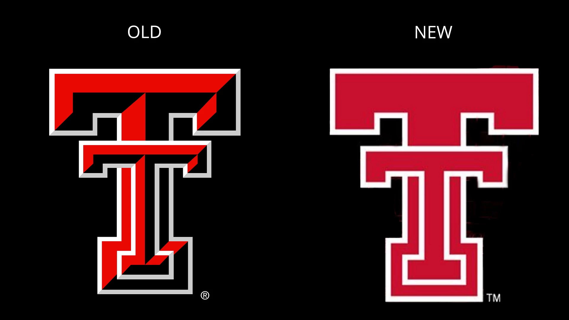
Texas Tech introduced a new athletics-specific mark in October 2025 and said the modernized Double T would represent the athletics brand going forward. The backlash came fast.
Fox 4 reported that many fans criticized the new look as plain, boring, and too similar to other schools.
This is a classic simplification mistake. Legacy marks can absolutely be refined, but simplification stops working when it removes personality faster than it improves legibility or versatility.
Fans of sports brands are especially sensitive to this because those marks are emotional property. People wear them, collect them, and attach memory to them.
What Texas Tech did wrong:
- Stripped out detail that fans associated with the identity’s character.
- Treated simplification as an automatic upgrade instead of asking what emotional value the older mark carried.
- Made the logo cleaner without making it more meaningful.
How Burger King Simplified Its Logo Without Flattening the Brand
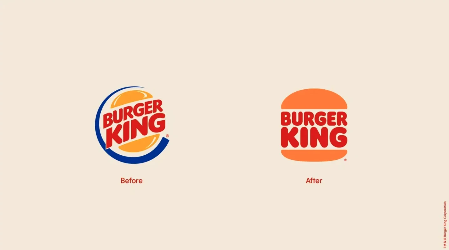
Burger King simplified its logo by returning to a more recognizable heritage form instead of stripping out the personality people liked.
In its 2021 rebrand, Burger King brought back a refined version of its older “bun halves” logo, and the company said the new system was designed to reflect the brand’s evolution in food quality, sustainability, and digital experience.
Design coverage also noted that the identity drew from the brand’s 1960s and 1970s visual history rather than replacing it with something cold or generic.
What Burger King did right:
- Simplified the mark by leaning into a familiar legacy shape, not by flattening the identity into something anonymous.
- Kept the logo warm, playful, and clearly tied to the product, so the simplification still felt like Burger King.
- Built the redesign into a full visual system across packaging, uniforms, signage, menu boards, and digital assets, which made the simplification feel intentional and complete rather than cosmetic.
![]()
Our team ranks agencies worldwide to help you find a qualified partner. Visit our Agency Directory for the Top Branding Agencies, as well as:
- Top Brand Strategy Agencies
- Top Brand Positioning Firms
- Top B2B Branding Agencies
- Top Corporate Branding Agencies
- Top Branding Agencies in Chicago
And don’t miss our Awards section, where we showcase the top agencies recognized for exceptional creativity and impact.
Branding Mistakes FAQs
1. What is the most common branding mistake companies make?
The most common branding mistake is changing visible brand assets without protecting the recognition and meaning attached to them. Companies often update a name, logo, slogan, or positioning to look more modern, but in the process they remove the cues customers already trust and remember.
2. Can a rebrand hurt a company even if the design looks better?
Yes. A rebrand can look cleaner or more modern and still hurt the brand if it creates confusion, weakens recognition, or clashes with what customers expect. Good branding is not just about aesthetics. It also has to preserve clarity, trust, and continuity.
3. How do you know if a branding change is too risky?
A branding change becomes risky when it removes a familiar name, symbol, color, tagline, or promise without strong evidence that the replacement will work better. If customers strongly associate an asset with the brand, changing it too quickly can reduce recall and make the brand harder to identify.
4. What is the difference between brand evolution and a branding mistake?
Brand evolution improves how the brand looks, feels, or communicates while keeping its core identity recognizable. A branding mistake happens when the change weakens what made the brand distinct in the first place. The difference usually comes down to whether the brand is being refined or unnecessarily rewritten.
5. How can brands avoid making major branding mistakes?
Brands can avoid major mistakes by testing changes before launch, protecting their strongest recognition assets, aligning branding with the actual product experience, and making sure any repositioning is backed by real business change. The safest updates usually build on existing equity instead of discarding it.


-preview-webp.webp)