
Every interaction your customer has with your business shapes how your brand is perceived, from your website to your social accounts and support emails.
A brand book brings structure to those moments, acting as the operating system that keeps your brand consistent, intentional, and recognizable everywhere it shows up.
Brand Book: Key Findings
- Treat your brand book as strategic infrastructure, not optional creative guidelines. A brand book shouldn’t sit in a drawer; it needs to be a living reference your team actually uses.
- Brand guidelines should drive real business results. Companies with consistent branding see revenue increase by 10–20%, proving this has a direct impact on growth.
- Clearly define verbal along with visual guidelines. A strong identity goes beyond logo and color swatches; it codifies tone, messaging pillars, and brand voice.
What Is a Brand Book
A brand book is the foundation that keeps a brand coherent as it grows.
It translates your brand’s identity into a clear, usable system that design, marketing, sales, product, and customer support teams can apply with confidence.
When that system is in place, everything your brand puts into the world — from ads and pitch decks to social posts and support emails — feels intentional, aligned, and unmistakably yours.
That consistency matters more than many businesses realize. 90% of consumers say they’re willing to pay more for brands they trust, which makes alignment and credibility powerful drivers of revenue.
The impact is measurable. Marq reports that brands maintaining consistency across touchpoints see revenue increase by up to 20%. In contrast, inconsistent branding weakens trust and recognition.
A strong brand book isn’t a set of rules buried in a shared folder. It’s the playbook your team relies on to make decisions, stay aligned, and show up consistently as the brand grows.
In the rest of this guide, we’ll break down exactly what goes into a brand book and how to build one that holds up as your business evolves.
3 Core Elements of a High-Performing Brand Book
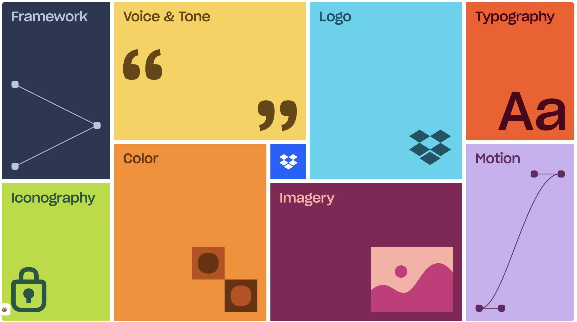
An effective brand book is structured so teams can quickly find what they need and written in a way that makes the guidance easy to follow. It shouldn’t be intimidating or overly rigid.
Clear sections, a table of contents, and a straightforward tone make the difference between a brand book that gathers dust and one your team actually uses.
Here are the key sections and components that most comprehensive brand guides include:
- Visual identity: How your brand looks
- Voice, tone, and messaging: How your brand sounds
- Application scenarios: Bringing it to life
1. Visual Identity: How Your Brand Looks
This section lays out the rules for all visual elements and usually includes guidelines for:
1.1. Logos
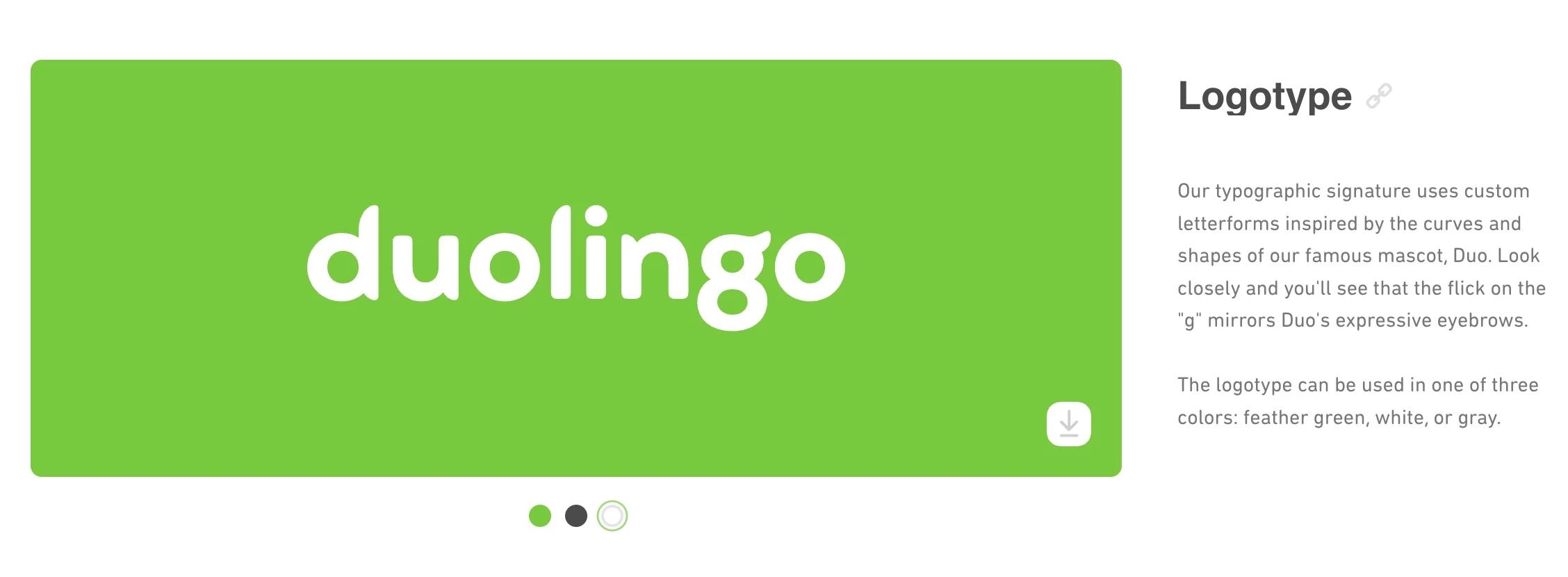
The brand book includes all versions of the logo — primary full-color, secondary or icon marks, and monochrome — along with clear usage rules. It should specify the minimum size, proper clear space around the logo, and how not to distort or alter it.
If the logo has variations (horizontal, vertical, symbol-only), those are detailed here along with when to use each.
1.2. Color Palette
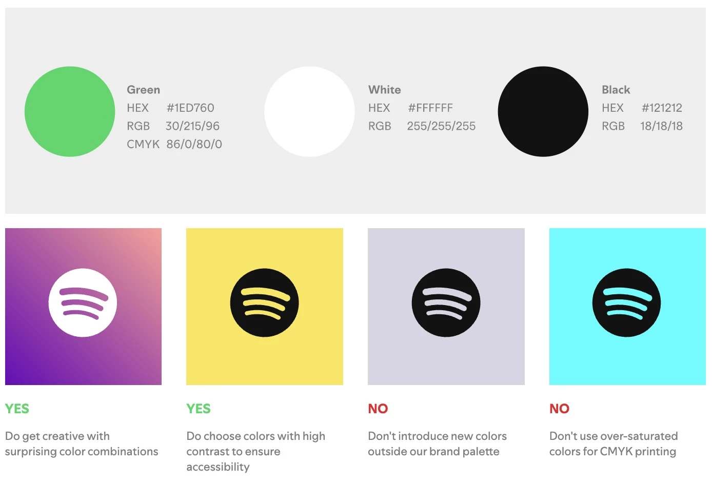
[Source: Spotify’s Brand Book]
This section lists the official brand colors with exact codes for different media (HEX and RGB codes for web, CMYK for print, Pantone if applicable). It defines primary colors (e.g., brand main color and secondary accents) as well as secondary or tertiary palettes.
@covenofhumanity Struggling to choose a color palette for your brand? Here’s the shortcut: start with either an analogous palette or a complementary palette. ⠀ Analogous colors (colors next to each other on the color wheel) give your brand a clean, cohesive, calm look. Complementary colors (opposites on the color wheel) give your brand more contrast, energy, and visual impact. #brandingtips#branddesign#smallbusinessbranding♬ original sound - Anja | DIY Branding Tips ✨
Usage guidelines explain which colors dominate and how to combine them. Consistent use of a signature brand color can increase recognition by 80%, as per Color.com’s findings, highlighting the impact brand colors have.
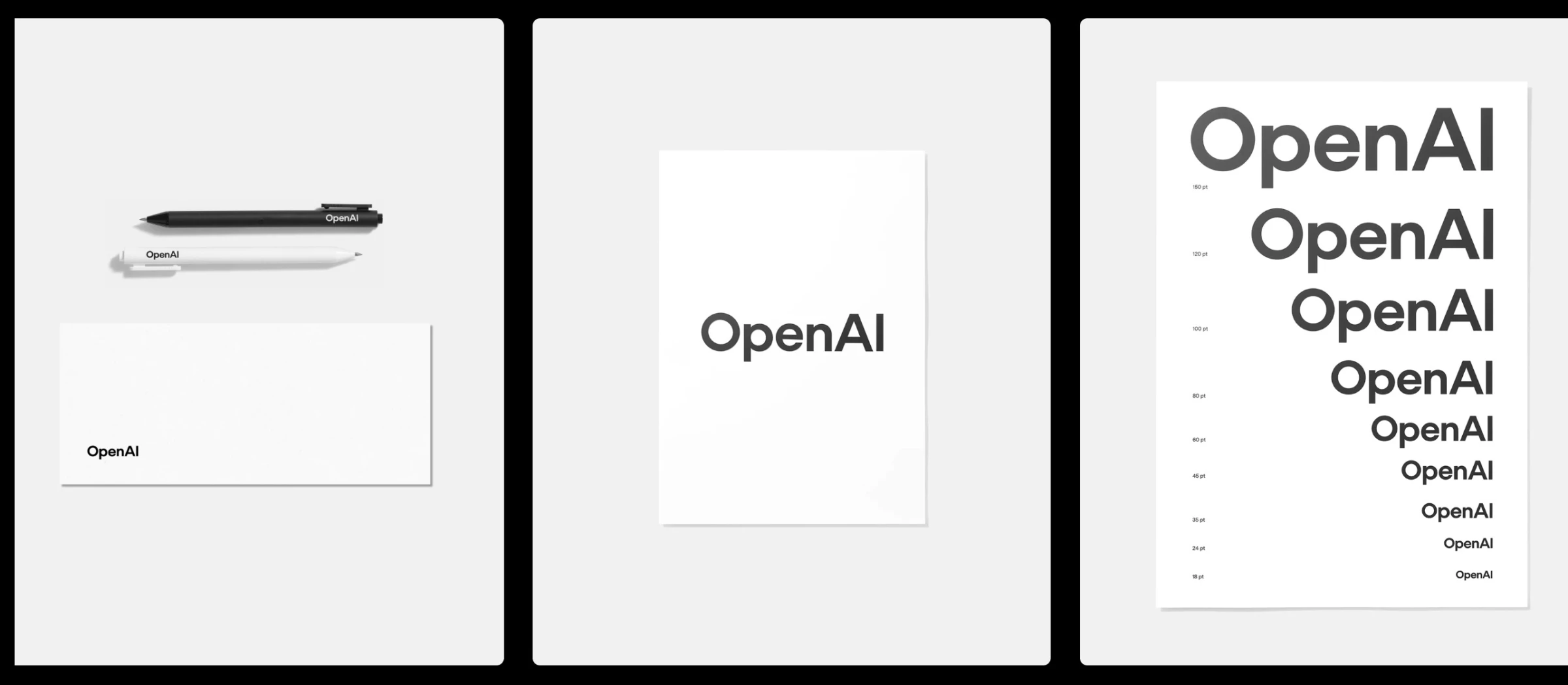
1.3. Typography
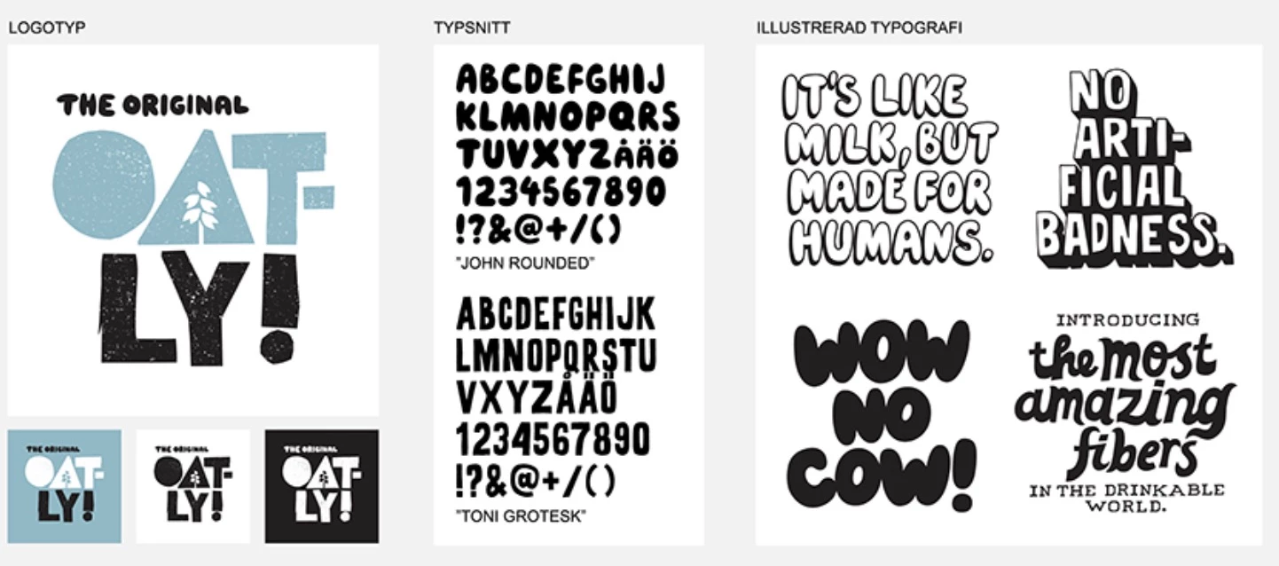
Typography includes the fonts that represent the brand, including primary typefaces and any secondary or web-safe alternatives. It specifies when to use each font (e.g., Headline font vs. Body copy font), as well as styles like weights, italics, and hierarchy (H1, H2, paragraph).
Good brand books show examples of correct typography usage and spacing. They may also include guidance on font pairing and acceptable substitutes if custom fonts aren’t available.
1.4. Graphic Style and Imagery
These guidelines specify icons, illustrations, graphic design, or photography style, such as:
- Icon styles (outline vs filled, line thickness)
- Illustration approach (e.g., hand-drawn vs geometric, specific illustration color palettes)
- Photo usage (e.g., candid lifestyle photos vs. stock photos, image filters or treatments to maintain a consistent look).
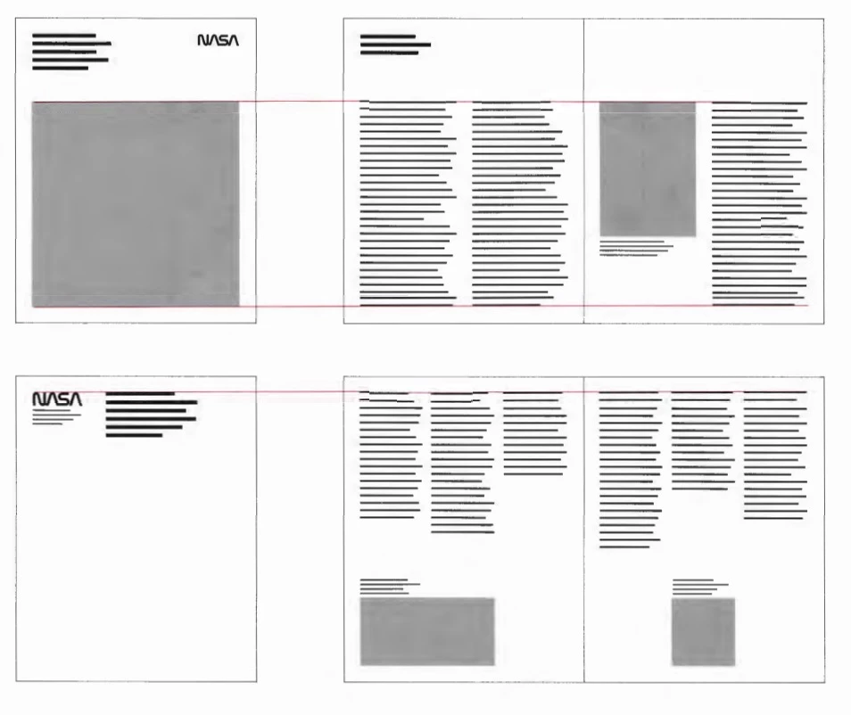
Grid systems might be outlined here, too, if the brand follows a layout grid for ads or posters. For example, NASA’s brand guidelines famously employed strict grid systems to ensure scientific precision and cohesiveness in layouts.
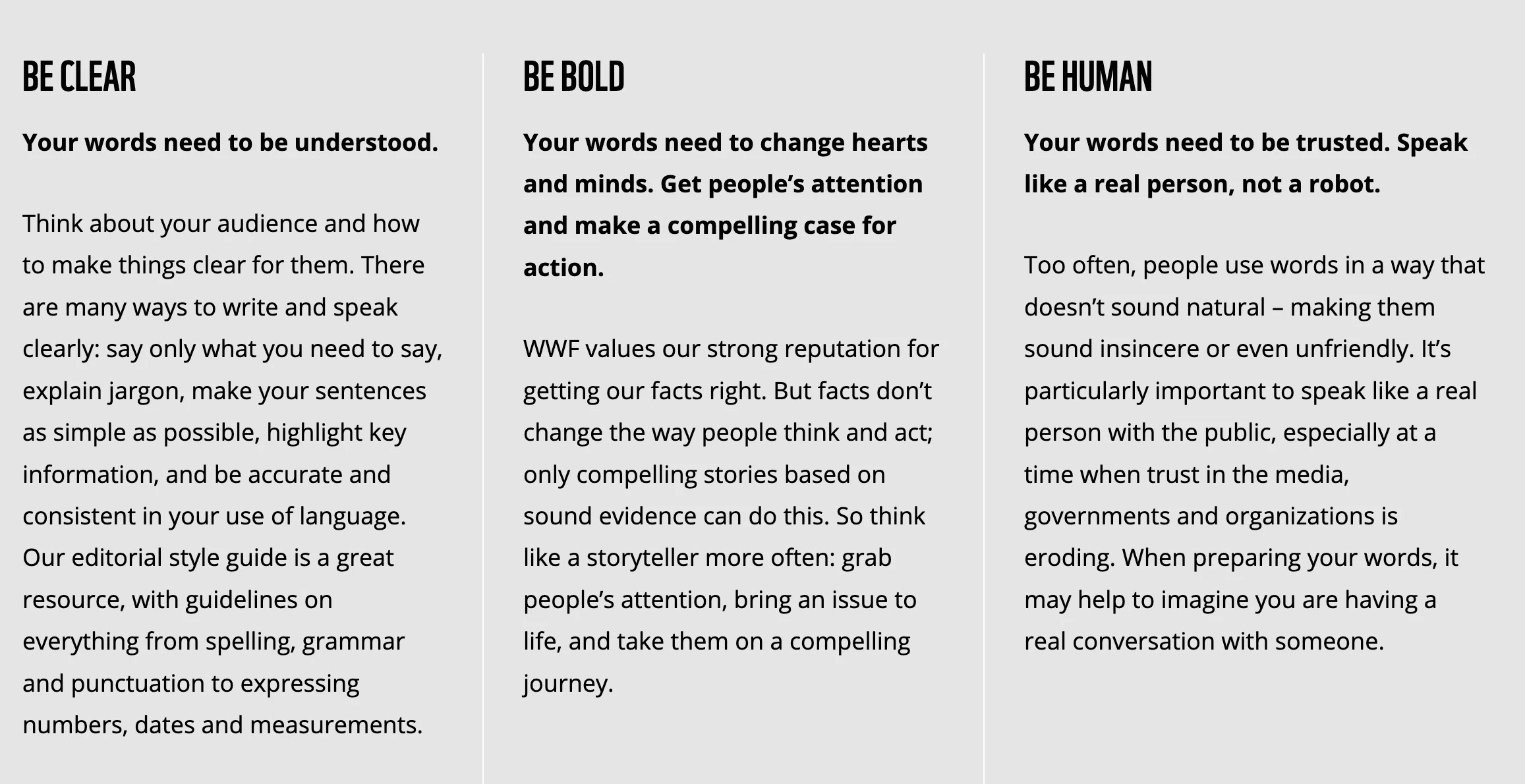
2. Voice, Tone, and Messaging: How Your Brand Sounds
This section defines the brand’s voice in text and speech; essentially, how the brand sounds to the audience:
2.1. Tone of Voice
Describe the brand’s personality in communication. Is the brand voice formal and authoritative, or friendly and playful? This part should use adjectives to stake out the voice (e.g., “Bold, savvy, and empathetic” or “Quirky, down-to-earth, and witty”).
Provide examples of the tone, like a sample sentence showing the preferred style and a non-example showing the wrong tone.
2.2. Messaging Frameworks
These break down how the brand talks about itself: for example, a brand book might list 3 core messages that should come across in all marketing (“Quality Craftsmanship,” “Customer-Centric Service,” “Innovative Spirit”).
It includes all key messages and copies that the brand uses, such as:
- The tagline and elevator pitch
- Value proposition statements
- Themes and messaging pillars
- Short company description
- Mission statement
- Origin story
Having these frameworks in one place helps writers maintain consistency in what is being communicated.
2.3. Language and Usage Guidelines
Brand books also specify the rules for style and word choice. Essentially, this part ensures anyone writing on behalf of the brand “speaks the same language.”
This can range from:
- Preferred vocabulary (and words to avoid)
- Grammar and formatting preferences (e.g., US or UK, Oxford comma)
- Industry jargon vs simple language
- Inclusive language practices (e.g., dos and don'ts for respectful, inclusive wording).
Consistency here has a real impact: 77% of consumers form brand loyalty because of shared values, as per Vivendi’s report. So, conveying the brand’s values and personality consistently in writing helps attract loyal customers.
3. Application Scenarios: Bringing It to Life
Even the best-defined logos and messages mean little if people don’t know how to apply them. This section brings the guidelines to life with real-world applications:
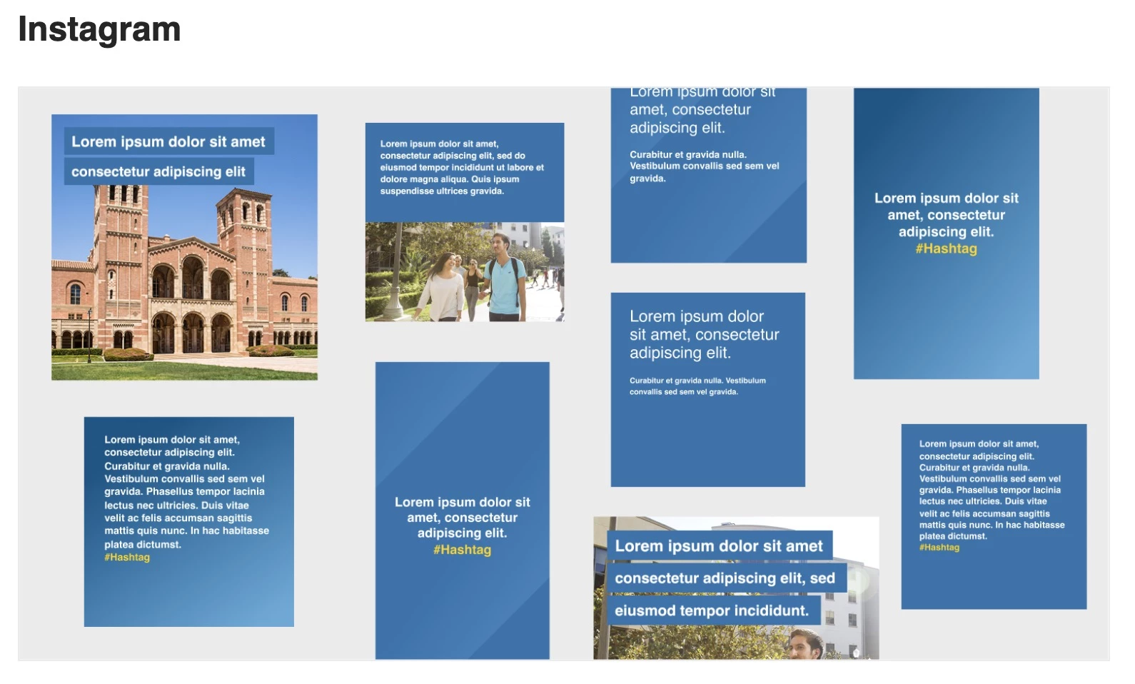
3.1. Usage Examples/Mockups
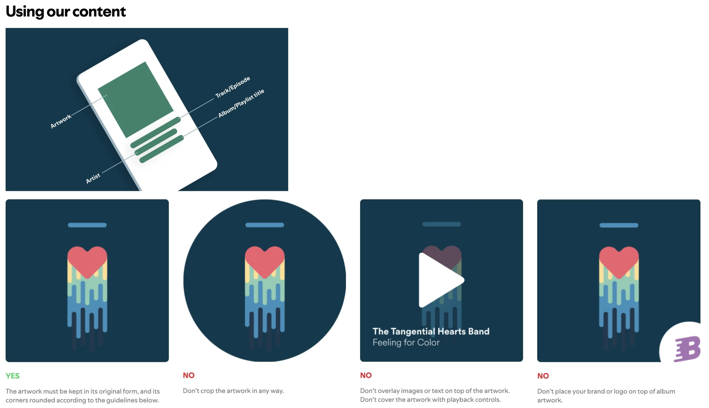
Include visual examples of the brand in context — e.g., how should the logo and design elements look on a website homepage? On a mobile app interface? In a print advertisement or a social media post?
Many brand books include mockups or real screenshots showing “this is how our brand appears in practice.” For instance, there might be a slide showing a sample business card design, a letterhead, and an email newsletter, all using approved branding.
These examples bridge the gap between abstract rules and concrete execution.
3.2. Templates
Some brand books (especially digital ones) provide actual templates or layouts for common needs, like PowerPoint/Google Slides templates, Word document templates, email signature formats, social media post templates, etc.
If not the files themselves, the brand book at least shows design layouts that people can follow. This makes it easier for various teams to create on-brand materials without any guesswork.
For instance, a sales team could use a pitch deck template provided to ensure their client's proposals are on-brand.
3.3. Cross-Channel Guidelines
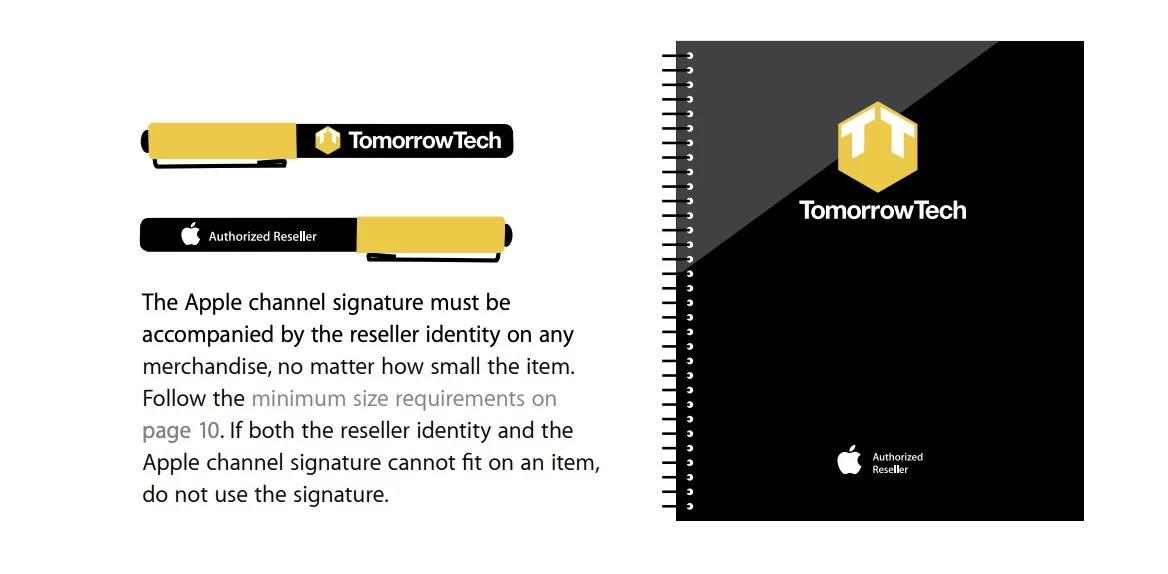
Cross-channel guidelines provide guidance on adapting the brand to different platforms. This includes rules like how the avatar/logo should appear on social media profiles or how the brand translates to black-and-white or single-color print.
It can also discuss tone variations: for instance, the brand’s tone might be slightly more informal on Twitter than in an annual report.
The goal is to ensure that whether someone encounters the brand on a billboard, smartphone, or in an email, it feels like the same entity. When visual and verbal identities are aligned in context, the brand experience becomes seamless.
4 Brand Book Examples That Set the Standard
The best brand book examples all have one thing in common: their brand guidelines go beyond logos and colors.
They clearly reflect the brand’s strategy, positioning, and personality, and explain why the brand looks, sounds, and behaves the way it does.
Below are standout brand books that get this right, along with what you can learn from each one.
- Spotify: A minimalist approach to expressive branding
- Airbnb: Seamless integration of design and storytelling
- NASA: A legacy brand rebooted with precision
- Mailchimp: A playful yet practical brand system
1. Spotify: A Minimalist Approach to Expressive Branding
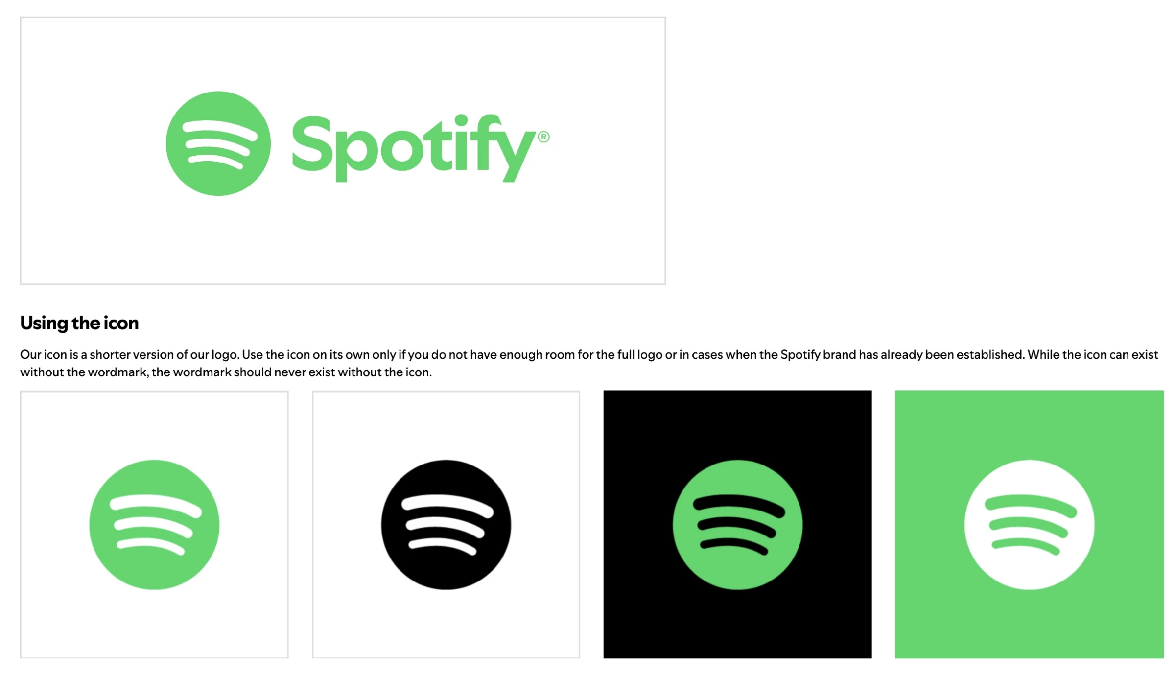
Spotify’s brand guidelines are known for being clean and user-friendly for designers, while still allowing creative flexibility. They prioritize conveying an emotional, music-inspired tone through simplicity.
The guide provides exact specifications (like RGB color codes, font usage rules) and shows how the branding adapts across their app, web, and partner integrations.
The emphasis is on consistency that supports an adaptable, digital-first brand — ideal for a lifestyle tech company that must appear seamlessly across various platforms and playlists.
Spotify’s example teaches us how a brand book can enforce consistency without stifling creativity, which is key for fast-moving digital products.
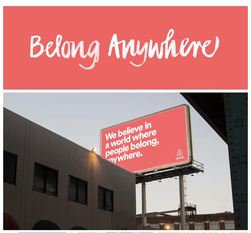
2. Airbnb: Seamless Integration of Design and Storytelling
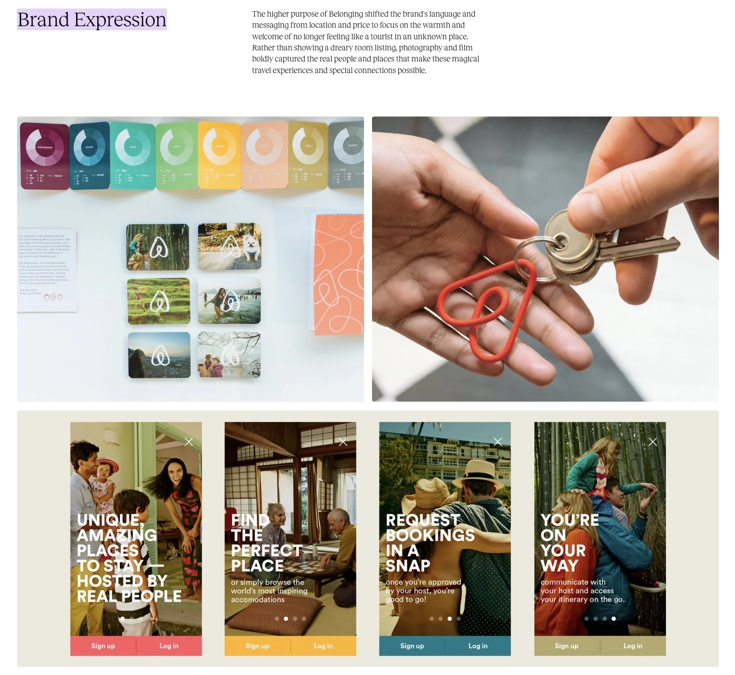
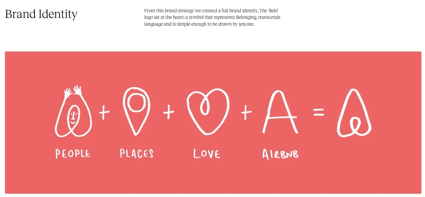
Airbnb’s branding is a masterclass in combining visual identity with its core brand story: “Belong Anywhere”. Their brand book (developed during a major rebrand) doesn’t just list colors and fonts. It ties every element back to the feeling of inclusivity and community.
There’s a strong emphasis on authentic imagery, such as real photos of hosts and guests, to capture a welcoming, human vibe. Typography and layout choices reflect clarity and warmth, mirroring the friendly, intuitive design of Airbnb’s platform.
Airbnb’s guidelines show how brand values can shape not just visual rules, but also tone, voice, and content. The result is a cohesive experience, from the app UI to a promotional video, it always feels like Airbnb.
The brand even released an Inclusive Design Toolkit to help creatives consider diverse perspectives, underscoring how serious they are about their brand principles driving every design decision.
3. NASA: A Legacy Brand Rebooted With Precision
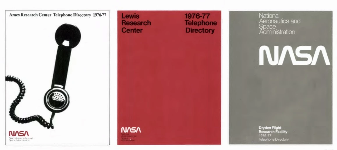
NASA’s brand has decades of history, and its Graphics Standards Manual is legendary for its rigor.
Originally created in 1975 for the now-iconic “worm” logo, the guide showcases a very systematic approach: grid-based layouts, strict logo usage across everything from spacecraft to stationery, and an almost scientific level of detail.
When NASA revived the retro logo in recent years, the updated brand guidelines retained that same scientific clarity and modular structure. It shows that strict consistency and creativity aren’t mutually exclusive. In fact, a clear structure can make designs even more effective.
NASA’s guide ensures that whether you see a NASA emblem on a rocket, a website, or a jumpsuit, it’s instantly recognizable and rooted in the same principles.
The takeaway: a strong brand book can preserve brand integrity for decades, even as the brand is applied in wildly different contexts (from digital screens to physical equipment).
4. Mailchimp: A Playful Yet Practical Brand System
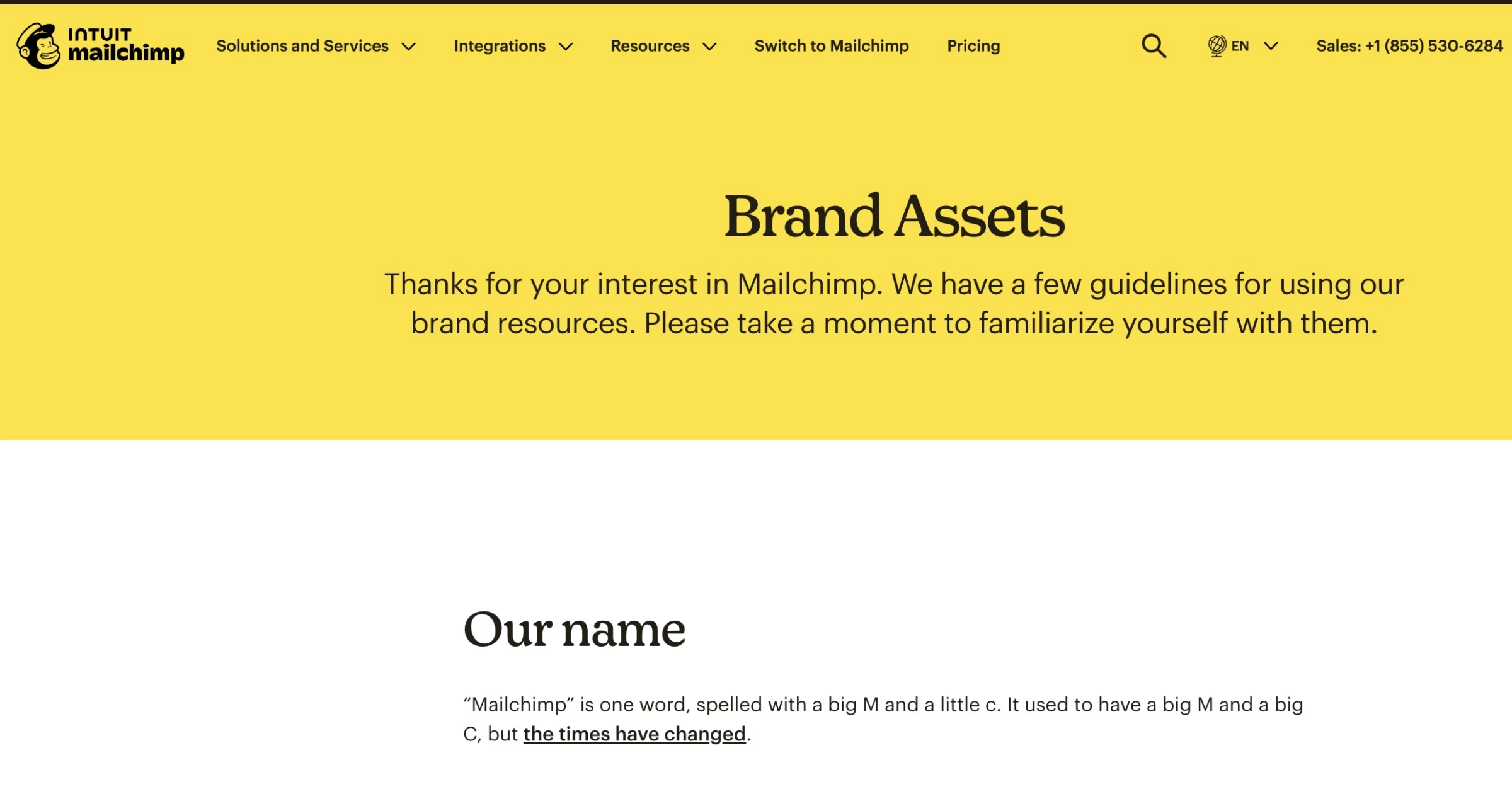
Mailchimp, known for its email marketing platform, has developed a delightful and thorough brand guide often cited as an example of tone and design.
Though not a giant corporation, Mailchimp’s brand book covers everything, from a playful yet clear tone of voice and quirky illustrations to a unique color palette and very practical usage guidelines.
The guide breaks down voice and content style by context. It provides writing examples for error messages, marketing emails, social media, etc. Its cross-channel consistency — from its website to its famous annual reports — shows the power of a well-implemented brand book.
The lesson here is that investing in a detailed brand guide early on helps even smaller companies project a polished, consistent presence like much larger brands.
Step-by-Step: How To Create Brand Guidelines That Deliver Business Impact
Creating a brand book is a strategic project that brings together leadership, marketing, design, and operations.
Strong brand guidelines align everyone around how the business shows up, makes decisions, and communicates at scale.
This step-by-step framework is designed to help you build brand guidelines that are clear, practical, and built to drive real business impact:
- Step 1. Discovery & strategic alignment
- Step 2. Define visual & verbal identity
- Step 3. Structure for adoption & usability
- Step 4. Test and gather feedback
- Step 5. Deliver and train the team
Step 1. Discovery & Strategic Alignment
Before starting design work, align with leadership on the brand’s core strategy and assess its current market position:
- Meet with key stakeholders (CEO, CMO, founders, etc.) to clarify the goals of the brand book and the brand’s positioning, values, and target audience.
- Conduct a brand audit by gathering all existing brand materials (logos, past ads, decks) and noting inconsistencies or gaps.
- Perform competitor analysis to see how competitors present themselves and identify opportunities to differentiate.
The idea is to ground the brand book in a clear understanding of what the brand stands for and who it speaks to. Skipping this step risks creating a guide that is disconnected from business goals.
Output of step 1: A creative brief or outline of brand identity goals and buy-in from leadership in the brand’s direction.
Step 2. Define Visual & Verbal Identity
With the strategy in mind, develop the tangible elements of the brand’s identity. This is typically a collaborative phase between brand strategists, designers, and copywriters:
- Visual identity: Designers explore logo designs or refinements, color palettes, typography, and other visual elements. Tools like mood boards can be useful to converge on a look and feel.
- Verbal identity: Content strategists or writers define the tone of voice and key messages. Exercises like brand archetypes or voice charts (e.g., we are more X, less Y) can guide this process.
Use iterative feedback loops here. For example, present 2–3 style directions (e.g., playful vs. conservative) with sample visuals and copy to get alignment.
Test the visual elements for versatility, e.g., how does the logo look in small vs. large scale, do the colors work on screen and print, etc.
Joshua Schmitt, Senior Graphic Designer at 4CDesignWorks, emphasizes the importance of consistency:
“The most common branding mistake is inconsistency across their branding elements, using different logos, colors, or messaging across various platforms and touchpoints.
This lack of cohesion confuses customers, dilutes brand recognition, and undermines the startup's efforts to establish a strong, memorable identity in the marketplace.”
Output of step 2: Core elements finalized, such as the logo, the color scheme, fonts, voice attributes, tagline, etc.
Step 3. Structure for Adoption & Usability
Plan out the format and structure of the brand book with the end-users in mind:
- Choose the medium. A PDF or printed booklet works well for a straightforward guide, while a web-based style guide is better for a regularly updated resource.
- Consider the brand’s workflow. For example, a tech startup might prefer a Notion or web portal accessible to all employees, whereas a smaller business might be fine with a PDF.
- Include an index or navigation for quick reference (especially if digital).
- Write guidelines clearly. Avoid jargon and explain the “why” behind rules when helpful. People are more likely to follow guidelines if they understand the reasoning.
- Outline the sections of the brand book (visual identity, verbal identity, applications, etc., as discussed above).
- Ensure usability. Include plenty of visual examples and templates. If the client’s sales team frequently creates slide decks, provide example layouts or template links. Make the guide practical for daily use.
@eyesavvy ✨ Ever wondered what actually goes into a full brand guidelines deck? This is one of the most important (but often overlooked) parts of the brand design process — and if you’re a designer or a business owner, this is where real clarity and consistency begins. Because handing off a logo just isn’t enough. Clients need to know how to use their brand. In this video, I’m walking you through a real brand guidelines doc I created for a hair extension company. From values, vision, and brand personality, to logo suites, typography usage, color psychology, pattern systems, and real-world mockups — it’s all here. 👉 This guide isn’t just about making things look good. It’s about making your brand work. Every section is built to help the client (or your team) stay consistent, strategic, and confident when showing up online, on packaging, or in marketing. I share this because I know how overwhelming it can be — especially when you’re trying to build a legit, professional brand that actually connects with your audience. If you want to know exactly what to include in your brand guidelines or want help building your own, comment below or message me. I’m happy to share what’s worked best for me and my clients. #brandguidelines#brandingtips#graphicdesignforbusiness#brandstrategy#visualidentity♬ original sound - Kiki | EyeSavvy Brand Design
Output of step 3: A well-designed brand book document that’s both on-brand and easy to navigate.
Step 4. Test and Gather Feedback
Once the brand book content is compiled and designed, present it to the broader team and gather feedback.
A great practice is to test the brand book’s usability. Have a few team members (designers, marketers, even salespeople) attempt to use the guidelines in a mini-scenario:
- Can a designer easily find the correct logo files and color codes?
- Can a copywriter quickly grasp the tone of voice from the guide and emulate it?
Note any pain points or questions that arise and refine the guide accordingly.
Step 5. Deliver and Train the Team
Finalize the brand book and deliver all files, including the main document and assets (logo files in various formats, fonts, templates, etc.). To ensure adoption, host a training or rollout workshop.
In this session, walk the team through the brand book, showing where to find resources and how to apply key elements. This transforms the guide from a static document into a living program within the organization.
@byfrankieharry Brand Style Guidelines are essential for making sure your clients know exactly how to use their new branding. From the logos, brand colours, brand typography, layouts, photo treatments and more. That’s why I created a template to speed up your workflow and leave your clients feeling confident and proud! #brandstyleguide#brandguidelines#brandidentity#logodesigner#visualidentity♬ original sound - Frankie Harry
Finally, package editable versions (e.g., InDesign or Google Slides) for future updates. Also, consider scheduling a 6-month or 12-month follow-up to review any new needs.
By following these steps, you end up not just with a beautiful brand book, but one that teams feel ownership of and know how to use. That means the brand actually will be consistently represented going forward, which is the ultimate measure of success for this whole process.
Brand Book: Final Thoughts
When you define how and why your brand should consistently show up across every channel, you build clarity internally, trust externally, and measurable advantage in the market.
Start treating your brand guidelines as a core business tool and you’ll see the difference in both perception and performance.
![]()
Our team ranks agencies worldwide to help you find a qualified partner to implement the latest AI solutions. Visit our Agency Directory for the Top Branding Agencies, as well as:
- Top Brand Strategy Agencies
- Top Brand Positioning Firms
- Top B2B Branding Agencies
- Top Corporate Branding Agencies
- Top Small Business Branding Agencies
And don’t miss our Awards section, where we showcase the top agencies recognized for exceptional creativity and impact.
Brand Book FAQs
1. What format is best for a modern brand book?
It depends on the client’s needs and how their team works. For smaller teams or simpler use cases, a PDF or slide deck may suffice — it’s easy to distribute and print. Many companies start with this format.
For remote, fast-scaling, or global organizations, a digital brand portal is often better. This could be a dedicated intranet page, a platform like Frontify or Brandfolder, or even a Notion workspace.
Digital portals are easily updatable, searchable, and interactive, often with downloadable assets and real-time access for all teams.
2. Are brand books useful for startups?
Absolutely. For startups, establishing a clear brand identity early on can save time and money down the road. A brand book doesn’t have to be hundreds of pages, but even a lean style guide helps define the brand’s mission, voice, and visual identity, preparing the company for scale.
Startups may pivot or evolve, but having a reference for “how we present ourselves” ensures consistency through change. Many successful startups attribute part of their growth to strong branding from the get-go.
3. How do agencies make money from brand books?
Agencies monetize brand books by treating them as both a key deliverable and a gateway to ongoing services. They typically bundle brand book creation into larger branding projects, then offer follow-ups like brand audits, updates, or training sessions.
This turns a one-off project into a recurring revenue stream and a launchpad for an ongoing client relationship.


-preview-webp.webp)