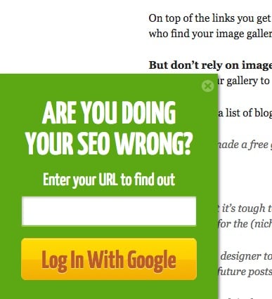
The most important thing when designing a website is to make it easy for users to understand how to navigate the site and get the information they want. It should be obvious to them where each click leads and what action each button triggers.
The same principles apply when designing a call to action (CTA) button. However, we’ve seen more examples than we can count of buttons that are placed out of context, are too big, or feature confusing copy.
Here are the basic principles of designing a CTA button that converts.
Table of Contents

Pick the Right Colors for Your CTA Button
When it comes to conversion optimization, color is a polarizing and animated topic. Some people believe that color is the sole factor that can impact conversion while others neglect it completely.
We here at DesignRush like to pick the middle ground. Yes, color plays a crucial role in web design and can influence our emotions and, consequently, our decision-making process. However, it’s not the only element that counts.
Use color and contrast to direct the user’s attention towards your button. Try to remember that several studies have shown that women tend to incline towards purple, green and blue (as well as combinations, such as turquoise or lavender), while men lean toward blue, green and black.
Ensure that your button is in line with the rest of your design and the color scheme of the website. You want your CTA button to stand out, but not be an eyesore.

Be Mindful of Shape and Sizing of Your CTA Button
We get it: You are a creative type who doesn’t like to follow the norm. But, when it comes to designing a CTA button, sticking to the rules is what will ensure a high conversion rate.
First thing first, as we mentioned at the beginning of the article, don’t try to reinvent the wheel. Make your buttons look like buttons, not like memes, hyperlinks or other whimsical imagery.
Keep in mind that rounded shapes draw attention to what is inside, while square shapes draw attention to what is outside.
As far as size is concerned, bigger isn’t always better. After all, no one likes a red button the size of half their screen.
If you’re designing buttons for an app or mobile interface, make sure that it is big enough for users to touch it without accidentally clicking on other elements. As a rule of thumb, you should make your CTA button at least 44px by 44px.

The Placement of Your CTA Button is Crucial
According to Fitt’s law, the time needed to move the mouse to a target area (the CTA button in this case) is equal with the relation between the size of the button and the distance to it. In other words, if you want to increase your conversion rate, you need to make the CTA button bigger than other elements on the page and place it closer to the starting mouse location.

Feature Compelling Copy in Your CTA Button
Yes, we know: you are a designer, not a copywriter. But, the design is only half the job. It doesn’t matter how well designed your button is or if the placement is calculated to perfection. If the copy is confusing, people will leave without taking any action.
Here are some rules to keep in mind:
- Be Specific: Don’t use vague terms. Let users know what they should do next: download, share, buy, click, join, etc.
- Personalize Your CTA: Personalized CTAs can bring up to 42 percent more conversions than generic ones.
- Be Clear and Concise: Don’t overcrowd the button. If you need to provide additional information, then you should do so in the content.

Appeal to Your Audience’s Emotions with Your CTA Button
If you nail your web design and copy, then it should elicit a certain emotional response from your visitors. Whether you make them feel excited, fearful, or curious, you need to channel these emotions into conversion.
Consider what makes your audience tick and why. Why did your customers purchase that vacation, for example? Was it because they always wanted to visit the place, or was it a last-minute deal?
Use the insights you have on your audience to place your CTA button in the right context. Use images that appeal to them and focus their emotions on that action.
The Final Word
After hosting your website on the fastest dedicated servers, the CTA button is another factor that can improve conversion.
The CTA button is among the key tools a website can use to improve conversion. Use the right color, the best shape, and size, and place it where it can be seen and clicked easily. Add a clear, engaging message, and you’re ready to go. And don’t forget to test, tweak and repeat.
CTA Button That Converts FAQs
What is an example of a CTA?
Common CTAs usually have this text: “Buy Now,” “Add to Cart,” “Get Started,” “Sign Up,” “Learn More,” and the like.
What is the purpose of a CTA?
The purpose of a CTA is to prompt a specific and immediate action from the audience.


