Telling jokes isn’t our main forte, but we know what a great user experience is — and how to design with it in mind.
UX design is a serious science -- and we say science because it revolves around consumer psychology and behavior. Knowing its intricacies can help you transform your business. For example, did you know that you can easily improve your SEO rankings, increase website traffic and thus gain more opportunities to convert visitors into customers? Offspring redesigned their website and they saw a bump of 25.9 percent in traffic.
So, where does laughter fit into snagging potential consumers and gaining their trust online? It’s simple.
If people like your content, they’ll stay longer, consume more, spend additional time on a website and, ultimately, send signals to search engines that your website has been helpful or enjoyable for them, which also improves your SEO rankings. Witty content makes people want to learn more about you and your services. Thus, humor is great for user experience!
Couple that with a strategically minimal design and you can really make your copy pop and capture attention. In fact, minimal web design has plenty of business growth benefits, and plenty of negative space provides a perfect backdrop for important web design elements.
Your design and copywriting will work hand-in-hand to secure new customers because our brains make a decision about a website in a fraction of a second! To be precise:
We form an opinion about a website in under 50 milliseconds.
Good websites provide your users with the best possible experience, and it’s becoming an art form all on its own. But, ensuring your users have a great time exploring your site also means making them feel good. In fact, humor, laughter, and smiling are at the core of humanity – so why wouldn’t it be at the core of your website? After all, multiple studies have shown laughter improves health and reduces stress. Plus, a strong voice is a major factor in recognizable branding that consumers identify with and can inspire those consumers to develop a loyalty to you.
So, it feels almost natural to integrate humor into your web design. If your work is aimed at ensuring people have a good experience, why not go for something you know will get a positive result?
Adding humorous elements to your UX design is easier than you think. Plus, it’s a great way to set yourself apart from your competitors and make people remember your website.
But don't worry -- you won’t have to break out the “100 funniest knock-knock jokes of all time” in your copy. Instead, we rounded up some easy tips for incorporating humor into your website design -- plus, the best real-world examples.
How To Infuse Humor Into Your Website Design To Promote A Positive User Experience
1. Know Your Website's Audience
It seems pretty obvious, but if you want to give people the best on-site experience, you need to know who they are.
People have different types of humor. What one person finds hilarious, another one might perceive as bad taste. While you can’t make everyone happy, there are a few guidelines you should keep in mind.
For instance, you can stick with easy word plays or generalities so that everyone gets the punchline. Don’t go into obscure subjects, unless your site caters to a very narrow niche.
2. Know When to Use Humor in Your Web Design
Humor is a pretty versatile thing, so you don’t have to worry that it might not fit your website. It can be integrated into politics, e-commerce or educational platforms, as long as you keep it simple and know when it is appropriate to use.
Just think about it: In real life, you don’t start cracking jokes at inopportune moments. The same principles should translate into your website as well. You don’t have to fill every single corner of your page with funny imagery or puns, but there are a few instances when you can have a little fun and let something amusing slip in.

Example 1: LessFilms
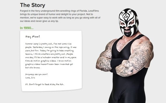
This video production company adds an off-the-wall edge to their professional personality through little humorous design quirks -- namely, the masked wrestlers that periodically adorn the pages. The web design gives off a mid-aughts vibe, with seemingly irrelevant hand-drawn illustrations and clever notes to "mom," for instance.
However, the reason why LessFilms' particular brand of humor works is that it never interferes with the message they are trying to portray. Each lighthearted moment either service to communicate information to potential clients in an on-brand manner or simply adds a subtle emotional consistency to each page.
3. Have Fun With Your "About Us" Pages
Typically, an “About Us" page conveys relevant information about the company and its team. It’s pretty straightforward and has a clear purpose of letting the visitors get to know the company better.
And what is a company, if not its people?
If you want to showcase your company’s personality and make your team seem more relatable, then a touch of humor is the way to go. Whether you choose to share a funny anecdote about the company or encourage staffers to take silly pictures, don’t forget that your “About Page” should give prospects a look into what you stand for.
This approach will help your brand build a coveted emotional connection with consumers, which is imperative for longevity. Studies show that if people consider a business to be distant, non-human and without personality, they will often seek a competitor who isn’t.

Example 2: Station.ch
Station.ch has mastered an interesting team web page -- even their office dog landed a spot and dedicated biography. While not overtly humorous or slapstick funny, this page has a distinct playful air -- which, many times, is enough to get your consumers to lighten up and portray your company's culture and core values.
This page also smartly maintains an air of mystery, as everyone has part of their faces covered on the landing page. When you click on an image, you'll get to read a full bio and see an unshrouded image of the team member.
4. Get Creative With Loading Screens
By adding engaging elements or a touch of humor to loading screens, businesses can cut down on interstitial anxiety -- or the uncomfortable anticipation they feel as they wait for something to load online. This tactic is proven to reduce bounce rates and foster positive online experiences.
A staggering47 percentof consumers expect that a website or an app will load in under 2 seconds.
Depending on users' internet connections and your personal content, website screens can continually take different amounts of time to completely load. That’s why it’s important to use loopy animations that will distract the users while they wait. After all, more than 40 percent of people abandon a website if it takes more than 3 seconds to load.
Make any loading animation either pertinent to your business or brand identity -- even irregular shapes morphing into one another can fit certain brands.
Where To Find Loading Screen Inspiration?
Strangely enough, great loading screen inspiration can be found in video games. By default, there’s a lot of content to be prepared before a player can start his adventure, so most video games use several loading screens. Another great thing about video games is that they often provide loading screens with tooltips. Some strong examples of the latter include Skyrim and Fallout.
Waiting while installing a game has never been more enjoyable.
Fallout uses pictures with tooltips, humor, and additional videos. This approach is a great idea if you offer complex services or you need to teach people how to use your website.
Affordability is no laughing matter - these Miami-based agencies will provide success at low prices.
What Are The Downsides For Loading Screen Animation?
If your website has repeat visitors or your business depends on it, seeing the same loading screen can be really annoying. Even if it’s hilarious, the novelty may wear off.
However, if a long and frequent page load is unavoidable, you can always add variety to your loading screens. Assign different designs randomly, cycle through several in a loop, or create a great, engaging story. Each time a user visits your website, they can see another piece of the story
Want more tips to increase website traffic? Check out our go-to guide!

Witty “Contact Us” Pages Can Make An Impact
People often disregard the Contact Us page and generally, it’s the blandest one on almost every website. But that’s so wrong! When people go to your contact page, that means they’re ready to perform an action that will drive your business. They either need more information, want to place an order, get in touch or propose a partnership.
Without a good “Contact Us” page, you’re missing out on a lot. But a humorous one will keep your visitors coming!
This is why we have paid special attention to designing “Contact Us” pages, what makes them work and what makes them great, apart from the humor.
Example 3: Brand Embassy
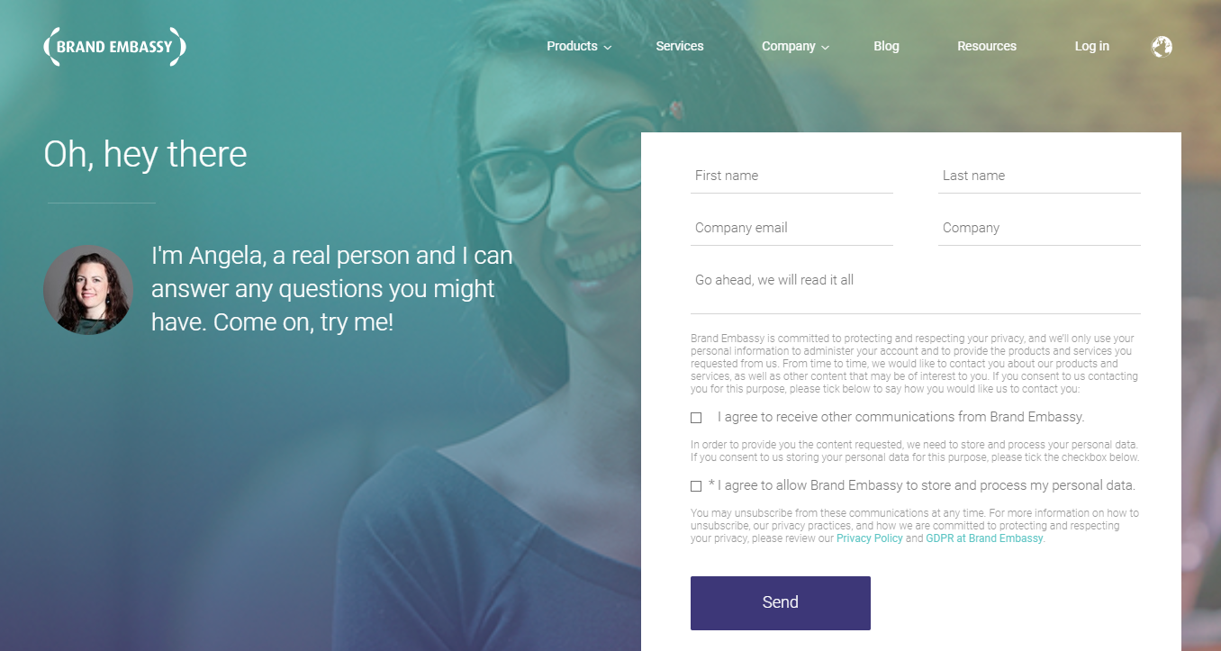
This digital customer service platform poked fun at, well, digital customer service in 2018 with their contact us page, as seen above. In a world that's dominated by automatic responses, artificial intelligence and non-human chatbots, they make it clear that they can help you with your questions, person to person.
This hyper-attention to their industry and their own product facilitates a trustworthy feeling between customer and business, making the former understand that Brand Embassy understands the importance of strong customer service for all brands -- including theirs.
At the end of the day, if inspiration strikes, you can make any website page or element funny — even dreaded contact forms. But don’t stop there -- you can add humor to newsletter signups, login screens, account creation, buttons and even Frequently Asked Questions.
Funny Email Newsletter Copy Is Effective
If you think that email advertising is dead, you’re dead wrong. However, much of its success mainly depends on clever copy. From the subject line to the main body copy, you can get a much better click-through rate just with written content.
What's better? Using emojis in the subject line can increase your email open rate by56 percent.
Example 4: Groupon
In 2010, Groupon gained accolades for their funny unsubscribe text at the bottom of every landing page. Their idea was so ingenious that it likely deterred more people from unsubscribing than it encouraged. You can check it out below.
Although Groupon has become older, wiser and, by default, a bit more sophisticated, this early trend of raw humor set the tone for Groupon's evolution. This clever personification of the person responsible for your email marketing campaigns adds a sense of humanity and seemingly unfiltered look into the Groupon office -- with a dash of humor, of course. Not only did this solidify Groupon's brand with consumers, it encouraged consumers to stay subscribed through a funny, falsified depiction of the horrors of fewer followers at a startup.
Plus, did you know? Email marketing can bring you a 4000 percent return on investment!
How Can You Personalize Your Brand?
Treat your brand like it’s a person — as if you’re using it to connect, network, make friends and help other people. And like we already mentioned — people are social creatures, and gravitate towards this type of brand presentation.
Humor is the best way to connect with your customers and humanize your brand, so don't be afraid to poke a little fun at harmless topics or your own company. That’s exactly what will make your brand identifiable -- imperfection and the ability to make people relate to you.
Conveying Important Messages Through Humor
Although communicating your company's main message is tricky, one effective way to make sure people will read important information on your site is to grab their attention with something amusing. But, be careful to craft the appropriate “joke” for the appropriate context. Notices regarding payments or refusals are more difficult to turn funny. Unless you’re a comedic genius in the making, it’s best to steer clear of those.
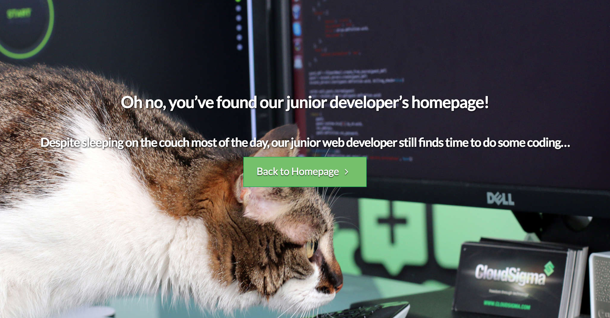
Plus, perhaps the most frustrating number on the entire internet (404) showcases a broken link and non-existent web page that can cause conversions and regular users to plummet. Therefore, it’s important to keep them engaged and distract them from their fleeting annoyance.
The good news? Funny quips and humorous games can help reduce a user’s frustration when a process isn’t working as intended.
When users locate a 404 page, don’t forget to link to another page that can meet the user’s needs. An amusing image might help your visitors with their frustration, but if you want them to stay engaged, you also need to tell them what to do next and where to go.

How To Write Funny Copy
Yeah, we know it’s easier said than done. Just saying, “Write something funny” could be a potential recipe for disaster and numerous drafts... and that is no laughing matter. (See what we did there?) Little puns -- we like to call them punny -- are always a cool and easy way to lighten the mood of your website content.
If you want to add a bit of humor but aren't sure where to start, begin with your blog. It can be easier to weave a playful voice into content marketing.
Introducing tasteful humor will help to engage your website visitors.
Example 5: The Onion
The Onion is a satirical website that has amassed readership of roughly 9 million active monthly visitors. Their business model solely depends on the humor they portray on their website, so it’s only natural that you can find that quirky wittiness all over their online space -- not just in their articles.
Their About section is a perfect example:
What if I want to sue The Onion?
Please do not do that. The First Amendment protects satire as a form of free speech and expression. The Onion uses invented names in all of its stories, except in cases where public figures are being satirized. Any other use of real names is accidental and coincidental. The Onion is not intended for readers under 18 years of age.
The good news? You don’t have to publish satirical content to utilize humor in your website copy.
However, using humor in your website has to be carefully planned out. Test your pages and even A/B test your language to identify the type of humor your users love and what copy entices them to covert.
If you want, you can even go straight to the source (your consumers) through quick and simple surveys. Plus, if you’re running your website on a WordPress platform, here are five plugins that can help facilitate surveys and feedback from customers.
When And Where Can You Be Humorous On Your Website?
Depending on the business type, you can infuse humor in small doses or large doses.
It all depends on if it fits your business model, website design and brand identity. You can choose if you want to make the website lighthearted with a pun here or there, or if you want to make a comedic, satirical appearance like The Onion or 9Gag.
You can embed humor in the design fully, or you can use smaller website elements like animations, popups, loading screens and sliders.
Pro Tip: Don’t forget about sign up, log in and sign out actions, too. Those are excellent places to infuse humor.
Every page on your website can have a humorous side to it (although we don’t recommend this for Terms of Service and Privacy Policy pages), but one of the best (and most natural) places to start is the “About Us” page. However, ensure the overarching tone throughout your website is cohesive. This will ensure the customer journey is seamless instead of jarring or confusing.
Finally, the power of content (mainly copy) is unequivocal and unwavering when it comes to humor. A great copywriter can help you develop a humorous tone in your blogs posts that will leave your website visitors begging for more.
The Unparalleled Power Of Humor In Web Design
Make sure to test and find the best form of "funny" for your website -- you don’t want to hurt your business by going overboard. Use a slogan, a pun or a witty comment here and there is almost certainly a safe bet.
Humor can do so much for your brand identity and brand awareness. Perhaps it can even land you in the Webby Awards for the most humorous web design!
Humor is a valuable tool in website design and branding. It can communicate to consumers in a way that bland text cannot, and encourages them to create a lasting emotional and personal connection with your brand, which can easily translate into long-term brand loyalty and revenue. Whether you want to fill your entire site with quippy, witty phrases, if you want to subtly infuse it into certain areas, there's no doubt that humor will leave a lasting impression on your audience.
And consumers will love you for it.

Our team ranks agencies worldwide to help you find a qualified partner. Visit our Agency Directory for the Top UI/UX Design Agencies as well as:


