As soon as people see a brand or product color, it sparks subconscious associations.
For brands, that’s powerful. Consistent color use turns visuals into memory triggers that build recognition, familiarity, and trust in your brand.
Psychology of Colors in Branding: Key Findings
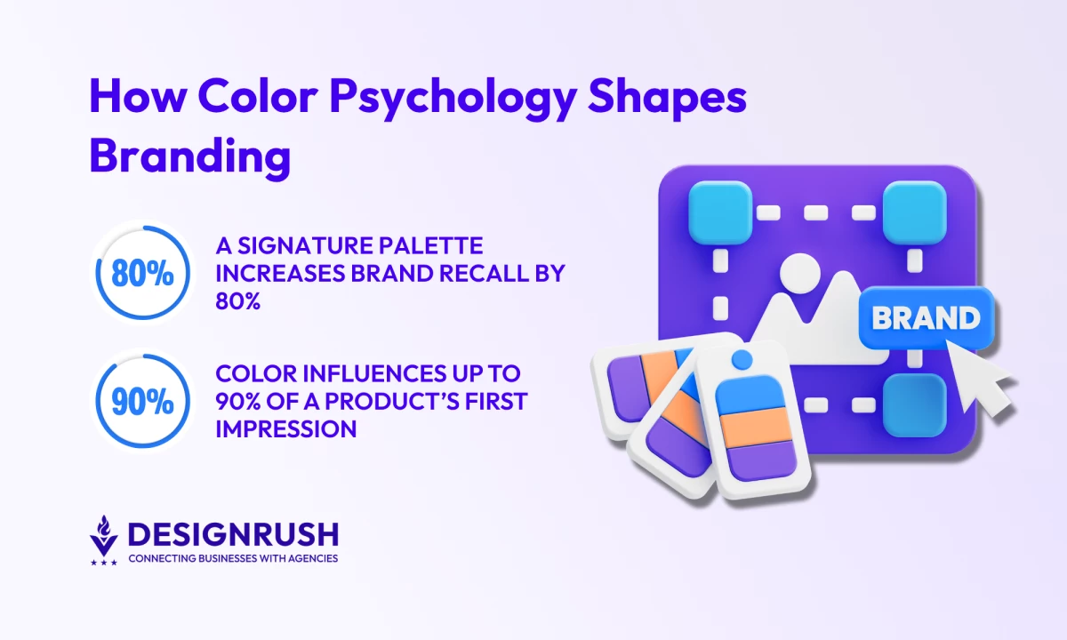
- Start with emotion: identify what you want your brand to evoke. Color accounts for up to 90% of first impressions.
- Codify and apply your colors across every touchpoint. Brands using a consistent palette see up to 80% higher recognition.
- Align your palette with emotional triggers that fit your positioning. 85% of consumers say color influences their purchase decisions.
The Science Behind Color Psychology Branding
Color psychology explores how hues influence perception, emotion, and decision-making in a brand context.
In branding, color works visually and emotionally:
- It conveys your brand’s personality and associates basic emotions (e.g., blue signals trust).
- It speeds recognition that helps people identify your brand instantly, even from a distance.
- It influences consumer behavior and drives actions, such as using bold reds or oranges to prompt clicks or purchases.
In fact, consistent use of a signature palette can increase brand recall by 80% and influence 85% of purchasing decisions.
Psychologists call this cognitive ease. When something feels easy to process, we tend to trust it more.
Best Colors for Branding: What Each Hue Communicates
Color is one of the most immediate brand cues audiences register. Each hue communicates distinct emotional and psychological meanings that influence trust, preference, and behavior.
Here’s what each core color communicates and which types of brands use it best.
Keep in mind these are broad psychological cues, and thus context always matters. Cultural and regional backgrounds can shift meanings entirely.
Always validate assumptions through experimentation and audience research to see how your specific market actually responds.
How To Use Color Psychology Strategically for Your Brand
Color psychology only creates impact when it’s applied strategically. Here’s how to use color intentionally:
1. Break Industry Norms To Differentiate
Every industry follows unwritten color codes; tech and finance lean blue, food and retail love warm reds and yellows, and organic brands use greens.
But these conventions also create visual sameness. Choosing a hue that diverges from your competitors’ palette can carve out a distinct space.
Conduct a color audit of your competitors. Identify gaps in hue, saturation, and brightness to stand out.
That said, breaking the norm works only if done thoughtfully. For example:
A cybersecurity firm using pastel pinks would feel off-brand because it breaks the category’s expectation of security and seriousness.
Instead, find creative tension within your category (e.g. a tech startup might use purple as a unique twist on the usual blue).
2. Guide User Actions With Color Hierarchies
Use contrast and hierarchy to guide the user’s eye toward what matters most.
As Jason Saldana, president and CEO of Copa Design, explains:
“We advise focusing on a strong visual hierarchy — ensuring that the key message is immediately visible and supported by secondary elements.
Typography, color, and imagery must all work in harmony to reinforce the brand’s voice and the message being conveyed."
For instance, a bold orange “Sign Up” button against a blue background naturally draws attention and increases clicks. Keep supporting colors neutral or muted so text and primary elements pop.
And always check accessibility by ensuring sufficient contrast (WCAG guidelines of 4.5:1) for tex and interactive elements to lift click-through rates.
3. Adapt to Cultural and Demographic Contexts
Color symbolism varies across regions and groups, so it’s crucial to test your color choices within your specific market.
Gender, age, and culture shape preferences, too. Young audiences might favor bold, saturated brights, while older audiences often appreciate subdued palettes.
Most importantly, research local meanings:
- Red represents luck and celebration in China, but often signals danger or urgency in Western markets.
- White conveys purity and minimalism in much of the West but can symbolize mourning or sterility elsewhere.
This is why when targeting international markets, global brands keep a neutral core palette (blacks, whites, grays) and adjust accent colors per region.
4. Refresh Brand Perception by Evolving Your Colors
When rebranding, color tweaks can signal change.
Subtle hue shifts or new accent colors convey freshness or a new chapter without losing all recognition.
For instance:
- Instagram’s rebrand introduced a vibrant gradient to signal creativity and a modern vibe.
- Dunkin’ (formerly Dunkin’ Donuts) refreshed its palette by brightening its orange and toning down the pink to feel more energetic and current.
@themarinmachine Another perfect rebrand… Let us know which companies you want to see next! . #dunkin#dunkindonuts#dunkindonutscoffee#coffee#donuts#starbucks#marketing#branding#rebrand#rebranding#breakdown#rebrandingbreakdown♬ original sound - The Marin Machine
Use color changes to mark strategic shifts: a new product line might adopt a distinct accent color that still harmonizes with the main palette (like a seasonal color that complements your core brand hues).
Real-World Examples: Brands That Nailed Their Color Psychology
Color alone can influence up to 90% of a product’s first impression. Each of these brands is a testament to this fact.
Notice how none of them overload the spectrum. Each brand has one or two signature colors that it owns in customers’ minds:
1. Coca-Cola – Red: A Global Symbol of Energy and Togetherness
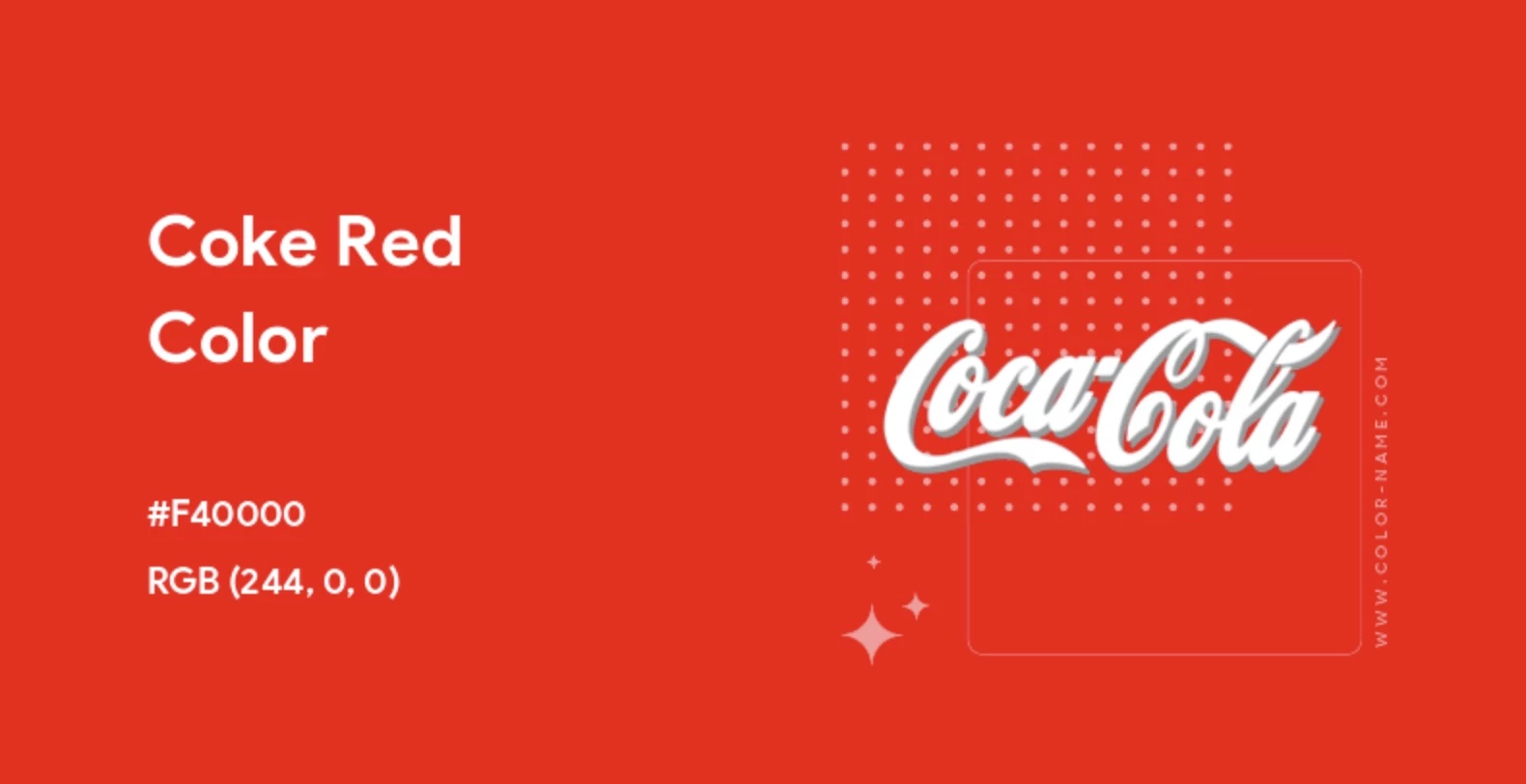
Coca-Cola’s red is one of the most valuable brand assets in modern marketing. That bold, energetic red instantly evokes excitement, appetite, and joy.
From the beginning, the brand used red-and-white signage to stand out on crowded shelves.
Today, that same red ties every product back to one global identity. It acts as the glue that unites Coca-Cola’s portfolio around optimism, togetherness, and shared happiness.
2. Barbie – Pink: Femininity Into Empowerment
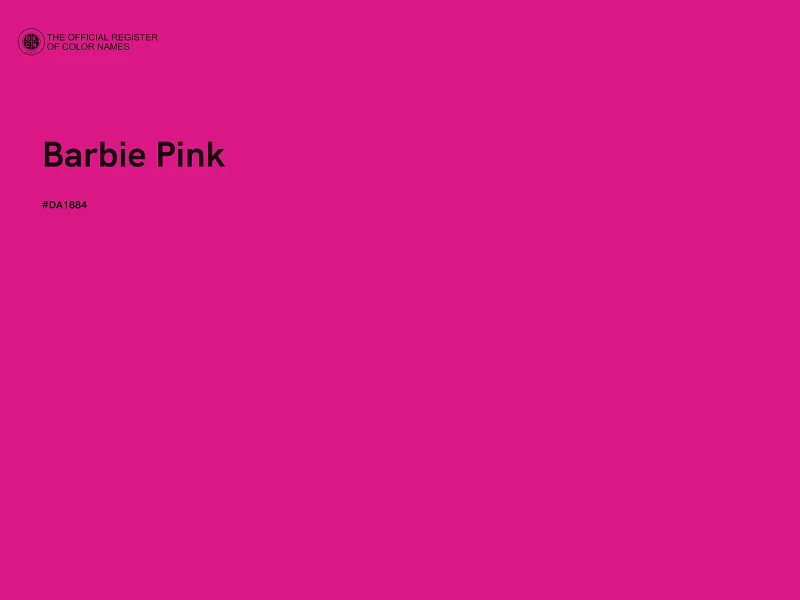
Few brands have weaponized color as effectively as Barbie. Its signature pink has endured for decades precisely because it adapts.
Once tied to traditional femininity, Barbie Pink has evolved into a symbol of agency, self-expression, and girl empowerment, reflecting cultural shifts across generations.
@brunabarbieoficial Hi Barbie 👱🏻♀️💖🎀 #barbie#pink#doll#barbiegirl♬ Barbie Girl - Aqua
Today, that unmistakable shade more than stands out on shelves. It serves as a reminder that when color carries cultural relevance, it can turn a simple toy into a multibillion-dollar movement.
3. Tiffany & Co. – Blue (Tiffany Blue): Owning Luxury and Timeless Romance
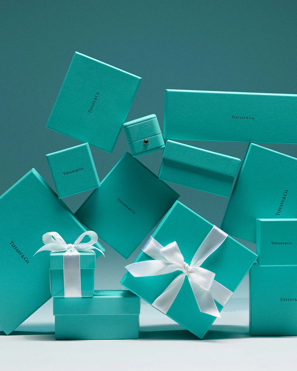
Tiffany Blue, officially “1837 Blue,” is a masterclass in how color can move beyond design to represent craftmanship and prestige.
Tiffany’s robin-egg blue was inspired by turquoise, which evokes timeless elegance and romance. The brand trademarked it in 1998, turning its color into an owned asset and trust mark.
Over decades, Tiffany Blue has embodied the brand’s identity, becoming synonymous with its premium jewelry.
4. Starbucks – Green: Connection Through Conscious Consumption
Starbucks’ signature green shade acts as a visual shorthand for calm, community, and conscious consumption. It signals restoration, an invitation to pause, connect, and feel good about what’s in your cup.
That feeling is backed by substance: 99% of its coffee is ethically sourced, 31 million climate-resilient trees have been donated, and more than 9,000 “Greener Stores” operate worldwide.
Green has become the brand’s trust signal as among the world’s most sustainable companies.
Branding Colors Psychology: Final Words
Color is a silent ambassador for your brand. When chosen thoughtfully, it speaks of who your brand is, what it stands for, and how you want people to feel.
Invest the time to research, test, and refine your colors. The payoff is a distinct, cohesive identity that grabs attention and earns trust.
Make sure you introduce your brand confidently with the right color choice.
-content-large-webp.webp)
Our team ranks agencies worldwide to help you find a qualified partner to implement the latest AI solutions. Visit our Agency Directory for the Top Branding Agencies as well as:
- Top B2B Branding Agencies
- Top Small Business Branding Agencies
- Top Corporate Branding Agencies
- Top Design Agencies
- Top Creative Agencies
And don’t miss our Awards section, where we celebrate the most innovative projects in design, from logo and app design to print and packaging.
Color Psychology in Branding: FAQs
1. Why is color psychology important in marketing?
Because people react to color fast. The right color can build trust, trigger action, or set your brand apart.
For example, blue often signals trust — which is why it’s common in finance and tech.
Red creates urgency, so it’s used in sales and promotions.
2. How many brand colors should you use?
Most brands stick to one primary color, one or two accent colors, and a neutral. Too many can dilute your identity or confuse users. Keep it simple and consistent.
3. What’s the difference between brand color and logo color?
Your brand color is part of a broader palette used across all touchpoints — from your website to your packaging.
Your logo color is just one piece of that system. They should work together, but your brand color strategy goes beyond the logo.


-preview-webp.webp)