Knowing how to choose brand colors is essential for building a strong visual identity. Like your logo, your brand colors act as visual shorthand for your identity. It goes beyond what looks appealing — it’s about picking a palette that represents your company’s personality, communicates your values, and leaves a lasting impression.
With the help of our experts, we’ll guide you through six essential steps to choosing colors that strengthen your visual identity and boost brand recognition.
Why Are Brand Colors Important?
Think of brand colors as your brand’s signature — they tell your story and make your business instantly recognizable. When used consistently, they don’t just look good — they build recognition and help your audience connect with your brand.
You’ll see these colors everywhere, such as:
- Logos: The visual representation of your brand.
- Websites: The overall color theme of your online presence.
- Social media: Consistent use of colors across platforms.
- Packaging: Creating a cohesive and memorable impression.
- Physical spaces: Reflect your style in stores or uniforms.
Using your brand colors consistently creates a lasting impression and ensures your business is recognizable across all platforms.
How To Choose Colors for Your Brand
Selecting the right brand colors is a strategic process that combines creativity, psychology, and research. Follow these six actionable steps to craft a color palette that truly represents your brand and makes a lasting impact:
- Define your brand identity
- Understand color psychology
- Master key color terms
- Explore competitors’ brand colors
- Develop a cohesive color palette
- Test and implement consistently
1. Define Your Brand Identity

Start by defining who you are as a brand. This creates a foundation for choosing colors that represent your business and connect with your audience.
Ask yourself:
- What are our core values? (e.g., innovation, trust, or sustainability).
- How do we want your audience to feel? (e.g., inspired, confident, or joyful).
- What’s our brand personality? (e.g., playful, professional, or luxurious).
For example, a tech startup aiming to convey trust and innovation might lean toward blues and whites. Or a sustainable brand focused on harmony and nature may choose greens and earthy tones.
When you define your brand identity, it’s easier to pick colors that match your goals and speak to your audience.
| Tool to use: Try Brand Archetypes to clarify your brand’s personality and values. |
2. Understand Color Psychology
Colors do more than just catch the eye — they influence emotions, perceptions, and even decision-making. Understanding color psychology can help you align your palette with the feelings and values you want your brand to convey.
Each color choice tells a unique story, contributing to the overall brand narrative. Here’s what colors can say about your brand:
- Red: Bold, energetic, and attention-grabbing. Coca-Cola uses red to evoke excitement and urgency, encouraging impulse purchases.
- Blue: Trustworthy, calming, and professional. Google and Facebook rely on blue to foster trust and reliability, making it ideal for tech companies.
- Yellow: Cheerful and optimistic. McDonald’s uses yellow to evoke happiness and attract families looking for a fun dining experience.
- Green: Eco-friendly, fresh, and harmonious. Starbucks uses green to highlight its commitment to ethical sourcing and sustainability.
- Pink: Feminine energy and youthfulness. Barbie’s iconic pink appeals to its young and predominantly female audience.
- Orange: Vitality, creativity, and fun. Nickelodeon uses orange to create a playful vibe that resonates with children.
- Brown: Honest, earthy, and reliable. WWOOF uses brown to emphasize its connection to organic and sustainable farming.
- Purple: Royalty, luxury, and creativity. Cadbury uses purple to evoke sophistication and indulgence.
- Black and White: Sophistication and simplicity. Apple’s clean, minimalist branding uses these colors to convey innovation and elegance.
How does color impact perception and behavior?
- Warm tones: Red, orange, and yellow create energy and excitement, encouraging action or exploration. These colors are great for promotions or calls to action.
- Cool tones: Blue and green instill calmness, trust, and reliability. These colors are ideal for brands in healthcare, finance, and tech.
| Tool to use: Use guides like Psychology of Color Guide by CoSchedule to understand how colors influence emotions and behavior. |
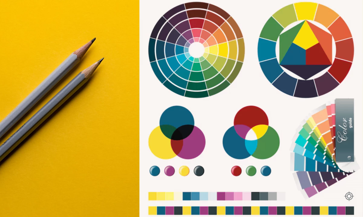
3. Master Key Color Terms
Understanding color terminology is crucial when collaborating with designers or developing your brand palette. These terms give you the tools to describe your vision clearly and make informed decisions about your color choices.
Common color terms you should know:
- Hue: The pure form of a color, such as red, yellow, or blue.
- Tint: A lighter version of a color, created by adding white. Tints are perfect for creating a softer, more approachable look. For example, pastel tints work well for brands that want to evoke calmness or friendliness.
- Shade: A darker version of a color, created by adding black. Shades add depth and sophistication, often used by luxury or professional brands.
- Tone: A muted version of a color, created by mixing black and white. Tones are versatile for adding subtlety and balance, ideal for brands wanting to appear understated yet modern.
- Saturation: The intensity of a color. Highly saturated colors grab attention and evoke energy, while low-saturation colors feel more subdued and calming.
- RGB and HEX Codes: Digital formats for consistent colors across screens.
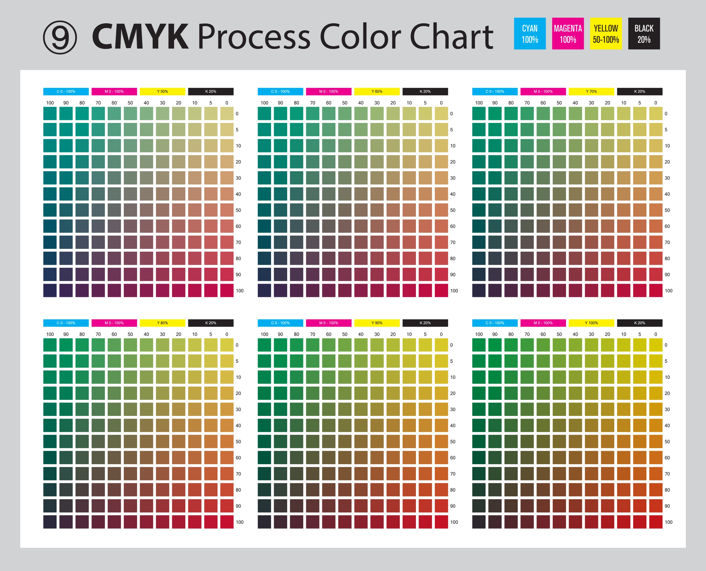
- CMYK and PMS Codes: Printing formats for accurate colors on physical materials.
| Tool to use:Adobe Color lets you explore hues, tints, and shades to see how they work together. |
4. Explore Competitors' Brand Colors
Studying your competitors’ brand colors is key to finding opportunities for differentiation while staying relevant in your industry.
What to look for:
- Visual identity impact: Analyze competitors’ colors to understand how they reflect their brand personality and establish recognition. For example, many tech companies use blue to convey trust and professionalism.
- Audience perception: Check customer reviews, forums, or social media to see how customers feel about competitors’ branding. Do their colors evoke the right emotional response?
- Content patterns: Look for recurring themes in competitors’ advertisements, social media, and packaging. Are they heavily using warm tones, neutrals, or bold contrasts?
- Differentiators: Pinpoint what sets your brand apart from each competitor, considering content type, tone of voice, and messaging. Consider how these differences can be visually represented through color.
Here are a few ways to differentiate yourself from your competitors:
- Choose colors with untapped potential: If competitors favor blues or grays, try greens or purples to stand out.
- Incorporate industry norms thoughtfully: If your industry predominantly uses certain colors (e.g., green in health and wellness), consider using shades or tones that are less common. For instance, opt for mint green instead of emerald.
- Leverage your brand personality: Use your brand’s unique traits to break away from predictable choices. A bold, adventurous brand in the finance industry could add orange accents to the traditional blue palette.
By thoughtfully analyzing competitors’ palettes and strategies, you’ll uncover ways to strengthen your brand identity and capture your audience’s attention.
| Tool to use:Coolors helps you create and compare palettes with competitors’ designs. |
5. Develop a Cohesive Color Palette

Once you’ve clarified your brand identity, it’s time to build a balanced and versatile color palette. A cohesive palette ensures that your brand is visually appealing and consistent across all touchpoints.
Key components of a cohesive color palette:
- Primary color: Choose one dominant color that captures the essence of your brand.
- Secondary Colors: Add two to three complementary hues to enhance variety, depth, and visual interest. These colors can be used for supporting elements, accents, or calls-to-action.
- Neutral Colors: Include neutral tones like white, black, or gray to balance the brighter hues and maintain legibility in designs.
To refine and balance your palette:
- Diversify within a single hue: Instead of relying on just one shade of green, use lighter tints (e.g., mint) for accents and darker shades (e.g., forest green) for contrast. This adds depth and versatility.
- Balance bold and muted tones: Pair saturated hues with toned-down secondary colors to avoid overwhelming your audience. For example, a bold red primary color can be softened with muted grays or pastels.
- Match tones to your brand’s style: A playful brand might use brighter tints and higher saturation, while a professional brand could rely on deeper shades and subtle tones for a polished look.
Also remember to follow the 60-30-10 rule: 60% primary, 30% secondary, and 10% neutral colors for balance.
Tool to use:Canva Color Palette Generator lets you upload images to create balanced palettes for your brand.
6. Test and Implement Consistently
Once you’ve finalized your brand colors, the next step is to ensure they work seamlessly across all branding platforms. Consistency is key to building trust and recognition with your audience.
Where to test your brand colors:
- Digital platforms: Test your palette on websites, social media, and email templates. Ensure readability, accessibility, and visual harmony across devices and screen sizes.
- Print materials: Verify color consistency on business cards, packaging, and brochures. Use CMYK color codes to avoid discrepancies between digital and print.
- Physical spaces: Apply your palette to signage, store interiors, and uniforms. Colors should evoke the desired emotional response in real-life settings.
Document your color choices in a brand style guide to maintain consistency across all touchpoints. Include:
- HEX, RGB, and CMYK codes for digital and print use.
- Usage rules for primary, secondary, and neutral colors.
- Examples of correct and incorrect applications.
Gather feedback from stakeholders and customers before rolling out your palette. Small adjustments based on real-world testing can enhance its effectiveness. By testing and implementing your brand colors consistently, you’ll create a cohesive and professional visual identity that resonates with your audience.
| Tool to use: Use Material Design Color Tool to test your palette across platforms for consistency. |
How To Choose Brand Colors Takeaways
The perfect brand color tells your story and connects with your audience. This guide gives you the tools to start, but creating a cohesive visual identity often requires expert guidance.
With the right support, you can turn your vision into a bold, recognizable identity that sets your brand apart.

Our team ranks agencies worldwide to help you find a qualified branding partner. Visit our Agency Directory for the Top Branding Agencies, as well as:
- Top Brand Strategy Agencies
- Top Brand Positioning Firms
- Top B2B Branding Agencies
- Top Corporate Branding Agencies
- Top Branding Agencies In Houston
And don’t miss our Awards section, where we showcase the top agencies recognized for exceptional creativity and impact.
How To Pick Colors for Your Brand: FAQs
1. What is the rule for branding colors?
The 60-30-10 rule is a simple way to create a balanced palette. Use 60% of your primary color, 30% secondary colors for variety, and 10% neutral or accent colors for contrast. It keeps your branding cohesive and visually appealing.
2. What colors are most attractive for branding?
Attractive colors depend on your brand and audience, but some are universally effective. Blue builds trust, red grabs attention, green conveys sustainability, and black and white add sophistication. Choose colors that align with your values and appeal to your audience.
3. How to choose a color for a brand?
Start by defining your brand’s personality and the emotions you want to evoke. Explore color psychology, check competitor palettes, and test your colors to see how they work across platforms. The right color should reflect your identity and connect with your audience.


-preview-webp.webp)