


Receive our NewsletterJoin over 70,000 B2B decision-makers growing their brands
UI/UX Design Trends
Learn about emerging strategies in UI/UX design to ensure functionality and spark creativity in all your products. We provide insights into methodologies and metrics that countless design experts are using today. You’ll also learn about the different processes, research methods, and more.

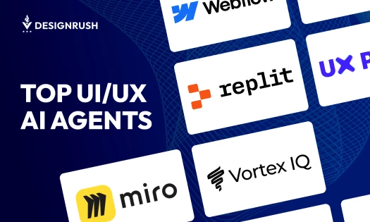
I Tried 5 UI/UX AI Agents: Here’s What Works Best for Designers and Businesses
| 6 months ago | 13 min read

Agile Design Process: Definition, Main Principles, and Benefits
| 1 year ago | 10 min read
Receive our NewsletterJoin over 70,000 B2B decision-makers growing their brands