The right UI can shorten sales cycles, boost retention, and cut development time in half. The wrong one? It confuses users, clutters your product, and quietly erodes revenue.
Here, we unpack the business case for strategic UI design and present actionable insights from industry leaders across product design, development, and web strategy.
Strategic UI Design: Key Points
- Spotify’s personalized home UI contributed to a 1,000% growth in users and revenue over a decade.
- Snapchat’s 2018 redesign backlash, including a single influencer’s criticism, triggered a $1.3 billion drop in market value.
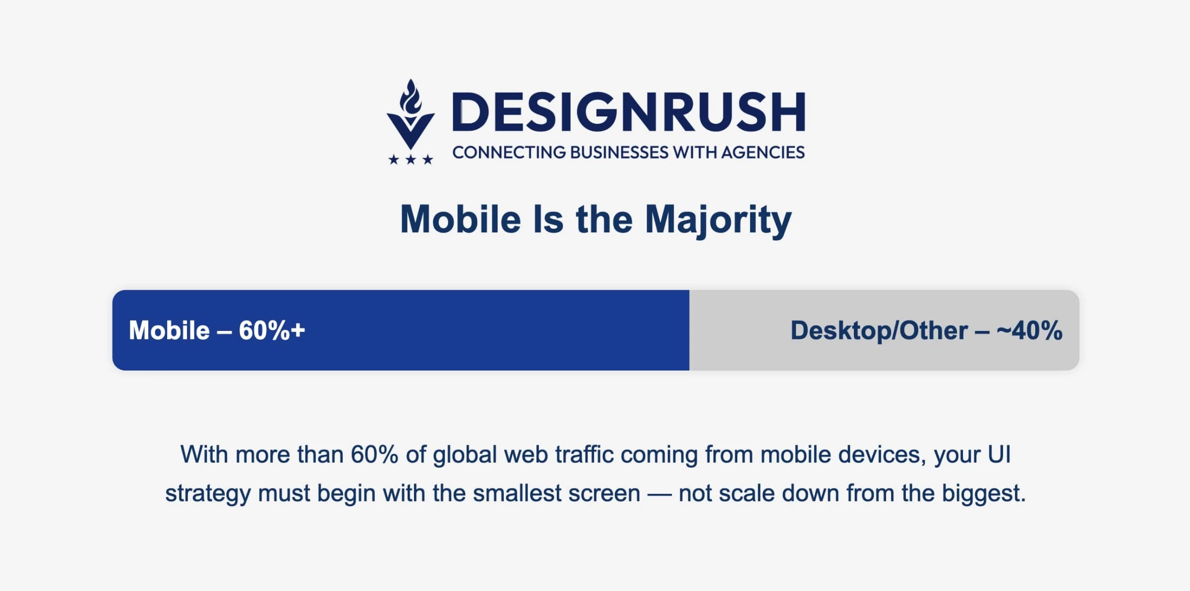
- With over 60% of global web traffic now mobile, failing to prioritize mobile-first UI puts businesses at risk.
What Is UI in Digital Design?
User interface (UI) design refers to the visual and interactive elements through which a user engages with a digital product – buttons, menus, icons, layouts, typography, color schemes, and so on.
It’s the presentation layer between your brand’s functionality and the user’s actions.
Who is Nicole Sauk?
Nicole Sauk, founder of Ventus Design Studio, is a web strategist with 20+ years of experience. Starting with hand-coded HTML in the ’90s, she became an award-winning designer in high school and later held roles in hosting, advertising, and higher ed before launching her studio in 2012. Today, she helps businesses turn websites into growth engines.
Let’s see what she has to say about designing UIs that actually move the needle.
Why UI Matters to Business Leaders
From boosting retention to accelerating development cycles, a well-executed UI directly impacts revenue, brand perception, and operational efficiency.
Here's how.
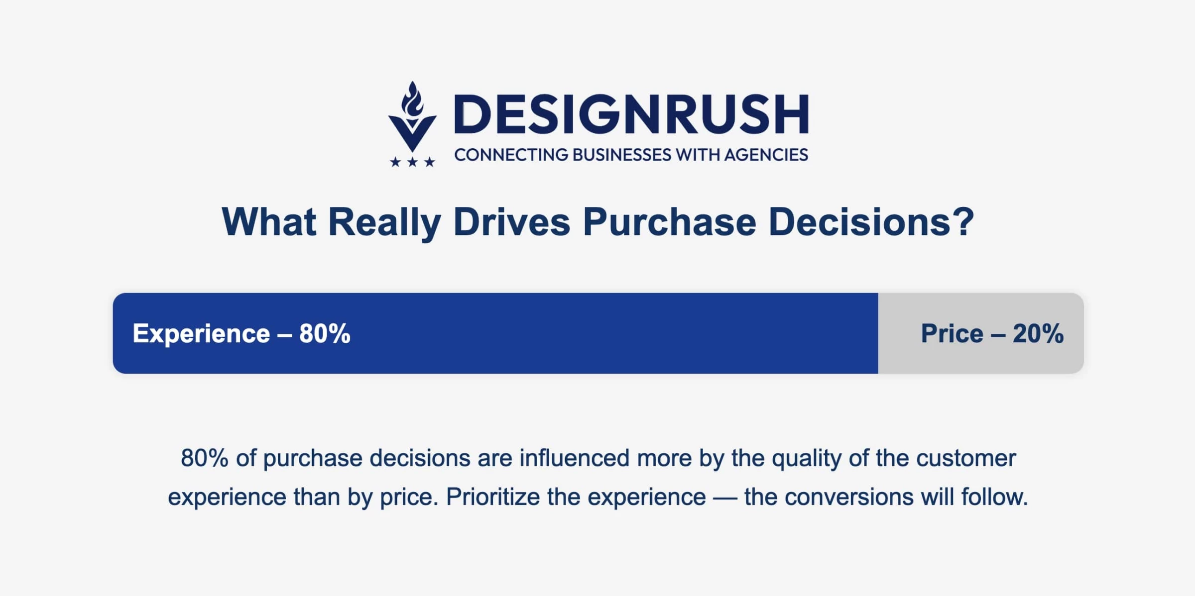
- Improved retention: Intuitive interfaces reduce friction, increase task completion, and drive repeat usage. 80% of purchase decisions are shaped by experience, not price.
- Stronger brand recall: Consistent, polished UIs build trust and make your brand more memorable.
- Operational efficiency: Design systems and reusable components streamline work. IBM reports 75% faster design time and 33% faster development.
As Sauk emphasizes, “If you say, ‘I don’t really get much business from my website,’ your UI is probably underperforming.”
UI vs. UX: A Framework for Executive Decision-Making
Both UI and UX are critical to product success, but they aren’t one and the same. Here’s a simple framework to distinguish the two in strategic planning:
User Interface | User Experience |
Focus: Visual layout and interactive elements (look and feel) | Overall journey flow, utility, and emotional response (how it works) |
Examples: Color schemes, typography, button styles, form design, icons, responsive layouts | User research, information architecture, workflow mapping, content strategy, customer emotions |
Key Metrics: Click-through rate, error rate on forms, time on task, conversion on specific UI elements (e.g. % clicking a CTA) | Task completion rate, funnel drop-off rates, Net Promoter Score (NPS), overall satisfaction, retention rate |
Tools: Design tools like Figma, Sketch, Adobe XD for mockups and prototypes | Research and testing tools like Hotjar, UserTesting, Maze for user behavior insights; also analytics for flow analysis |
A quick UI fix might be adding a tooltip or making a button more prominent, but a deeper UX fix might simplify the workflow.
Knowing which lever to pull, either UI polish or UX re-architecture, can save money and time.
When UI Goes Wrong: The Cost of Poor Design
Not all redesigns lead to glory. In fact, many fail, sometimes spectacularly, when driven by personal taste or siloed decisions rather than user data.
Two cautionary tales stand out:
Case #1: Snapchat’s 2018 Redesign Debacle
In an attempt to overhaul its interface, Snapchat rolled out a new UI that immediately faced user backlash.
The changes were so disliked that even influencers chimed in (a single tweet by Kylie Jenner saying she stopped using the app wiped out $1.3 billion of Snap’s market value overnight).
Within weeks, Snapchat saw a decline in daily users and had to scramble to partially revert or adjust features.
The Lesson
Drastic UI changes should be carefully tested; what seems like an “innovative” design can alienate your core users if it disrupts how they naturally navigate your product.
Case #2: Booking.com’s Relentless Experimentation
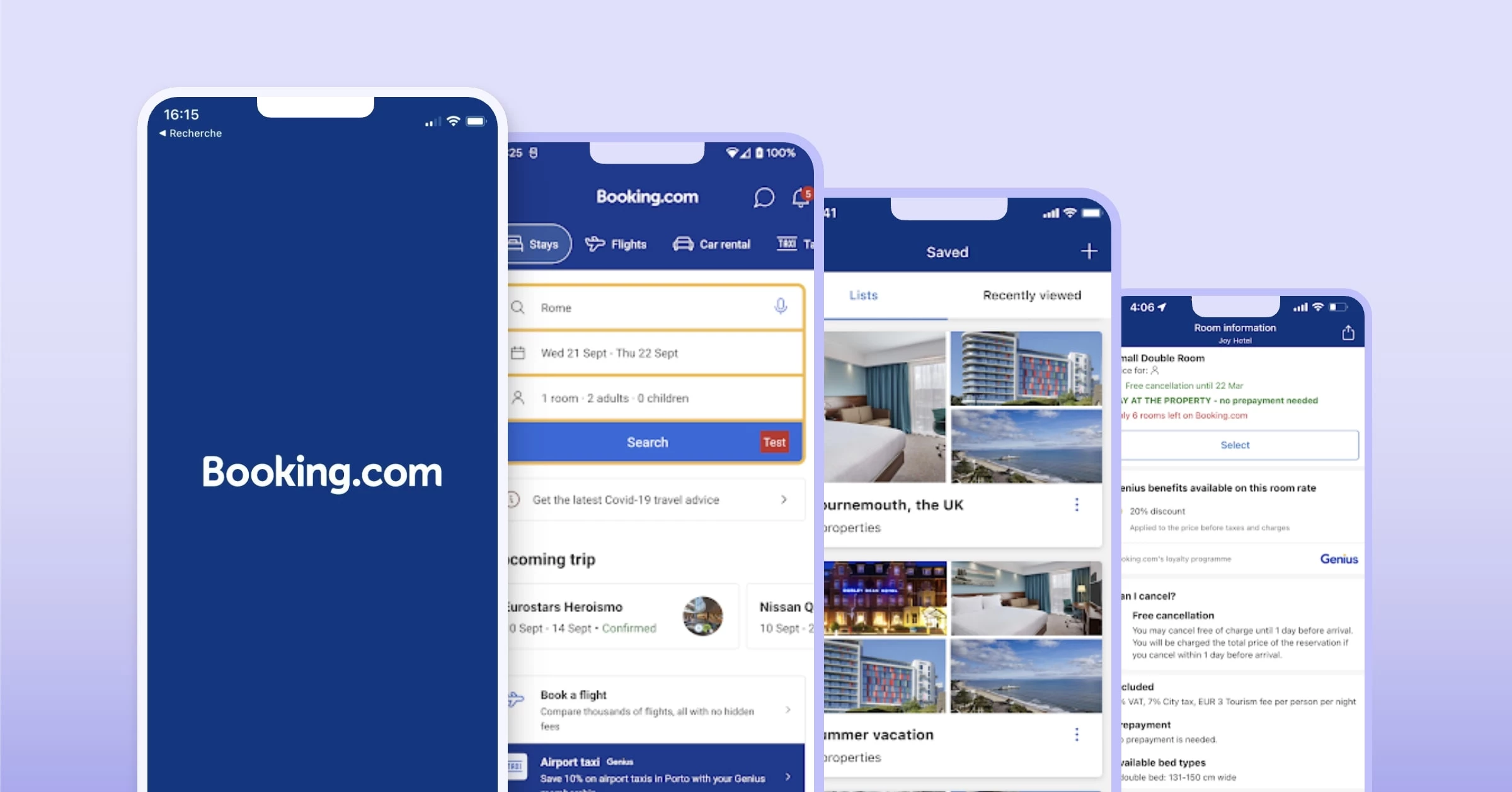
The opposite of a big one-time overhaul is continuous A/B testing. Booking.com is famous for running over 1,000 concurrent UI/UX experiments on its platform at any time.
The result is a culture of iterative tweaks that have yielded a roughly 5% conversion improvement year-over-year.
But notably, about 90% of their experiments do not improve the metric tested. In other words, most UI ideas fail or have no impact – and Booking embraces that.
They treat failed tests as learnings and keep optimizing.
The Lesson
Data-driven iteration works, but you must be willing to fail often.
Booking’s conversion gains come from the 10% of tests that succeed, and they only know what works by rigorously testing everything (even CEO-suggested ideas aren’t spared from testing).
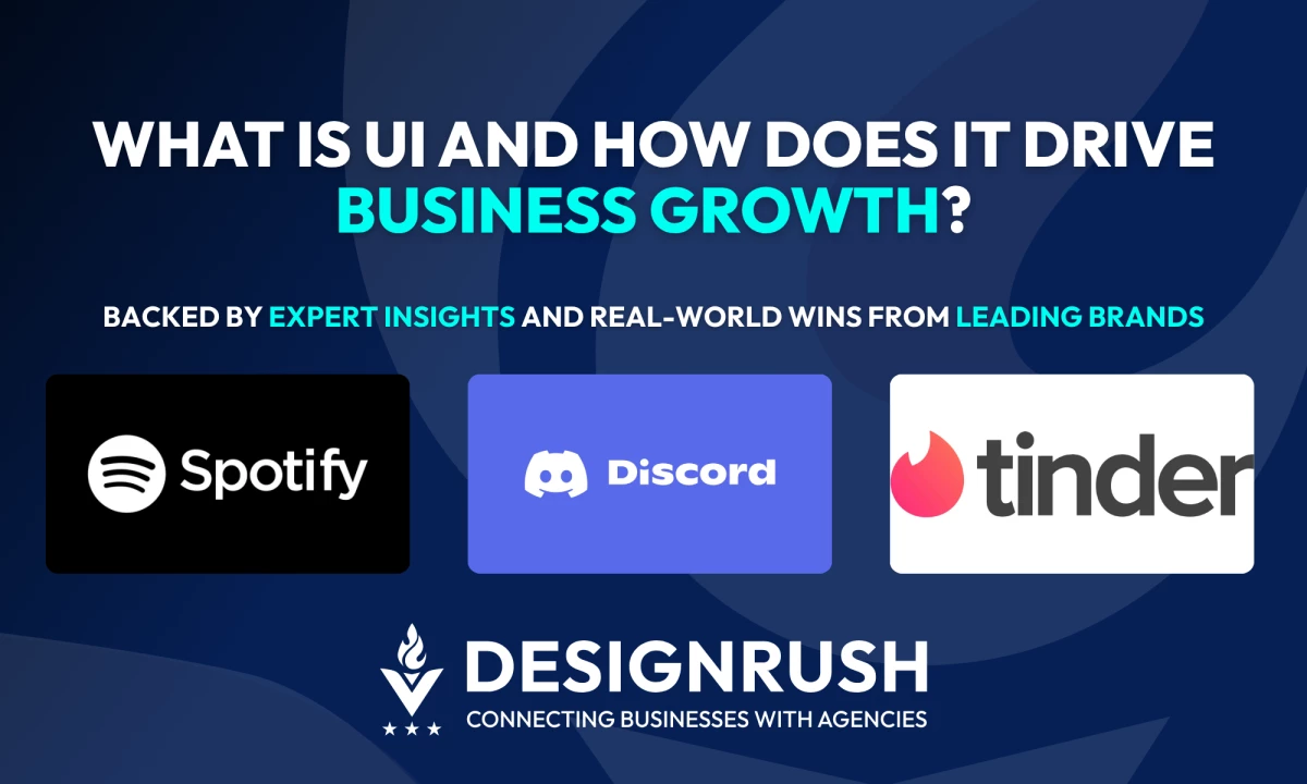
Interface Improvements That Drive Business Metrics
Thoughtful UI enhancements, when aligned with user needs, can yield substantial lifts in key metrics.
Below are five household names that have turned UI into a strategic differentiator, delivering real, measurable outcomes across engagement, growth, and revenue.
- Spotify’s predictive home feed enhances retention and engagement
- Discord’s redesigned server discovery boosts community growth
- Tinder’s UI streamlining and video profiles drive deeper user engagement
Spotify’s Predictive Home Feed Enhances Retention and Engagement
In 2024, Spotify refined its home UI with dynamic content cards like “Discover Weekly,” “Daily Mix,” and “Recently Played,” combining adaptive layout, time-of-day theming, and micro-interactions to anticipate user needs.
View this post on Instagram
Business Results
According to the 2025 Dinasti research, users found Spotify’s visual language soothing and re-engaging.
Spotify attributes much of its growth — a 1,000% rise in users and revenue over the past decade — to its personalization-powered UI strategy, which boosts retention and session length.
Discord’s Redesigned Server Discovery Boosts Community Growth
In late 2024, Discord revamped its Discover UI: including category tagging, hover‑based server previews, and grid layouts to reduce clutter and improve exploration.
Business Results
Discord’s public discovery feature now surfaces over 3 million servers and supports 227+ million monthly active users.
The ~30% growth in server joins and reduced bounce rates from Discover, signaling heightened user onboarding via the redesigned UI.
Tinder’s UI Streamlining and Video Profiles Drive Deeper User Engagement
In late 2023–2024 Tinder introduced a “rizz-first” UI redesign: new match animations, dark mode, streamlined profile layout, integrated video bios, and context-aware prompts.
Business Results
Post-update, Tinder saw 19% more matches per active user, 33% increase in profile dwell time, and improved Gen Z engagement metrics.
The gesture-driven UI remains central, with enhancements focused on richer first impressions and smoother navigation.
Strategic UI Playbook Backed by Industry Experts
Treating UI as a growth engine means embedding strategic design practices into your team’s culture, tools, and metrics.
We’ve distilled key strategies backed by expert insights, to help you embed great interface design into your organization’s DNA.
- Adopt a design system
- Pair UI with analytics
- Prioritize mobile-first design
- Ensure UI/UX/dev alignment
- A/B test everything, and iterate
Adopt a Design System
If you haven’t already, create or implement a design system, like a centralized library of reusable UI components, patterns, and guidelines that serves as a single source of truth for your team.
A well-structured design system accelerates development and simplifies scaling. It helps teams avoid reinventing the wheel with every project, enabling faster rollouts and higher design quality.
As Marina Marsh, Founder of Web Loft Designs, puts it, “A successful website goes beyond just assembling elements — it requires thoughtful research, planning, and execution.”
To measure impact, track metrics like developer hours saved per project or onboarding speed for new designers. The efficiencies add up, especially as your team and product grow.
Pair UI with Analytics
UI decisions must be driven by how users actually behave, not assumptions.
Sauk’s approach? “If you’re getting traffic but not conversions, something’s wrong with the website. And you won’t know what until you look at the data.”
Start by reviewing:
- Where users click (and don’t)
- Where they drop off or rage-click
- What devices they use most
Tools like Google Analytics, Microsoft Clarity, or Hotjar provide this clarity. Sauk also suggests checking if users are completing your primary CTA (e.g., contact form). If not, you have a UI or messaging issue.
Prioritize Mobile-First Design
“The site should load before users finish blinking,” says Marsh — and that expectation isn’t hyperbole, it’s reality.
With over 60% of global web traffic now coming from mobile devices, your UI strategy must begin with the smallest screen.
Marsh emphasizes that “having a mobile-first design ensures the site meets the expectations of mobile users.”
It’s not just about resizing content for smaller screens — it’s about rethinking the experience from the ground up: faster load times, intuitive tap zones, and layouts built for scrolling thumbs, not mouse clicks.
Ensure UI/UX/Dev Alignment
Sauk highlights the need for cross-functional alignment from day one.
She emphasizes that your website must work hand-in-hand with your marketing efforts.
- If you're running ad campaigns, your landing pages should be ready.
- If you're promoting a lead magnet, the signup flow must be seamless.
“I talk about business goals during the initial call,” says Sauk. “A website isn’t just about looking good — it should support trust, conversions, and the larger marketing plan.”
The takeaway? UI isn’t a design task. It’s a cross-functional initiative. Keep design, development, and marketing in sync from day one.
A/B Test Everything, and Iterate
You don’t need to test every color change, but big decisions, like navigation flows or CTA placement, should always be validated.
Sauk calls out one of the most common UI mistakes: no clear call to action.
“If you tell users to do too many different things, they’ll get confused and do nothing. But if you tell them clearly what to do, like ‘Book a call’ or ‘Request a quote’, you’ll start seeing real results.”
How To Achieve a Seamless Testing Cycle
- Set up basic split tests for CTAs or homepage layouts
- Track form completions and bounce rates
- Adjust based on what works, not what you think works
Remember: Most users won’t convert because your site looks cool. They convert because it’s easy and obvious what to do next.
![]()
Our team ranks agencies worldwide to help you find a qualified agency partner. Visit our Agency Directory for the top UX/UI Design Agencies, as well as:
- Top Design Agencies
- Top Graphic Design Agencies
- Top Digital Agencies
- Top Digital Marketing Agencies
- Top Social Media Marketing Agencies
What Is UI FAQs
1. Can UI improvements directly impact revenue?
Yes. UI improvements reduce friction in key user journeys, like checkout or onboarding, which leads to more conversions, higher MRR, and lower churn.
2. How do I know if our UI is underperforming?
Watch for red flags like high drop-off rates, low feature engagement, or repeated support questions about basic tasks. User reviews with terms like “clunky” or “confusing” also signal trouble. Compare your metrics to industry benchmarks — if retention or conversion is lagging, UI could be the issue.
3. Is building a design system worth the investment?
Yes, especially at scale. A design system cuts duplication, streamlines handoffs, and ensures visual consistency. For executives, that means lower costs, faster launches, and a UI that scales cleanly across teams and products.