In recent years, attention is at a premium. We’ve seen how brands lose leads and revenue simply because their websites fail to meet user expectations.
Responsive Web Design: Key Points
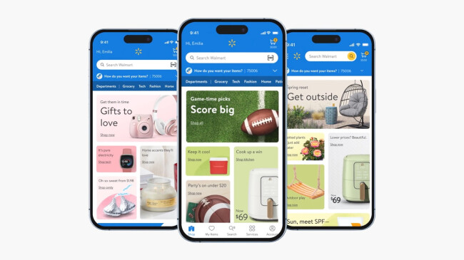
- Walmart Canada grew mobile sales by 98% after redesigning with mobile at the core.
- As Google simply won't index your site if it's not accessible using a mobile device, Oliveira warns that non-responsive sites risk significantly lower rankings.
- A well-designed user interface can raise conversion rates by up to 200%, and exceptional UX can boost conversions by up to 400%.
Why Responsive Website Design Is a Growth Strategy
1. Responsive vs. Adaptive Web Design
2. Web Design Best Practices 2025
3. 10 Web Design Elements for Seamless UX
4. Top AI Web Design Tools
High-growth brands treat responsive website design as a growth strategy, not a visual upgrade.
Sergio Oliveira, Director of Development at DesignRush, shines light on actionable strategies that consistently drive higher conversions and stronger user engagement.
Who is Sergio Oliveira?
Sergio Oliveira is a tech leader and software engineer with expertise in scalable systems, C#, .NET, SQL, and Azure. At DesignRush, he's in charge of responsive web design and leads the full development lifecycle, ensuring technical execution aligns with business goals.
1. Start With a Mobile-First Mindset
Despite mobile usage dominating web traffic, many brands still build for desktop first — an outdated habit with costly consequences.
“Most of the time, the desktop is being thought through first, and then we kind of try to figure out what’s missing for mobile,” Oliveira said. “It should be the other way around.”
This backward approach results in mobile interfaces that feel like afterthoughts: slow to load, cluttered, and poorly optimized, especially problematic given that Google uses mobile-first indexing.
How To Prioritize Mobile the Right Way
To fix this, Oliveira suggested starting with data:
- Identify your most common user devices and screen sizes
- Design specifically for those, instead of trying to support everything at once
- Use tools like Hotjar to gather behavioral insights
- Set breakpoints based on actual usage patterns, not assumptions
This data-first design philosophy ensures you build for the majority of your audience, not an imaginary desktop user.
Jeremy Koh, founder of KOPI, reinforces this, adding that:
“Adopting a mobile-first approach isn’t just about prioritizing smaller screens; it’s about distilling the user experience to its most essential elements. This clarity often leads to more intuitive navigation and faster load times — both critical to engagement and conversion.”
By thinking mobile-first, you’re building leaner, faster, and more user-centric experiences from the ground up.
2. Set Strategic Breakpoints Based on Real User Behavior
Responsive design isn’t about supporting every possible screen size but supporting the right ones.
Oliveira emphasized that many teams over-engineer their breakpoints by guessing or copying frameworks that weren’t built for their audience.
“We try to go with a data-driven approach. It starts with understanding what devices your users are coming from and designing for those — not everything under the sun.”
Don't Chase Fringe Cases
Instead of optimizing for every possible resolution, Oliveira recommends focusing on the device types your users actually use:
- Use tools like Microsoft Clarity to find your users' real devices
- Define 2–4 key breakpoints based on top usage clusters
- Focus on performance where it counts, not every theoretical resolution
“If I know 70% of my traffic comes from iPhones and 13-inch Macs, I’m not optimizing for someone on a 5-inch Android that represents 0.7% of visits,” says Oliveira. “You let the outliers fall out.”
This targeted approach avoids bloat, speeds up load times, and ensures your site performs where it counts, without sacrificing essential user groups.
Gabriel Shaoolian, founder and CEO of Digital Silk, reinforces the importance of adapting to user behavior across devices:
“A responsive site not only improves usability, but it also boosts SEO rankings, improves engagement, and builds trust by adapting to the user's preferred platform effortlessly."
3. Don't Neglect the Hand-Off to Front-End
Once designs are approved, execution begins — and Oliveira stresses how crucial the handoff is.
“We hand the breakpoints and design logic to the front-end devs. Their job is to implement those layouts using CSS and media queries,” he says. “If they don’t understand how users interact on different devices — mouse vs. touch, portrait vs. landscape — the design won’t hold up.”
In other words, without precise collaboration, even the most well-researched responsive strategy can fall apart in implementation.
To bridge the gap between design and development, teams must go beyond visual comps and ensure a shared understanding of context, constraints, and user interactions.
What a Smooth Handoff Looks Like
- A prioritized list of breakpoints, based on real user data
- Clear layout specs showing how designs should adapt across screens
- Notes on expected behaviors (tap targets, stacking order, visibility toggles)
- Active collaboration between designers and front-end devs during implementation
This level of clarity prevents costly misalignment, reduces rework, and ensures that your responsive design performs just as intended — no matter the device.
4. Consider the User From the Start, Not After the Build
Responsive design is about more than fitting content to screens; it’s about understanding how different users experience your website.
“Websites aren’t just static anymore. They need to engage, not just inform,” Oliveira says. “And users aren’t all the same — some are visual, others are analytical. You can’t default to one experience for everyone.”
When UX is treated as a post-build polish, it often misses the mark. Visual thinkers may feel overwhelmed by walls of dense content, while analytical users may be frustrated by overly simplified interfaces that lack structure.
That’s why UX planning needs to begin with user intent, not after wireframes are approved.
Map UX Strategy Based on Intent
- Identify key user types (e.g., visual vs. analytical) early in planning
- Design components that adapt to different content expectations
- Avoid defaulting to a single layout model for all audiences
- Prioritize layout clarity and content hierarchy from the beginning
This approach ensures that your responsive design doesn’t just function, but it also resonates.
Nina Jelic, Lead Product Strategist at Infinum, emphasizes how this early UX investment pays off:
“On mobile, every second counts. Responsive design helps users access the information they need without friction, making trust and conversions easier to earn.”
By aligning content structure with user mindset, your site becomes more than responsive: it becomes intuitive, engaging, and conversion-ready across every device.
5. Do Not Compromise on UX and Bring In External Help (When Necessary)
View this post on Instagram
Responsive design is only as effective as the user experience it delivers, and that experience has a measurable impact on your bottom line.
A well-designed user interface (UI) could raise a website’s conversion rate up to 200%, and an exceptional UX design could boost conversion rates up to 400%, depending on the industry.
But not every business has the in-house talent to design high-performing, mobile-optimized journeys. That’s okay — what matters is recognizing when it’s time to bring in external expertise.
Oliveira noted that, when UX plays a central role in how customers interact with your brand, outsourcing to a specialized agency can make all the difference.
“Sometimes we work with agencies that already have a UX expert embedded... If UX is critical for that customer journey, then you should bring in someone who has that background.”
This is especially important for brands with:
- High-converting landing pages
- Complex navigation flows
- Mobile-first customer journeys (e.g., ecommerce, SaaS, booking platforms)
How To Get the Most Out of Partnering With an Agency
- Evaluate if UX directly impacts conversion or retention in your funnel
- Choose agencies that bring both UX strategy and responsive design execution
- Involve the UX team early, again, during planning, not after launch
Still bootstrapping? That doesn’t mean sacrificing good UX.
Tools, Templates, and Tactics To Simplify UX In-House
For budget-conscious teams, Sergio recommends:
- Feed sample content into AI to generate screen-specific design variations
- Inspect websites using dev tools to see how they implement breakpoints and media queries
- Leverage Figma templates or drag-and-drop builders like Visily to prototype fast
- Reach out to UX pros on LinkedIn for quick, targeted feedback
- Check Apple and Google reports for trends if your own data is limited
Even without a full UX team, these tools and tactics help you design with intention, keeping the experience responsive, relevant, and user-focused.
6. Embrace Forward-Thinking Design
@karlobuilds 🚀 Forget Pixel Perfect! This is the Future of Web Design! Here’s how to make your Elementor Website responsive in 2025! #wordpress#webdesigner#webdesigntips#webdevelopment#learnwordpress#elementor#onlinebusiness @Elementor ♬ Sunroof - David Cutter Music
Most responsive strategies focus on today’s devices, but that may not be enough.
Oliveira noted that while many brands still struggle to get current responsiveness right, forward-thinking teams should begin considering how their designs will hold up as technology evolves.
This doesn't mean over-optimizing for edge tech. But it does mean:
- Avoiding rigid layouts that break on ultra-wide or foldable displays
- Designing components that are modular and flexible
- Staying informed on emerging devices and screen behaviors
Being future-aware ensures your site stays relevant longer and minimizes the need for costly redesigns every time the tech landscape shifts.
3 Brands That Turned Responsive Design Into a Competitive Edge
What separates the good from the great when it comes to responsive web design is how it translates to real business results.
Here’s how three well-known brands used responsive design to gain a measurable advantage:
- Walmart Canada: 98% sales surge from a mobile-first overhaul
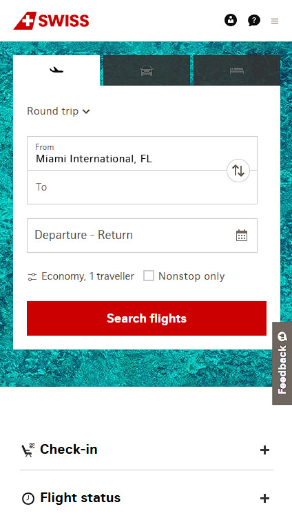
- SWISS Air: Simplicity that drives bookings
- Dropbox: Responsive design with user intent at the center
1. Walmart Canada: 98% Sales Surge From a Mobile-First Overhaul

Walmart Canada rethought its digital presence with a mobile-first strategy — not just visually, but functionally.
Oliveira explains why this matters:
“Mobile can’t be an afterthought. If you’re getting 70–90% of your traffic from mobile, that has to be where design starts. Otherwise, you’re building friction into the one area that matters most.”
Walmart’s team prioritized screen-specific usability, optimizing key touch zones and loading times.
This lean approach resulted in a 98% increase in mobile sales.
2. SWISS Air: Simplicity That Drives Bookings

SWISS Air’s website strips away distractions, guiding users toward a single action: booking a flight.
Oliveira emphasizes this kind of intentional UX:
“Design should reflect the intent of the user on that device. On mobile, they’re not here to browse — they’re trying to do something. Make that flow effortless.”
The result is a mobile experience that’s as smooth and purposeful as the flights the company offers.
3. Dropbox: Responsive Design With User Intent at the Center

Dropbox’s approach to responsive design goes beyond resizing content. Each layout, mobile or desktop, feels intentionally crafted for the context in which it's used.
- On mobile, the experience is simplified, focusing on quick actions like uploading or previewing files.
- On desktop, it expands to support multitasking and deeper file management.
Oliveira calls this a "responsive mindset":
“You’re not designing one experience. You’re designing many — for visual thinkers, analytical users, mouse users, finger scrollers. If your site treats them all the same, you lose half.”
The result is an experience that feels natural across every device, reinforcing trust and usability.
Responsive Website Design: Final Thoughts
When users hit your site and it just works — no delays, no clumsy resizing, no second-guessing where to click — that’s not luck.
It’s the result of choices made upstream: where you set breakpoints, how you prioritize devices, who you design for first.
The businesses getting this right are paying attention to how people interact, and they’re building around that.

Our team ranks agencies worldwide to help you find a qualified partner. Visit our Agency Directory for the best responsive website design agencies, as well as:
- UI/UX Design Agencies
- Web Development Companies
- WordPress Web Design Companies
- eCommerce Development Companies
- Top B2B Web Design Agencies
Our design experts also recognize the most innovative design projects across the globe. Visit our Awards section for the best & latest in website design.
Responsive Website Design: FAQs
1. What’s the difference between responsive and mobile-first design?
Responsive design adjusts to any screen size, while mobile-first starts with mobile layouts and scales up. Mobile-first ensures the best experience for mobile users from the start.
2. How does responsive design impact SEO?
Responsive sites rank better on Google by improving load speed, usability, and mobile experience — all of which lower bounce rates and boost traffic.
3. Can a non-responsive site hurt your brand?
Yes. Poor mobile experiences frustrate users, damage trust, and reduce engagement, which can weaken brand credibility and loyalty.


