Web design best practices are the decisions that hold up when a real visitor arrives from a phone, on a mediocre connection, with very little patience.
This guide covers 14 best practices, sequenced from cheapest to most expensive, with tips on what to fix first and what can wait until the next redesign cycle. Three practitioners also weigh in on the parts designers most often get wrong.
Website Design Best Practices: Key Findings
- Deloitte's 2020 study with Google across 37 brand sites and more than 30 million user sessions found that a 0.1-second improvement in mobile load speed produced up to 8.4% more conversions in retail and 10.1% in travel.
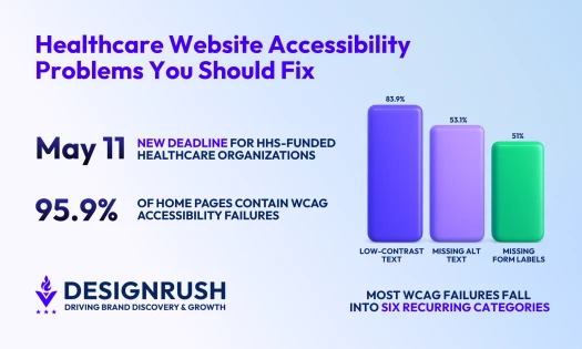
- The WebAIM Million, which scanned the top one million home pages in February 2026, detected WCAG 2 failures on 95.9% of them, up from 94.8% in 2025 and reversing six consecutive years of improvement. Low-contrast text appeared on 83.9% of pages.
- Usercentrics' State of Digital Trust 2026, conducted by Sapio Research across 11,000 consumers in seven markets, found 47% of people took at least one action with direct revenue consequence over data-handling concerns, 24% canceled a subscription and 20% switched to a competitor.
1. Best Practices for Web Design Navigation: Get Users There in 3 Clicks
Navigation works when a visitor reaches the page they came for in roughly three clicks. While the click count is a useful rule of thumb rather than a hard threshold, usability research has repeatedly found that visitors will keep clicking as long as each step feels like progress.
Put the main menu where people already look, across the top or down the left side, and label items with the words your customers use rather than your internal product names.
Visitors arrive carrying expectations built by every other site they have used. A novel navigation pattern takes attention away from your content, and then it's over before the visitor has any reason to invest.
The principles that hold across almost every site type:
- A shallow hierarchy, so no important page sits four levels deep
- Consistent placement, styling, and labeling on every page
- A search bar at the top for any site with a deep catalog
- Breadcrumbs once the structure runs more than two levels down
- Navigation that adapts to screen size without hiding primary paths behind a menu
If you’re still settling the fundamentals of the discipline, our explainer on what web design is covers all the fundamental information.
How IFF Kept a Long-Scroll Report from Losing Its Readers

Digital Silk's IFF 2025 Sustainability Report shows the principle working on the hardest possible layout: a single long-scroll page with no page-to-page navigation to lean on.
A persistent top bar names the section you're currently in and updates as you scroll, so the visitor always knows their position in a document that would otherwise be an undifferentiated column. Long-scroll pages lose people in the middle, and a persistent positional anchor is the cheapest fix.
2. Build the Mobile Layout First, Then Scale Up to Desktop
StatCounter recorded mobile at 52.57% of worldwide page views in July 2026, against 45.93% for desktop and 1.5% for tablets.
Mobile-first means you design the small-screen layout first and expand upward, rather than designing for desktop and stripping elements out. The two approaches produce different sites, because what survives an expansion differs from what survives a cut.
Designing upward from the small screen forces early decisions about what actually earns space. Practical steps:
- Simplify the navigation menu for small screens, using a hamburger pattern only where the primary paths remain reachable
- Set legible body-text sizes and line spacing before you set anything on desktop
- Size interactive elements against the tap-target rules
- Compress and format images for mobile delivery
- Test on real devices across browsers rather than only in a desktop emulator
The right web design tools make the small-to-large workflow far less painful than retrofitting a desktop comp.
How GOV.UK Discovered It Was Responsive But Not Mobile-First

GOV.UK is the clearest published example of that gap, because the team documented it against themselves. GDS built the site responsive from launch in 2012, well ahead of the field.
Eight years later, with mobile usage having risen from around 19% to consistently over half of all visits, their Head of Design wrote that the team had been building responsive interfaces rather than designing mobile-first, and that these are not the same thing. The site worked on a phone. It had not been designed from the phone outward.
What changed when they corrected it was process, not styling:
- Search filtering moved to a full-screen takeover so the interaction owned the viewport instead of competing with the page around it.
- A sticky button at the bottom of the screen gave users a route back to their filtered results.
- Breadcrumbs got new small-screen logic, collapsing to the home link and the current section rather than rendering a full trail that wraps across three lines.
- And the team committed to running usability testing on mobile devices, having previously done most lab testing on desktop tasks.
That last one is the real lesson. A team can ship a responsive layout without a single person having tested the site on a phone. Mobile-first is a decision about where the work starts, and the tell is which device your research runs on.
3. Set Typography for Scanning: 50–75 Characters per Line
Keep body-text lines between 50 and 75 characters, with 66 as the target most typographers cite. Baymard Institute's usability testing points the same way, recommending you stay at or below 80. In CSS, max-width: 66ch gets you there without hard-coding a pixel width that breaks at other font sizes.
Line spacing between 130% and 150% of the font size keeps text from reading as a solid block. Below that, the eye loses its place returning to the start of each line; above it, the paragraph stops cohering as a unit.
For paragraph length, three to four rendered lines are a reasonable working default on desktop. You can break this whenever the content earns the space.
More readability enhancements include:
- Choose widely available typefaces that render predictably across devices
- Set a visible size step between headings and body text
- Hold body text to the contrast ratios in section 7
- Give readers a way to scale text without breaking the layout
How Scheme Engine Held Every Paragraph on the Site to 60 Characters

Scheme Engine is a London film and television production company whose portfolio site was built by The Blackpepper Studio. It solves the measure problem in the most durable way available: p { max-width: 60ch } sits in the site's stylesheet.
The rest of the scale is built around that number. Body copy is Neue Haas Grotesk Display at 1rem in medium weight, with leading at 1.3. Longer-form blocks get their own slightly wider caps, 50ch on studio bios and 54ch on the client copy, and headings and standfirsts are held far tighter, between 15ch and 38ch.
The leading is worth pausing on, because 1.3 sits at the floor of the 130–150% band rather than the middle. The eye's return journey at 60 characters is brief enough that it needs less vertical help finding the next line. Measure and leading are a pair, not two independent settings. Push the same text out to 75 characters and 1.3 would start to feel airless.
The transferable move is putting the measure on the element selector instead of a class. A class is a decision every future page has to remember to repeat; an element rule is a decision made once, and it is the version that survives the contractor who builds page eleven.
4. Use White Space and Visual Hierarchy to Direct Attention
White space is the mechanism that makes hierarchy legible. Space around an element tells the eye that the element is separate and worth stopping on, which is why a single call-to-action in a wide clearing outperforms the same button crowded by three competing links.
Hierarchy itself comes from size, weight, and position working together. Enlarge what you want read first, set it in a heavier weight, and place it where the eye lands: the upper-left region on left-to-right layouts. Use contrasting color for emphasis sparingly, since a page where everything is emphasized has no hierarchy at all.
Visual cues do the rest of the guiding. Directional imagery, arrows, and a person in a photograph looking toward your headline all move attention where you want it, and none of them costs a redesign to implement.
How Qodeca Used Breathing Room to Make Its Own Case

Qodeca, a Warsaw studio, built its own portfolio site in-house, and it took the June 2026 DesignRush Design Award for website design with a jury score of 9.67 out of 10. A soft periwinkle-to-white gradient carries the base layer and electric yellow-green appears on almost nothing except the things worth clicking, including the "Let's talk" button.
Large-scale structural typography, subtle geometric dividers, and deliberate space between sections let the agency's client metrics land without a single element fighting them, which is why Design Awards juror Lazar Stojkovic described the visual pacing as "exceptionally well-structured."
5. Keep Layout and Branding Consistent Across Every Page
Consistency is what lets a visitor learn your site once and then navigate it by memory. When the logo, palette, button treatment, and heading scale are dependable, every subsequent page costs the visitor less effort than the last. Sites that vary these aspects across templates make each page feel like a new site.
A grid system is the underlying tool. Fixing your column structure, gutters, and vertical rhythm at the start gives every later page a set of positions to snap to, and it removes the per-page judgment calls where inconsistency creeps in.
Write the rules down, covering the palette with hex values, the typeface and its weights, the button states, and the icon style. A short document can be the difference between consistency that survives a team change and consistency that lasts until the next contractor.
Consistency does not mean every page looks identical, either: vary one dimension deliberately, a palette shift to mark a new chapter or section, and hold everything else fixed, and the visitor reads the change as structure rather than as a different site.
How Zig.ai Wrote Its Rules Down as Tokens Instead of a Document
Zig.ai is a B2B SaaS platform whose site was designed by Peppermint. Its answer to the write-it-down problem is to put the rules where the browser reads them: the site runs on roughly 99 CSS custom properties covering every dimension the checklist above names.
The palette is black, white, and five color families, blue, coral, gray, green and purple, each graded in regular steps from 50 through 800, so a designer picks a grade rather than a hex value. Spacing runs off a single scale named by pixel value, from 4 up to 140.
Type sizes are named semantically rather than numerically, title-xl down to title-xs and text-xl down to text-s, and each of those tokens carries three values, one per breakpoint, so title-xl resolves to 4.5rem, 2.875rem, or 2rem depending on screen. Leading is a five-step scale from 100% to 140%, weights are three, and letter-spacing is four.
The two most telling values are the ones with no scale at all. There is one container width, 85rem, and one button radius, 5rem, for the entire site. Those are exactly the two numbers that drift between templates.
What we can learn from Peppermint is that a style guide in a shared drive is advisory and tokens are binding, and the gap between those two shows up around month six.
Whichever you keep, the test is the same: a designer building the tenth page should have no decision left to make about container width, button radius, or the space between sections.
This full set of web design elements is a useful checklist for what belongs in that document.
6. Meet WCAG Contrast Minimums and 24×24 Pixel Tap Targets
Accessibility failures are the most common defect on the web and the easiest to measure. The WebAIM Million report detected Web Content Accessibility Guidelines or WCAG 2 failures on 95.9% of the top one million home pages in its February 2026 scan, averaging 56.1 errors per page across 56,114,377 total errors. That’s a 10.1% increase year over year.
Contrast Ratios for Text and Interface Elements
WCAG 2.2 Success Criterion 1.4.3 requires a contrast ratio of 4.5:1 for text against its background at Level AA, dropping to 3:1 for large-scale text. Large-scale means 18pt and above, or 14pt bold and above, roughly 24px and 18.67px. The criterion is defined in points, which is where most implementations go wrong.
A separate requirement covers everything that is not text. SC 1.4.11 Non-text Contrast asks for 3:1 on icons, form-field borders, focus indicators, and other interface components. Two different criteria share the 3:1 figure, and conflating them is a common audit finding.
Low-contrast text appeared on 83.9% of the home pages WebAIM scanned, averaging 34 instances per page. That makes it the single most common accessibility defect on the web and the one you can fix fastest, since it can usually be fixed with a handful of palette values.
Tap Target Sizes: 24 Pixels to Comply, 44 to Be Comfortable
Make every button, link, checkbox, and form control at least 24 by 24 pixels, and aim for 44 by 44 on anything people tap often. The smaller number is what accessibility rules generally require. The larger one is closer to what a fingertip actually needs, and the gap between the two is where most fiddly mobile interfaces live.
Confusion about this usually comes from how WCAG is organized. It sorts every requirement into three tiers: A, AA, and AAA, and AA is the one that accessibility laws and procurement rules point at, so make that your minimum goal.
What to do: size anything a visitor taps to buy, submit, or navigate at 44 pixels or larger. Hold 24 as the hard floor everywhere else, and where a dense layout makes bigger targets impossible, buy your compliance with spacing instead of size.
Keyboard and Screen Reader Checks
Every interactive element needs to be reachable and operable by keyboard alone, with a visible focus indicator that clears the 3:1 non-text contrast requirement. Tab through your own site once from the top; anything you cannot reach or cannot see when focused is a defect.
Screen reader support rests on markup rather than visuals. Descriptive alt text on informative images, a heading hierarchy that never skips a level, link text that states its destination instead of reading "click here," and captions or transcripts on media cover the majority of real-world failures.
WebAIM attaches a caveat to its own numbers that belongs here too: only automatically detectable failures were counted, so the share of pages achieving full A/AA conformance is certainly below 4.1%, and a clean automated scan does not mean a page is accessible.
For a working example of an audit under regulatory deadline, see our breakdown of healthcare website accessibility.
How the U.S. Web Design System Turned Contrast Into Arithmetic
Low-contrast text is a systems failure, not a per-element one. At 34 instances per page, no team is going to catch it by pasting hex values into a checker one pair at a time. The fix is to make the palette itself enforce the rule.
The U.S. Web Design System does exactly that. Every color token carries a grade on a 100-point scale where 0 is pure white and 100 is pure black, and grades are regularized across families, so grade 50 in one hue is the same lightness as grade 50 in another.
The difference between any two grades is what USWDS calls the magic number: 40 or more clears AA for large text, 50 or more clears AA for body text, and 70 or more clears AAA. Any color at grade 50 passes AA against both white and black.
A designer picking a text color against a background subtracts two numbers. There is no tool to open and no audit step to skip, which is the point — the compliance decision moved from the review stage to the palette definition, where it only has to be made once.
The transferable move is encoding the constraint in the tokens rather than in the checklist. You do not need federal tooling to do it: grade your own brand palette, write the safe pairings into the same document that holds your hex values, and the 83.9% defect stops being something your team has to remember.
7. Get Load Times Under 2 Seconds
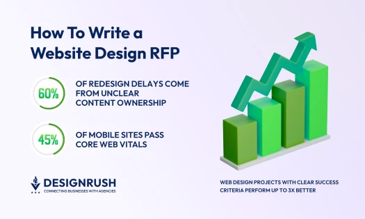
Speed converts, and the effect is measurable at intervals far smaller than most teams optimize for. Deloitte's study with Google, covering 37 brand sites and more than 30 million user sessions, found that improving mobile site speed by a single tenth of a second lifted conversions by up to 8.4% in retail and 10.1% in travel. Under two seconds is the working target; three is tolerable.
Caleb Bradley, CEO and Founder of Bighorn Web Solutions, has seen the same pattern in client work. Bradley frames speed as the factor teams overlook while optimizing everything downstream of it:
"Speed is one of the biggest hidden factors in conversions. We've helped a client even by merely shaving two seconds off their page load time. A few quick ways you can improve performance are by reducing render-blocking elements, lazy loading images, and cleaning up excess code. Faster sites convert better. It's that simple."
The most-quoted figure in this area needs handling with care. Google's 2017 analysis with SOASTA, built on a neural network with 90% prediction accuracy, found that moving from one second to ten seconds raised the probability of a mobile visitor bouncing by 123%, with 1 to 3 seconds at 32% and 1 to 5 seconds at 90%.
It is probability of bouncing rather than bounce rate, it is nine years old, and it was drawn from mobile ad landing pages, three reasons to treat it as directional color rather than a benchmark.
How Rakuten 24 Raised Revenue per Visitor 53.37% Through Core Web Vitals Work Alone
Rakuten 24 ran a controlled A/B test in which the only difference between the two versions was Core Web Vitals optimization, with no functional or visual changes to either. The company split traffic 50/50 and ran the test for a month.
The optimized version produced 53.37% higher revenue per visitor and a 33.13% higher conversion rate, documented on web.dev. Because the visual design was held constant, the result isolates performance from every other variable, which is what makes it worth more than a redesign case study reporting a similar number.
What to copy: hold the design fixed and test performance as its own variable. A redesign that also happens to be faster tells you nothing about which change earned the lift.
How Redbus Doubled Mobile Conversions After Eliminating Layout Shift
Redbus reduced Cumulative Layout Shift from 1.65 to 0 and cut Time to Interactive from roughly eight seconds to around four. The company reported an 80% to 100% increase in mobile conversion rate over the same period.
This one is correlational, and the effect size is large enough to invite reasonable skepticism about confounding factors. It is still worth citing because the CLS figure is unusually specific and layout shift is the metric design decisions influence most directly.
What to copy: measure CLS before you touch anything else, since it is usually caused by images without dimensions, injected banners, and web fonts — all design-owned.
The implementation list:
- Serve images in WebP or AVIF, which compress further than JPEG and PNG without visible quality loss, keeping the older formats as fallbacks
- Lazy-load anything below the fold
- Minify HTML, CSS, and JavaScript
- Enable browser caching for static resources
- Use a content delivery network to shorten the physical distance to your users
- Prioritize above-the-fold rendering
- Reserve space for images and embeds so nothing shifts as the page fills in

8. Design the Consent Banner as a First Impression
The consent banner is frequently the first element a visitor interacts with, which makes it a design surface rather than a legal artifact bolted to the page. Give accept, decline, and customize equal visual weight and keep granular controls reachable within two clicks.
Eike Paulat, VP of Product at Usercentrics, the company behind Cookiebot, says the failure starts with the copy rather than the layout. Paulat's test is who the text was written for:
"Most banners read as though the legal team was the audience; the ones that work are written for the person actually reading them."
Paulat describes the worst implementations as doing the reverse of every point above: a bright accept button, a greyed-out decline buried a layer down, and timing that interrupts a visitor rather than greeting them.
"That produces opt-ins, not consent, and it's visible to the user as a design decision about whose interests come first."
That distinction now carries a price. Roughly 70% of wrongful data collection claims cite the California Invasion of Privacy Act, according to Business Insider, and Security Boulevard counted more than 1,500 CIPA suits in the 18 months to August 2025.
Penalties reach $5,000 for every instance a tracker fires before consent, with no requirement to prove harm, and neither California customers nor a California office is needed, a publicly accessible site qualifies. DesignRush reported in August 2026 that the letters are now generated at scale by tools that crawl sites for common tracking technology.
Additionally, Usercentrics' State of Digital Trust 2026, conducted by Sapio Research across 11,000 consumers in seven markets with fieldwork in March 2026, found 52% of consumers globally will pay more for AI transparency. The same study found 47% had already taken an action with direct revenue consequence over data concerns.
How Google Paid €150 Million for a Missing Button
On 31 December 2021 France's CNIL fined Facebook Ireland €60 million and Google a total of €150 million, because facebook.com, google.fr and youtube.com did not let users refuse cookies as easily as accept them: rejecting everything took three clicks on Facebook and five on Google, against one click to accept.
The regulator's finding was that the asymmetry itself invalidated the consent, and both companies were given three months to fix it or pay €100,000 for every additional day.
The remedy was a design change of about one component. Google's replacement banner, rolled out on YouTube in France in April 2022 and then across the EEA, the UK and Switzerland, put equal "Reject all" and "Accept all" buttons on the first screen, with "More options" alongside them.
Getting there was not a one-line CSS edit: Google described it as a full redesign of its approach that required re-engineering the way cookies work across its sites, with coordinated changes to core infrastructure.
That gap between the size of the fix and the size of the retrofit is the lesson. A banner engineered around a single accept button tends to be sitting on tag configuration built around the same assumption, and the button is the cheapest part to change.
9. Keep the Consent Layer Out of Your Core Web Vitals
A consent management platform is a script that runs before everything else on your page, which gives it more influence over your performance scores than almost any design decision. Three checks determine whether it costs you anything.
Script Position in the Head
The consent script has to sit at the very top of the <head> element for blocking to work at all. Anything that loads above it fires before the platform can intervene, which means trackers run regardless of what the visitor eventually clicks.
Paulat's verification method takes about a minute:
"Test it in an incognito window with the network tab open — if scripts fire before you've interacted with the banner, the banner is decorative."
The Banner and Largest Contentful Paint
A full-width banner that renders before your hero image can become the Largest Contentful Paint element on the page, which hands your LCP score to a component you did not design as content. Watch for the second failure mode as well: a banner that appears after initial render and pushes the layout down registers as Cumulative Layout Shift.
Reserve the space or overlay the banner rather than inserting it into flow. Both fixes are trivial before launch and awkward afterward.
Tag Manager Consent Triggers
Tags need to be wired to wait for the consent signal rather than fire alongside it. A tag manager configured with the platform installed but the triggers left on their defaults produces exactly the pattern the incognito test catches.
Paulat's summary is the reason this section sits in a design guide at all:
"Get those three right and the consent layer costs you almost nothing in Core Web Vitals; get them wrong and it undoes the optimization work everywhere else on the site."
How Pipedrive Loads Its Consent Script First Without Paying for It
Reading a site's source is the quickest way to see whether these three checks were made deliberately, and the CRM company Pipedrive's homepage is a clean worked example. The OneTrust stub is the first script tag in the document head, sitting ahead of the structured data, the framework bundles, and everything else on the page.
The gating is then expressed in the markup: three scripts carry type="text/plain" alongside a consent category class, which the browser treats as inert text and will not execute until the platform rewrites that attribute for a category the visitor has agreed to. One of the three is the Optimizely loader, the A/B testing tool section 12 recommends.
The detail that makes the arrangement work is that the stub is loaded asynchronously. Most teams told the consent script has to come first load it synchronously and pay for it in render-blocking time on every page, but because the block here lives in the markup, it holds regardless of when the platform finishes loading.
10. Place CTAs Where Heatmaps Show Users Actually Look
Heatmaps and mouse-tracking replace assumptions about attention with a record of it. Run one for a few weeks on your highest-traffic page, then move your call-to-action to where the data says people are already looking rather than where the layout made room.
Standard placements to test against your own data:
- Above the fold, visible without scrolling
- Adjacent to the content that motivates the action
- In the upper-left region, where left-to-right readers begin
- Sticky, so it survives a long scroll
- Post-content, for decisions that require reading first
Treat that list as hypotheses rather than rules, because the most durable finding in this area is that the conventions are often wrong.
How Chartbeat Found That the Top of the Page Is Not Where People Look
Writing in Time in March 2014, then-Chartbeat CEO Tony Haile published attention data drawn from two billion visits across the web over a month. Two findings cut against standard layout practice.
First, 55% of visitors spent fewer than 15 seconds actively on a page, so most of the audience never evaluates the layout at all. Second, and more usefully for CTA placement, 66% of attention on a normal media page was spent below the fold.
Haile's point was about ad placement, and it applies directly to buttons: the leaderboard slot at the very top of a page is the position visitors have been trained to scroll straight past, because they have learned that only branding and navigation live there. Media planners kept buying it anyway, because the heuristic was older than the data.
11. A/B Test the Decisions You Can't Settle by Argument
A/B testing serves the arguments a team cannot resolve by reasoning: headline wording, button color, and the order of two sections. Split traffic between versions, run until the numbers separate, and let the result stand.
Queue your tests by cost to build, not by predicted value. Reserve the expensive variants, a rewritten value proposition or a restructured page, for pages where traffic will produce a readable result quickly enough to justify the build.
How Bing's Least Promising Idea Became Its Best One
In 2012, a Microsoft employee suggested lengthening the title line of Bing's ads by folding in the text from the first line below it. Building it needed a few days of engineering time, but it was one of hundreds of proposals and program managers rated it low priority, so it sat for more than six months.
Then, an engineer, who noticed how cheap the code would be, ran it as an A/B test. A few hours in, a revenue-too-high alert fired, the sort of thing that normally means the experiment is broken.
It wasn't. Revenue rose 12%, worth more than $100 million a year in the US alone, without meaningful damage to user-experience metrics, and the result was replicated repeatedly over a long period. Kohavi and Thomke published the case in Harvard Business Review in 2017; it remains the best revenue-generating idea in Bing's history.
Our guide to website redesign objectives covers how to set the success metric before the test rather than after.
12. Website Design Best Practices for Search Visibility
Design decisions determine a large share of what search engines and AI assistants can do with your page. A designer who hands over a layout with one H1, a descriptive title, and a clean URL has done more for discoverability than most on-page optimization performed afterward.
The elements that sit inside a designer's control:
- One H1 per page, carrying the topic in plain language, with heading levels below it that never skip a step
- Title tags and meta descriptions written per template, not generated from the first paragraph
- Short, descriptive URLs using hyphens, set when the information architecture is set
- Long-tail phrasing tied to intent, since a page built around "web design pricing for small business" answers a different visitor from one built around "web design"
- Conversational question phrasing in headings, which matches how people speak to voice assistants and type into AI search
- A text equivalent, with its own URL where it makes sense, for anything the layout presents as image, audio, or video
- Backlinks earned from relevant, high-authority sites, which follow from work worth linking to rather than from outreach volume
How This American Life Made a Decade of Audio Findable
This American Life began transcribing its radio archive in April 2011 and finished the backlog by that October, publishing each transcript on its own page linked from the episode page. Nothing about the show changed. What changed was that a decade of content stopped being a format search engines cannot read.
Measured across 15.8 million unique visitors, 7.23% viewed at least one transcript and 4.18% arrived on a transcript page as their first page on the site, a 4.36% increase in inbound traffic attributable to the transcripts. Among visitors arriving from search, 6.26% landed on a transcript page, a 6.68% increase in search traffic.
Page speed and mobile layout, covered in sections 2 and 8, are also ranking inputs. The overlap is the point: the same decisions that keep visitors on the page keep the page eligible to be found.
13. Frame the Homepage Around a Brand Story
Most homepages describe what a company sells. The ones that hold attention describe why the company exists and what changes for the customer, then let the feature list follow. The framing devices that do most of the work:
- An origin story that names the problem the founders hit and could not solve with what already existed
- A mission stated as a direction, so the reader has something to align with rather than a claim to evaluate
- A stated "why" that positions the product as the answer to a question the visitor already recognizes
Design carries the story as much as copy does. Photography of real staff and real premises reads differently from stock imagery, and custom illustration signals that someone invested in the brand instead of in a template.
The storytelling category in the DesignRush Design Awards collects sites where that framing drives the layout rather than decorating it.
How Off+Brand Built a Personal Brand Site Out of One Distinction
Off+Brand, a Glasgow studio, designed Lando Norris' website around a split that runs through the entire information architecture. "On Track" holds race results and performance, "Off Track" holds culture, partnerships, and personality.
The palette is two colours, a neon yellow-green (#D2FF00) against near-black (#111112), drawn from Norris' helmet livery, making it an intentional choice. The homepage opens on a helmet splitting across his face, with a Next Race widget anchored bottom-left and contour-line animation moving behind it like a circuit map.
Off+Brand’s structural decision is the transferable part. Most personal brand sites stack a biography, a gallery, a press kit, and a contact form in whatever order the CMS offers, while Norris' site makes its central claim clear before anyone reads a sentence.
Juror Andrea Owsinek-Brucker described the excitement as "consistent and cohesive with the messaging" in the April 2026 award announcement. You can copy the method by finding the one distinction your brand turns on, then building the navigation out of it.
14. Break Convention Once the Fundamentals Hold
Distinctiveness is the last practice because it depends on all the others. Once navigation is predictable, contrast passes, and the page loads under two seconds, you have earned room to break convention in places where breaking it costs the visitor nothing.
Choose low-risk surfaces. An unconventional grid on an About page, custom illustration in place of stock photography, a hover state with more personality than a color change. None of these interfere with a visitor's ability to complete a task, and all of them make a site memorable in a category where most sites are not.
Keep the experiments away from anything transactional. Novel navigation, unfamiliar form patterns, and animated checkout steps all spend attention at the moment you least want it spent.
Our analysis of AI startup homepage designs shows what happens to a whole category when every brand converges on the same safe template.
How Miu Miu Put the Experiment Next to the Store

Merci-Michel built The Tie-Break for Miu Miu's New Balance collaboration in July 2026 with Coco Gauff as a playable microsite: an interactive tennis-themed experience users explore rather than scroll. It's about as far from a conventional product page as a luxury brand goes.
The experiment lives on its own campaign URL, adjacent to miumiu.com's commerce flow rather than inside it. Nobody trying to buy a 530SL has to learn a game to do it, and nobody playing the game is mid-checkout. The brand got its distinctive surface and its transactional paths stayed conventional.
Web Design Best Practices: Key Takeaways
Work in the order this guide presents. Contrast ratios, tap-target sizes, and load time are the cheapest fixes with the most measurable returns, and they resolve to palette values, CSS, and asset formats rather than new design work.
The consent layer comes next because it loads first. Check the script position, the LCP element, and the tag triggers before you invest anywhere else, since a banner that blocks nothing exposes you while a banner that blocks badly costs you the performance work in section 8.
Verification is third. Heatmaps and A/B tests only pay off once the fundamentals hold. Running a button-color test on a page that takes four seconds to load measures the wrong variable.
Then, narrative framing and distinctive design come last, when the site is fast enough and clear enough for anyone to notice them.
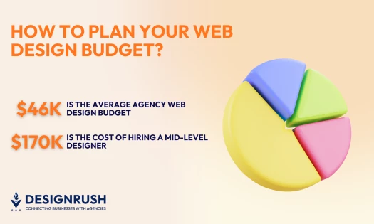
In-house effort stops scaling at the point where the fixes require rebuilding rather than adjusting. If your audit turns up structural problems, like a hierarchy that cannot support the content, the work has become a redesign, and our web design budget guide covers what that costs.

Our team ranks agencies worldwide to help you find a qualified agency partner. Visit our Agency Directory for the top Web Design Agencies, as well as:
- Top Web Development Companies
- Top WordPress Web Design Companies
- Top Search Engine Marketing Agencies
- Top Small Business Website Design Companies
- Top Social Media Marketing Agencies
For examples of the distinctiveness discussed in section 14, browse the best website designs recognized through the DesignRush Design Awards.