A confusing sign-up process, a slow-loading dashboard, too many choices on one screen, or an app that feels annoying after a week. All this can quietly push your customers away.
The UX strategies below focus on reducing that friction and making UX easier, quicker, and more satisfying to return to.
UX for Customer Retention: Key Findings
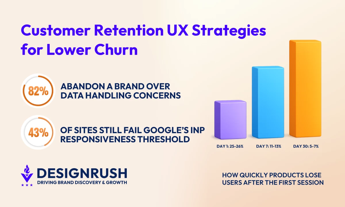
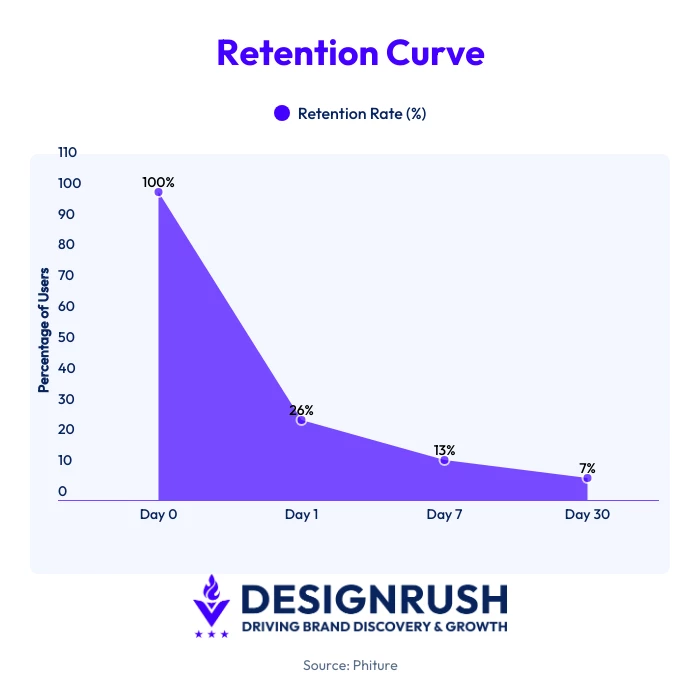
- Most apps lose users extremely quickly. Day-1 retention averages just 21.1% on Android and 23.9% on iOS, dropping to only 2.1% and 3.7% by Day 30.
- Only 48% of mobile pages and 56% of desktop pages currently pass all Core Web Vitals thresholds, and sites that do pass see 24% lower bounce rates.
- Accessibility is a retention factor, with 81% of professionals reporting improved user retention linked to accessible design.
Why Most Products Lose Users Within the First Month
Business of Apps’ 2026 retention benchmarks show that Day-1 retention averages 21.1% on Android and 23.9% on iOS. By Day 30, those numbers fall to just 2.1% and 3.7%.
Another 2025 report found that products retaining at least 7% of users by Day 7 rank among the top 25% for long-term retention.
Those numbers show how quickly early interest fades. You have a short window to convince people that your product is worth returning to, especially when users can easily switch to another app, platform, or service.
1. Reduce Friction During the First Session
The first few minutes with a product usually decide whether someone keeps exploring or closes the tab and never comes back. That is why onboarding UX has shifted away from lengthy product tours and toward getting users into meaningful interactions as quickly as possible.
In onboarding UX, that point is often called the “aha moment”, the moment a user understands why the product is useful. For Slack, that is sending a message inside a real conversation.
Slack’s onboarding flow guides users to create channels and interact immediately, rather than slowing them down with unnecessary setup.
Notion takes a similar approach. New users are quickly moved to editable pages, templates, and starter workspaces so they can begin interacting with the product right away.
For your own product, this could mean:
- Supporting SSO logins like Google or Apple to speed up access
- Cutting unnecessary steps during sign-up or checkout
- Delaying optional profile setup until after users complete a meaningful action
- Letting users explore key features before asking for too much information
- Using templates, sample content, or guided actions to help users get started faster
- Highlighting one clear next step instead of overwhelming users with too many choices
- Saving progress automatically so users can return without starting over
- Introducing advanced features gradually as users become more familiar with the product
2. Lower Mental Effort for Key Steps
The more decisions users have to make simultaneously, the harder it becomes to keep them moving through a product. In UX, this mental effort is known as mental workload.
Navigation menus, pricing pages, dashboards, onboarding flows, and checkout experiences become harder to use when too many options compete for attention at the same time.
Amazon's 1-Click checkout became one of the best-known examples of reducing cognitive load in eCommerce.
Instead of forcing repeat customers to go through multiple checkout steps each time they made a purchase, Amazon eliminated unnecessary decisions and shortened the checkout process. That approach helped make purchasing feel faster and more routine.
Several well-established UX laws are built around the same idea:
| UX Law | What It Predicts | Retention Application |
| Hick-Hyman Law | More choices increase decision time |
|
| Fitts’ Law | Larger and closer targets are easier to interact with |
|
| Miller’s Law | People can only process a limited amount of information at once, typically 7 pieces of info |
|
3. Treat Performance as Part of the UX
A page that responds slightly too slowly, a delayed filter interaction, or a laggy checkout button may only cost a second or two at a time. Across an entire session, though, those delays start adding friction to almost every interaction.
That is part of the reason Core Web Vitals have become a much bigger UX conversation in 2026.
According to Core Web Vitals data, only 48% of mobile pages and 56% of desktop pages currently pass all three Core Web Vitals thresholds. Sites that do pass all three metrics see 24% lower bounce rates.
Google currently recommends:
- Largest Contentful Paint (LCP) under 2.5 seconds
- Interaction to Next Paint (INP) under 200ms
INP has become more important because it measures responsiveness throughout an entire session, not just during the first page load. And a whopping 43% of sites still fail the INP threshold in 2026.
In a 2025 web.dev case study, they used prerendering to speed up product detail page (PDP) navigation on Ray-Ban’s eCommerce site.
The result was a 43% LCP improvement on mobile and desktop, conversion rates rose by 101.47% on mobile and 156.16% on desktop, and exit rates dropped by about 13% on both device types.
For your own product or service, improving performance UX could include:
- Reducing unnecessary third-party scripts and tracking tags
- Compressing oversized images and video assets
- Prioritizing responsive interactions throughout a session, not just initial load speed
- Testing product pages, checkout flows, and dashboards on slower mobile connections
- Monitoring INP alongside traditional speed metrics like LCP
- Delaying non-essential animations or scripts until after core content loads
- Auditing plugins, widgets, and personalization tools that may slow down interaction speed
4. Design Better Empty States and Error Recovery
The first time someone opens a new dashboard and sees nothing there, the product immediately has a communication problem. The same thing happens when a form suddenly fails, a search returns no results, or an action disappears without explanation.
Users should never have to guess what happened, why it happened, or what they are supposed to do next.
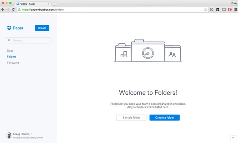
Dropbox is a good example. Instead of showing users an empty folder after sign-up, Dropbox uses illustrations and prompts encouraging them to upload their first file, turning an otherwise inactive screen into part of the onboarding experience.
Gmail’s “Undo Send” feature works similarly. Giving users a short recovery window after sending an email reduces the stress of small mistakes and gives people a chance to correct them immediately.
Tiny wording changes can also affect how users respond to errors. An error message like "Password must be 8 characters" seems abrupt, while "Almost there, your password needs at least 8 characters" feels more helpful and less discouraging.
For your own product or service, improving these difficult moments could include:
- Replacing blank dashboards with starter content or suggested actions
- Using inline validation instead of disruptive error popups
- Writing error messages in plain and supportive language
- Giving users a quick way to undo important actions
- Explaining empty search results instead of showing blank pages
- Highlighting one recommended next step when users hit dead ends
- Using examples or placeholder content to make first-use experiences feel less intimidating
5. Build Accessibility Into Core Product Flows
Closed captions are one of the best-known examples of the “curb-cut effect” in UX.
They were originally designed for deaf and hard-of-hearing users, but now millions of people use them daily while watching videos without sound in public places, at work, or during commutes.
The same pattern appears in digital products. Larger tap targets help mobile users navigate more quickly. Clear focus states make interfaces easier to scan.
Simpler authentication flows reduce the difficulty during sign-in and checkout. Accessibility improvements often improve usability for everyone, not just users with disabilities.
In the Level Access 2025-2026 State of Digital Accessibility Report, 81% of professionals reported improved customer retention linked to these usability benefits enabled by accessible design.
Accessibility is also becoming much harder for businesses to ignore legally.
More than 4,000 lawsuits were filed in 2024, while the European Accessibility Act entered enforcement in June 2025.
That means accessibility issues are no longer limited to UX audits or compliance checklists. They can now affect customer trust, purchasing behavior, and legal risk.
The most common accessibility problems are also some of the easiest to fix.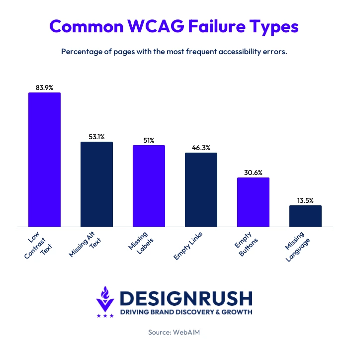 According to WebAIM, six issues alone account for 96% of detected Web Content Accessibility Guidelines (WCAG) errors on the web today, including low color contrast, missing alt text, unlabeled form fields, empty buttons, missing language declarations, and empty links.
For your own product or service, building accessibility into your core UX flows could include:
- Increasing color contrast for text and interactive items
- Adding descriptive alt text to important images
- Making forms easier to complete with proper labels and clearer error guidance
- Expanding tap targets and interactive buttons on mobile
- Supporting keyboard navigation throughout major processes
- Testing products with screen readers like VoiceOver or NVDA
- Simplifying authentication and checkout flows for users with cognitive or motor impairments
6. Use Micro-Interactions To Reinforce Progress and Build Habits
Duolingo rarely lets users complete a lesson quietly. Finish an exercise, and the app celebrates it immediately. Maintain a streak, and the milestone becomes more visible and rewarding over time.
Correct answers trigger animations, sounds, XP rewards, and character reactions designed to make progress feel satisfying.
That attention to feedback is intentional. After redesigning its streak milestone animations, Duolingo saw more users maintaining streaks and returning for daily lessons across both iOS and Android. The update focused on making progress feel more rewarding and visually satisfying.
These small feedback loops work because they constantly answer an important user question - whether something worked. The best micro-interactions confirm an action, show progress, and create a small emotional reward.
Small UX moments like these can have a surprisingly large effect on loyalty over time.
In UserTesting’s 2025 global loyalty study, 68% of loyal customers said they would stay with their favorite brands even if prices increased, with positive customer experiences ranking among the biggest drivers of long-term loyalty.
For your own product or service, effective micro-interactions could include:
- Showing immediate visual confirmation after important actions
- Using subtle animations to reinforce progress (if applicable)
- Adding progress bars or completion indicators during longer flows
- Rewarding repeat behavior with streaks, milestones, or achievement tracking
- Using haptic feedback on mobile for taps, swipes, or successful actions
- Confirming autosaves, uploads, bookings, or purchases in real time
- Introducing a lightweight personality through sound, motion, or microcopy without becoming distracting
7. Make Privacy, Consent, and Cancellation Easier To Trust
In 2024, a New York judge ruled that SiriusXM’s subscription cancellation process was illegally difficult.
According to the lawsuit, users were required to call an agent and sit through multiple retention offers before they could cancel. The court found that leaving the service required significantly more effort than signing up.
Cases like this are becoming much more important for UX because trust now directly affects retention. In Thales’ 2025 Digital Trust Index, 82% of consumers said they abandoned a brand in the previous year due to concerns about how their personal data was handled.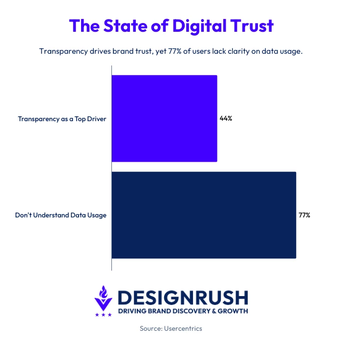 Usercentrics’ 2025 State of Digital Trust report also found that 44% of consumers consider transparency around data use the single biggest factor in trusting a brand, while 77% said they still don’t fully understand how companies collect and use their data.
Users are also becoming much more aware of manipulative UX patterns. A Dovetail study found that 56% of users reported losing trust in websites or platforms due to deceptive design practices, or dark patterns, such as hidden fees, confusing unsubscribe steps, or misleading consent banners.
For your own product or service, a trust-centered UX could include:
- Making cancellation flows as simple as sign-up flows
- Explaining clearly how customer data is gathered and used
- Avoiding pre-checked consent boxes or misleading language
- Showing upfront pricing, renewal terms, and fees
- Giving users control over privacy and notifications
- Confirming subscription changes and billing updates transparently
- Writing consent and privacy messaging in plain language instead of legalese
How To Tell Which UX Problem Is Driving Your Churn
Retention drops usually follow a pattern. The timing of churn is often the fastest way to identify which part of the UX is creating friction.
If users leave during the first session or within the first few days, the problem is usually onboarding, unclear value, or too much effort too early.
Apps retain roughly 25-26% of users on Day 1, 11-13% on Day 7, and only 5-7% by Day 30. That means the largest retention drop often happens before habits have time to form.
UXCam’s 2026 benchmarks found that the strongest predictor of Day-30 retention is whether users complete a meaningful first action during their first session.
Products with good first-session activation retained users at two to three times the rate of products that failed to reach that moment early.
Churn that occurs later usually points to different problems. If users return a few times before disappearing, the issue is commonly associated with mental effort, weak habit formation, performance friction, or a product that becomes tiring to use over time.
When users consistently abandon one specific flow, checkout, onboarding, account creation, or subscription management, the problem is usually easier to isolate.
Session recordings, heatmaps, rage clicks, abandoned forms, and repeated backtracking often reveal exactly where users hesitate or get stuck.
Heatmaps and session recordings are most effective when paired with behavioral analytics because they reveal the why behind abandonment patterns that dashboards alone cannot explain.
A simple diagnostic framework looks like this:
| Churn Pattern | Most Likely UX Issue |
| Users leave during the first session |
|
| Users stop returning after several sessions |
|
Users abandon checkout or subscription steps |
|
| Users repeatedly fail actions or forms |
|
| Users browse but rarely engage |
|
How To Measure Whether Your UX Changes Are Actually Working
A redesigned onboarding flow or cleaner interface may not automatically improve your customer retention. The only reliable way to know whether a UX change worked is to measure user behavior afterward.
1. Retention Curves
Retention curves are usually the clearest place to start:
- Day-1 retention reflects first impressions and onboarding quality
- Day-7 retention shows whether users are forming habits
- Day-30 retention helps measure whether the product continues to provide value beyond initial curiosity
According to Amplitude’s 2025 Product Benchmark Report, top-performing products retain 18.5% of users after three months, while median products retain just 3.8%.
2. Retention Rate Formula
Retention rate measures how many users continue returning after a specific period.
Retention Rate = (Active Users at End of Period/Users at Start of Period)×100
For example, if 1,000 users signed up in January and 180 were still active after 30 days, the Day-30 retention rate would be 18%.
You can also track retention using cohort retention tracking, which groups users by when they signed up or when they experienced a specific version of the product.
Instead of averaging all users together, cohort tracking makes it easier to compare retention before and after UX changes.
You could compare:
- Users who completed the old onboarding flow vs. the redesigned version
- Users before and after a checkout update
- Mobile vs. desktop cohorts
- Users acquired through different campaigns
This helps you isolate whether a specific UX change improved retention rather than relying on broader averages that can hide the actual impact.
3. Flow Abandonment
Track where users leave during onboarding, checkout, account setup, or subscription management.
Large drop-offs at one specific step usually point to a fixable UX issue, such as:
- Confusing forms
- Unclear pricing
- Weak trust signals
- Complicated mobile interactions
- Poor error handling
4. Session recordings and clicks
Rage clicks and repeated taps on the same element often signal displeasure or broken interactions. Heatmaps can also reveal hesitation, ignored elements, and drop-off points.
The simplest approach is usually the most effective, and that is one UX change, one metric, one cohort. If you redesign onboarding, monitor Day-7 retention for that group. If you simplify checkout, track abandonment before and after the update.
UX Best Practices for Customer Retention: Final Thoughts
Improving retention usually comes down to identifying where the experience starts feeling harder than it should and fixing those moments directly.
If you need help improving onboarding, accessibility, conversion flows, or product usability, hiring a UX agency may be beneficial.
![]()
Our team ranks agencies worldwide to help you find a qualified partner. Visit our Agency Directory for the Top UI/UX Design Agencies as well as:
- Top Austin UX Designers
- Top UX Audit Agencies
- Top AI UI/UX Design Agencies
- Top Design Agencies
- Top UX Research Firms
Our design experts also recognize the most innovative design projects across the globe. Visit our Awards section to see the best & latest in design.
UX Design Strategies for Better Customer Retention: FAQs
1. What is a good customer retention rate for a mobile app?
Benchmarks vary by category, but many apps retain roughly 25-40% of users on Day 1, 10-20% on Day 7, and 5-10% on Day 30. Apps in the top quartile often exceed 15% retention by Day 30.
2. How do I know if UX is causing churn?
The timing of churn is usually the clearest signal. Early drop-offs often point to onboarding or activation problems, and abandonment during checkout or account setup usually indicates friction inside a specific flow.
3. How do I test whether a UX change improved retention?
Measure one metric tied to the specific change. For example, track Day-7 retention after redesigning onboarding or monitor checkout abandonment after simplifying payment flows. Session recordings and heatmaps can help explain behavior changes.
4. What are the most common UX reasons users churn?
Users often leave when products start feeling harder to use than expected. Common causes include unclear onboarding, slow load times, confusing navigation, difficult mobile interactions, weak error handling, and checkout or subscription flows that require too many steps.
Small frustrations repeated across multiple sessions tend to have a greater effect on retention than a single major UX issue.