When it comes to design, brands need to keep consumers and their digital experience in mind. They have to create platforms that are exciting and engaging and offer their audience exactly what they're looking for.
This isn't just in content but in the look and feel of the design. It's in how users get from one page of a block of content to the next. And if it's confusing or lagging, that's when users will start feeling this interstitial anxiety that will turn them off from your page and your brand as a whole.
Marketers and business owners -- listen up! This guide to interstitial anxiety can help transform your website and app designs to promote conversions, sales and brand identity as a whole.
What Is Optimized Interstitial Anxiety?
Firstly, before we start optimizing it, interstitial anxiety refers to the momentary state of tension users experience between an action and a response. For example, if I’m on a website and I choose to click on a button (action) to navigate to another page, that page will have to load (response) before I can view it.
If you were born pre-broadband, you’ll be all too familiar with slow loading web pages — the ultimate anxiety builder! That, along with laggy feedback and latency issues are usually the core reasons behind delays that a user will experience between their action and the expected response.
You might think these thoughts and feelings are fleeting -- but they make a profound impact on users and stick with them even if its subconsciously. Users will inevitably take a mental note of the slowness of your site and equate that with an inefficiency in your overall brand.
And that spells disaster for future conversions, leads, sales, and growth.
Is Optimized Interstitial Anxiety Important for User Experience?
If you’d prefer to have happy people who return to your site, then yes! Having a user-centered design is vital in reducing UX design anxiety and promoting your brand and business. In all seriousness, interstitial anxiety can have an unfortunately profound impact on the performance of your website or app.
During the Web 2.0 Conference in 2006, Marissa Mayer, then Google Vice President, revealed research showing that a 0.5-second delay in load time resulted in a 20% drop in traffic for Google’s search page.
One in five users left the site because they were stalled for half a second… just let that sink in.
Now think about what that could potentially mean in relation to your website. If you choose to leave speed and performance issues unattended, how long will it be before your users experience similar anxiety and are ultimately alienated? Not long, according to Mayer.
Look at it this way. Your website might be filled with all the right answers. Your social campaigns might resonate perfectly with your target audience. Your creative designs might be catching the eye of the perfect customer. However, it will count for nothing if those people can't access the information you’ve spent hours crafting on your site.
People don't just want good content, they want efficiency. They want what they want, where they want it, but most importantly, when they want it. If your site is producing delays in that process, consumers will likely look elsewhere for the information, products or services they were originally looking for.
Using Optimized Interstitial Anxiety To Enhance UX Design
The last thing you want is a UX design that negatively affects the experience that your website visitors are having. Therefore, using optimized interstitial anxiety is a great way to reduce the likelihood that your users encounter slow loading speeds or transitional issues.
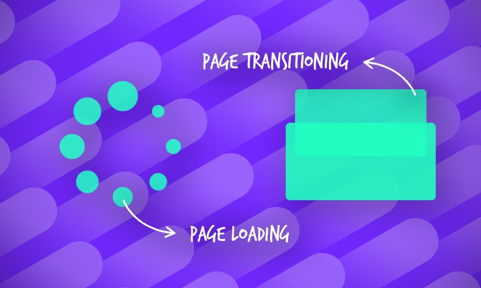
Before we actually outline the ways you can do this, it’s important to understand that there are two connected components that form interstitial anxiety: transitional anxiety and temporal anxiety.
Transitional Anxiety
Firstly, let’s consider the transitional anxiety that people can experience. This is the first step of the sequence and refers to the anxiety derived from the transition period to another screen or page. This transitional shift from one section of a site or step of a process to another must be completely seamless. If a user experiences any friction, it will ultimately hinder the process and break what should be a continuous experience.
A great example of transitional anxiety is during the checkout stage of an online transaction that a user is carrying out. Say, for example, that you have added all the items you wish to purchase from Amazon into your basket. You’re ready to pay for your order and begin to move through the steps to review your purchase.
All seems to be going to plan, however, you notice that when you click complete purchase you’re redirected to the homepage of Amazon.
“Did my order complete?”
“Have I been charged?”
“Where is the email confirming my order?”
These are all potential questions you might ask yourself in a mad panic if you haven’t received the expected transitional screen or page. The sudden change prompts a rise in anxiety — that’s just our natural instinct.
Even if there's an easy fix -- even if it was just a momentary, minor hiccup -- it's enough to turn people off and fill them with a negativity that will stay with them going forward. And it might even cause them to leave your site and end their purchase altogether.
Temporal Anxiety
The second form of interstitial anxiety focuses on the tension caused by the time it takes for a page a user is trying to access to load. This occurs after a user has transitioned to the new page or screen, but refers to specifically to the time it takes for all of the pages content to load.
Naturally, the longer this takes, the more anxious you’re going to become, and in particular situations, it can be quite stressful — again, think of a purchasing process.
For example, you’re attempting to buy tickets for an Ed Sheeran concert. You expect that it will be hard to get tickets and that the website might be slower than usual, but you still expect to go through the normal booking process if you’re fortunate enough to have the opportunity to buy the tickets.
You make it to the payment stage of the booking process — you’ve nearly got your tickets! However, when you click “pay now” the screen transitions to a screen that is only about 25 percent loaded. You can’t tell whether or not you have paid for the tickets, and the screen appears to freeze.
“Should I refresh the page?”
“What if I have to pay twice?”
“Have I lost my spot in the queue?”
This is a prime example of temporal anxiety and a commonly experienced on at that. You’re literally in limbo as to whether you’ve been awarded the tickets or not.
And it's one we can all relate too. You're not sure what to do, you're not sure if you did something wrong -- all you know is that there's a delay in the process and your end results might never be achieved.
On a smaller scale, however, this anxiety can be felt when any page doesn't load. You don't have to be at the final stages of a transaction. If you really want to buy a new dress, but the product images on your favorite online retailer won't load, you'll be forced to look elsewhere, plain and simple.
And your brand doesn't want that.
How To Improve User Experience Through Optimized Interstitial Anxiety
For simplicity's sake, let’s break this down into the previously identified types of interstitial anxiety again. Starting with…
How To Reduce Transitional Anxiety
The optimal way to reduce transitional anxiety is through the use of subtle animations and transitions between screens. Why? Well, this should help users adjust gradually to the change between page or screens that would otherwise look quite different.
As online businesses have realized, learning how to channel transitional anxiety to their advantage is a better approach than trying to remove it altogether. By creating transition elements — like offering a snippet preview or a glimpse of what is to come in the next section — users can anticipate, rather than worry about, what will happen next.
Loading times and slowness are inevitable in some cases. And trying to fix these problems might take more time and cause more irritation than brands want. But incorporating these animations is a simple and effective way to create a seamless transition that increases positivity and excitement.
Using a real-life practical example, imagine when you’re woken up at 6:00 AM by your alarm clock (not a nice thought, I know!). Now, make that experience even worse by imagining how you’d react if your bedroom light also went on unexpectedly at the same time. You’d be shocked, flustered, angry, upset and probably confused.
However, if your bedroom light was to gradually come on over the course of time that your snooze alarm is on, then you’d have nine minutes to adjust to the light, rather than being taken off guard and left in a state of shock. This is the same principle that is applied to the gradual web page transition.
Need help with your online destination? These web design and development agencies can help take your site from drab to fab!
How To Reduce Temporal Anxiety
There are two key methods you can use to counter the issue of temporal anxiety, both of which focus on the use of visuals to deliver something more interesting than a blank screen: a loading animation and a placeholder animation.
Loading Animation
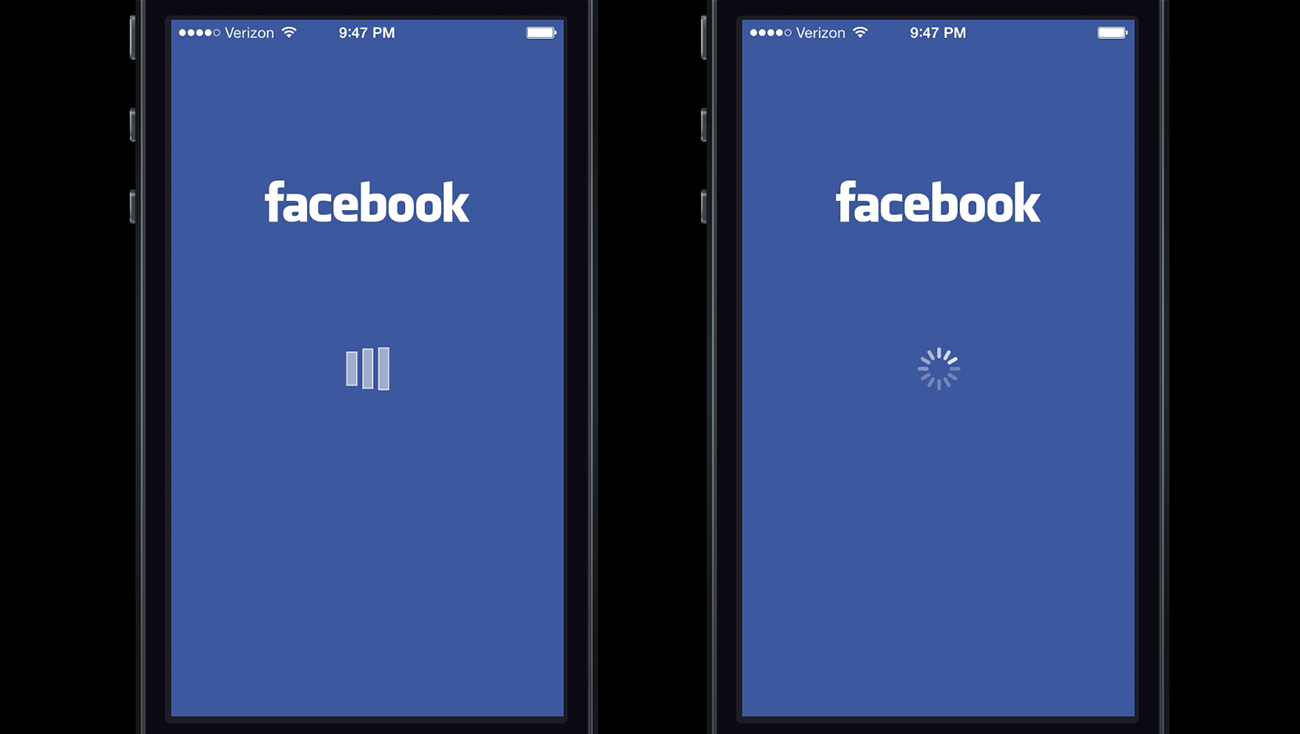
Using a loading animation such as a spinning wheel or loading bar can be all that’s required to transform a confusing page loading sequence into a satisfying user experience. You might be aware of and have probably have experienced, Facebook’s loading animation.
What you might not realize is that based on the type of graphic used for the animation, users will feel differently. For example, it has been suggested that “when the users were presented with a custom loading animation in the Facebook iOS app (left) they blamed the app for the delay. But when users were shown the iOS system spinner (right), they were more likely to blame the system itself.”
Again, placing this technique into some context — think of the last time you were in an elevator. Say you were on the 20th floor and wanted to get off at the fourth floor. When the lift starts moving, you’re aware of it obviously.
However, what if you had no concept of what floor you were on. How would you know when to get off? While you’re waiting in the elevator, you can usually see the floor number displayed. As you go down towards the fourth floor you know when to expect the lift to stop.
Not only does this give you a chance to brace yourself slightly, but it ultimately makes for a pleasant trip — or, in other words, it's a frictionless user experience!
And you can even incorporate some branded content and animations here to make it look like it was all done on purpose! This can add a playfulness and a creative persona to your brand and identity that makes users happier to interact and engage.
Branding is important, and design effects branding immensely. If you've got problems with UX anxiety, it might be in your favor to use the problem to your advantage and solidify an exciting and innovative brand identity in response.
Placeholder Animation
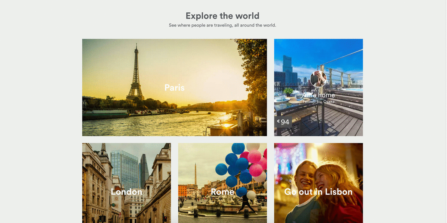
Alternatively, you can opt for a placeholder animation that simulates what the actual content will look like when it loads. The example below is from Medium, who use a simple image wireframe as a placeholder, while the actual image loads.
This is a simpler, more elegant way to solve the anxiety problem. And it works great for brands who don't need nor want all the bells and whistles that come from creative and complicated animations.
It fosters a feeling and atmosphere of elegance and sophistication that gives your brand an authority that would otherwise be lost due to lagging loading times and anxiety-riddled designs.
Using Optimized Interstitial Anxiety To Create Designs
Now that we have an understanding of what interstitial anxiety is, how it relates to the user and how we can minimize it, we can begin to piece together steps that designers can take to ensure that their designs meet the UX expectations set by the people that matter — the users!
Based on the potential solutions outlined for both transitional and temporal anxiety, it's clear that motion plays an important role in the reduction of interstitial anxiety. Issara Willenskomer from UX in Motion put together a ‘UX in Motion Manifesto’ in which he outlines the 12 specific opportunities to support usability in your UX projects using motion.
In the case of interstitial anxiety, this means:
- Reducing the time in which it takes for a page or screen to load
- Minimizing the number of blank screens and pages
- Reducing any friction caused by stagnant transitions
And so brands can use these 12 outlined options to create a design that's dynamic and intuitive.
You can incorporate dynamic elements into corporate websites too! Check out these top professional websites for inspiration!
The 12 Principles Of UX In Motion
Two things spring to mind with the above image. Firstly, the motions are quite subtle, and secondly, it’s quite interesting how 12 simple movements can comprise the foundations from which most animations are built.
These are just the basics, but they can be built upon in dynamic and creative ways to create a design that promotes interactivity, engagement and hopefully even sales.
Willenskomer goes into each of these elements in great detail, but in summary, they're as follows:
- Easing: Object behavior aligns with user expectations when temporal events occur
- Offset & Delay: Defines object relationships and hierarchies when introducing new elements and scenes
- Parenting: Creates spatial and temporal hierarchical relationships when interacting with multiple objects
- Transformation: Creates a continuous state of narrative flow when object utility changes
- Value Change: Creates a dynamic and continuous narrative relationship when value subject changes
- Masking: Creates continuity in an interface object or object group when the utility is determined by which part of the object or group is revealed or concealed
- Overlay: Creates narrative and object spatial relationship in visual flatland when layered objects are location dependent
- Cloning: Creates continuity, relationship, and narrative, when new objects originate and depart
- Obscuration: Allows users to spatially orient themselves in relationship to objects or scenes, not in the primary visual hierarchy
- Parallax: Creates spatial hierarchy in visual flatland when users scroll
- Dimensionality: Provides a spatial narrative framework when new objects originate and depart
- Dolly & Zoom: Preserves continuity and spatial narrative when navigating interface objects and spaces
Keeping these 12 motion options in mind is a great guide to ensure your design is at the top of its game, incorporating movement where necessary in order to reduce anxiety and foster a feeling of excitement in your website and app design.
Everything Online Businesses Need To Know About Optimized Interstitial Anxiety
In summary, we’ve taken a look at interstitial anxiety, what it is and how it can impact the UX of websites and apps alike. And it's not just another passing design trend.
As a quick recap, here are some quick key points to keep in mind when you’re reviewing the topic in the future:
- Interstitial anxiety is the momentary state of tension that a user experiences between an action and a response, such as click a button and waiting for the page to load
- There are two stages of interstitial anxiety: transitional and temporal
- Transitional relates to the shift from one screen or page to another
- Temporal is the time it takes for a page or screen to load and how that affects the user’s behavior
- Introducing gradual page transitions and loading screen animations will help you achieve optimized interstitial anxiety, and thus, better performing UX design
- The 12 principles of UX in motion define the ways in which you can use animation to improve usability
Interstitial anxiety is often overlooked, and it has just recently become a topic of discussion in the design, branding and marketing world. But it's an important concept to understand and fix in your own designs.
Users make judgments based on web and app design. They come to their own conclusions about your brand in response to how your designs make them feel. And if they frustrate, confuse or irritate, they won't be coming back.
Hopefully, you’ll have a better grasp of the concept after reading this article. If you think we’ve missed any crucial points, or if you’d like to ask us any questions about optimized interstitial anxiety, you can always share in the comments.

Our team ranks agencies worldwide to help you find a qualified partner. Visit our Agency Directory for the Top UI/UX Design Agencies as well as:
- Top Austin UX Designers
- Top UX Audit Agencies
- Top Web Design Companies
- Top Interactive Design Agencies
- Top UX Research Firms
Our design experts also recognize the most innovative design projects across the globe. Visit our Awards section to see the best & latest in design.

