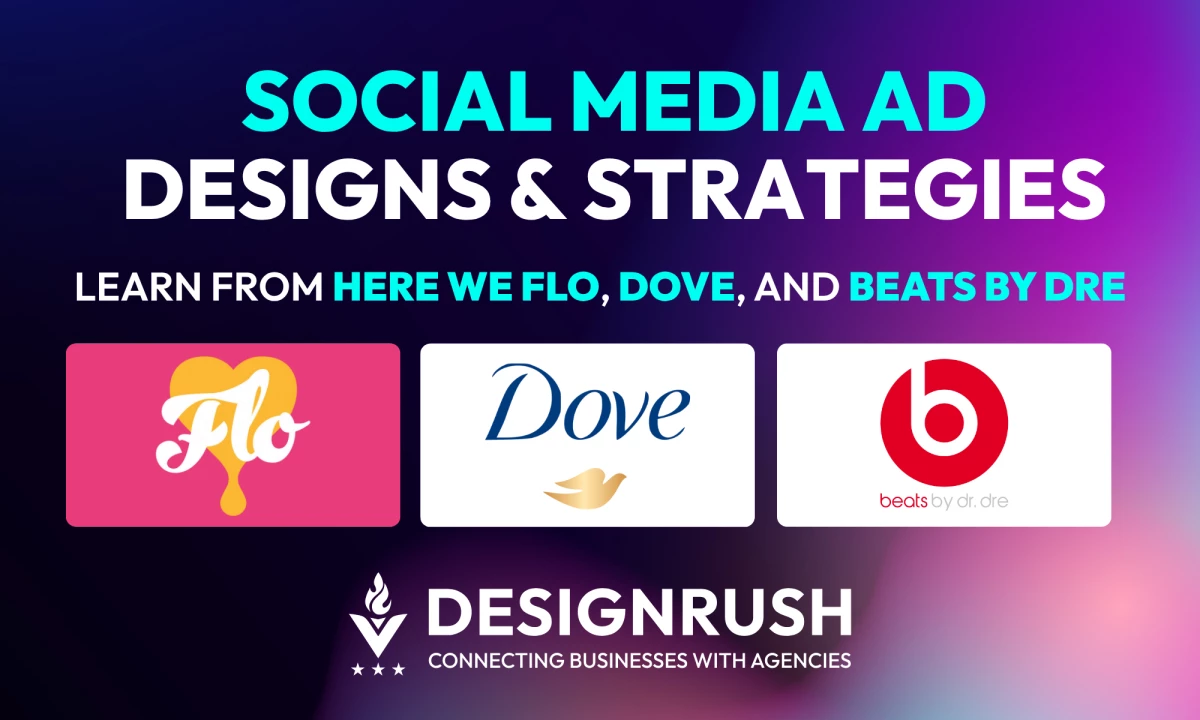
Planning your 2026 social strategy? We’ve rounded up four standout ad designs that tap into today’s trends and behaviors, ready to inspire your next campaign.
Rapid recap: Social media ad design trends to watch in 2026 — in under 2 minutes.
Social Media Ad Design: Key Points
- 78% of consumers prefer short-form video, making vertical, mobile-first designs essential for engagement across TikTok, Instagram Reels, and YouTube Shorts.
- Influencer and UGC-style content drives higher conversions — 6 in 10 marketers report better performance than traditional branded posts, making raw, relatable content a must.
- From Dove’s emotional contrast ads to Beats by Dre’s story-led launch, visual storytelling builds trust, sparks conversations, and improves brand recall more than direct sales messaging.
Social Media Ad Design Case Studies: An Overview
We'll walk you through why these examples worked and how you can put a similar spin on these ideas for your brand. Let’s get into it!
1. Here We Flo: Ad Design That Builds Awareness
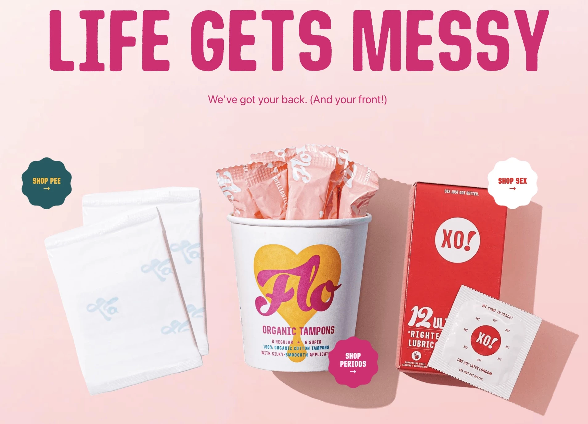
Before people can engage with your brand, they need to know it exists. One way to achieve this is through chaos marketing — a strategy where brands package everyday products in unexpected ways.
This turns the product into an ad, sparking instant intrigue, social media buzz, and organic word-of-mouth.
@hereweflo Join the FLO revolution - where comfort meets sustainability for all your intimate care needs! 🌍✨ #flo#hereweflo♬ original sound - Here We Flo
Here We Flo, a menstrual health brand, executed this strategy brilliantly by packaging tampons in an ice cream tub. It’s quirky, unexpected, and impossible to miss in the feminine care aisle.
However, the design wasn’t just for aesthetics or to go viral; it gave customers a discreet, playful way to carry their period essentials, while also creating an open, shame-free space for women to share their experiences online.
Flo created a product that stands out on shelves, challenges stigmas, invites conversation around menstruation, and builds brand affinity by truly understanding its customers’ needs.
Why It Worked
Chaos packaging is a built-in social media ad as much as it is a shelf disruption. When a product appears in an unexpected format — like tampons in an ice cream tub — it triggers curiosity, making people stop, engage, and share online.
The novelty factor turns packaging into content and then into a viral brand awareness campaign. This is because unconventional designs are highly Instagrammable and TikTok-friendly, fueling organic brand awareness with minimal ad spending.
How To Apply This to Your Brand
Flo’s success came from turning its product into an ad through unexpected packaging. Here’s how you can adapt this approach:
- Break design norms: Experiment with unconventional packaging or presentation to disrupt shopper habits.
- Make your product shareable: Design with social media in mind — bold, surprising, and conversation-worthy visuals encourage organic sharing.
- Align with audience emotions: Tie your design to a relatable experience or cultural insight to make your brand more engaging.
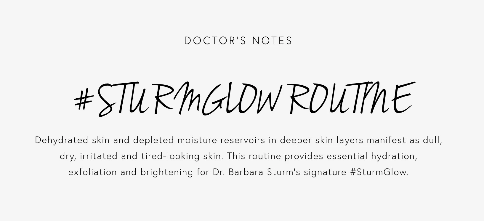
2. Dr. Barbara Sturm: Ad Design That Generates Leads
Lead generation is the bridge between brand awareness and conversions. Social media ads aimed at generating leads must grab attention and compel users to take action.
Dr. Barbara Sturm, a luxury skincare brand, is a great example of a brand that successfully used social media ad design to generate leads.
@drbarbarasturm GLOW DROPS 101 with Dr. Barbara Sturm 👩🏼⚕️ The iconic GLOW DROPS deliver instant luminosity and hydration to the skin ✨ They can be used alone, mixed with moisturizer, or added to make-up for the ultimate STURMGLOW™️. Click the link in bio to shop now at DRSTURM.COM #DrBarbaraSturm#Skincare#GlowDrops#GlowySkin#Glowing♬ original sound - Dr Barbara Sturm
They launched the #SturmGlow hashtag challenge on TikTok and teamed up with influencers to create content that encouraged followers to share their own glow-up routines, turning engagement into lead generation.
It resulted in a 150% increase in website traffic and a 35% boost in online sales in the US. This goes to show how strategic ad creatives and influencer collaborations can directly impact conversions.
Why It Worked
The campaign’s success was heavily driven by intentional and native ad design, specifically crafted for TikTok’s users.
Ads were optimized for the vertical format, using close-up shots, smooth transitions, and a mix of ASMR-style product demonstrations.
Rather than a hard-sell “buy now” approach, creators used tutorials, morning routines, and transformation videos to naturally showcase the product’s benefits. It mirrored organic beauty posts to blend right into TikTok’s For You Page.
Lastly, the ads featured strategic CTA overlays (“Shop Now” and “Get Your Glow”), linking directly to the brand’s website. As Bhavdeep Singh, CEO of LOAB Solutions, puts it:
“Creativity grabs attention, but functionality guides the user toward a conversion. Make sure the message is simple and directs users where you want them to go.”
How To Apply This to Your Brand
Dr. Barbara Sturm’s TikTok ad strategy proves that well-designed, organic-feeling ad content can drive lead generation. Here’s how you can adapt this approach:
- Design for platform-native storytelling: Structure your ad like organic content, using smooth transitions, user-generated-style filming, and a vertical-first format for mobile users.
- Use high-quality, close-up visuals: Skincare and beauty brands thrive on detailed product shots, texture swatches, and ASMR-style demonstrations.
- Ensure ad pacing matches the platform: TikTok and Instagram Reels favor fast-moving, visually dynamic content — design your ad to capture attention in the first three seconds with eye-catching visuals and motion.
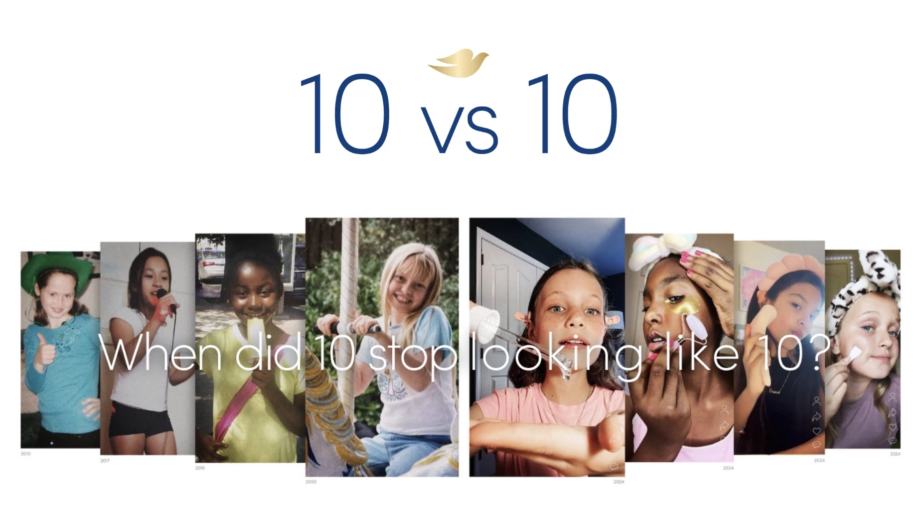
3. Dove: Ad Design That Builds Trust
Social media ad designs that build trust address real concerns, align with audience values, and create meaningful conversations.
Dove, known for its purpose-driven marketing, launched #TheFaceof10 in March 2024 to expose the growing issue of young girls using anti-aging skincare.
The campaign urged parents and caregivers to recognize and counter these beauty pressures, reinforcing Dove’s mission to support self-esteem and body confidence.
@dove Girls as young as 10 are being influenced by skin care content. Together we can protect #TheFaceOf10♬ original sound - Dove Beauty & Personal Care
This ad’s impact was recognized on a larger scale — it earned a shortlist at the Cannes Lions and won a Bronze Pencil at the ONE Asia Creative Awards.
Why It Worked
The success of #TheFaceof10 was deeply tied to its social media ad design. The ads used a side-by-side format, juxtaposing carefree 10-year-olds with young girls performing adult skincare routines. This visually stark contrast immediately captured attention.
The format also made the issue feel urgent and relatable, sparking discussion. This emotional connection reinforced Dove’s role as a brand that genuinely cares and actively challenges unrealistic beauty pressure.
By featuring Drew Barrymore and TikTok creators, the campaign amplified reach by using voices that audiences already respect.
How To Apply This to Your Brand
If you want to design social media ads that build trust, here’s how to adapt Dove’s approach:
- Show, don’t just say: Use your ad creatives to visually demonstrate your brand’s values rather than just stating them.
- Highlight contrasts: Utilize visual contrasts to underscore your message and make it more compelling and memorable.
- Work with aligned creators: You don’t need A-list names; partner with micro-influencers or niche creators who genuinely align with your mission. Their relatability can foster stronger trust and engagement.
4. Beats by Dre: Ad Design That Launches Products
When launching a product, your social media ad design should be eye-catching and seamlessly integrate with platform trends to reach more people.
Beats by Dre exemplified this approach with the launch of its Powerbeats Pro 2 through the Listen to Your Heart campaign.
The social media roll-out was packed with striking visuals and featured cultural icons like LeBron James, Lionel Messi, and Shohei Ohtani — instantly tapping into multiple fanbases to drive conversation and visibility.
Why It Worked
This wasn't just a product drop — it was a social-first visual experience. The ad was tailored for platforms like TikTok and Instagram, using fast cuts and neon lighting to create a sleek, futuristic aesthetic that fits both music and sports content.
Most importantly, the featured athletes shared their personal stories about the role music and the Powerbeats Pro 2 play in their training.
Beats also shared more campaign content to keep the fans engaged, including behind-the-scenes footage and athlete interactions.
How To Apply This to Your Brand
If you’re planning a product launch, here's how to apply the social media ad design strategies that made Beats’ campaign effective:
- Design for motion and immediacy: Use fast-paced editing, dynamic transitions, and movement to mirror the visual rhythm of social feeds.
- Build your visuals around sound: Sync your design with an immersive audio track to make your ad feel cinematic and memorable.
- Use creator-focused visuals: If working with talent, show them using the product in motion — keep the visuals energetic and aspirational.
Proven Social Media Ad Design Strategies for 2026
Besides the examples we’ve covered, it’s also important to know the trends that are shaping high-performing social campaigns this year. These are the design strategies that will get you results across platforms:
- Prioritize short-form video with strong visual storytelling
- Use storytelling to build an emotional connection
- Optimize every design element for mobile first
- Integrate influencer content and UGC for authentic reach
- Let UGC do the selling
- Make your ads feel native to the platform
- Use data to guide your creative choices
- Try what’s next: shoppable, AR, and AI-powered ads
1. Prioritize Short-Form Video With Strong Visual Storytelling
Short-form videos are an essential part of social media ad strategies in 2026:
- 78% of consumers prefer learning about products via short videos (Wyzowl).
- Platforms like Instagram Reels, TikTok, and YouTube Shorts continue to dominate. Brands are using them for storytelling, visual explainers, and product demos.
The reason is clear: videos are immersive, easy to consume, and highly shareable, making them an ideal format for grabbing attention quickly.
2. Use Storytelling To Build an Emotional Connection
Buyers engage more with ads that show solutions or outcomes instead of features. Emotional resonance and relevance are winning over aggressive calls to action (CTAs).
- Instead of focusing on a direct sales pitch, visual storytelling in ads allows you to emotionally engage your audience.
- Even simple product ads can adopt storytelling principles. Using sequences of visuals that demonstrate the before and after of a product’s impact or showcasing a customer’s journey creates a connection, rather than just a promotional message.
3. Optimize Every Design Element for Mobile First
To maximize ROI, ensure your video content is optimized for mobile viewing.
- Vertical videos (9:16) occupy more screen real estate, are more engaging, and perform better than other formats.
- A study found that mobile-optimized video creatives show significant improvements in key engagement metrics like ad recall, message association, and message recall, surpassing regional benchmarks (ScienceDirect).
Singh adds that in 2026, color and typography will matter more than ever — bold contrasts boost visibility, while custom and handwritten fonts bring clarity and personality, both critical for scroll-stopping impact.
4. Integrate Influencer Content and UGC for Authentic Reach
In today’s crowded ad space, authenticity is everything.
- Users often scroll past overly polished or promotional ads, but they pause for content that feels genuine.
- That’s where influencer collaborations and user-generated content (UGC) shine. Testimonials, behind-the-scenes clips, and real customer stories can be repurposed into high-performing ad creatives that build trust and connection.
Jill Sherman, CEO of Modalyst, reinforces this idea:
“The best content is authentic content. Show your customers that you are a thought leader in your niche... Build your traffic funnel by being a leader in the space — vocal, knowledgeable, and trustworthy.”
5. Let UGC Do the Selling
User-generated content (such as customer reviews, photos, or videos featuring real customers) lends credibility to your ads.
- A report by TINT found that UGC-style content is highly effective at driving engagement, with 6 in 10 marketers noting it leads to higher conversion rates than branded content.
- Chelsea Evans-Flower, owner and CEO of Scott Social, shared how their ambassador program for Scrubs & Beyond reshaped the brand’s content strategy.
“We carefully selected ambassadors who were passionate about the brand and could genuinely represent it... While the analytical results were impressive, the user-generated content was even better.
It completely transformed the Instagram feed from feeling promotion-heavy to one that prioritizes community, storytelling, and diverse voices."
6. Make Your Ads Feel Native to the Platform
Design with each platform’s format and user behavior in mind — what works on Instagram Stories won’t necessarily land on LinkedIn or TikTok.
Tailoring visuals, pacing, and tone to match the feed makes your ads feel less like ads and more like content users actually want to watch.
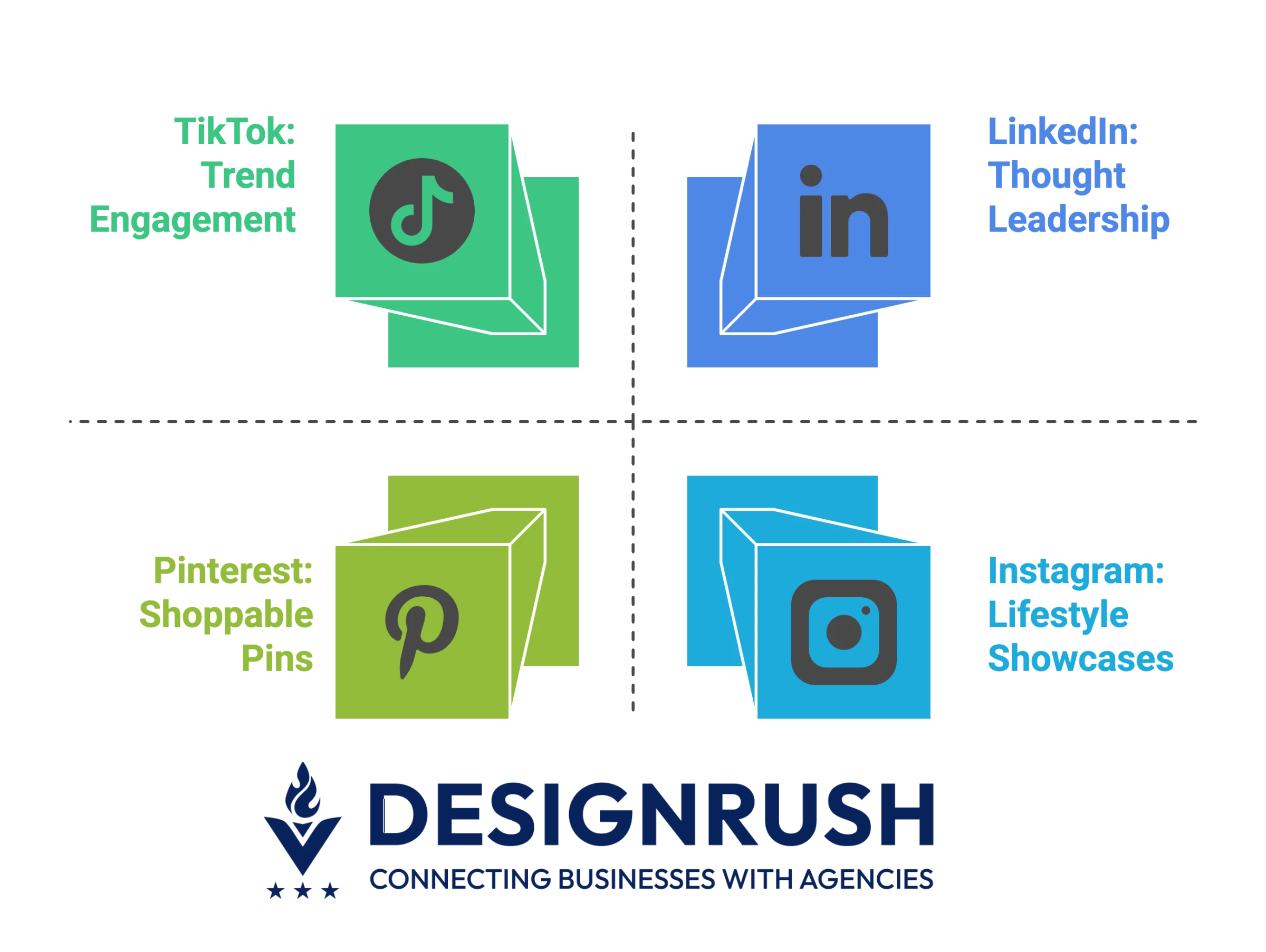
How to optimize for different platforms:
- On TikTok, focus on trends and casual, engaging visuals.
- On Instagram, use visually appealing content and showcase products in a lifestyle context.
- On LinkedIn, adopt a more professional tone with informative content or thought-leadership posts.
- On Pinterest, leverage visually inspiring, shoppable pins that highlight your products.
7. Use Data to Guide Your Creative Choices
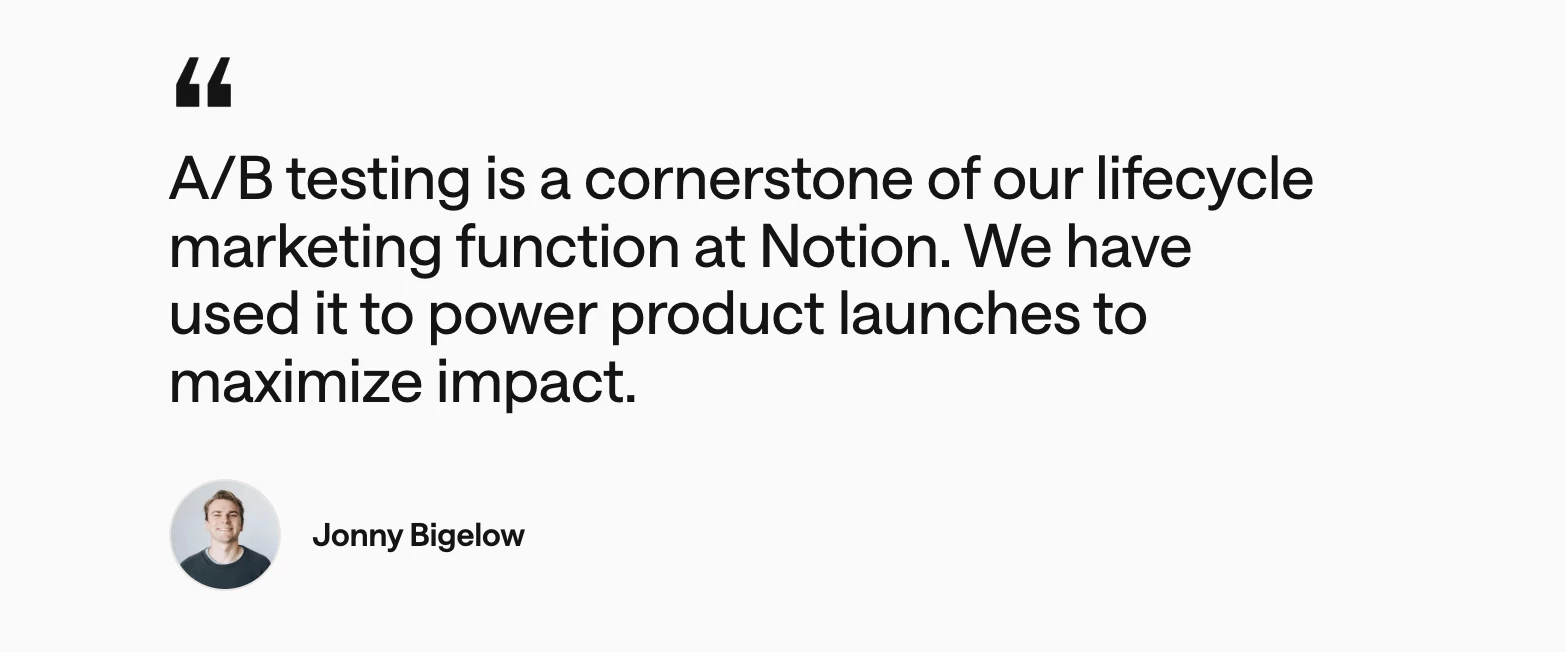
Maximizing ROI on social media is a continuous process. A/B testing your creative designs and leveraging data insights are crucial for optimizing ad performance.
- Notion, a productivity software company, achieved impressive results by implementing rigorous A/B testing on its ad creatives.
- By testing various headlines, visuals, and landing pages, Notion was able to optimize its ads for better results, resulting in higher sign-up rates and improved return on ad spend (ROAS).
Smart testing frameworks:
- Test visuals, copy, and CTAs across different audience segments.
- Use heatmaps to track user interaction with ads and landing pages.
- Leverage AI-powered tools like Meta’s Dynamic Creative to automate and optimize ads for better performance.
8. Try What’s Next: Shoppable, AR, and AI-Powered Ads
Emerging technologies such as shoppable videos, augmented reality (AR), and AI-generated content are changing the way brands engage with consumers.
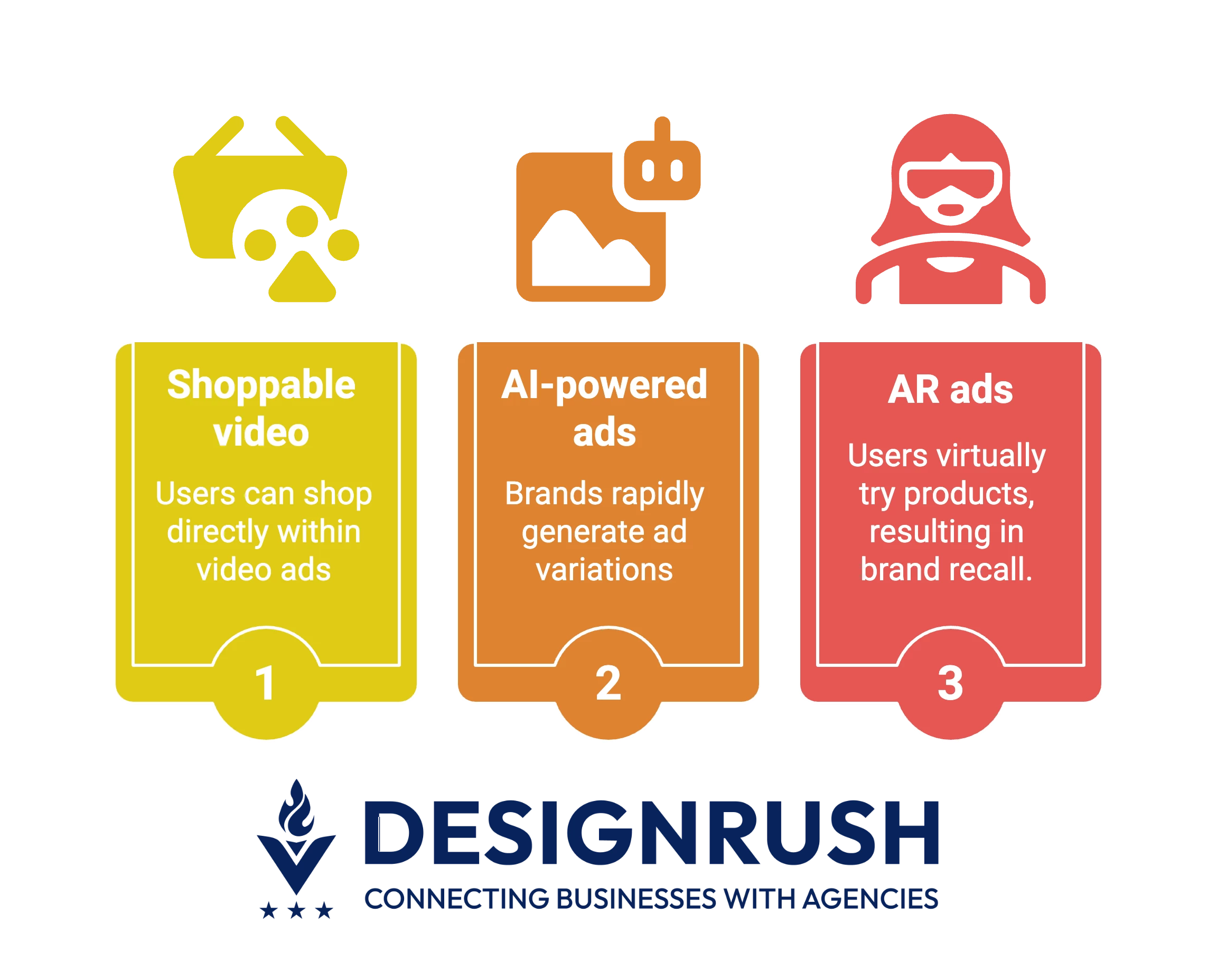
- Shoppable video: TikTok and Instagram now let users shop directly within video ads, streamlining the path from discovery to purchase and boosting conversion rates.
- AI-powered ads: Creative tools like Canva AI, Adobe Firefly, and Midjourney help brands rapidly generate ad variations using audience data, making it easier to test, optimize, and scale campaigns.
- AR ads: Brands like L’Oréal and Sephora utilize AR lenses on Snapchat and Instagram to enable users to try products virtually, resulting in stronger brand recall.
Social Media Ad Designs 2026 Inspiration: Final Words
In 2026, social media ad design is less about chasing trends and more about knowing the platform, telling authentic stories, and creating for how people scroll, swipe, and share.
Use these examples as inspiration, not templates. Look deeper at the strategy behind each one, then create something uniquely yours that speaks to your audience.
![]()
Our team ranks agencies worldwide to help you find a qualified partner. Visit our Agency Directory for the Top Social Media Marketing Agencies, as well as:
- Top B2B Social Media Marketing Agencies
- Top AI Social Media Marketing Companies
- Top Enterprise Social Media Agencies
- Top Instagram Marketing Agencies
- Top TikTok Agencies
Social Media Ad Designs 2026 Inspiration: FAQs
1. What is the best ad format for social media in 2026?
Short-form vertical video remains the most effective format across platforms like TikTok, Instagram Reels, and YouTube Shorts. These formats are optimized for mobile and support high engagement through motion, audio, and storytelling.
2. How often should you refresh your social media ad creatives?
Ad fatigue can set in quickly. Experts recommend refreshing creatives every 2 to 4 weeks, depending on performance metrics and platform. Frequent updates keep your ads from becoming repetitive and improve their effectiveness.
3. What metrics matter most when evaluating social media ad design?
Key metrics include click-through rate (CTR), engagement rate, cost per click (CPC), and conversion rate. For brand campaigns, consider view-through rate (VTR) and brand lift studies to measure awareness and sentiment shifts.