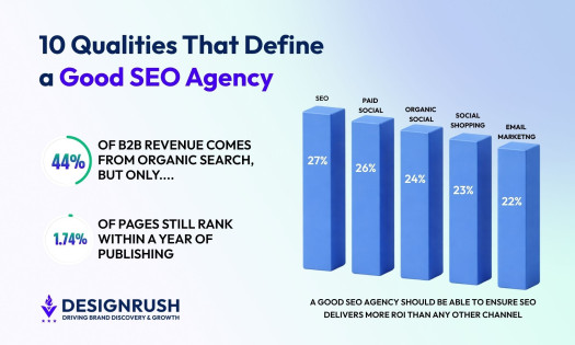
The art of visual storytelling has long been an integral part of cinema and television. From stunning cinematography to innovative special effects, the visuals in a film or TV show can captivate audiences and bring the story to life in ways that words alone cannot take these binge-worthy teasers and trailers, for example.
Apart from the official work of the artists behind the finished product, these industries are also a known playground for professional video designers who frequently reimagine some concept or introduce an entirely new one.
Some of the best film and TV visuals never see the light of day. However, this article aims to remove these limits and present both the official and personal work as equal, shedding some light on the creative qualities of the notions.
Here are some of the best film and TV visuals that show the full range of creative possibilities in the industry:
1. TV Net by Stato

Standout Features:
- Four versions
- Light cube symbolizing the center of information
- Points of reference map
The Turkish media channel, TV Net, is the first on our list of best film and TV visuals.
They needed a traditional introductory segment adapted to modern, fast-paced, global television. Stato created an effective solution that combines the familiar premise of presenting network communication with contemporary visual effects.
The visuals entail four versions of a similar pattern, representing the main news, weather channel, global economy, and sports section. Each is short, serious, and direct, lasting no longer than 15 seconds.
The segments begin with a close-up of a bright light square. The object is zoomed out as blue and gold threads stem out of it and extend through similar squares, connecting them into a vast map of global reference points. As the map expands, the video zooms out again, showing the viewer a globe of interconnected points.
The final frame elaborates on the particular segment, finishing with a fascinating geometrical depiction of the planet, a 2D map of the world behind a stats graph, or a stadium built with interchangeable lights. The last frame also entails a caption that lets the viewer know what the video is about: the news, weather, economy, or sports.
2. 20 Edition du Cine-Festival by Marine Dassac

Standout Features:
- A feminine, gentle style
- A soothing shade of lilac
- A harmonious blend of typefaces
Marine Dassac had the opportunity to work on the identity, program, leaflets and invitations for the 20th edition of the Cine-Festival en Pays de Fayence. The result was a holistic approach that exquisitely conveyed the festival’s long-running history, fitting to this list of best film and TV visuals!
Everything designed relies heavily on a beautiful black-and-white typography mix resting on a soothing shade of lilac. While subtly switching shades, the lilac is dominant across materials, unobstructed by other colors. This coloring lets the design breathe and adds an artistic, explorative note with a touch of feminine energy.
The typography combines condensed sans serifs, mostly reserved for the headlines, with a wide range of script-style fonts contributing to the overall creative atmosphere.
3. Rebranding TV Manchete by Lucas Dias Design

Standout Features:
- Reviving a brand name
- Repositioning the television program
- A new target audience
TV Manchete is a beloved Brazilian television program that ended in 1999, being remodeled into the still active RedeTV. Lucas Dias Design developed a hypothetical scenario in which TV Manchete is looking for a present-day restructure and designed the contemporary visuals required for a successful comeback.
The renewal is centered around a new target audience that lacks representation in modern-day television – young adults. With the local MTV shutting down in 2013, the musical outlook was severely limited for Brazilian teens. There are also no channels that offer high-quality cartoons and anime. So, the new TV Manchete would look to combine the two missing links and fill this market gap.
Another aspect of their television restructuring is addressing the passions of the “geeks,” as their interests are frequently not represented on mainstream television.
That’s why the proposed color palette combines vibrance, modernity, and energy with the visuals relying on the retro aesthetics of good old prime television. The new logo would spell out the “M” from several lively, bright gradients that fuse the energetic vision behind Manchete.


-preview.jpg)