The launch was engineered to land hard. On April 17, 2026, Anthropic dropped Claude Design on a Friday — the highest-traffic window in the content cycle.
Three days earlier, Anthropic's Chief Product Officer Mike Krieger had quietly resigned from Figma's board. Then came the tool, the press release, and the demo videos, all at once.
Within hours, Figma's stock had shed 7%, erasing roughly $1.2 billion in market cap in a single session. Adobe and Wix followed in sympathy, caught in the downdraft of a shifting paradigm.
The design community split almost immediately into two camps: panic ("Figma is dead") and dismissal ("this is just a fancy Artifact").
Both reactions stemmed from a carefully timed and deliberately framed portrayal of the tool.
That framing has now done its job. The hype cycle has passed. Here is what is actually in front of you.
What Claude Design Genuinely Does Well
Introducing Claude Design by Anthropic Labs: make prototypes, slides, and one-pagers by talking to Claude.
— Claude (@claudeai) April 17, 2026
Powered by Claude Opus 4.7, our most capable vision model. Available in research preview on the Pro, Max, Team, and Enterprise plans, rolling out throughout the day. pic.twitter.com/2BgBGtgYGX
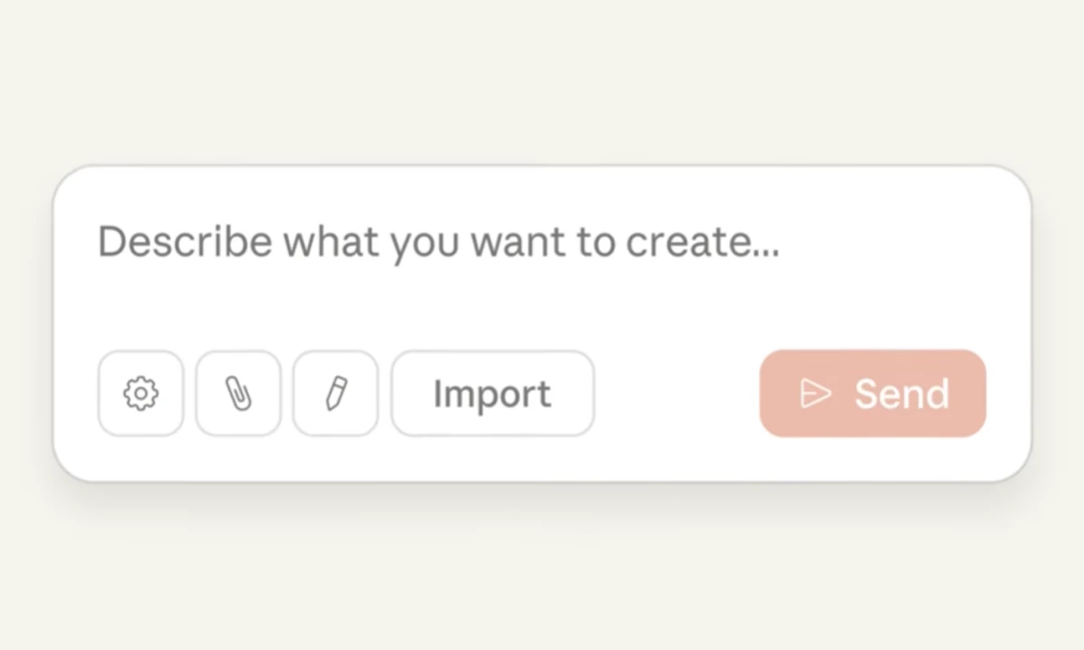
Start with what earns its keep. Claude Design is a two-pane workspace — chat on the left, live canvas on the right — powered by Claude Opus 4.7, Anthropic's vision-forward model.
You write a prompt; it renders a design. The mechanic is fast, and for certain categories of work, the output quality at launch surprised even skeptics.
The real value shows up in three places. First: early-stage ideation at speed. What used to require a designer blocking out two hours for an initial exploration now takes a strong prompt and a few minutes.
For a product manager who needs to communicate a feature concept before a team standup, or a founder who wants to put something visual in front of investors without commissioning a deck, that compression is real.
Second: the design system ingestion. During onboarding, Claude Design reads your codebase and any uploaded design files, then extracts your color tokens, typography, and component conventions and applies them to every subsequent project automatically.
This removes the most tedious part of AI design output: everything coming back as a generic SaaS template.
The catch is that it works best when your codebase is well-documented, so the cleaner your setup going in, the more useful this gets.
Third, and most structurally interesting: the Claude Code handoff. When a design is ready to build, Claude Design packages it into a bundle that passes directly to Claude Code for implementation.
No screenshots handed to an engineer. No Figma-to-Zeplin-to-Jira chain. The loop from prototype to running code is closed natively, inside a single toolchain, for the first time.
That is architecturally new. No other tool in the current market does this without third-party glue.
Where It Actually Breaks
This is the part that most coverage skips, because it takes more than 48 hours to find.
The output convergence problem is real and documented, including Anthropic's own engineering team.
When left without explicit reference material or constraints, Claude Design gravitates toward a familiar set of safe choices: Inter or Space Grotesk for the typeface, teal or purple as the dominant color, pill-shaped tags, and card-heavy layouts with rounded corners.
Anthropic's own Claude Cookbook calls this the "AI slop aesthetic," a distributional tendency baked into how the model was trained on vast amounts of real-world web UI, which skews heavily toward a narrow visual band.
The model is optimizing for "looks like a real app," and real apps, it turns out, mostly look alike.
The design system ingestion helps, but it doesn't fully solve the convergence problem. Even with a well-documented component library, Claude Design frequently generates its own lookalike version rather than pulling directly from your system, and teams with complex, multi-product design systems will hit that ceiling fast.
The usage economics are a separate problem, and one nobody is talking about plainly. Claude Design runs on Opus 4.7 vision tokens, which cost roughly three times more per token than text.
Real-world reports from week one tell a consistent story: two or three complex design sessions can consume a significant share of a Pro account's weekly limit, with no real-time meter showing consumption as it happens. Multiple users reported burning through the majority of their allowance in a single sitting.
What's missing entirely from the current build reads like a long list: multiplayer editing, an infinite canvas, persistent component libraries between sessions, and any path to a Figma export.
That last one is pointed.
Anthropic included Canva, PDF, PPTX, and standalone HTML as export options, with Figma conspicuously absent.
The intent isn't to slot into Figma's workflow but to route around it — and whether that succeeds depends on whether production design teams will accept a toolchain that never touches Figma.
The Prompt Is the Brief
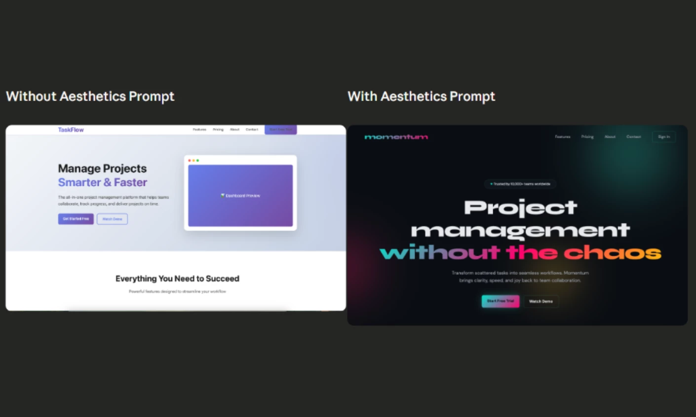
The tool rewards specificity the same way a good design brief does. Vague in, vague out — and vague in Claude Design means the default aesthetic, every time.
What works: uploading reference screenshots before you write any prompt, since reference images are the highest-leverage input according to practitioners who've spent a week in the tool.
Lock your design tokens (colors, type scale, spacing, border radius) as explicit instructions before you touch any screens, and use negative constraints as precisely as positive ones. "Don't use Inter or DM Sans" does more work than "use something distinctive," and referencing cultural or editorial aesthetics rather than product names ("Swiss editorial grid" or "early-2000s zine") gives the model a richer generative space than "make it look like Linear."
A week in, the Muzli community had converged on something they're calling the "Taste skill": a reusable document encoding your aesthetic preferences and negative constraints, pasted in at the start of every session to override the model's defaults.
It works, but it's also manual labor that users of mature design tools don't currently have to perform.
That's worth sitting with. This is a prompting literacy problem the design community is only beginning to reckon with, and the designers who get the most from this tool will be the ones who treat prompt-writing as a discipline on par with writing a good creative brief.
Where the Work Actually Moves
The deepest thing Claude Design does isn't replace designers. It relocates the beginning of the process.
Clients now arrive with prototypes, founders ship their own pitch decks, and product managers hand off wireframes before an agency brief is written.
The ideation phase that was once billable discovery work is getting absorbed at the tool level, and that changes what designers are hired to do, not whether they're hired.
What survives is judgment: knowing which direction is worth pursuing, which system is architecturally sound, which layout breaks at mobile.
The DesignRush analysis of the launch drew a similar distinction: agencies that sell judgment will use Claude Design to accelerate their work; agencies that sell execution are the ones with something to worry about.
The Honest Verdict
Claude Design is worth learning and worth using for the right jobs: rapid prototyping, pitch decks, early directional exploration, marketing one-pagers that need to look like a real product.
It's not a Figma replacement, and it's not a design system tool in its current state. If your workflow requires version history, component libraries, multiplayer review, or developer handoff that connects to an existing Figma setup, this isn't ready for that yet.
The designers who get the most from it will treat it like a sharp junior with a tendency to go off-brief: fast, capable of impressive output, and in constant need of specific direction.
The hype said it would replace the designer. The truth is more interesting: it raises the floor for what a non-designer can produce, and it raises the bar for what a working designer needs to bring.
The gap between those two things is where professional design value lives. That gap hasn't closed. It has just moved.