Standout Features:
- A distinctive dark color palette
- Easy-to-notice orange elements
- A rounded headline font style
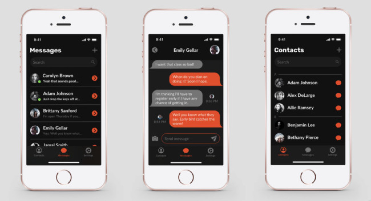
Our next talking point is Taylor Romney's UI kit development for a Messenger Mobile App.
The designer opted for a distinctive color palette that combines black screens with complementary light gray elements that help other UI elements gain a touch of sophistication. These colors are contrasted with a bright orange hue that points out the momentarily active features, as well as notifications and your messages.
This shade is easily noticeable and, with a rounded headline font style, brings the needed sense of optimism and energy to this predominantly dark palette.
Get a chance to become the next Design Award winner.
SUBMIT YOUR DESIGN

-preview.jpg)
