Standout Features:
- Simple typography
- Friendly color story
- Light to the eyes
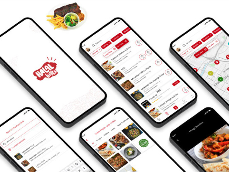
The user interface in this app is perfect for someone who wants a hassle-free, breezy user experience. The agency utilized subtle yet friendly colors in the background, and items are easy to find with the help of categories at the bottom of the screen.
The typography is also simple yet legible enough so that it's easy for someone to read what they're selecting. The font size also works well with the overall design, making it easier to read and browse the items.
Apps that are light to the eyes in terms of the user interface are great, and they can contribute generously to the overall user experience, so this app nails the requirements on the head.
Indeed, Quantum Art has done a great job conceptualizing the app from beginning to end.
_dc350bf47ad5-preview.jpg)
_ac86644899b1-preview.jpg)