- Article by
- Branko Dimitrijević

#ED6741 #E7CA8C #000000 #FFFFFF
- Agency: Blast & Aftermath
- Client: Bryony Purdue
- Category: Logo Design (Typography)
- Location: London, United Kingdom
- Project Brief: Create a bespoke typographic logo for a singer-songwriter that captures personal identity while remaining adaptable for single releases or a long-term recording career.
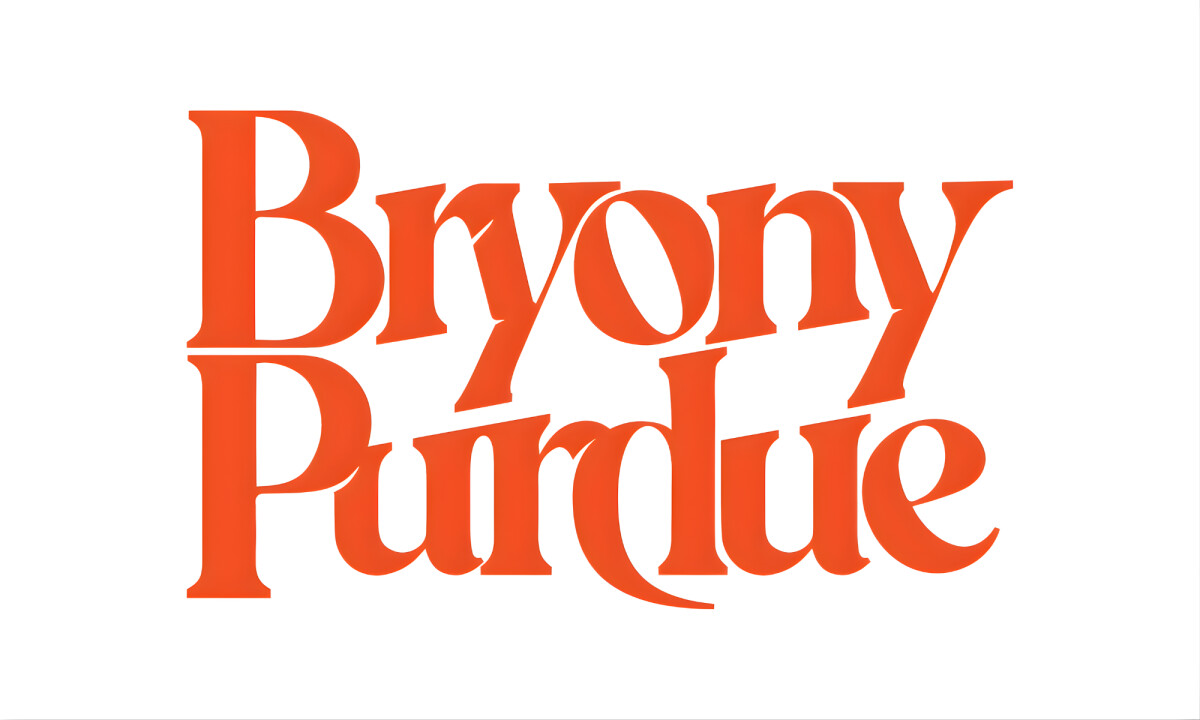
Bryony Purdue’s logo demonstrates how typographic branding can feel intimate and distinctive without becoming visually restrictive.
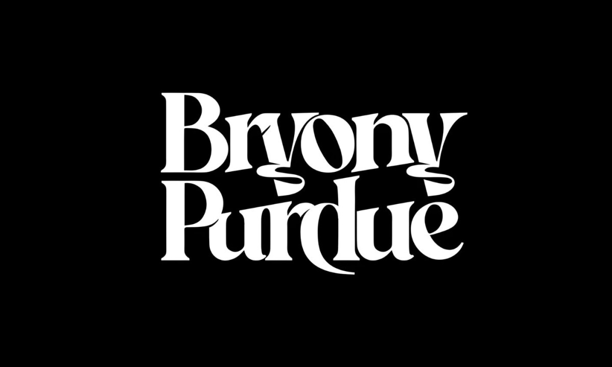
- Custom Typography & Letterform Craft: I find the bespoke letterforms are sculpted to create an expressive rhythm that gives the name a highly recognizable silhouette. The subtle curves and transitions introduce a unique character for me without ever tipping into excessive ornamentation.
- Personal Branding & Identity Expression: I believe this logo reflects the necessary balance between creativity and restraint required when branding an individual artist. From my perspective, the typography feels confident and individual while still allowing the artist to evolve stylistically over time.
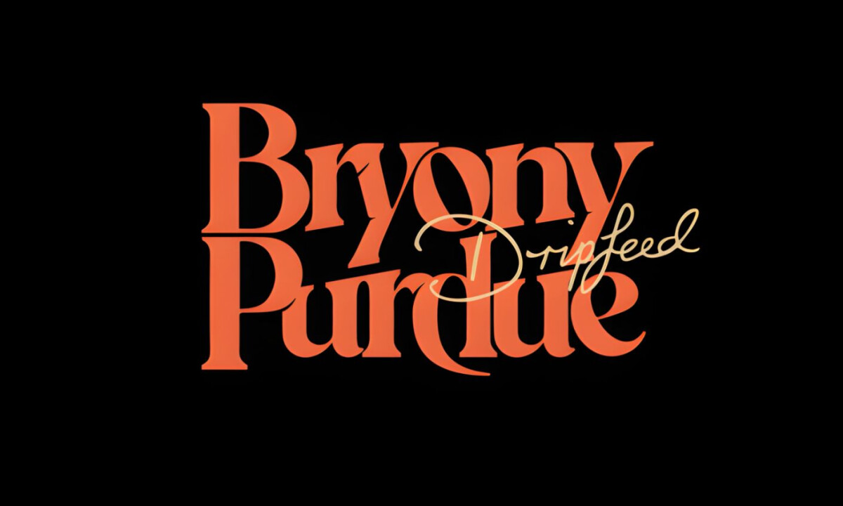
- Versatility & Longevity: I appreciate that the wordmark is strong enough to maintain its impact across album covers, digital platforms, and promotional materials. I see this as a flexible foundation that can adapt to future releases without losing its core recognition.
- Visual Tone & Contrast: The high-contrast presentation reinforces a sense of presence that allows the pure form of the letters to take precedence over temporary effects. I find this approach effective in ensuring the logo remains timeless rather than tied to a specific trend or moment.
What Brands & Designers Can Learn from the Bryony Purdue Logo
This project highlights how custom typography can express personality while remaining adaptable over time. Here are three key lessons from Bryony Purdue’s wordmark:
1. Build Recognition Through Letterform Shape
A distinctive silhouette makes the name instantly recognizable before it’s read. Thoughtful curves and proportions can create identity without relying on decorative effects.
2. Balance Personal Expression with Restraint
The typography feels intimate and confident while leaving room for artistic evolution. Successful musician branding supports growth rather than locking the artist into a single era.
3. Design for Longevity Across Formats
A strong wordmark performs equally well on album covers, digital platforms, and promotional materials. Timeless contrast and form ensure relevance beyond trends or releases.
Ready to elevate your designs?