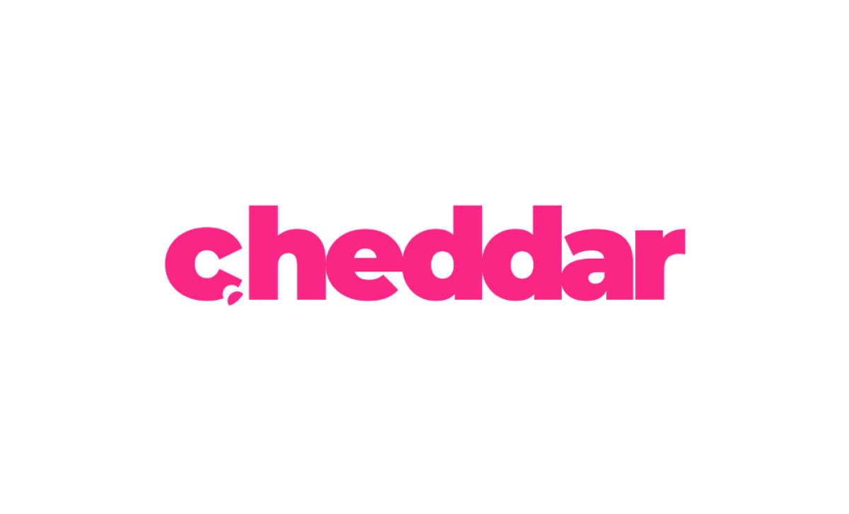
Standout Features:
- Modern lowercase typeface
- Electrifying pink color
- Chipped letter “C” representing cheese
It is hard to imagine how difficult it is for Cheddar’s SEO team to compete with one of the world's most popular types of cheeses for a top Google position. Indeed, it is admirable how this on-demand video news network, focused on business content, embraced its quirky name and created a unique and memorable logo.
The modern, lowercase typeface gives the logo a sleek, contemporary look that resonates with its millennial audience, while the electrifying pink color injects energy and vibrancy. The chipped letter “C” is a playful nod to cheese — a clever detail that reinforces the brand's name and hints at the idea of "cheddar" as slang for money.
Not only is the design clean, but it’s also a fun representation of what they do, merging professionalism with a lighthearted twist. Cheddar feeds its viewers’ curiosity about what’s next by offering weekday news and deep insights into the ideas and innovations shaping today's world. The Cheddar logo design is a prime example of creativity and originality, fitting perfectly with the organization’s dynamic and forward-thinking theme while setting it apart from the competition.