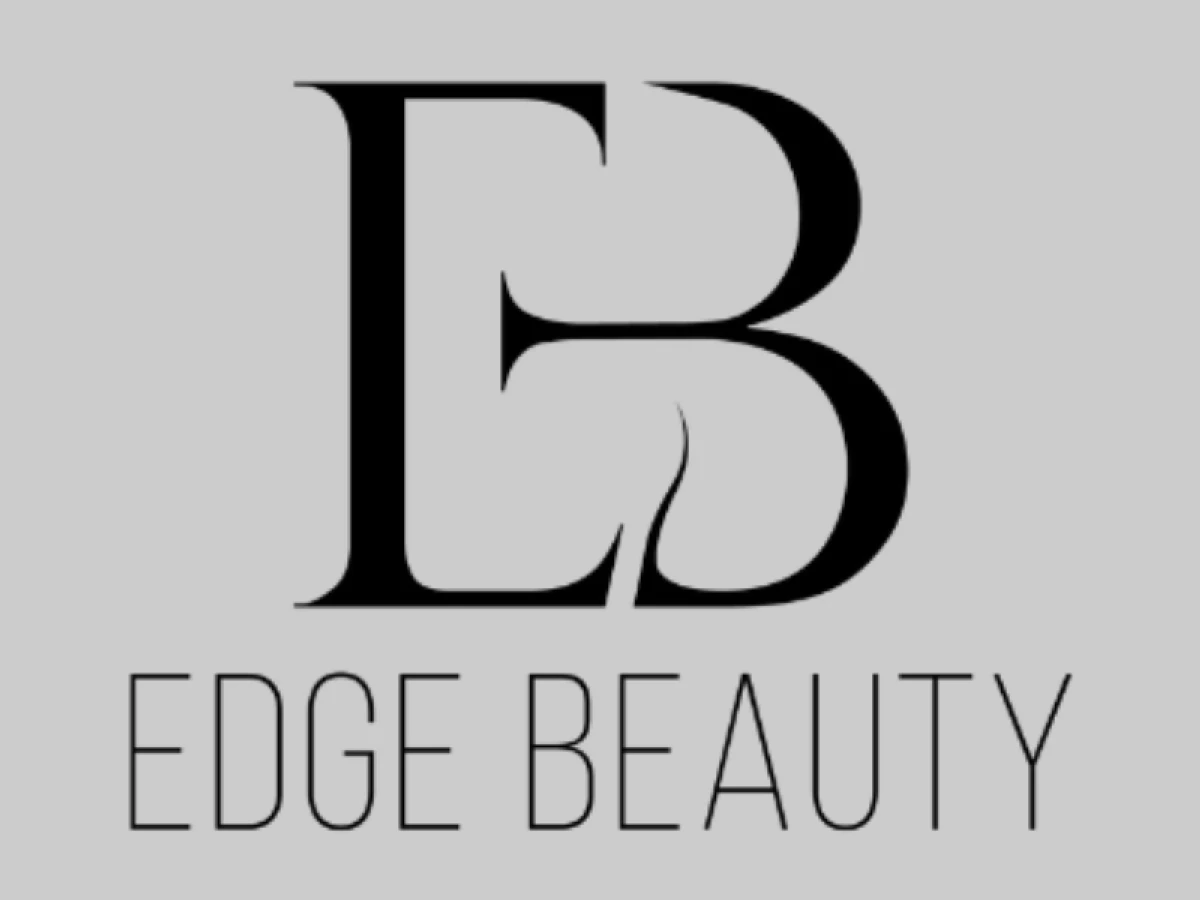
Standout Features:
- Sculptural ‘EB’ monogram with hairline motif
- High-contrast typeface pairing
- Sophisticated grayscale color palette
What does the ideal logo for a premium beauty brand look like? This one for Edge Beauty is a great case study.
It feels both classic and fresh, a critical balance to strike as 75% of consumers believe the 'look and feel' of a logo can make or break a company's success.
At the heart of the logo is a stylized monogram that combines the letters "E" and "B" into a single, cohesive form. A refined taper in the letters creates a razor-thin, swooping negative space, which resembles a flowing strand of hair.
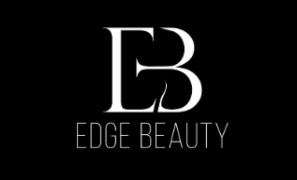
Let’s look at how the typography grounds the monogram. It provides clarity while enhancing the perception of refinement.
The font is delicate but firm, which communicates a sense of femininity without any fragility. It’s a perfect balance.
This is also a great example of one of the best beauty logos using a simple palette to create a big impact.
The focus is entirely on the beauty of the letterforms and the cleverness of the monogram. In fact, the lack of color makes the design feel more confident and self-assured.
Design by D's logo creation feels effortless, but is full of smart decisions. The takeaway for other beauty brands is that you don't need a complex or colorful design to communicate luxury.
To communicate a sense of luxury, a simple and clever idea is often much more effective.
That's why brands turn to expert partners, and our team has ranked the best agencies worldwide to make finding them simple.
Visit our Agency Directory for the Top Logo Design Companies, as well as:
Our design experts also recognize the most innovative design projects across the globe. Visit our Awards section to see the best & latest in logo design.