Standout Features:
- A combination of fonts
- Strong yet soft image
- Tagline is enclosed in an oval outline
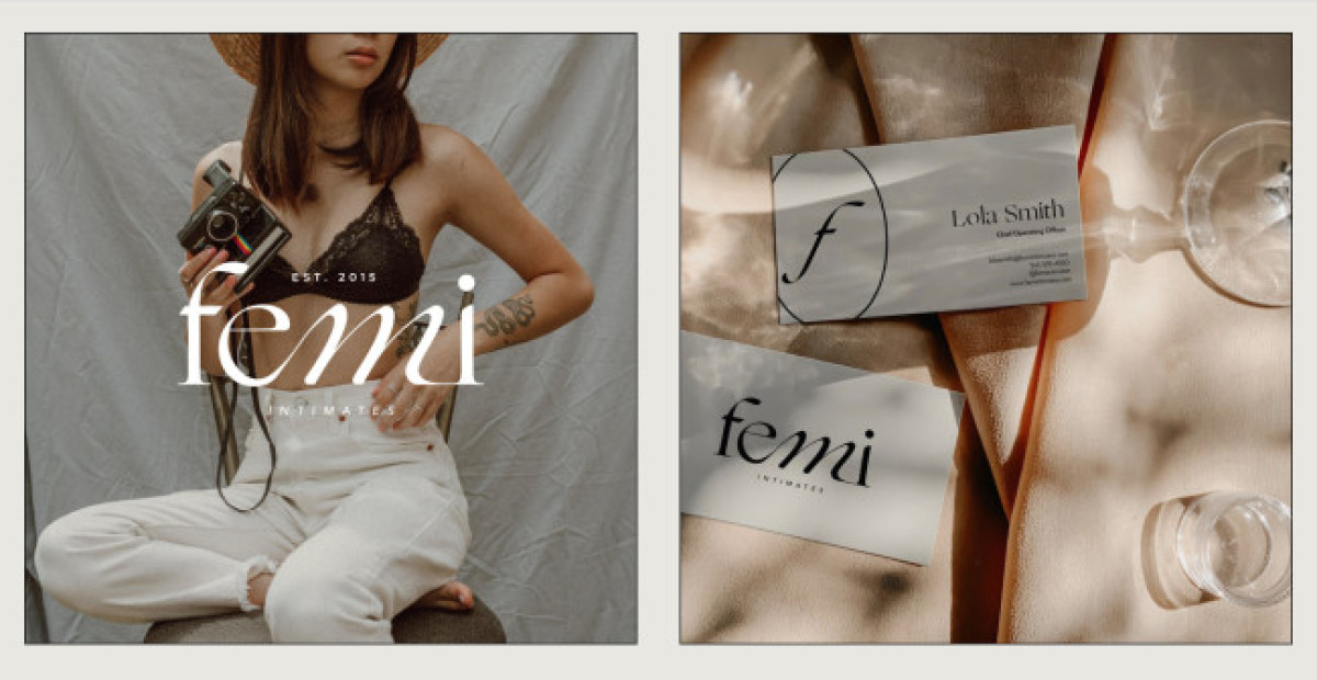
What sets Second Society's logo design for Femi Intimates apart from its competitors is the perfect harmony between the two different font styles.
The design agency used a thin serif font and a handwritten one to highlight the letter M from the logo. This represents the brand's intention to be seen as mature and sensual yet relatable to the customers as a sustainable lingerie brand.
The design also gives off stable vibes from how the other letters in serif fonts seem to hold the M upright, demonstrating their commitment to helping women stand up proudly from within. The brand's "Fiercely Feminine" tagline follows the same typography with a delicate oval outlining around it.
Get a chance to become the next Design Award winner.
SUBMIT YOUR DESIGN

