Standout Features:
- Typographic silhouette forming a brandmark of a dog
- Dynamic color pairings with distinct emotional resonance
- Whimsical, hand-crafted typography
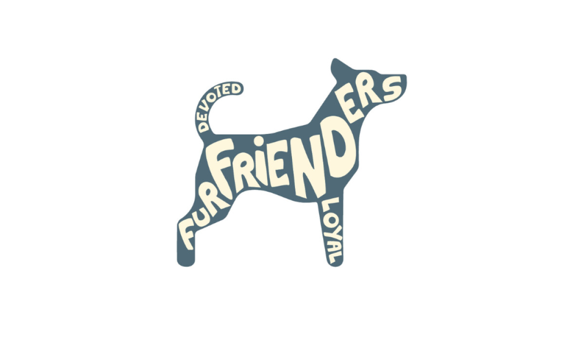
FurFrienders®, a boutique dog care service in Brooklyn, required a logo reflecting its personal and reliable approach. Designed by Cernero Productions, the brand identity needed to feel warm, trustworthy, and full of personality.
The resulting icon logo is clever, memorable, and deeply aligned with the brand’s community-focused mission of befriending neighborhood pets.
Communicating this mission effectively is not just good branding; it's good business, as over 13% of consumers are willing to pay 31-50% more for services from brands they perceive as having a positive impact.
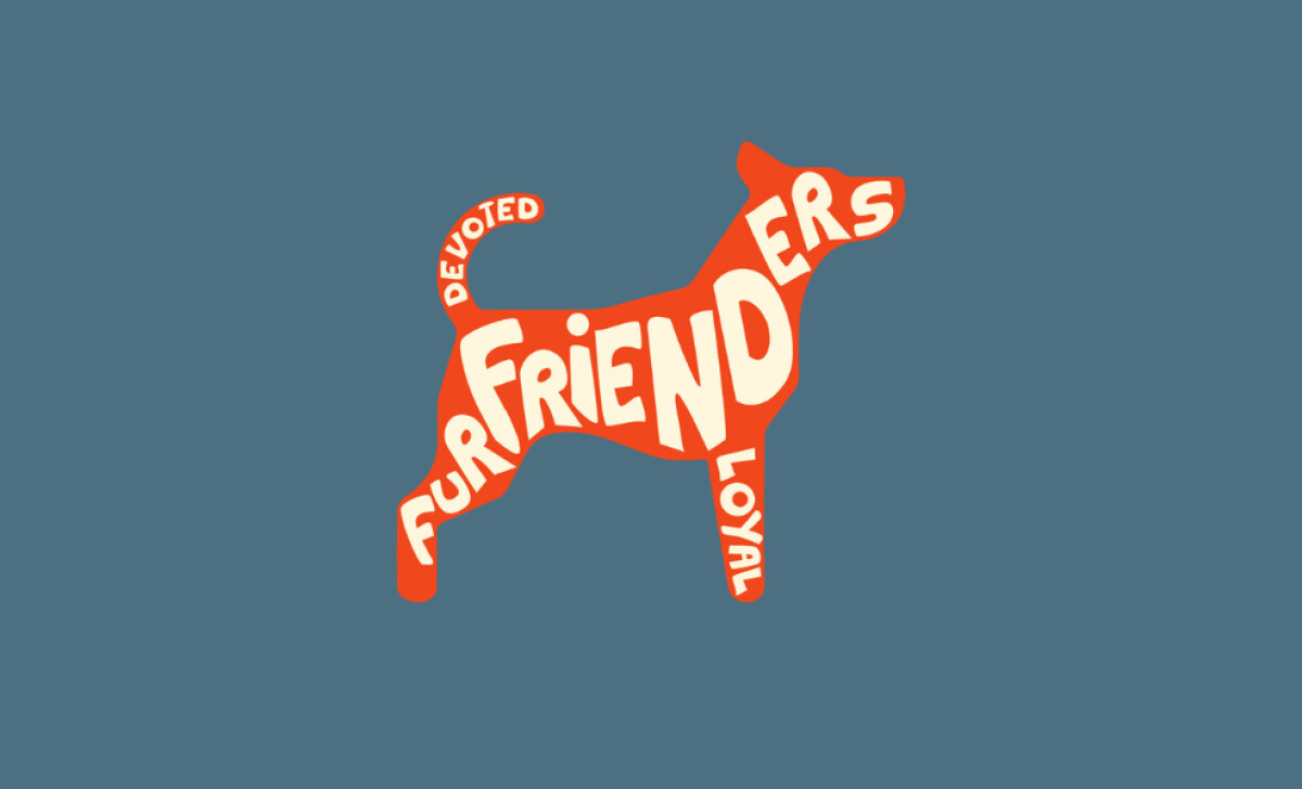
A standout element of this icon logo design is the typographic silhouette. The brand name and other words are shaped to create the body of a standing dog.
The custom lettering curves to fit the dog's form. This design is both witty and purposeful, positioning FurFrienders not as a generic service, but as a personality-driven experience.
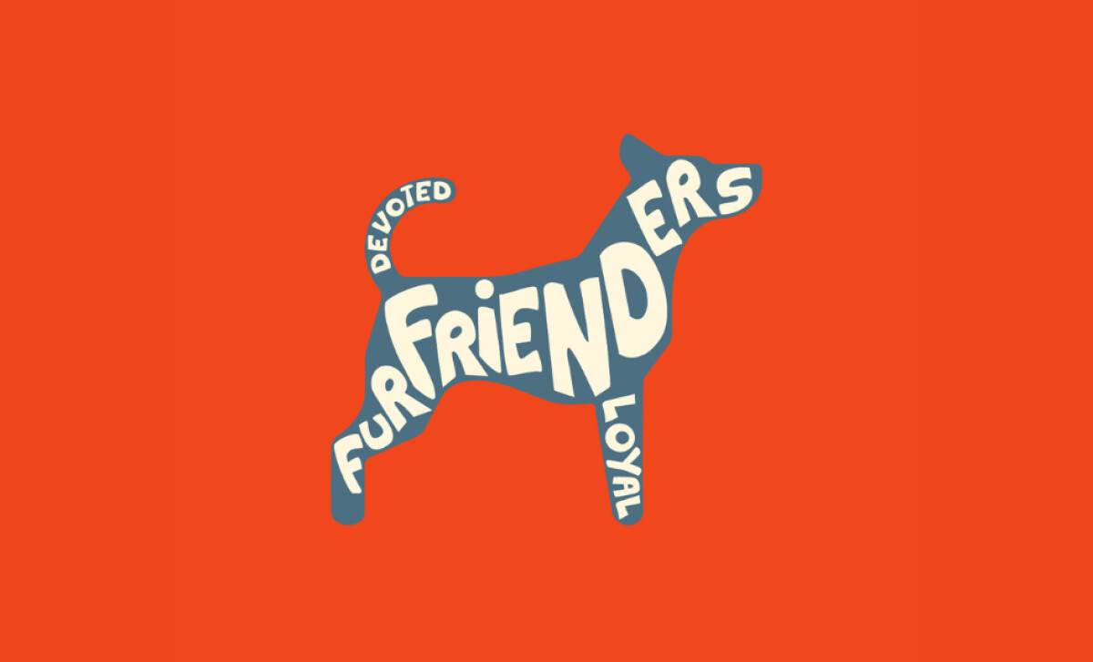
Multiple dynamic color combinations are used, such as cream on slate blue or orange on blue. These high-contrast duotones ensure the brand can adapt to different contexts. The palette is strategic: orange for energy, blue for reliability, and cream for warmth, all perfect for a dog care brand.
The typography is custom and hand-shaped, with letterforms of different sizes and rotations fitting into the dog's silhouette. This whimsical approach avoids slick corporate fonts. It intentionally reinforces the personal, handcrafted level of care that defines the FurFrienders brand experience for its customers.
FurFrienders underscores that a memorable logo can be a powerful conversation starter. By merging the brand name, its values, and a relatable icon into one cohesive form, the design ensures that FurFrienders is not just easily recognized, but also immediately understood and trusted by its target audience.

-preview.jpg)
