- Article by
- Branko Dimitrijević

This website uses a colour palette of 4 colours
#0F4366 #FFFFFF #61C2E1 #282828
Technologies & Tools
Description
Team Behind the Design
- Agency: KOMPAGNON Communications
- Client: Laserspectro
- Category: Logo
- Location: Koblenz, Germany
- Project Brief: Create a professional services logo that communicates scientific precision and reliability through refined typography and controlled visual symbolism.
Strong professional services logo design often balances concept, restraint, and clarity.
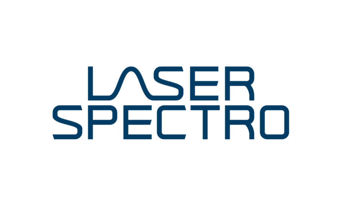
The Laserspectro logo shows how a highly technical brand can communicate expertise without visual complexity, using typography as the main storytelling device.
- Concept: At the center of the identity sits the wave-shaped “A,” which defines the mark with quiet confidence. I like how it alludes to laser signals and spectral data without slipping into literal symbolism, staying integrated within the wordmark and keeping the overall expression focused and intellectually grounded.
- Typography: A geometric sans-serif establishes a controlled, deliberate tone that feels appropriate for a scientific context. What works for me is how the rounded corners soften the structure slightly, while consistent stroke weights maintain the precision and accuracy the brand needs to communicate.
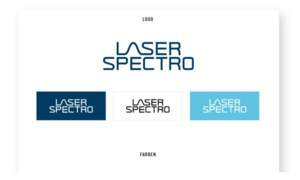
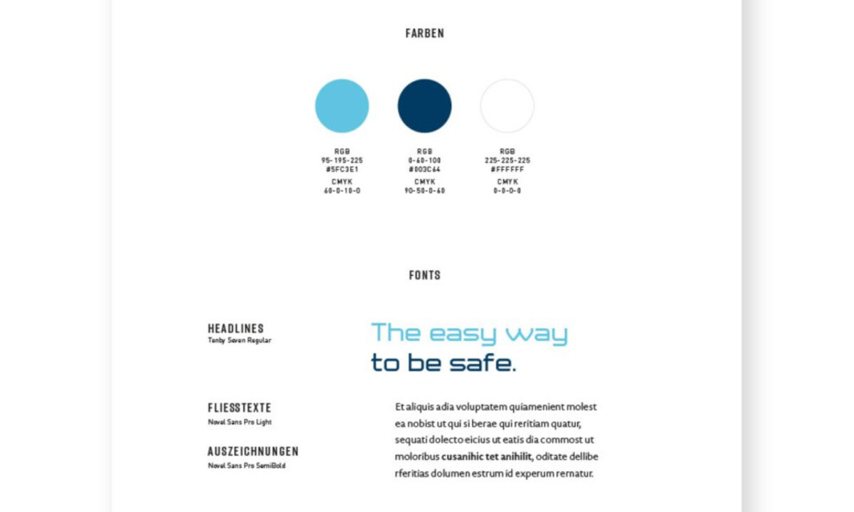
- Color: Rather than leaning on expression, the blue palette feels carefully calibrated. I find that the deep blue paired with lighter cyan holds clarity across different sizes and backgrounds, reinforcing trust and legibility in digital, printed, and technical environments.
- Applications: Consistency carries through every application without drawing attention to itself. I appreciate how stable proportions and spacing allow the logo to move between software, reports, and signage seamlessly, preserving coherence and authority across varied use cases.
What Brands & Agencies Can Learn from Laserspectro
Here are a few key lessons from Laserspectro’s logo design:
1. Let Typography Carry the Idea
Embedding meaning directly into letterforms can communicate complex services without relying on extra symbols.
2. Restraint Builds Credibility
Controlled geometry and limited color palettes often help professional services brands feel more trustworthy and precise.
Design for Technical Contexts
Logos that scale cleanly and adapt easily tend to perform better across tools, interfaces, and long-term applications.
Ready to elevate your designs?