Standout Features:
- Elegant script typography
- Minimalist architectural symbol
- Understated and refined color palette
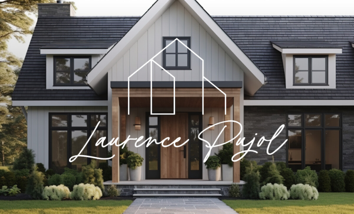
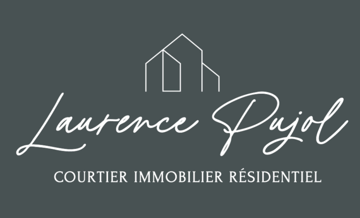
For Laurence Pujol, a passionate real estate broker, the designer Karen Storr was tasked with creating a logo that was both sophisticated and simple.
The handwritten-style script used for “Laurence Pujol” is a flowing, semi-cursive font with graceful ascenders and descenders.
Its slightly imperfect and organic rhythm gives the logo a sense of authenticity and a unique, individual personality.
Typography is often the most immediate carrier of a brand's character. A 2019 ResearchGate study indicates that handwritten typefaces elicit a perceived human presence, which is a powerful tool for enhancing authenticity.
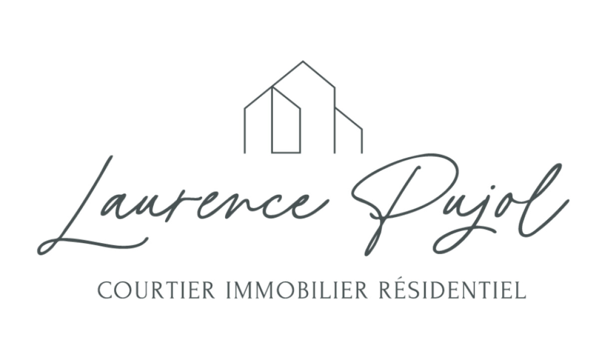
Above the name, a geometric line drawing suggests the outline of a home.
The design uses simple, linear forms, with a sharp angularity that provides an elegant contrast with the fluid curves of the signature below.
The real estate logo design alternates between two primary color treatments. The first is a deep slate gray on a clean white background.
The second is a reversed-out white version on a slate gray gradient background.
The restrained palette communicates a sense of timelessness and reliability — not to mention another layer of elegance and femininity.
For anyone seeking a real estate broker, this logo is incredibly reassuring. It manages to feel both high-end and approachable with its imperfect, handwritten name and classic colors.
A simple and elegant design can often be the most powerful way to communicate a brand's professionalism and personality.
That's why brands turn to expert partners, and our team has ranked the best agencies worldwide to make finding them simple.
Visit our Agency Directory for the Top Logo Design Companies, as well as:
Our design experts also recognize the most innovative design projects across the globe. Visit our Awards section to see the best & latest in logo design.