Standout features:
- Calligraphic ligature connecting the "M" and "A"
- High-contrast serif typography with modern character adaptation
- Context-aware logo application with effective contrast control
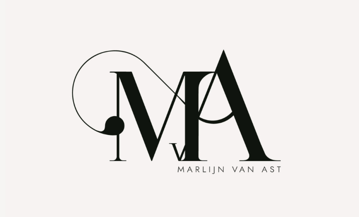
Marlijn van Ast’s logo, by Serinda Design Studio, represents the Dutch writer and addiction counselor’s personal brand. The logo displays elegance and expressiveness through an emblem blending classic typography with a modern sensibility reflective of her work.
A central feature is the calligraphic ligature intertwining the uppercase "M" and "A." A looping flourish starts at the "A's" crossbar gracefully connecting to the "M's" left stem. A filled circle at the loop's end balances the design.
This logo’s primary typography is a high-contrast serif, marked by its razor-thin hairlines and strong vertical elements. The extended arms and bracketed serifs give it a dramatic presence. The clever nesting of a lowercase “v” between the two main initials is a nice touch as well.
Such typographic styling is particularly effective for conveying classic elegance, as academic research (International Marketing Trends Conference, 2024) has demonstrated that serif fonts can significantly elevate perceptions related to refinement and authority.
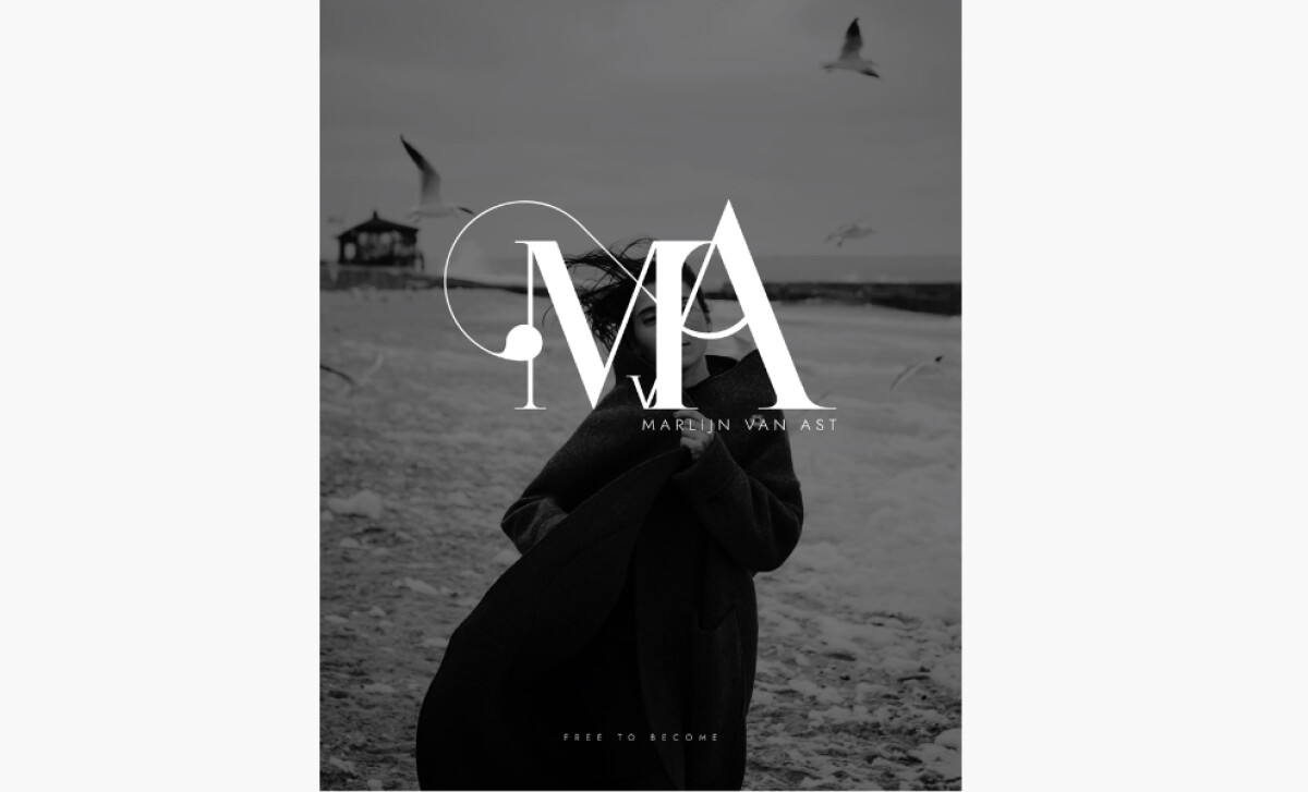
In various applications, the logo is shown effectively in black on white or reversed as white on real-life grayscale photos. This maintains legibility while enhancing the mood, amplifying the human story without overpowering it.
Serinda Design Studio’s work for Marlijn van Ast underscores that an emblematic logo can be as rich and intentional as the individual it represents.