Standout Features:
- Subtle duality
- Minimal illustrations
- Literal stem in monogram
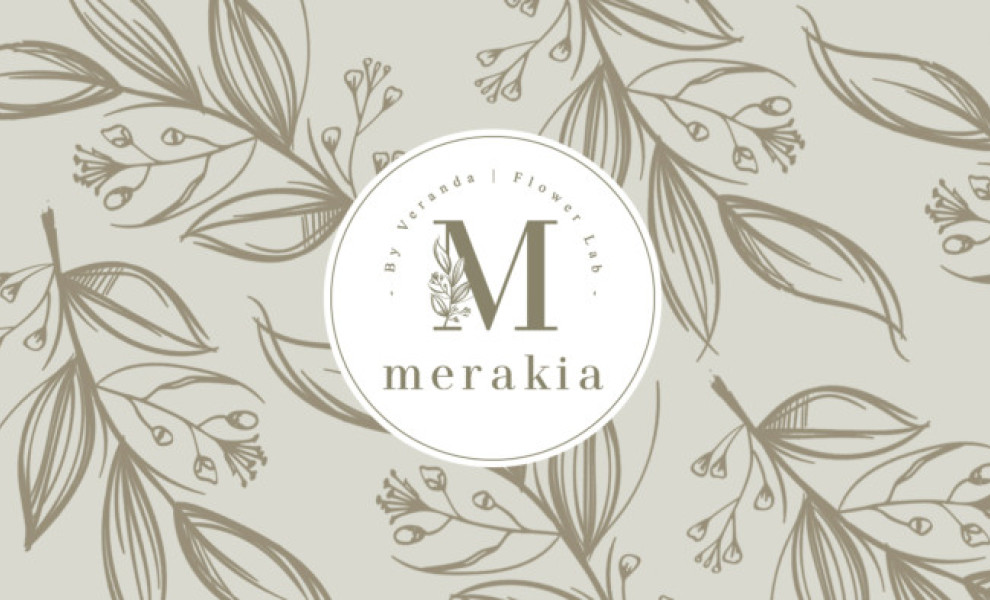
Merakia's design by Linart Lab takes a similar approach to our previous entry adding a more colorful twist that walks a fine line between sophisticated elegance and contemporary, millennial-oriented aesthetics.
Both the rich greens, minimal, linework illustrations and serif-freehand typography combos reveal this duality effortlessly putting Merakia in a league of its own.
Although it's a Mexican brand, its name derives its meaning from the Greek "Meraki" which translates to the "essence of ourselves". Essentially it refers to the act of doing something with your entire being, body and soul, and the company's branding showcases it perfectly.
Get a chance to become the next Design Award winner.
SUBMIT YOUR DESIGN