Standout Features:
- Monolithic "MH" letterform mark
- Calm and authoritative blue color system
- Scalable identity across all touchpoints
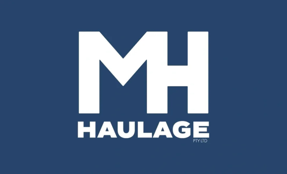
K-BOS Design delivered this brand identity for MH Haulage PTY LTD, a logistics company where trust and clarity are paramount. The design communicates these values through a typographically bold and geometrically grounded logo system.
The core visual is a bold monogram composed of the initials “M” and “H.” The ultra-heavy sans-serif letterforms are clean and geometric. They are aligned on a single baseline, forming a strong and stable rectangular block.
The deep slate blue is not overly corporate or too subdued. It’s a perfect balance that makes the brand feel both authoritative and approachable, a strategic choice as 54% of consumers identify blue as the most trusted brand color.
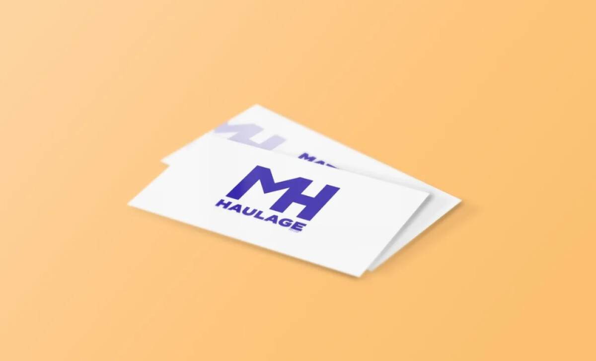
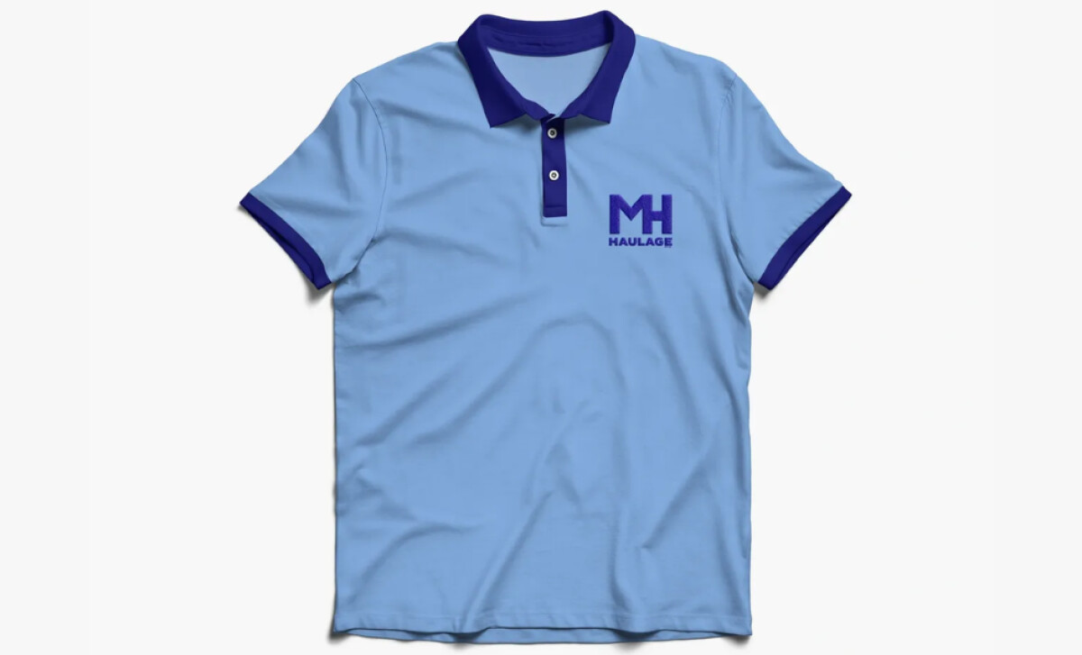
This is a fantastic example of a professional services logo design that enhances team cohesion. From print collateral to company merch, the consistent and professional branding on uniforms and vehicles creates a unified look. It makes the entire operation feel more organized and reliable.
Ultimately, this is a design solution that works as hard as the business it represents. It’s a fantastic example of a brand identity that is both aesthetically clean and highly functional in all its real-world applications.
A great brand identity for a service business needs to work hard — it has to look good on paper and be highly functional out in the real world.
That's why brands turn to expert partners, and our team has ranked the best agencies worldwide to make finding them simple.
Visit our Agency Directory for the Top Logo Design Companies, as well as:
Our design experts also recognize the most innovative design projects across the globe. Visit our Awards section to see the best & latest in logo design.


