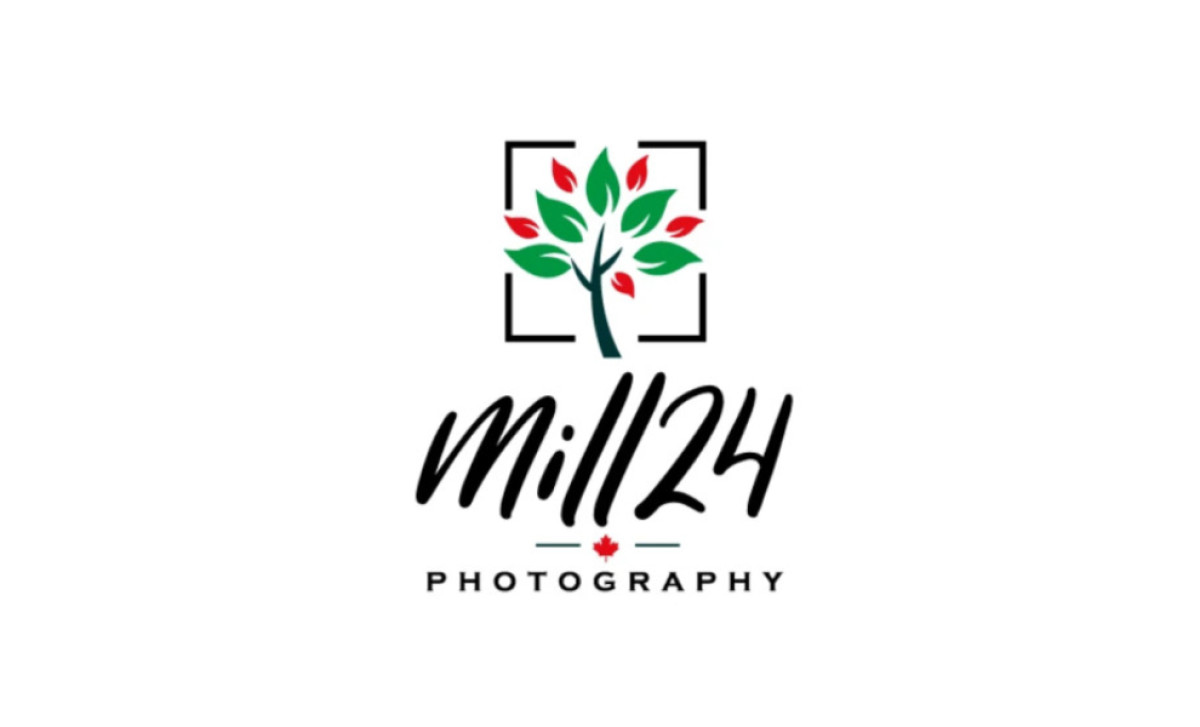
Standout Features:
- Framed tree icon
- Expressive script paired with clean sans-serif
- Maple leaf signifying Canadian identity
Though portfolios can speak for themselves, photography studios like Mill 24 still need a logo that makes the business look good. It has to clearly show they're creative visionaries but also reliable professionals you can trust. The NetMen Corp tackled exactly this challenge by mixing a tree-in-a-frame graphic (very meta!) with stylish typography.
Right at the heart of this logo sits a rather clever icon. Here lies a stylized tree with green and red leaves sitting inside the corners of a square frame. This frame can also be interpreted as focus screens you can see in the viewfinder of modern digital cameras — which is a reference to the studio’s offerings.
Typography-wise, the name "Mill 24" utilizes a flowing brush script, dialing up the creative, custom feel, while the word "photography" snaps back to business in a simple, stable sans-serif. This was done to signal both creativity and reliability, while making use of common typographic best practices.
One nice little touch is how they've integrated a red maple leaf icon into that dividing line between the words. It's an unambiguous nod to the studio's Canadian identity, which is great for local recognition. Plus, the colors used in the logo already work nicely with this national symbol too.
What this photography logo design nails is getting that mix right — it feels a bit artsy and personal because of the script font, yet totally professional thanks to the clean text underneath. Together, it adds personality beyond just saying "I take photos," which is a fantastic advantage for standing out as a studio.


