Standout Features:
- Geometric abstraction
- Bold typography
- Professional color palette
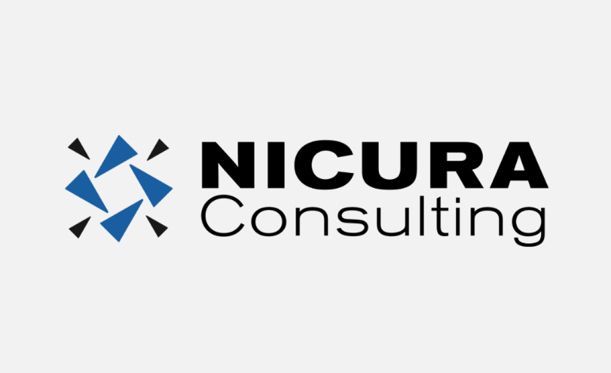
Nicura Consulting stands out in its industry with a logo designed by FKH Branding Design. It successfully communicates the company’s core values of professionalism and precision. It integrates modern design principles while remaining simple and impactful, a perfect fit for a consulting firm that seeks to inspire trust and competence.
The logo’s graphic component consists of abstract triangular shapes that form a dynamic, yet balanced pattern. This design not only conveys movement and progress but also visually represents the idea of alignment, which is crucial for a consulting firm that helps businesses navigate complex challenges.
The bold typography complements the geometric icon, adding a sense of authority and clarity to the logo. The clean, sans-serif font used for "NICURA" is modern and straightforward, while the more delicate “Consulting” in lowercase provides balance and reinforces the company's approachable nature.
The professional color palette, dominated by deep blue and black tones, enhances the overall impact of the logo. Blue is often associated with trust, dependability, and expertise — qualities central to the consulting industry — while the black provides contrast and sophistication.
By combining geometric abstraction, bold typography, and a strong color palette, the design conveys trustworthiness and forward-thinking innovation. As a result, this logo stands out in the professional services industry, providing Nicura Consulting with a memorable and powerful brand identity.