Standout Features:
- Interlocking geometric monogram symbol
- Sleek, spaced sans-serif typography
- Brand system expansion through pattern and stationery
The visual identity of Nienaber Attorneys, a law firm in South Africa, was recently modernized by Rydacom Designs. Moving away from a serif-heavy past, the new branding features a geometric mark. It's designed to convey the firm’s dedication to practical advice and quality legal work through a lens of contemporary professionalism.
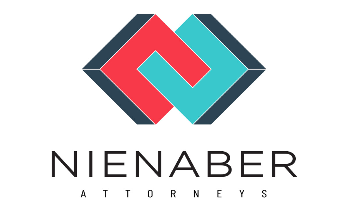
The new logomark presents an abstract monogram. It comprises two interlocking geometric forms, one red and one cyan, which create a mirrored "N." Navy shadows introduce a sense of three-dimensional depth, transforming the icon into a visually solid construct. This design element is distinct, memorable, and conveys stability.
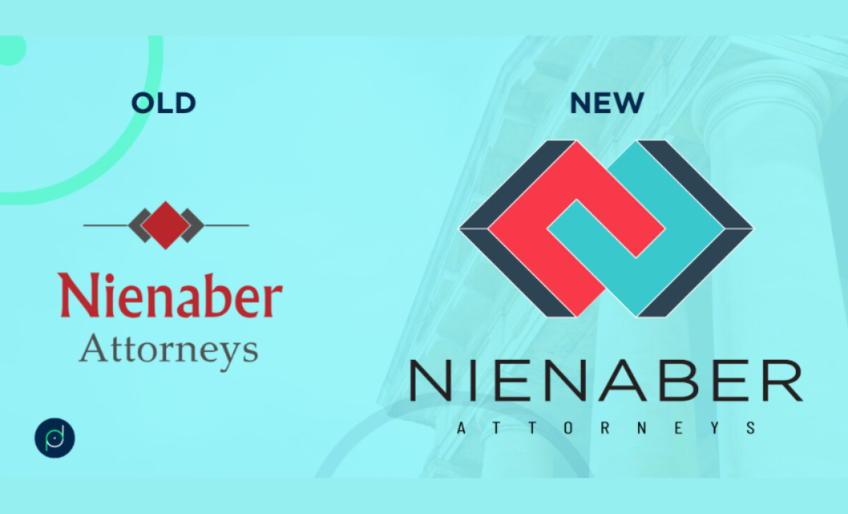
This rebrand introduces a thin, modern sans-serif for the "NIENABER" logotype, with extended forms and generous tracking that suggest confidence. "ATTORNEYS" is displayed in a clean, spaced uppercase beneath it. This careful typography lends a progressive yet authoritative feel, suitable for a boutique legal practice.
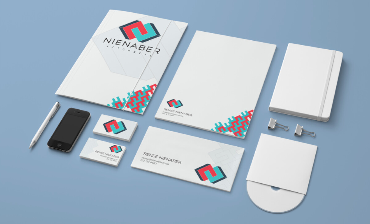
With this new legal logo, the visual identity is integrated into a comprehensive brand system. The monogram is adapted into patterns or elegant corner accents on various print materials, showcasing the logo’s adaptability. This is crucial, seeing that branding consistency can increase revenue by 20%.
The transformation of Nienaber Attorneys' visual identity showcases that modern design elements can add significant conceptual depth. This approach allows a brand to communicate core values like balance and resolution in a visually engaging and memorable way, which is particularly impactful in the legal field.