Standout Features:
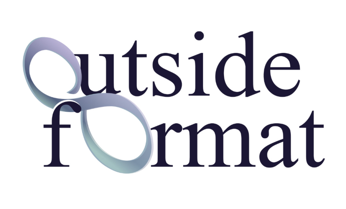
- Abstract loops replacing the letter “O”
- Professional colors and smooth gradient accents
- Classic serif font paired with modern graphics
Outside Format has specialized in dental software for quite a while now. Since establishing its presence in 2008, it has built up expertise in that niche. As such, it decided to bring in AV Grafica & Design specifically to craft a logo that truly represents their unique position combining technology with the dental field.
The coolest part of the logo is how the designer swapped out the 'O's in "Outside" and "Format" for fluid ribbons forming an almost infinity shape. It uses soft gradients and is starkly three-dimensional. Building them right into the wordmark gives the logo depth.
Color-wise, the palette used is sophisticated and well-considered. The name itself is in a professional dark blue or purple. But the ribbon graphics use a smooth teal to pale purple gradient. This adds a nice color contrast that’s not too aggressive, and a fluid, modern technology feel, thanks to the gradient.
Also, notice how the logo blends type styles: the text parts are in a traditional serif font, making it feel professional (important when handling critical dental data). But then you have the modern, abstract gradient graphics replacing the 'O's. This contrast balances the serif’s familiarity with the 3D element’s edginess nicely.
Swapping out letters for graphics directly within the company name itself is a really clever design approach we see in this professional services logo. It benefits specialized tech brands by making their logo instantly unique and packing it with relevant meaning, instead of just sticking a separate icon beside the name.