Standout Features:
- Dark theme
- Geometric logo symbol
- Industrial and modern look
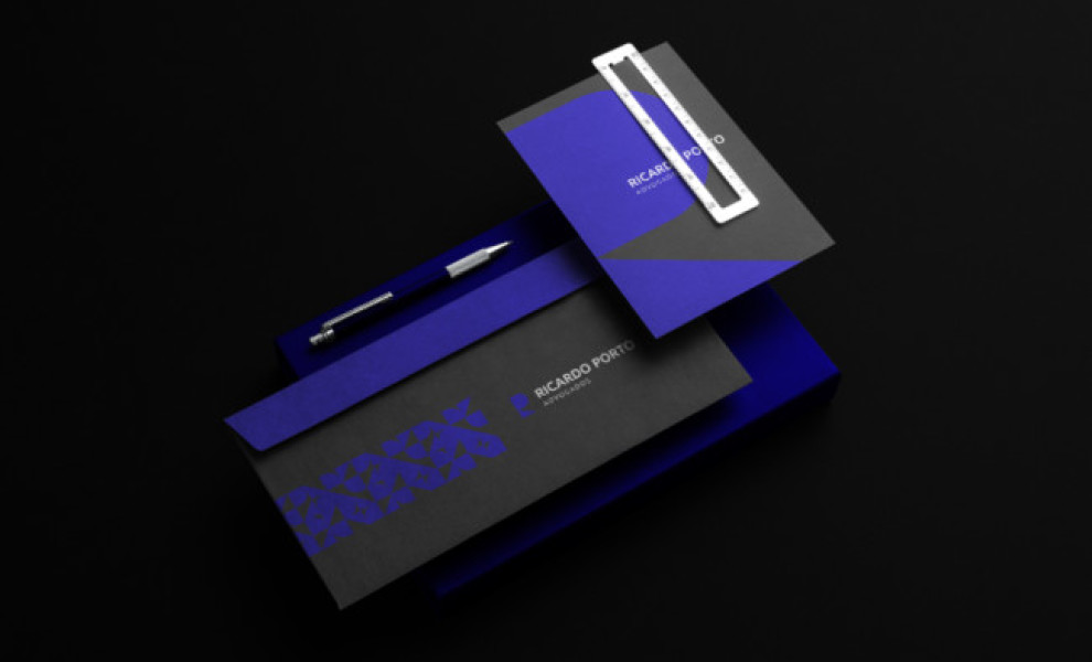
Ricardo Porto is a legal attorney who aims to be recognized in the industry as a professional who sparks meaningful change through quick, personalized, and transparent legal services.
With this in mind, Leo Mendes Design created a logo representing the legal office’s commitment to excellence and security while highlighting the brand’s modern and creative sensibilities.
The brand mark draws attention instantly. It's an integrated geometric symbol of the brand name’s initials. But that’s not all – it also doubles as an illustration of a door lock, representing the solid security that clients get from partnering with the attorney.
Finally, the combination of black and royal blue added a contemporary touch and depth to the brand, effectively introducing Ricardo Porto to a broader potential clientele.