Standout Features:
- Bold, dynamic icon inspired by road markings
- Strong use of color for brand recognition
- Versatile logo adaptable to multiple applications
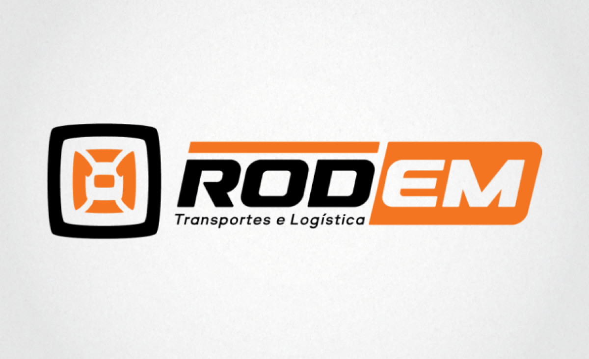
ROD EM, a company specializing in logistics and transportation services, needed a logo that symbolized efficiency, movement, and reliability. Designed by P1 Design, the logo reflects these values with a bold and modern identity. The design captures the essence of road transport, using a dynamic icon that instantly communicates the brand's mission.
The logo’s icon is inspired by road markings and mechanical elements associated with transportation. This geometric form stands out, evoking motion and speed while maintaining a strong, grounded look. It conveys the sense of reliability and efficiency that ROD EM offers in its services, making the logo both functional and visually appealing.
The combination of orange and black reinforces the brand’s energy and authority. Orange, a color associated with movement and attention, contrasts effectively with the black to create a high-impact visual. This color scheme not only grabs attention but also helps establish a sense of professionalism and strength.
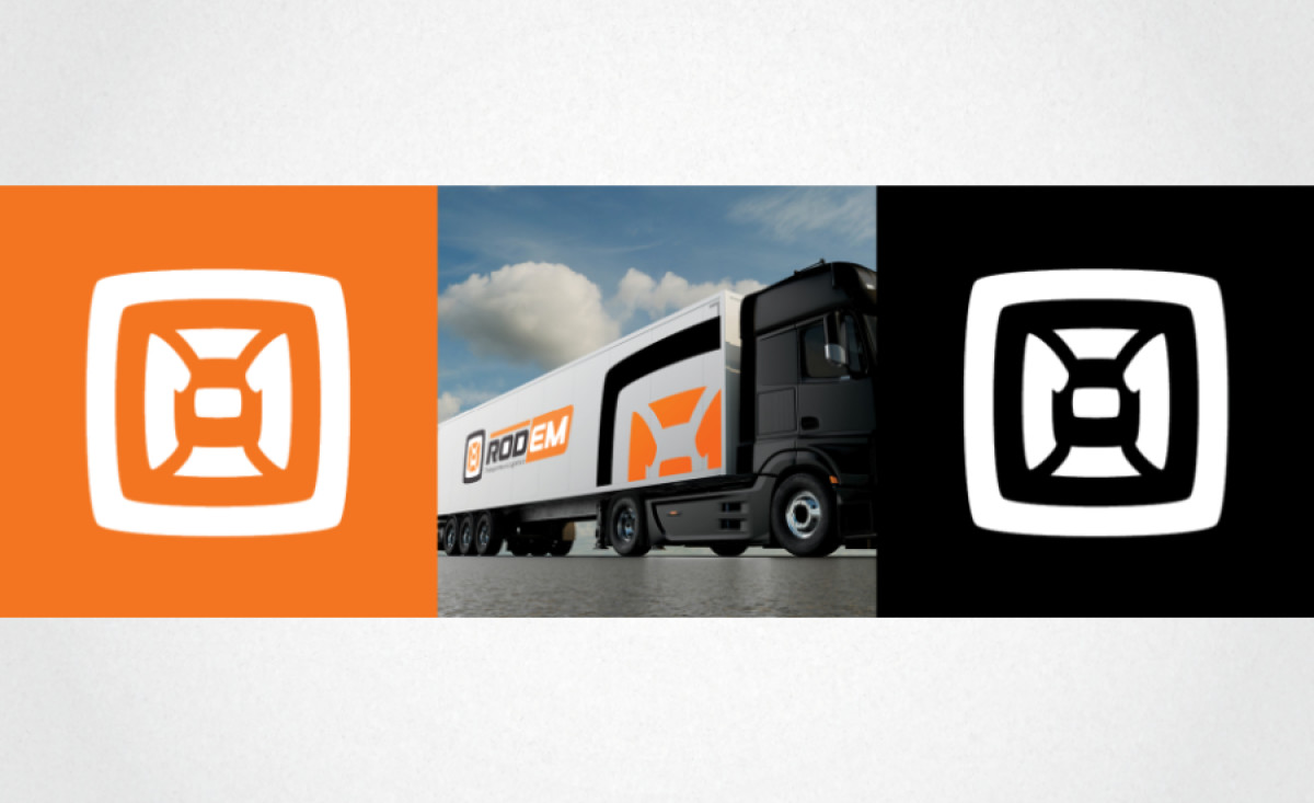
Lastly, the logo’s versatility allows it to adapt across multiple formats. The icon alone can be used as a powerful symbol on vehicles or promotional materials, while the full logo works well for both digital and print media. This adaptability is critical for a transportation company that needs its branding to be clear and effective across different channels.
With its dynamic icon, strong color scheme, and versatile design, it serves as an excellent representation of the brand’s core values in the transportation and logistics industry. This professional services logo design captures the essence of a company while ensuring lasting brand recognition.