Standout Features:
- Abstract design
- Playing around with positive and negative space
- Interconnected lettering
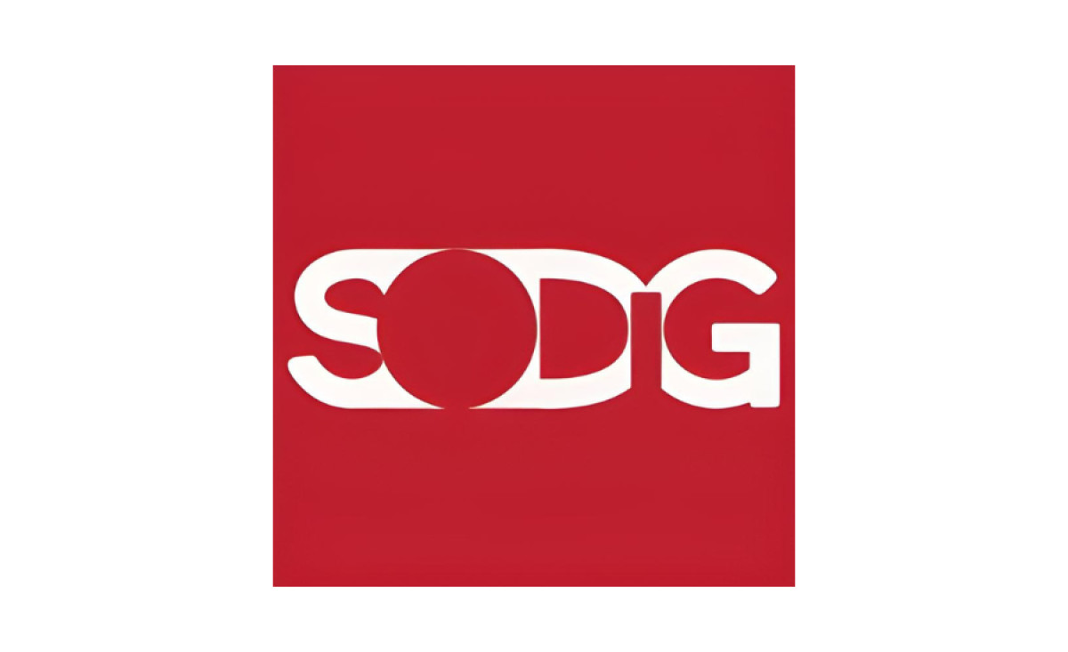
Our best video companies' logo designs list continues with SODIG, one more red-and-white emblem.
This is an abstract design that gives off intriguing rebus vibes. By leveraging the positive and negative space, this playful design provides several interesting visual features.
The vowels in the brand's name are presented through the negative space used to separate the other letters, showcased in white.
Did you enjoy this design's features? You'll love these abstract logo designs!
The lettering is interconnected. The "O" is enlarged, and the "I" is slightly smaller than other letters, which further helps the composition translate its authentic appeal.
Get a chance to become the next Design Award winner.
SUBMIT YOUR DESIGN
