- Agency: Louis Garella
- Client: Sonata Electronica
- Category: Logo Design — Entertainment
- Location: Paris, France
- Project Brief: Create a logo conveying a dynamic electronic identity through experimental forms for strong visual recognition.
Visualizing sound requires an entertainment logo to move beyond static geometry. Sonata Electronica's identity uses the grit of analog distortion to create a digital heartbeat that feels alive.
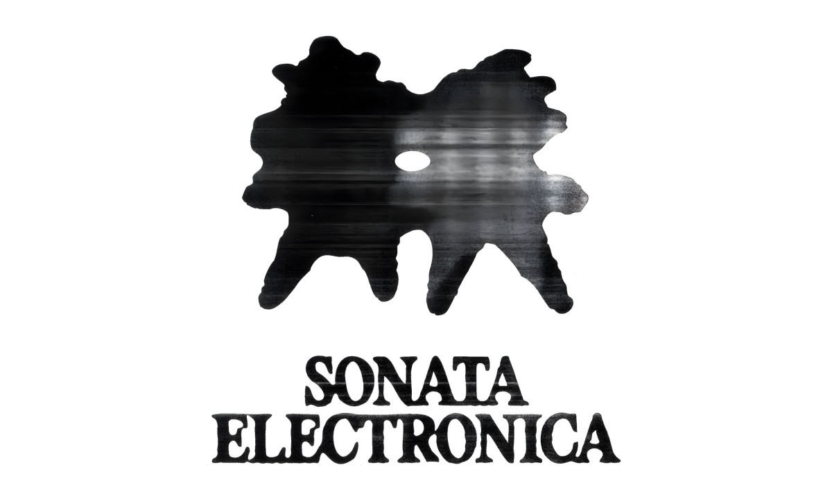
Louis Garella built the mark around a low-ink Xerox aesthetic, running the central shape through analog distortion until it looks like something caught mid-scan on a broken photocopier.
The shape itself resists easy reading. An irregular, symmetrical blot with a single hole at its center. It reads differently every time you look at it, which is intentional. For an electronic duo whose sound shifts between sets, a fixed symbol would be a lie. The mark moves because the music does.
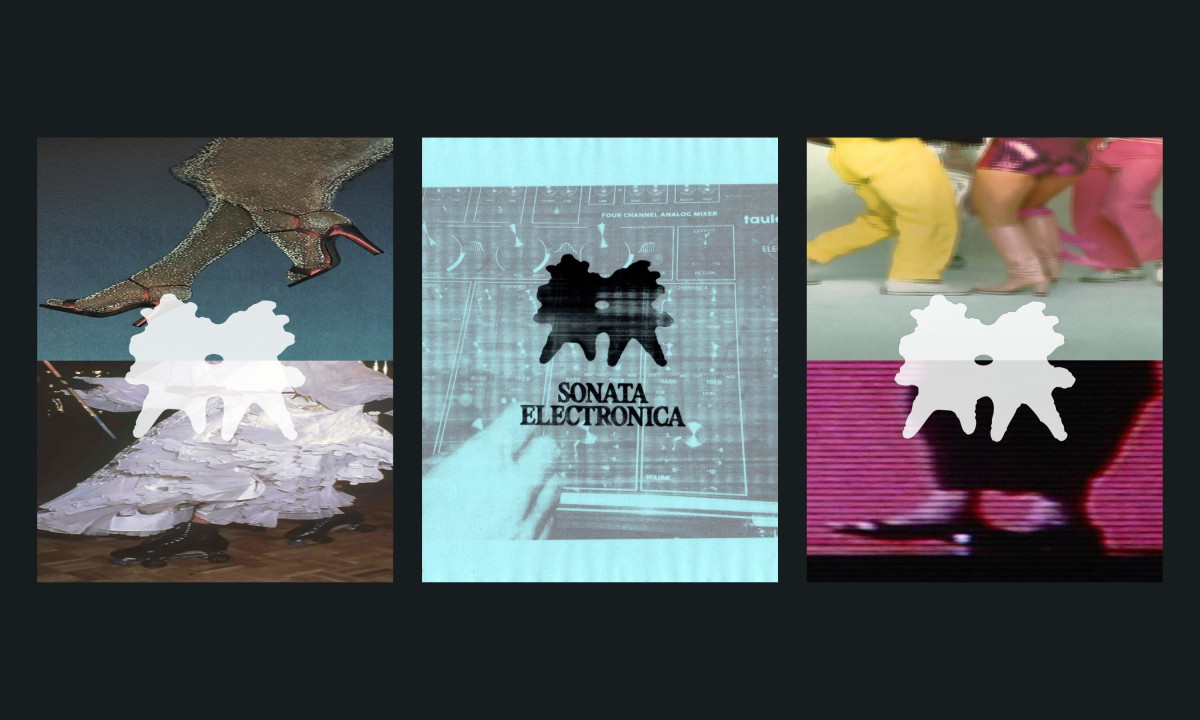
Color shifts the identity's register. In monochrome on white, the logo feels archival, like a zine pulled from a crate. In pink on a dark crowd photo, it becomes a flyer for tonight's show. In white over VHS-scanned fashion footage, it belongs on an art director's mood board.
Garella gave the duo a mark that changes tone without changing form.
The wordmark anchors everything. A heavy, slightly warped serif with uneven baselines sits below the blot, grounding the identity in something readable. Without it, the mark would be pure abstraction. With it, the logo holds together on a poster, a social card, or a projection behind a DJ booth.
Garella made a logo that behaves like the music it represents. Unstable on purpose. Recognizable anyway.