- Article by
- Branko Dimitrijević

This website uses a colour palette of 4 colours
#573A35 #A8514B #465516 #0F0F0E
Technologies & Tools
Description
Team Behind the Design
- Agency: Natalie Legg Design
- Client: Biotta
- Category: Packaging - Food & Beverage
- Location: Colorado, United States
- Project Brief: Design food and beverage packaging that reinforces Biotta’s organic, non-GMO positioning through minimal structure, clear hierarchy, and visible product integrity.
When I look at food and beverage packaging designs, I pay close attention to whether the design trusts the product or tries to justify it.
Biotta’s packaging clearly does the former, leaning into restraint and confidence instead of explanation.
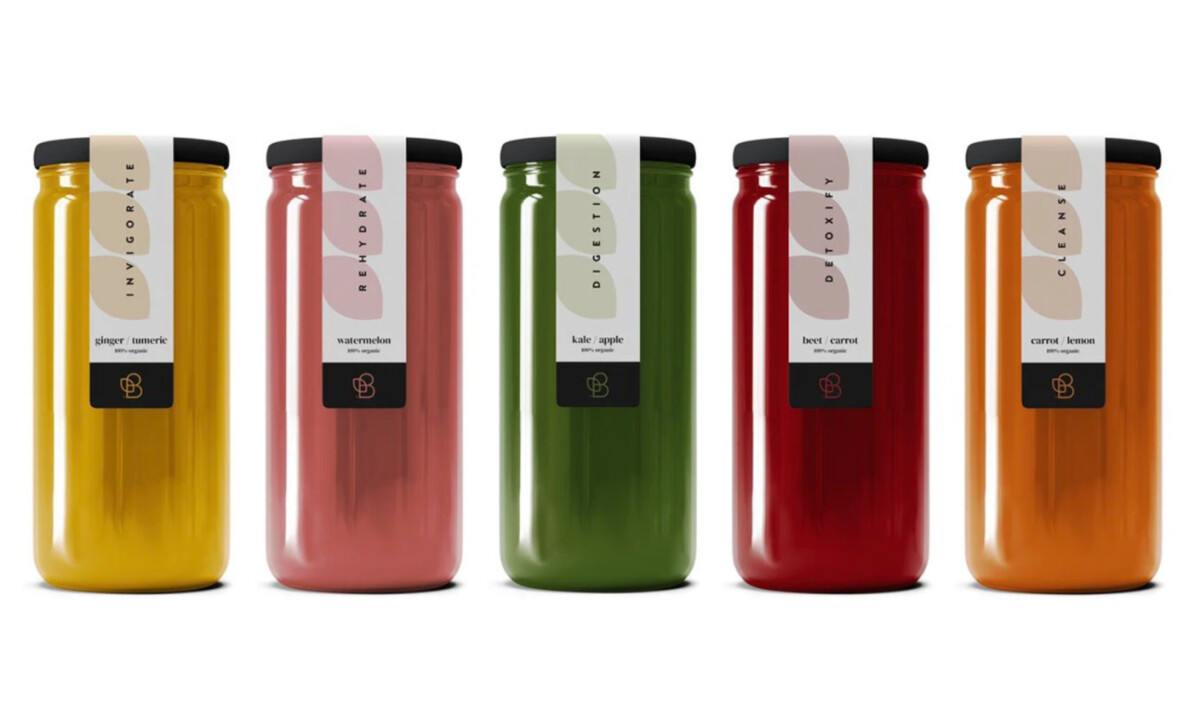
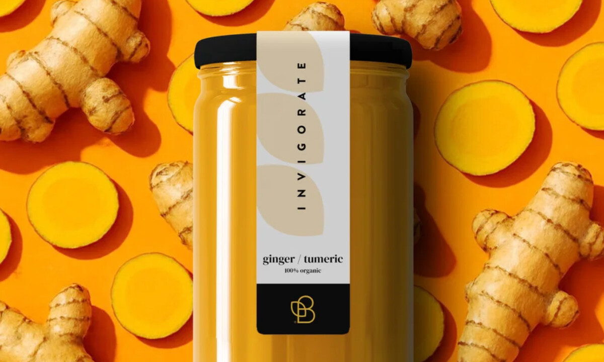
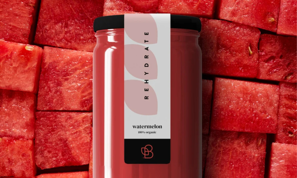
- Label Architecture: I like how the narrow vertical label shifts attention straight to the juice. Covering only a small portion of the bottle signals confidence and transparency, which feels fitting for an organic, never-from-concentrate product where the contents should speak first.
- Organic Shape Language: Softly layered abstract forms introduce character without becoming literal. That restraint works for me because it hints at natural process and origin rather than illustrating ingredients, keeping the label contemporary and composed.
- Typography & Hierarchy: Placing functional benefits vertically feels intentional and clear. I appreciate how purpose leads visually while flavor names sit back, matching the way many wellness buyers scan shelves by benefit before taste.
- Color & Contrast: A matte black base grounds the palette and adds visual weight. For me, it brings a sense of seriousness and quality control that pushes the packaging beyond natural cues into a more premium space.
- Product-as-Hero Strategy: Allowing the liquid color to define the range feels like a confident choice. The bottles read as a natural spectrum on shelf, which comes across as honest, appetizing, and easy to understand at a glance.
What Brands & Agencies Can Learn from Biotta
1. Let the Product Lead
Allowing the contents to remain visible can communicate freshness and authenticity more effectively than heavy graphics.
2. Design With Restraint
Minimal labels and limited color systems often feel more premium, especially in organic food and beverage categories.
3. Prioritize Clear Scanning
Strong typographic hierarchy helps shoppers quickly identify functional benefits in crowded retail environments.
Ready to elevate your designs?