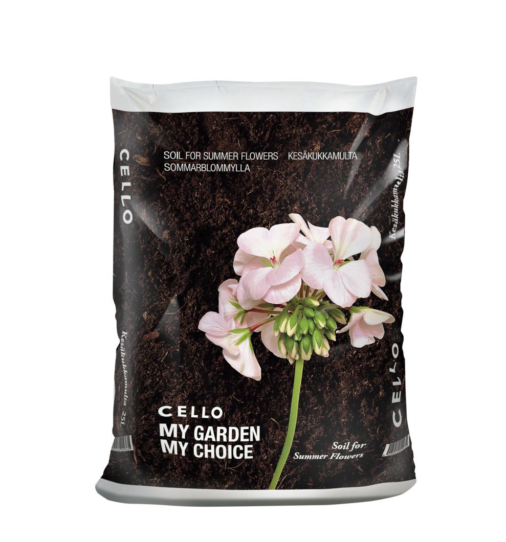
Cello Garden Soils needed a packaging design that stood out among other soil bags. Kesko created a design that used bright colors and stunning photos to capture the eye and imagination of aspiring gardeners, drawing them in to the product.
Right away, there is no question about what the designer wanted the focal point of the design to be. A beautiful photo takes up about a third of the packaging design. This image serves an informational purpose for customers, as well. It shows what kind of plant or crop the soil is best used for growing. Beautiful flowers and bright, colorful vegetables attract the eye and make you feel as if you can grow something just as incredible—with the right soil, of course.

The photos are the real highlight of Cello’s packaging. The rest of the design is clean and easy to read. Bold, white typography stands out against the grain of the soil in the photo. The soil type is italicized, and it features more flair than the basic sans serif font that displays the brand name and slogan.
Overall, the design is mainly emphasizes stunning photography that makes Cello stand out among their competitors. While other competitors may try to use their containers as an educational tool to bombard consumers with information, Cello uses their packaging to create inspiration instead.
Cello Garden Soils is a top packaging design in the Agriculture industry.