Standout Features:
- Minimalistic yet vibrant design
- Bold, nature-inspired elements
- Clear, friendly brand messaging
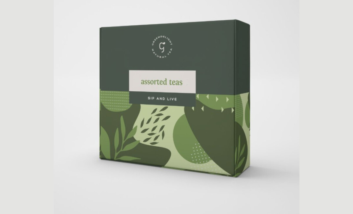
Greendelight Natural Teas offers a refreshing alternative to your typical afternoon pick-me-up, and AEO Design has crafted a packaging solution that perfectly complements this fresh tea brand. With a minimalist yet vibrant design approach, the packaging appeals to both tea lovers and health-conscious consumers.
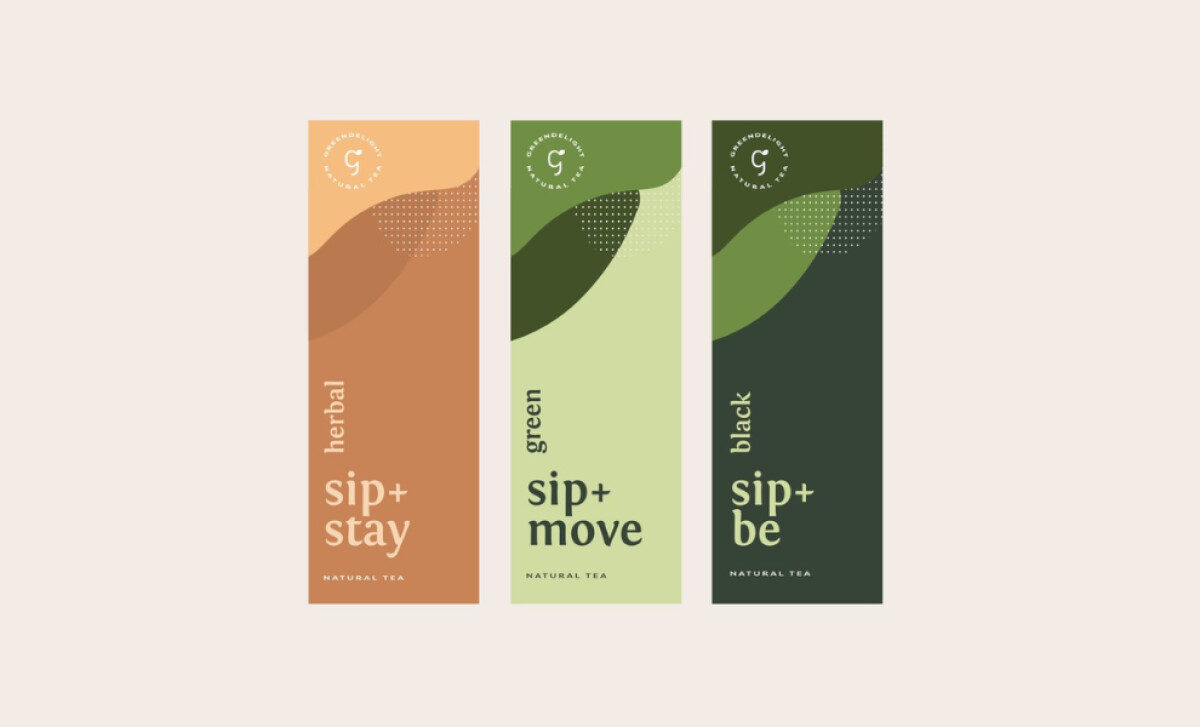
The color palette, dominated by soothing green tones and earthy neutrals, resonates with the natural essence of the product. Specifically, the vibrant green for the Green Tea variety, warm orange for Herbal Tea, and soft cream for Black Tea create a distinct visual identity for each product while maintaining overall cohesion.
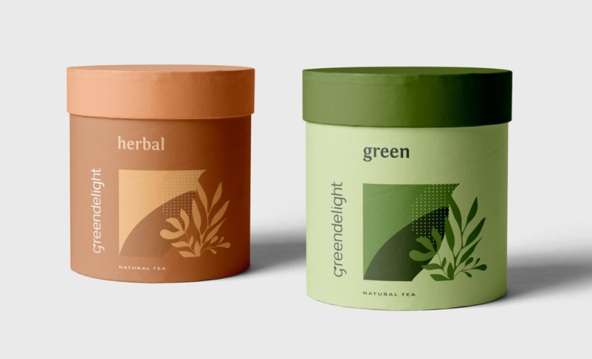
The tea packaging design also incorporates nature-inspired graphics, with delicate leaves, organic shapes, and geometric patterns. The botanical motifs create an immediate connection between the product and its all-natural ingredients, making it clear to the consumer that these teas are an extension of nature’s offerings.
The messaging on Greendelight’s packaging is straightforward and welcoming. The taglines — “Sip + Stay,” “Sip + Move,” and “Sip + Be” — are concise and easy to understand, immediately conveying the benefits of each tea type. This simplicity extends to the labeling, with clear product names and natural tea descriptors.
The design speaks to the growing demand for clean, natural products while offering a fresh, inviting take on tea packaging. With its user-friendly branding and vibrant design elements, this design is a prime example of how thoughtful packaging can elevate a product and connect with consumers.
-preview.jpg)

-preview.jpg)