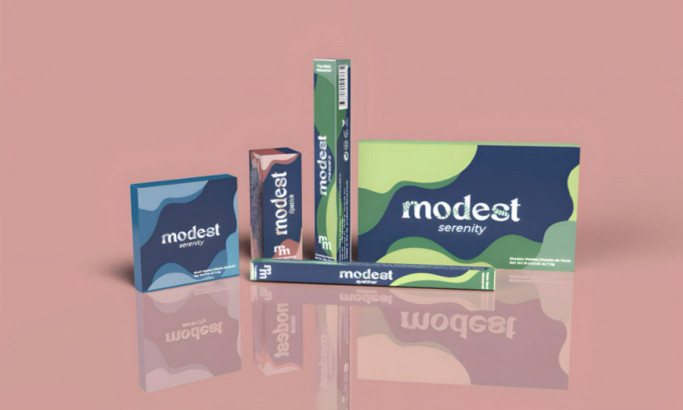
Standout Features:
- Vibrant unisex design
- Sleek, minimalist typography
- Eco-conscious design
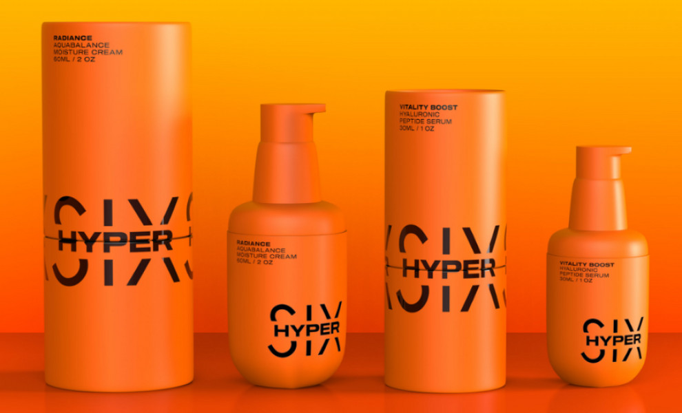
MATRAFOX studio's packaging design for Hyper Six, a unisex skincare brand, merges scientific innovation with a stylish aesthetic. The vibrant orange hue is an eye-catcher and symbolizes the brand's energy and dynamism.
The simple yet striking sans-serif typography conveys sophistication, reflecting the brand's commitment to science-driven, high-quality products. The central logo placement and uncluttered product labels ensure instant brand recognition.
Eco-friendly materials further emphasize Hyper Six's dedication to sustainability, which appeals to environmentally conscious consumers. This well-intentioned packaging design aligns with the brand's values without sacrificing style and usability.
Get a chance to become the next Design Award winner.
SUBMIT YOUR DESIGN